Creating a Lock Screen widget with SwiftUI
Understand how to make widgets available for the device Lock Screen in a SwiftUI app.


In the tutorial Adding a Widget to a SwiftUI app, we learned how to create stunning widgets that display information on the Home Screen. Now we will guide you on presenting essential information about your app directly on the Lock Screen using accessory widgets.
The sample code in this reference article is based on the project created in the Create Interactive Widget in SwiftUI tutorial.
Types of Lock Screen Widgets
In iOS 16, Apple introduced three new widget families representing different types of Lock Screen widgets:
- accessoryCircular: displays simple data in a circular format. Some examples are the battery widget and the weather widget
- accessoryRectangular: shows multiple lines of text or small graphs, such as the events displayed on the calendar.
- accessoryInline: offers a single row of text and an optional image to display essential information
Let's explore how we can support these widget families in our app.
Adding support for the accessory family
To implement a lock screen widget for our app the first step is to include the accessory types as supported families in our widget configuration file using the supportedFamilies(_:) modifier.
import WidgetKit
import SwiftUI

struct WaterCupInteractiveWidget: Widget {
    let kind: String = "WaterTrackerExtension"

    var body: some WidgetConfiguration {
        StaticConfiguration(kind: kind, provider: WaterCupProvider()) { entry in
            WidgetsEntryView(entry: entry)
        }

        .supportedFamilies([
            .systemSmall,
            .systemMedium,

            // Added new families
            .accessoryInline,
            .accessoryCircular,
            .accessoryRectangular
        ])

        .configurationDisplayName("Water Tracker Widget")
        .description("Track your water consumption directly from the Home Screen")
    }
}
Displaying the correct widget
Now that our widget supports different families we must provide the correct view for each family. We achieve it by accessing the information regarding where the widget is being displayed and providing the proper view accordingly.
You can access the current family of the widget by accessing the WidgetFamily value stored in the environment. The widgetFamily environment value can then be used to identify which view should be presented according to where it is being displayed.
struct WidgetsEntryView: View {
    @State var entry: WaterCupProvider.Entry

    // Access to the current widget family
    @Environment(\.widgetFamily) var widgetFamily

    var body: some View {
        VStack {
            switch widgetFamily {
            case .systemSmall, .systemMedium, .systemLarge, .systemExtraLarge:
                CupCounterView(count: $entry.count, dimension: 70)

                Button(intent: IncrementCupIntent()) {
                    Text("Add a cup")
                }
            case .accessoryCircular:
                AccessoryCircularView(entry: entry)
            case .accessoryRectangular:
                AccessoryRectangularWidget(entry: entry)
            case .accessoryInline:
                AccessoryInlineWidget(entry: entry)
            @unknown default:
                CupCounterView(count: $entry.count, dimension: 70)

                Button(intent: IncrementCupIntent()) {
                    Text("Add a cup")
                }
            }
        }
        .containerBackground(.fill.tertiary, for: .widget)
    }
}
Now let's create the AccessoryCircularView, AccessoryRectangularWidget and AccessoryInlineWidget widgets.
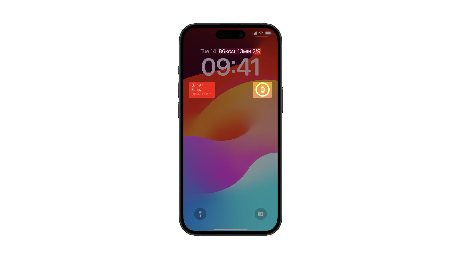
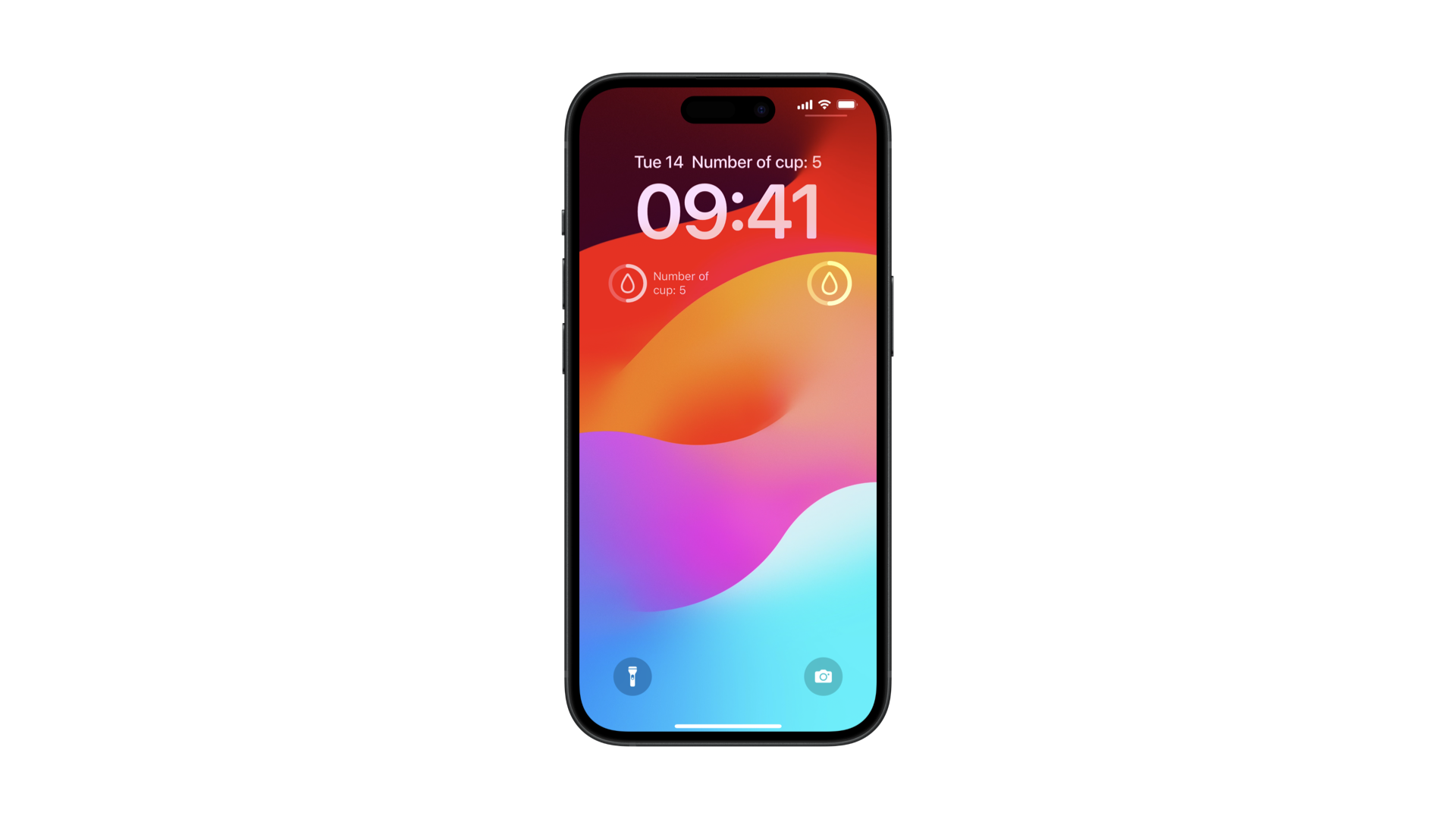
Circular widget
The accessoryCircular widget is the smallest widget that can be used on the Lock Screen to display data. It is typically used to show the current level of a value.
We can use the Gauge component to implement this widget and display the water cup quantity ratio.
struct AccessoryCircularView: View {
    var entry: WaterCupProvider.Entry

    var body: some View {
        VStack{
            Gauge(value: Double(entry.count) * 0.1) {
                Image(systemName: "drop")
            }
            .gaugeStyle(.accessoryCircularCapacity)
        }
    }
}
Rectangular widget
With this type of widget, we can take advantage of the additional space available to display additional textual information. For example:
struct AccessoryRectangularWidget: View {
    var entry: WaterCupProvider.Entry

    var body: some View {
        HStack{
            Gauge(value: Double(entry.count) * 0.1) {
                Image(systemName: "drop")
            }
            .gaugeStyle(.accessoryCircularCapacity)

            Text("Number of cups: \\(entry.count) ")
        }
        .padding(4)
    }
}
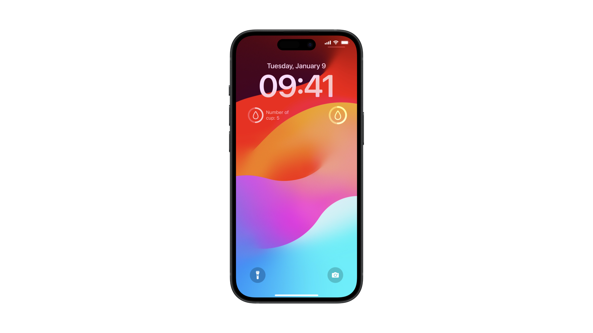
Inline widget
The inlineAccessory widget is designed to display essential textual information above the clock on the Lock Screen. Here’s an example implementation:
struct AccessoryInlineWidget: View {
    var entry: WaterCupProvider.Entry

    var body: some View {
        VStack {
            Text("Number of cups: \\(entry.count)")
        }
    }
}
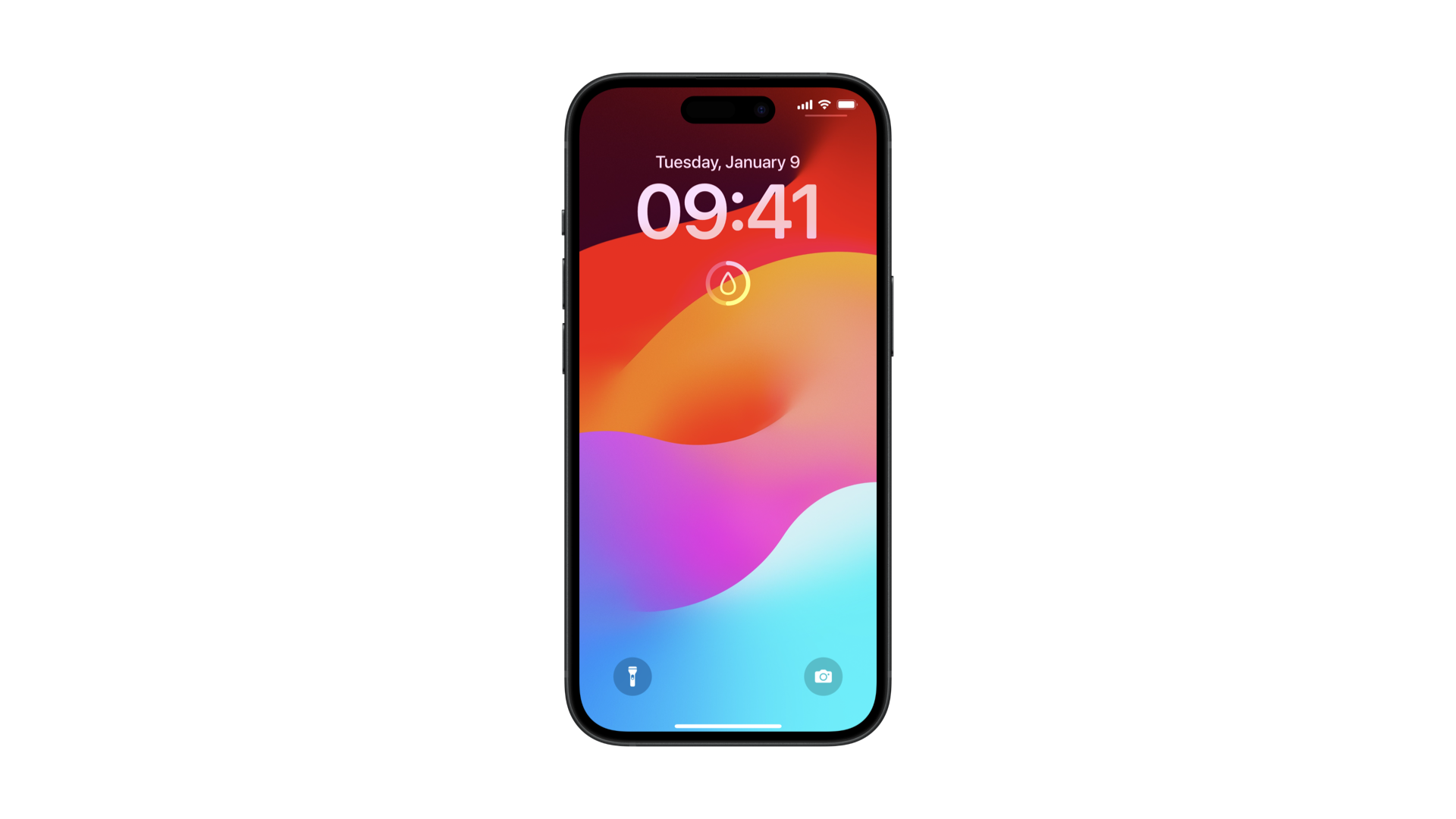
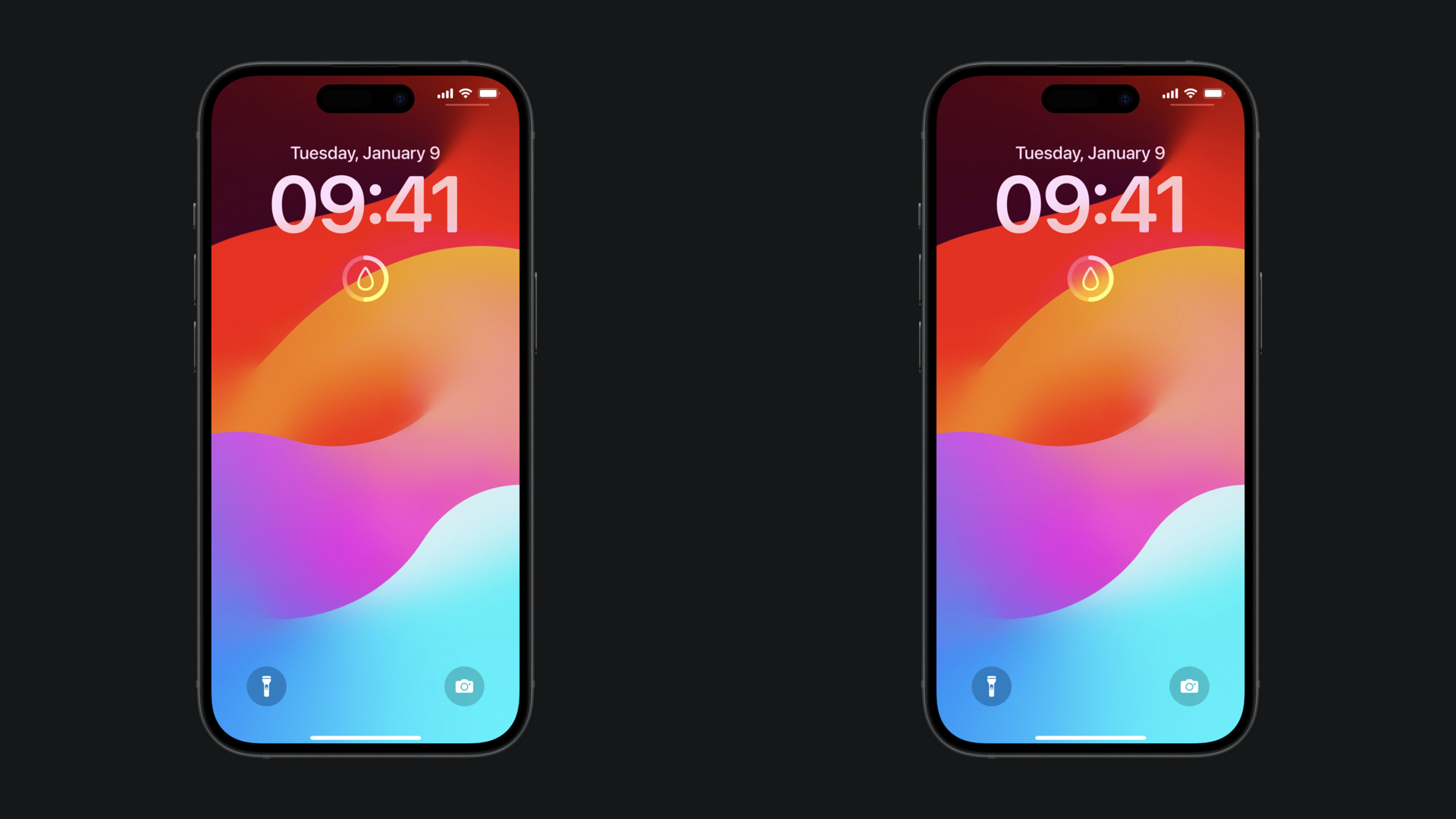
Enhancing widget visibility on the Lock Screen
To ensure that the widgets are always visible with any wallpaper, we can add the AccessoryWidgetBackground adaptive background view, which provides a standard appearance for our accessory widgets.
struct AccessoryCircularView: View {
    var entry: WaterCupProvider.Entry

    var body: some View {
        ZStack {
		        // Added the default background for an accessory widget
            AccessoryWidgetBackground()

            Gauge(value: Double(entry.count) * 0.1) {
                Image(systemName: "drop")
            }
            .gaugeStyle(.accessoryCircularCapacity)
        }
    }
}
Here’s the difference between the widget with the AccessoryWidgetBackground and the one without it:
Display sensitive information
When it comes to displaying data on the Lock Screen it is also important to consider if the information being displayed should be visible even when the device is locked.
To address this, we can use the privacySensitive(_:) modifier to determine if the information on the widget should be displayed while the device is locked or not.
struct AccessoryCircularView: View {
    var entry: WaterCupProvider.Entry

    var body: some View {
        ZStack {
            AccessoryWidgetBackground()

            Gauge(value: Double(entry.count) * 0.1) {
                Image(systemName: "drop")
            }
            .gaugeStyle(.accessoryCircularCapacity)
        }
        .privacySensitive()
    }
}
