Adapting widgets for tint mode and dark mode in SwiftUI
Explore the multiple rendering modes of widgets for different device settings with SwiftUI.

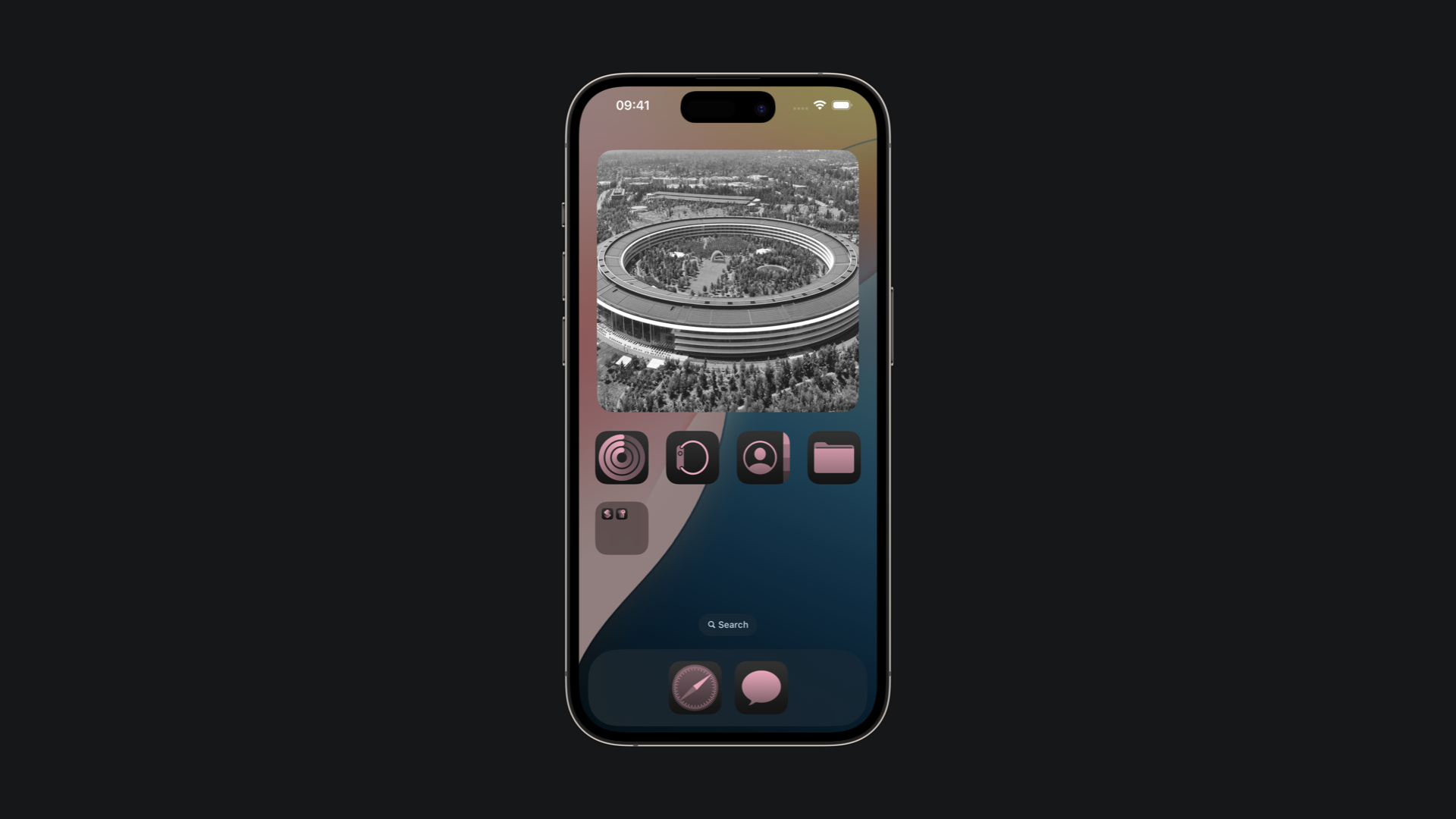
One of the most interesting introductions to iOS and iPadOS 18 was the possibility to customize the appearance of the home screen, opening to a level of customization never seen on Apple platforms. With the new Dark Mode and Tinted Mode, developers can and should provide a way for their widgets to adapt to the new available options, so that they appear correctly independent of which configuration their users have set on their devices.
Rendering Modes
Depending on where the widget is displayed the system renders it in different ways. We can access the rendering mode in SwiftUI from the widgetRenderingMode environment value, deciding how the widget should appear in each mode.
The system renders the widget in three distinct ways:
fullColor: the system doesn’t alter or apply any filter to the widget’s colors.accented: the system categorizes the widget’s visual hierarchy into an accent group and a default group, assigning distinct colors to each group.vibrant: the system desaturates the widget, resulting in a monochrome image that is used just for lock screen widgets.
import WidgetKit
import SwiftUI

struct WaterWidgetView: View {

    @Environment(\.widgetRenderingMode) var renderingMode
    @Environment(\.colorScheme) private var colorScheme

    var entry: WaterProvider.Entry

    var body: some View {
        ZStack {
            switch renderingMode {
            case .fullColor:
                //UI for Light and Dark Mode
            case .accented:
                // UI for Tinted Mode
            case .vibrant:
                //UI for Lock Screen Widgets
            }
        }
    }
}
Make it for Dark Mode
We can customize the appearance of widgets on the Home Screen based on the active light or dark icon by accessing the colorScheme environment value.
import WidgetKit
import SwiftUI

struct WaterWidgetView: View {

    @Environment(\.colorScheme) private var colorScheme

    var entry: WaterProvider.Entry

    var body: some View {

        VStack(alignment: .leading) {
            HStack {
                Image(systemName: "drop")
                Text("Tip of the day")
            }
            .font(.title3)
            .bold()
            .padding(.bottom, 8)

            Text(entry.waterTip)
                .font(.caption)

            Spacer()

            HStack {
                Spacer()
                Text("**Last Update:** \(entry.date.formatted(.dateTime))")
                    .font(.caption2)
            }
        }
        .foregroundStyle(.white)

        .containerBackground(for: .widget) {
            Color.cyan.opacity(colorScheme == .light ? 1 : 0.6)
        }

    }
}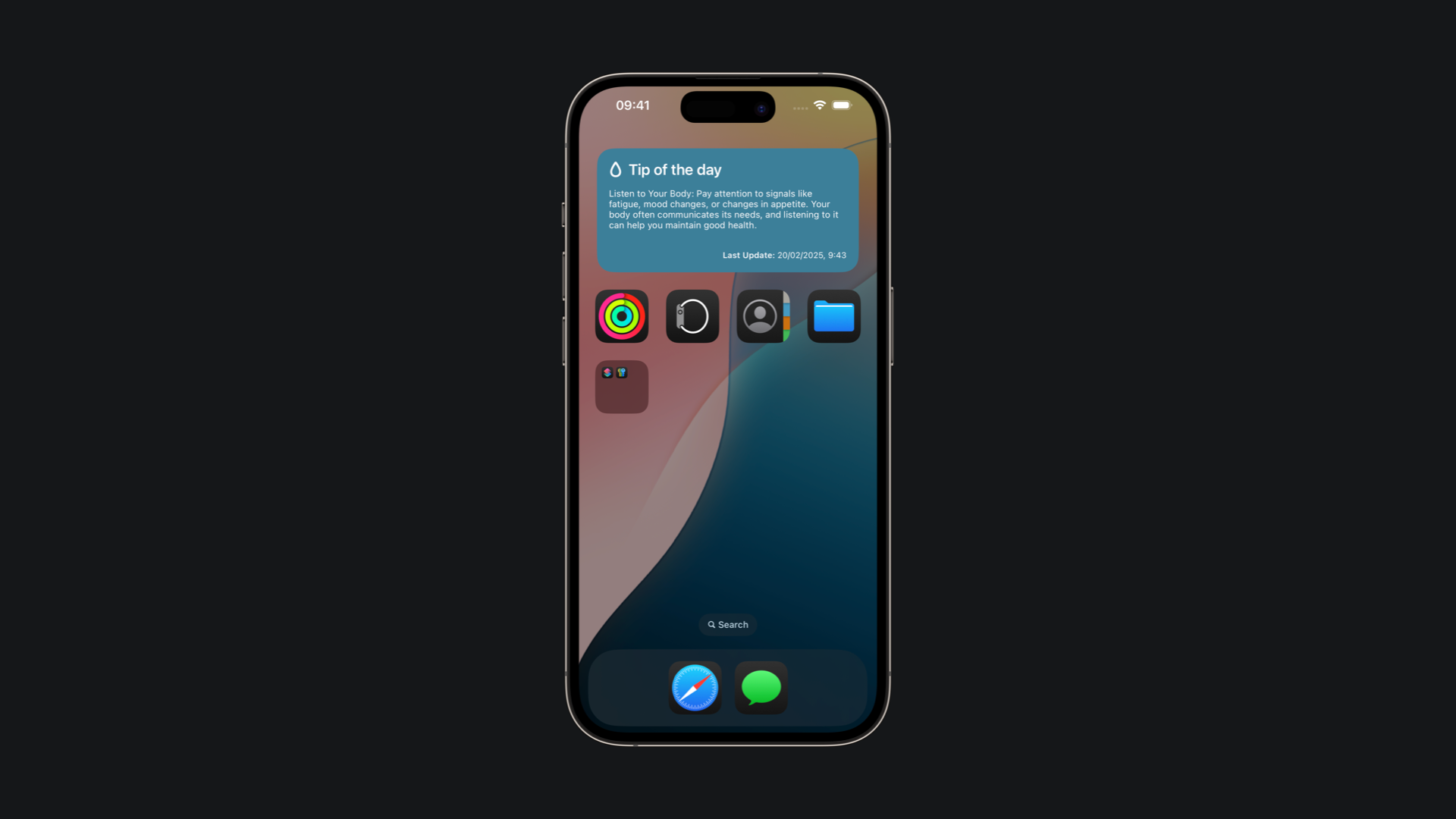
In this example, the background's opacity is adjusted based on the colorScheme value. When dark icons are enabled, the opacity is slightly reduced to enhance contrast and readability making it more coherent with the system.
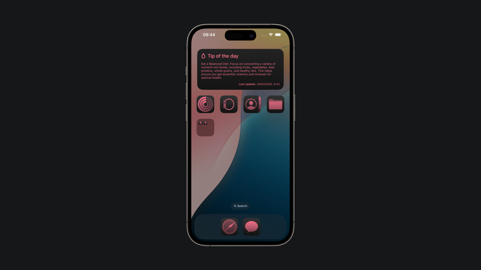
Make it for Tint Mode
When the user enables tint mode on the Home Screen, you can use the widgetAccentable(_:) modifier to allow text and symbols to automatically adapt their foreground color to the selected tint.
import WidgetKit
import SwiftUI

struct WaterWidgetView: View {

    var entry: WaterProvider.Entry

    var body: some View {

        VStack(alignment: .leading) {
            ...
        }
        .foregroundStyle(.white)
        .containerBackground(for: .widget) { Color.cyan }

        .widgetAccentable()

    }
}
By applying the modifier to the entire view, as in the example, the system adds that View and all its subviews to the accent group. Consequently, the colors are rendered based on the view’s alpha channel.
Sometimes, especially when you have different colors in your widget, just the .widgetAccentable() property is not enough to achieve a satisfactory result automatically.
To preserve the color information of your widget while using the tint mode, we can utilize the luminanceToAlpha() modifier. This modifier maps the red, green, and blue components of each input pixel’s color to a grayscale value, applying a different opacity based on the luminance of the original color.
import WidgetKit
import SwiftUI

struct CirclesWidgetView: View {

    var body: some View {
        ZStack {
           Circle()
                .fill(Color.pink)
                .frame(width: 80)
            Circle()
                .fill(Color.green)
                .frame(width: 60)
            Circle()
                .fill(Color.cyan)
                .frame(width: 40)
        }
        .luminanceToAlpha()
        .foregroundStyle(.white)
        .containerBackground(for: .widget) { Color.gray }
        .widgetAccentable()
    }

}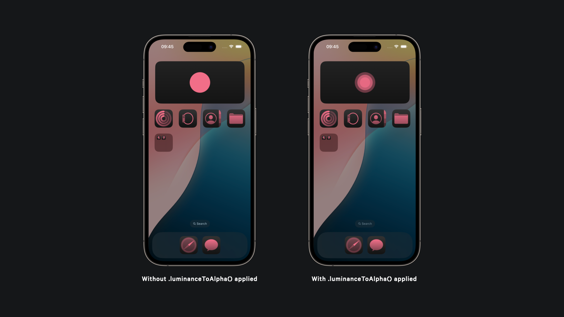
Image rendering in tinted mode
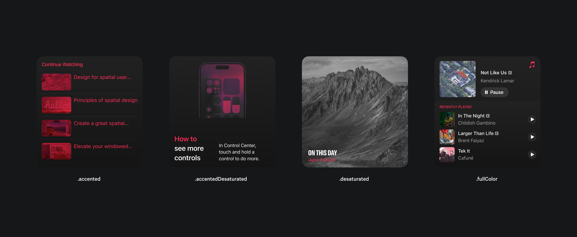
Managing images on widgets in tint mode is essential, as the system may face challenges rendering them correctly. Developers can control how images appear by selecting from four different visualization modes using the widgetAccentedRenderingMode(_:) modifier:
accented: theImageview will be included as part of the accented widget group.accentedDesaturated: transfers the image’s luminance to the alpha channel, substituting the original colors with the accent group’s applied color.desaturated: maps the image’s luminance to the alpha channel, replacing its color with a desaturated version.fullColor: the image will be displayed in its original full color without any alterations or adjustments.
Here's how you can apply this modifier in your widget View:
import WidgetKit
import SwiftUI

struct ImageWidgetView: View {

    var body: some View {
        VStack{
            Image("ApplePark")
                .resizable()
                .widgetAccentedRenderingMode(.desaturated)
                .scaleEffect(1.5)
        }
        .containerBackground(for: .widget) { Color.gray }
    }

}
luminanceToAlpha() modifier to the image View when the widget is displayed in Tint Mode