
Applying Gestalt Principles in UI/UX App Design
Discover how the foundational principles of visual perception can be applied to enhance the user experience in your app.
The perception of visual elements
The conviction to fully control the mind is a natural belief of every individual. We think we are the ones deciding what we want to focus on and what to pay attention to. However, the reality is that our perception is not something we can control. Some principles determine how people naturally perceive visual elements, which factors are most effective in any given circumstances, influence perception, direct concentration, and cause behavioral change.
A fundamental understanding of these principles is crucial for visual designers to manipulate attention, guiding the user through a graphical interface. So let’s try to understand how the human eyes perceive visual elements or, to be more precise, how the human eyes trick our minds.
For instance, the cover of this article is an optical illusion where our mind is distracted by the arrows at the end of each vertical segment: the three lines have the same length, but our mind perceives that they are different. As another example, our mind perceives three squares, but in reality, only the first is a square, while the other two are vertical and horizontal lines.
Our brain tries to make sense of the world by comparing previous experiences or visual patterns and connecting the dots. It has its own “weird” way of perceiving shape and form, grouping information, and filling in the gaps to draw the big picture.
Among the different artists who played with human eye perception, the figure of Maurits Cornelis Escher, a German graphic artist, stands out. Through his work, he invites the user to observe nature from a diverse point of view to bring out the beauty of geometric regularities, elusive at first glance but (for those who catch it) capable of generating wondrous magic. The goal of Escher is to denounce the inability of the human eye to perceive reality objectively since it is irreplicable if not in the form of illusion itself. What the artist does is play with visual perception through Gestalt principles.

Gestalt theory
Gestalt (form, shape in German) is a group of visual perception principles developed by Max Wertheimer and German psychologists in the 1920s. Gestalt principles are laws of human perception that describe how humans group similar elements, recognize patterns and simplify complex images when we perceive objects. In other words, Gestalt psychology is an attempt to understand the laws behind the ability to acquire and maintain meaningful perceptions in a chaotic world.
The central principle of this theory is that something is composed of many parts. However, it is somehow different from or more than the sum of its parts.
The whole is something else than the sum of its parts.
— Kurt Koffka
With this sentence, Koffka refers to the way humans, when looking at a group of objects, will see the whole before seeing the individual parts.

Gestalt = user interface design?
It occurs spontaneously to consider user interface design as embodying Gestalt principles and that the work of designers and developers is reworking these principles. As a matter of fact, the layouts of the apps we use daily are composed of UI elements organized within a specific space. Layouts enable the composition of user interface components into logical structures, resulting in a consistent user experience.
Think for a moment about iOS as if it were no longer an operative system. Instead, think of it as an architecture composed of visual grids and iconographic details integrated into an overall composition, where every element serves a distinct purpose. We will then begin to see iOS, not in its totality but its anatomical singularity as a logical, graphic, and significant sign created following the laws of Gestalt.
The Gestalt Principles play an essential role in UX design. When we design an interface the users should be able to understand what they see and to find what they desire at a glance. The development of meaningful products that meet the needs of our users requires an understanding of some basic psychological principles.
Similarity
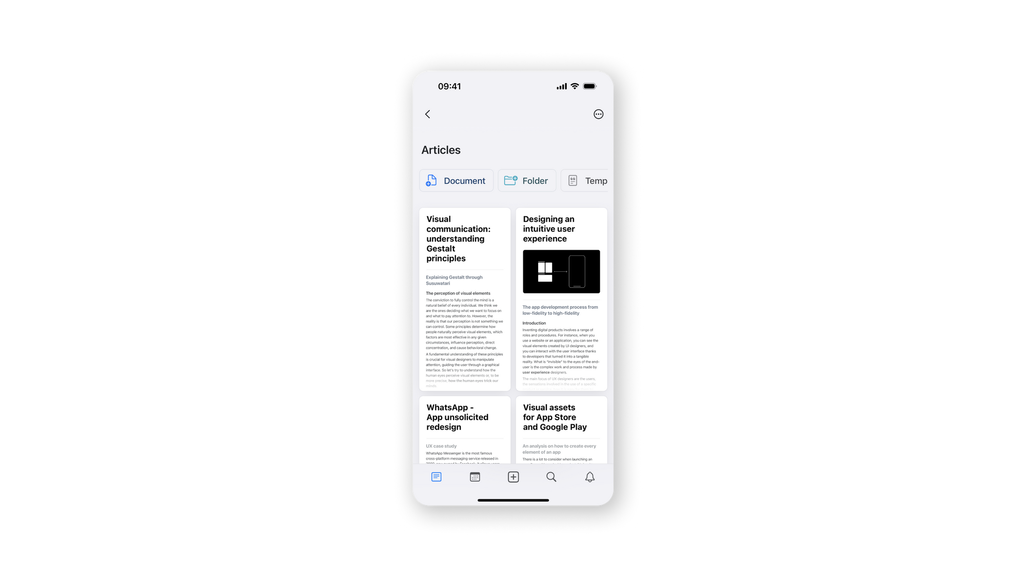
When elements are similar to each other, we tend to see them as a group or pattern. We can use similarity to organize and classify objects within a group and link them with a specific meaning or function.
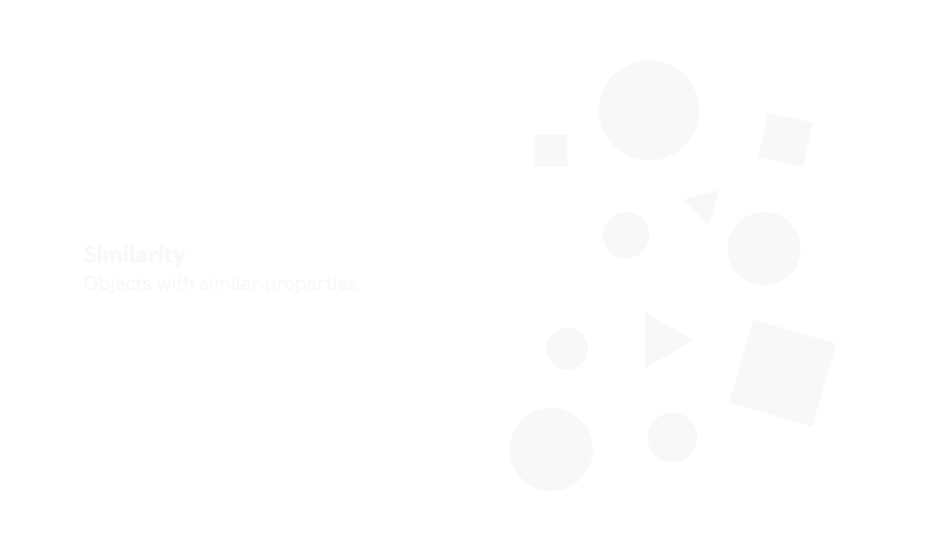
There are multiple ways to make elements appear similar and therefore related. Similar characteristics include color, size, shape, texture, dimension, and orientation. You can apply the principle of similarity to navigation, links, buttons, calls to action, headings, etc.
Proximity
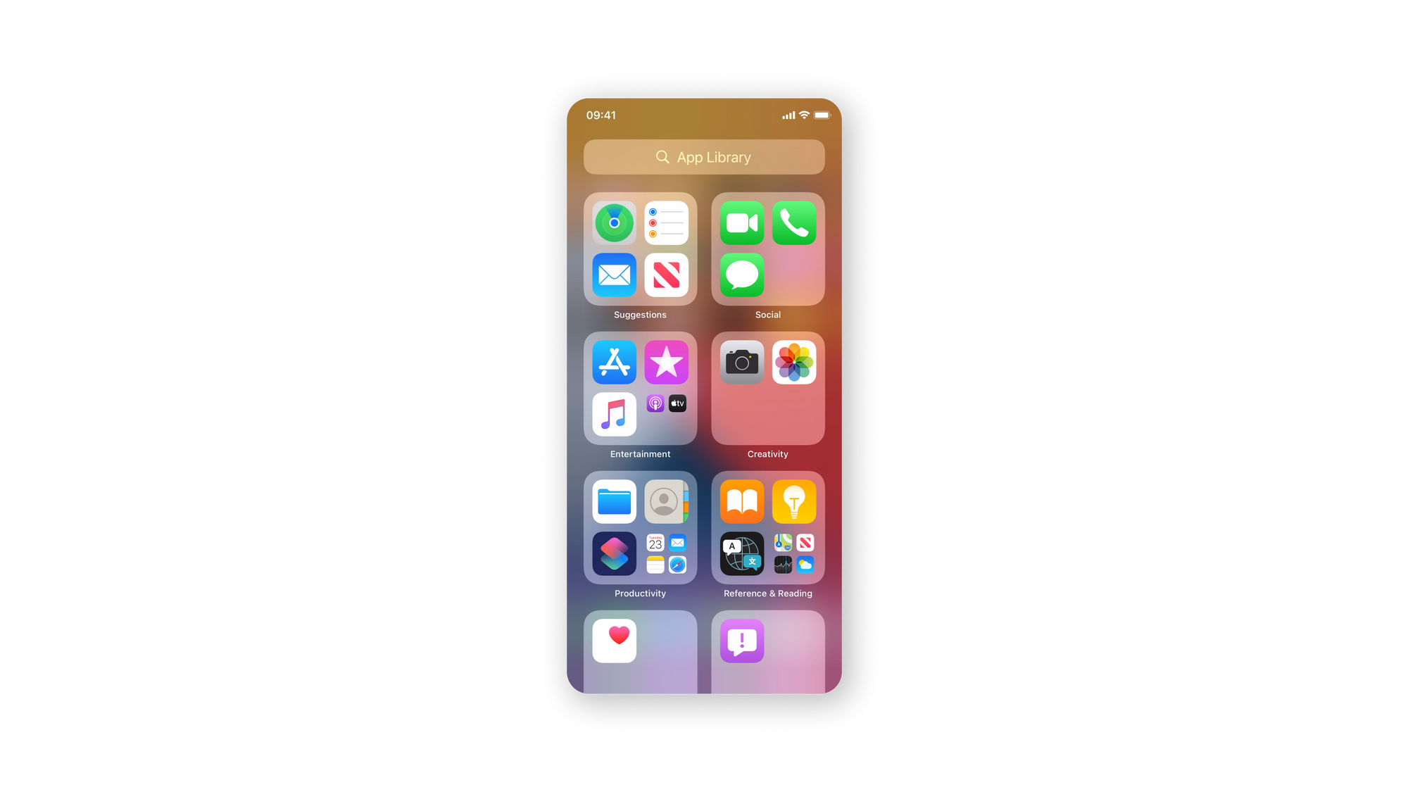
Using the proximity principle, designers can group similar content, organize elements, and declutter layouts by grouping similar information. When properly applied, it will enhance visual communication and user experience.

According to the principle, related items should be grouped, while unrelated elements should be far apart. Creating contrast with white space guides the eye in the intended direction by creating contrast. Users will get to their goals faster and have a more thorough understanding of the content.
The proximity principle can be applied everywhere, from navigation to cards and galleries to lists and texts.
Symmetry
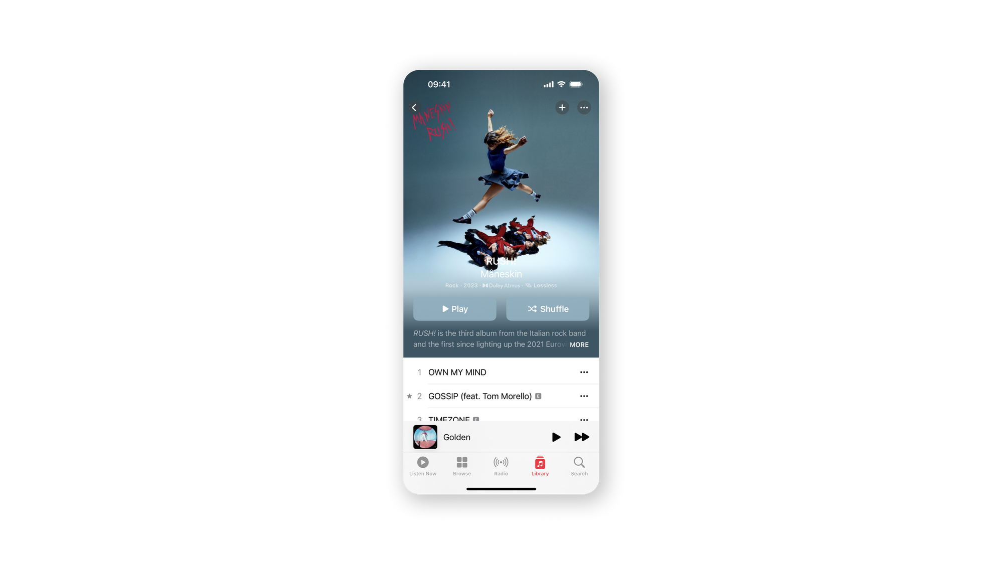
We tend to perceive symmetrical elements as belonging together regardless of their distances, giving us the sense that the structure is solid and orderly. Those are the qualities that we look for to make sense of our world, together with order and stability. Symmetry, therefore, facilitates the communication of information quickly and efficiently.
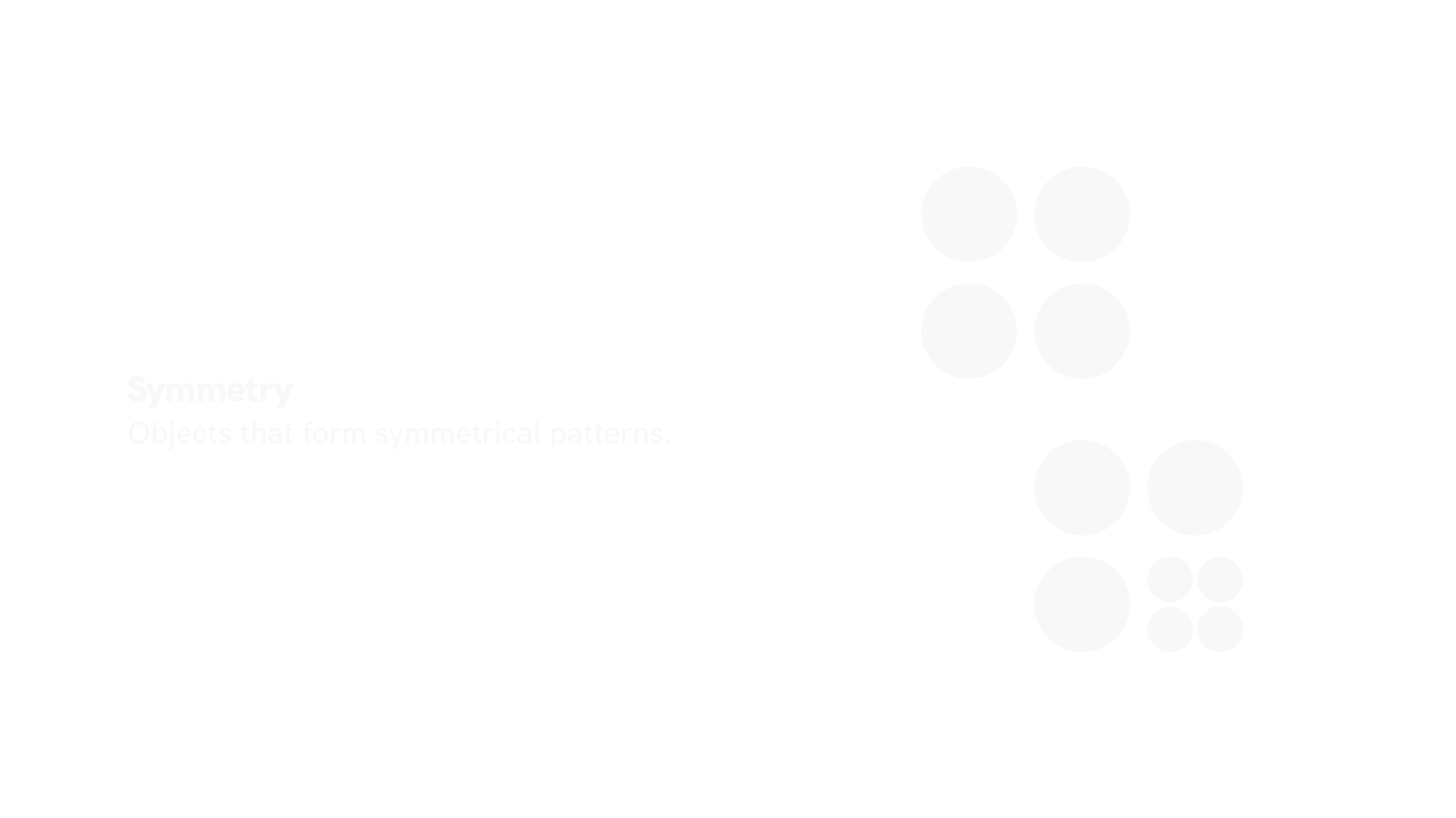
However, by adding asymmetry to an otherwise symmetrical design, you can draw attention to any point of interest or call to action. A proper balance between symmetry and asymmetry is key to functional design.
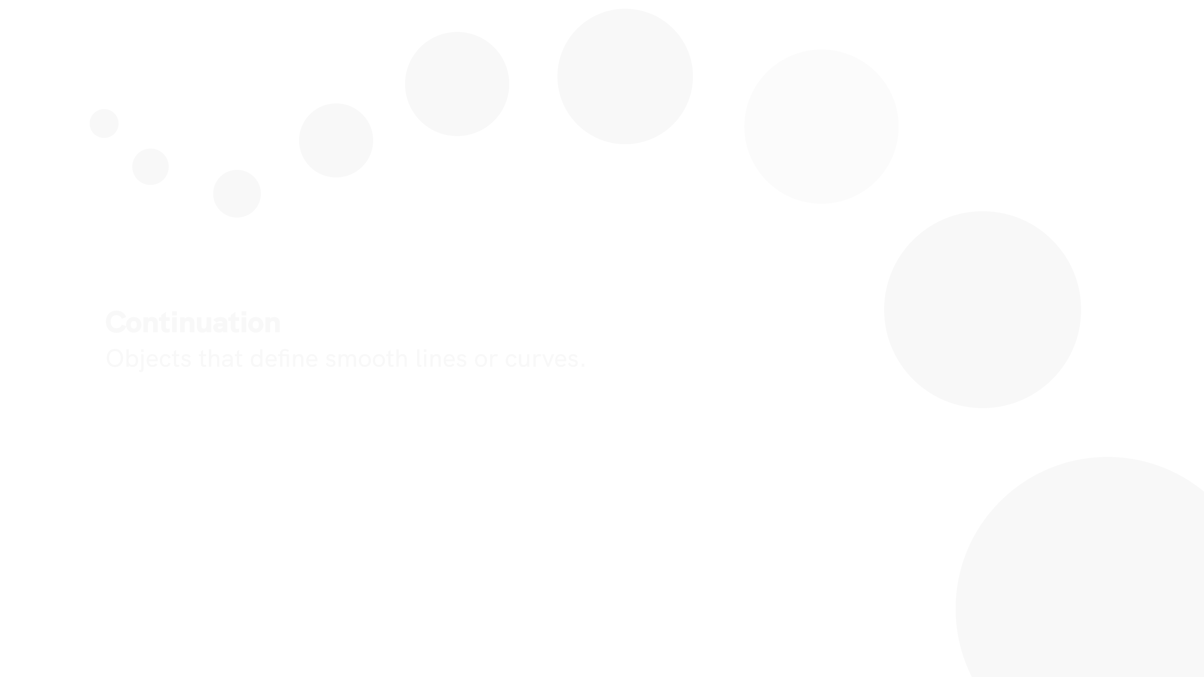
Continuation
The human eye perceives the elements arranged in a line or a soft curve as more related than those placed randomly or in a harsh line. In other words, elements in a continuous line are perceived as a group. The smoother the line segments, the more we see them as a unified shape. In a composition, continuity facilitates understanding of direction and movement. The alignment of elements helps our eyes to move smoothly through a view, thereby improving legibility.
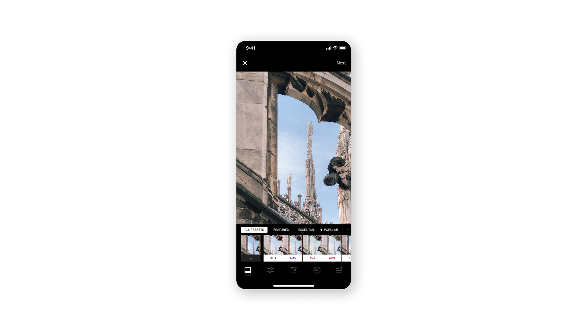
Establishing continuity reinforces the perception of grouped content, creates order, and guides users through different groups of content. The interruption of continuity may announce the end of a section and draw attention to a new piece of content. An example of continuity is the linear arrangement of rows and columns.
Conclusion
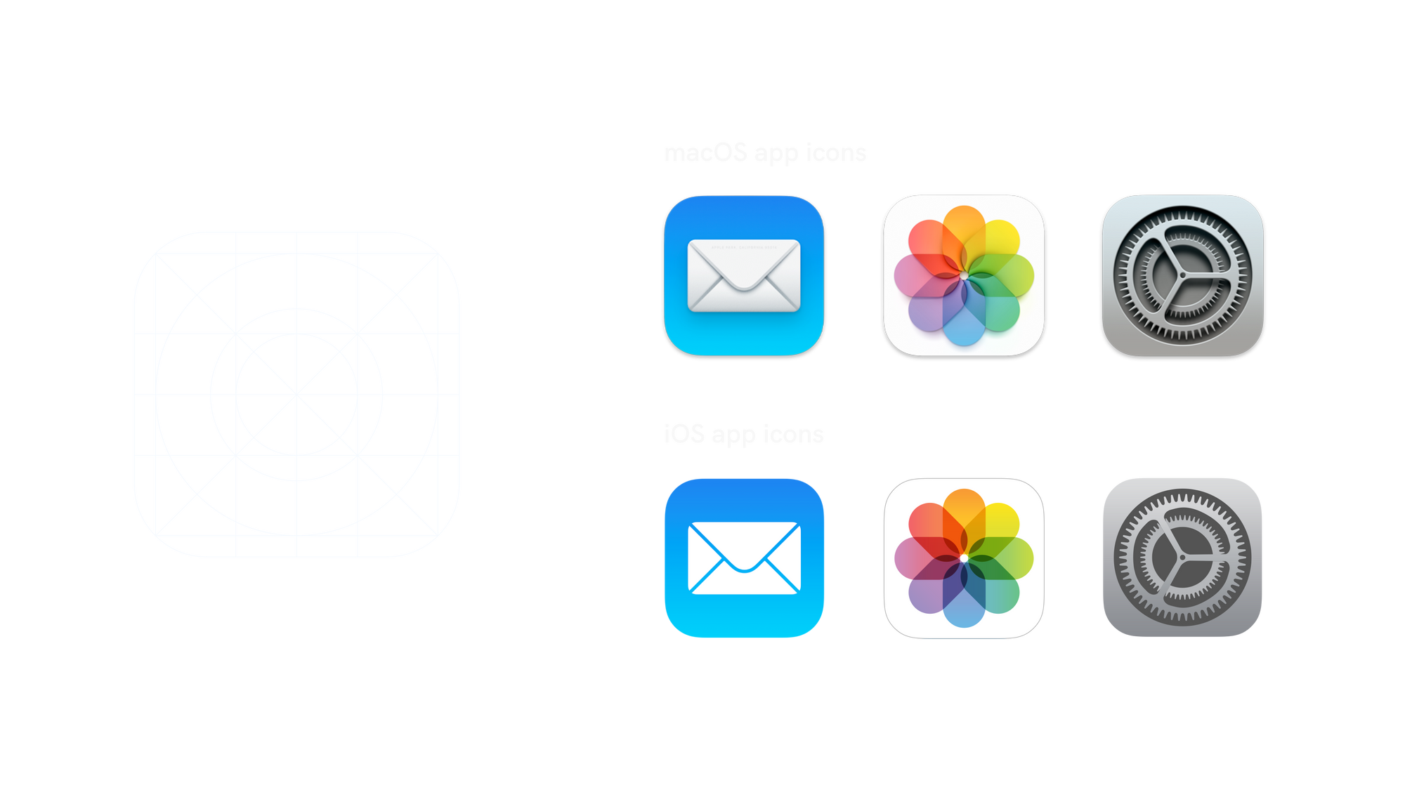
Gestalt is a way of manipulating perception and thinking, influencing with magic or strategy. For instance, if we use the iOS icon template as a reference point, we can see that the icon shape recurs in the operative system as well as in the hardware (for example, the shape of the iPhone camera).
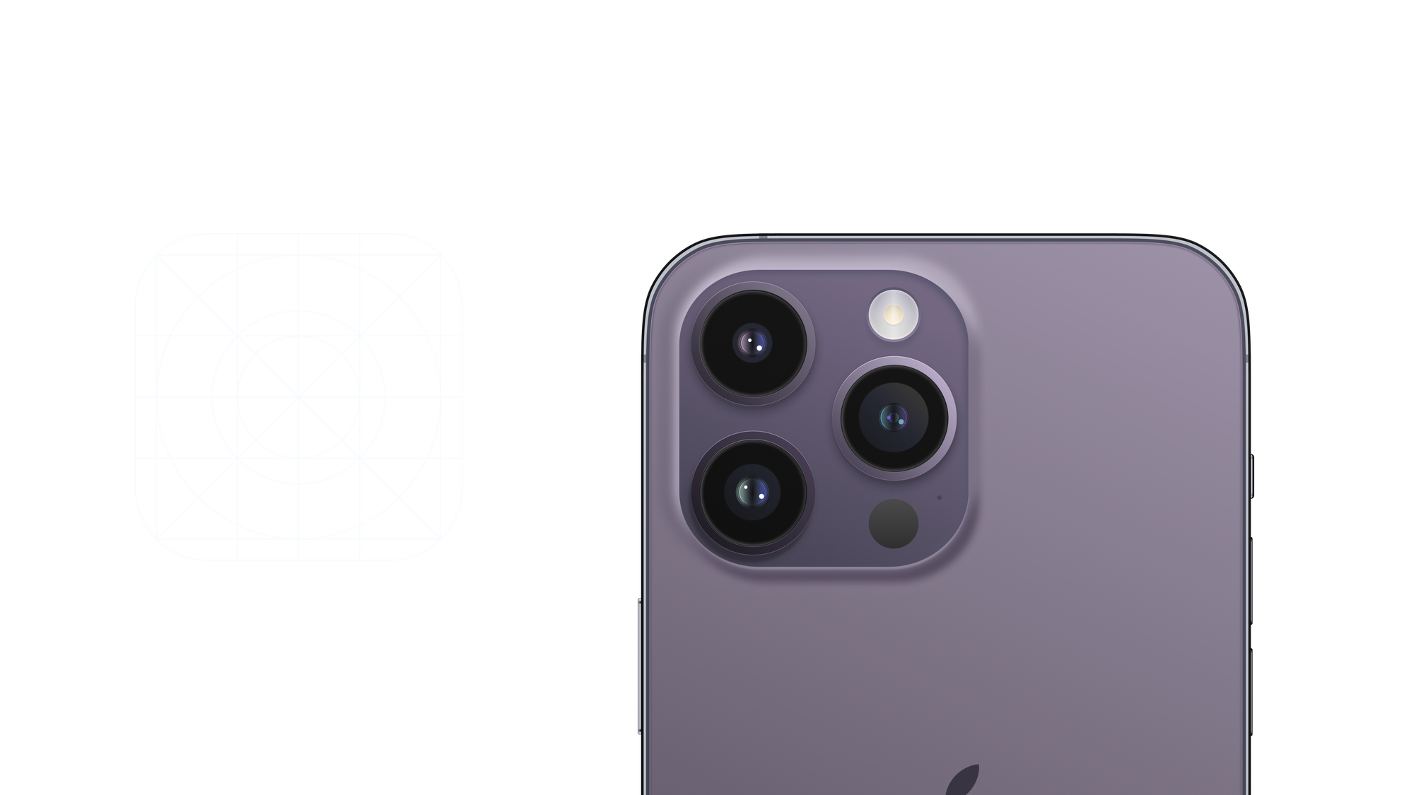
Throughout every element of the world-class developer ecosystem, Gestalt principles serve as brand imprinting: from macro-elements to micro-elements, using a consistent system of icons and graphics.
In analyzing Gestalt principles, we have seen how they are closely connected. Knowing Gestalt laws and the concept of human thinking will allow you to decide which design elements to use in different situations. As a result, you can influence visual perception, leading users to specific points of your product and meeting their needs.


