Creating advanced hover effects in visionOS
Learn how to create great hover effect experiences for visionOS applications.


Our previous article explored how applying hover effects on buttons in visionOS improves the user experience by providing visual feedback. As designers and developers, we can balance system components with custom designs to create intuitive user experiences.
 Emanuele Agosta
During WWDC24, Apple introduced a new way for visionOS to respond to users' gaze. This innovation allows developers to create immersive and responsive user experiences by making SwiftUI views interact with where users are looking.
Standard visionOS controls come with built-in hover effects, but the true magic lies in customizing them for unique user experiences. With the hoverEffect(_:) view modifier, developers can add custom effects to any SwiftUI view, elevating both standard and custom controls.
Case studies
Custom hover effects can improve your app or game experience by animating elements when users look at them, whether they’re standard UI components or custom elements. These effects can replace or supplement standard ones.
Custom hover effects stand out because users are familiar with standard effects or visual feedback, however, this means you should be cautious and avoid overusing custom effects that can distract users and cause visual discomfort.
For more information, refer to the custom hover effects section in the Human Interface Guidelines:
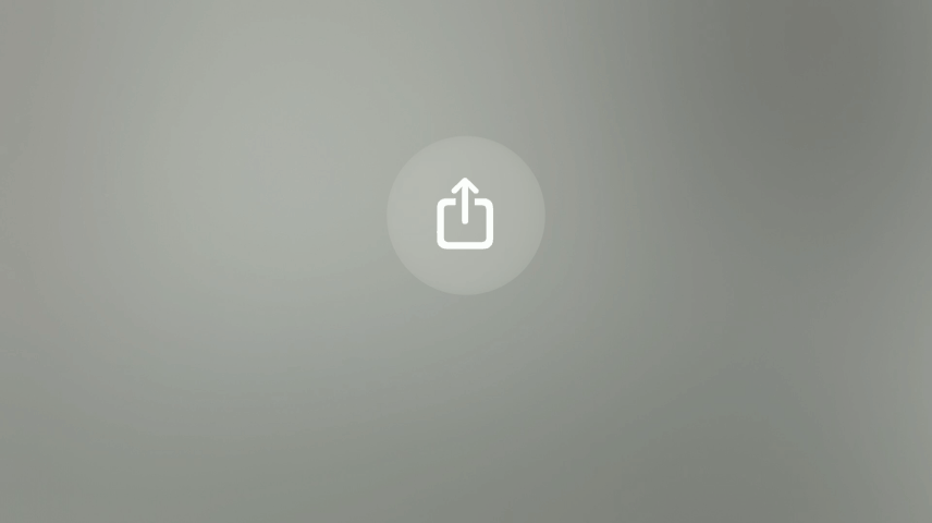
Tooltip
A long focus on a button can trigger a tooltip, providing additional information about its function. For instance, looking at the Share button for a bit longer displays a label that clarifies its purpose. This not only enhances usability but also improves accessibility by offering users more context.
How do we get a tooltip working?
Button {
      print("Hello by Create with Swift")
} label: {
      Image(systemName: "square.and.arrow.up")
}
.help("Share")
Using the help(_:) modifier on a view configures the view’s accessibility hint and its help tag (also called a tooltip) in macOS or visionOS.
Speak to search
Focusing on the microphone glyph in a search field for an extended period activates the Speak to Search function. This feature allows users to perform a search using just their eyes and voice, streamlining the search process.
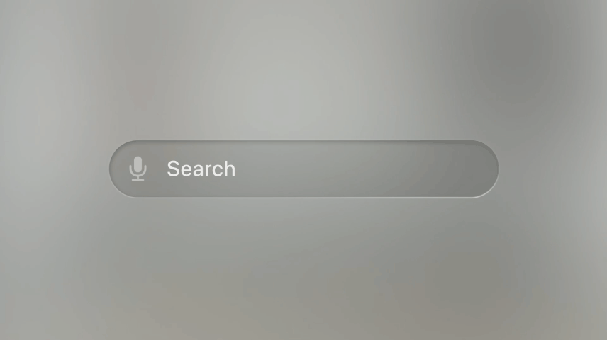
NavigationStack {
    List {
        // ...
    }
    .searchable(text: $searchText)
}
By adding the searchable(text:placement:prompt:) modifier to a view, you will get this hover effect behavior for free.
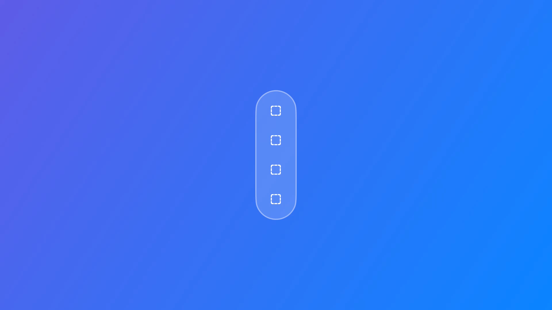
Tab bar
A tab bar is a UI component that provides easy navigation between different sections of an application. Typically, a tab bar displays both icons and labels. However, in visionOS, only in its inactive state it shows icons. When a user focuses longer on a tab, additional information is revealed without cluttering the interface. Specifically, a prolonged focus on the tab bar reveals labels for each tab, offering more context and aiding navigation.
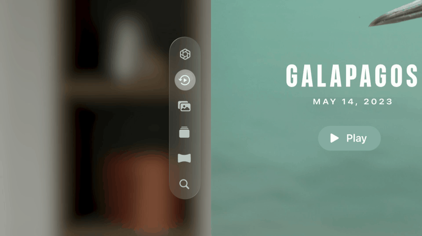
This is the system behavior of any TabView running in visionOS.
The new hover effect modifier
WWDC24 brought significant updates to the hoverEffect(_:) modifier in SwiftUI. It allows developers to define how a view should change when a user gazes upon it.
When hoverEffect(in:isEnabled:body:) is applied, you describe how the view should change its appearance when hovered over. This is accomplished through a closure that defines the effects to be applied and the conditions under which they should change.
The closure provided to the hover effect modifier receives three parameters:
- effect: An
EmptyHoverEffectContentthat you use to compose the visual changes. - isActive: A boolean value indicating whether the view is currently being hovered over.
- proxy: A
GeometryProxyobject that allows the effects to adjust based on the view's geometry, such as size and position.
Text("Hello, World!")
    .hoverEffect { effect, isActive, proxy in
        effect.scaleEffect(!isActive ? 1.0 : 1.1)
    }
In this example:
- When the
Textview is not hovered over, it has a scale of 1.0. - When the
Textview is hovered over, it scales up to 1.1.
Replicating tab bar hover effect animation
Let’s use the new hoverEffect(in:isEnabled:body:) modifier to create a custom button with a behavior that is similar to Apple’s tab bar.
First, we define a view for the visionOS icon that will be displayed on the button.
Next, we create a view for the details, meant to appear only when the user is looking at the button.
struct DetailView: View {
    var body: some View {
        VStack(alignment: .leading) {
            Text("visionOS")
                .font(.body)
                .foregroundStyle(.primary)
            Text("createwithswift.com")
                .font(.footnote)
                .foregroundStyle(.tertiary)
        }
        .padding(.trailing, 24)
    }
}
Now, we define the main view ButtonWithHoverEffectView without applying any custom button style. This view contains a button that executes an action when pressed. Inside the button, there are two subviews: IconView and DetailView.
struct DetailView: View {
    var body: some View {
        VStack(alignment: .leading) {
            Text("visionOS")
                .font(.body)
                .foregroundStyle(.primary)
            Text("createwithswift.com")
                .font(.footnote)
                .foregroundStyle(.tertiary)
        }
        .padding(.trailing, 24)
    }
}
Next, we define a custom button style ButtonWithHoverEffectStyle that enhances the button’s appearance.
struct ButtonWithHoverEffectStyle: ButtonStyle {
    func makeBody(configuration: Configuration) -> some View {
        configuration.label
            .background(.thinMaterial)
            .hoverEffect(.highlight)
            .hoverEffect { effect, isActive, proxy in
                effect.clipShape(.capsule.size(
                    width: isActive ? proxy.size.width : proxy.size.height,
                    height: proxy.size.height,
                    anchor: .leading
                ))
                .scaleEffect(isActive ? 1.05 : 1.0)
            }
    }
}
Finally, we update the ProfileButtonView to apply the custom ProfileButtonStyle.
struct ProfileButtonView: View {
    var action: () -> Void = { }

    var body: some View {
        Button(action: action) {
            HStack(spacing: 2) {
                ProfileIconView()
                ProfileDetailView()
            }
        }
        .buttonStyle(ButtonWithHoverEffectStyle())
    }
}
Adding a delay to the hover effect
The eye interaction in visionOS transforms user experiences, but there’s a delicate balance to strike. Default hover effects, which activate instantly, are perfect for subtle interactions that require quick confirmations. However, for more complex actions like button expansions, a sudden change can be distracting. If the delay for hover effects is too short, a simple glance might trigger unintended actions.
By introducing a short delay before this micro-interaction happens, we can minimize the chance of accidental activation, making users feel more in control. Here’s how to adjust the delay for the hover effect:
struct ButtonWithHoverEffectStyle: ButtonStyle {
    func makeBody(configuration: Configuration) -> some View {
        configuration.label
            .background(.thinMaterial)
            .hoverEffect(.highlight)
            .hoverEffect { effect, isActive, proxy in
                effect.animation(.linear.delay(isActive ? 0.8 : 0.2)) { $0.clipShape(.capsule.size(
                        width: isActive ? proxy.size.width : proxy.size.height,
                        height: proxy.size.height,
                        anchor: .leading
                    ))
                    .scaleEffect(isActive ? 1.05 : 1.0)
                }

            }
    }
}
To learn more about how micro-interactions, such as animations and visual feedback, enhance usability by providing feedback, displaying system status, and preventing errors, refer to this article:
Emanuele Agosta