Creating App Prototypes from Low to High-Fidelity
Dive deeper into the app design process and understand how to create an intuitive user experience with low and high-fidelity prototypes.
Inventing digital products involves a range of roles and procedures. For instance, when you use a website or an application, you can see the visual elements created by UI designers, and you can interact with the user interface thanks to developers that turned it into a tangible reality. What is “invisible” to the eyes of the end-user is the complex work and process made by user experience designers.
The main focus of UX designers is the user, the sensations involved in the use of a specific product or service, how it is easy for them to perform the expected task, and all the interactions the product offers. The purpose is to create an effortless, efficient, and all-around satisfying experience for the user, focusing heavily on empathy.
User-centered design means working with your users all throughout the project. — Donald Norman
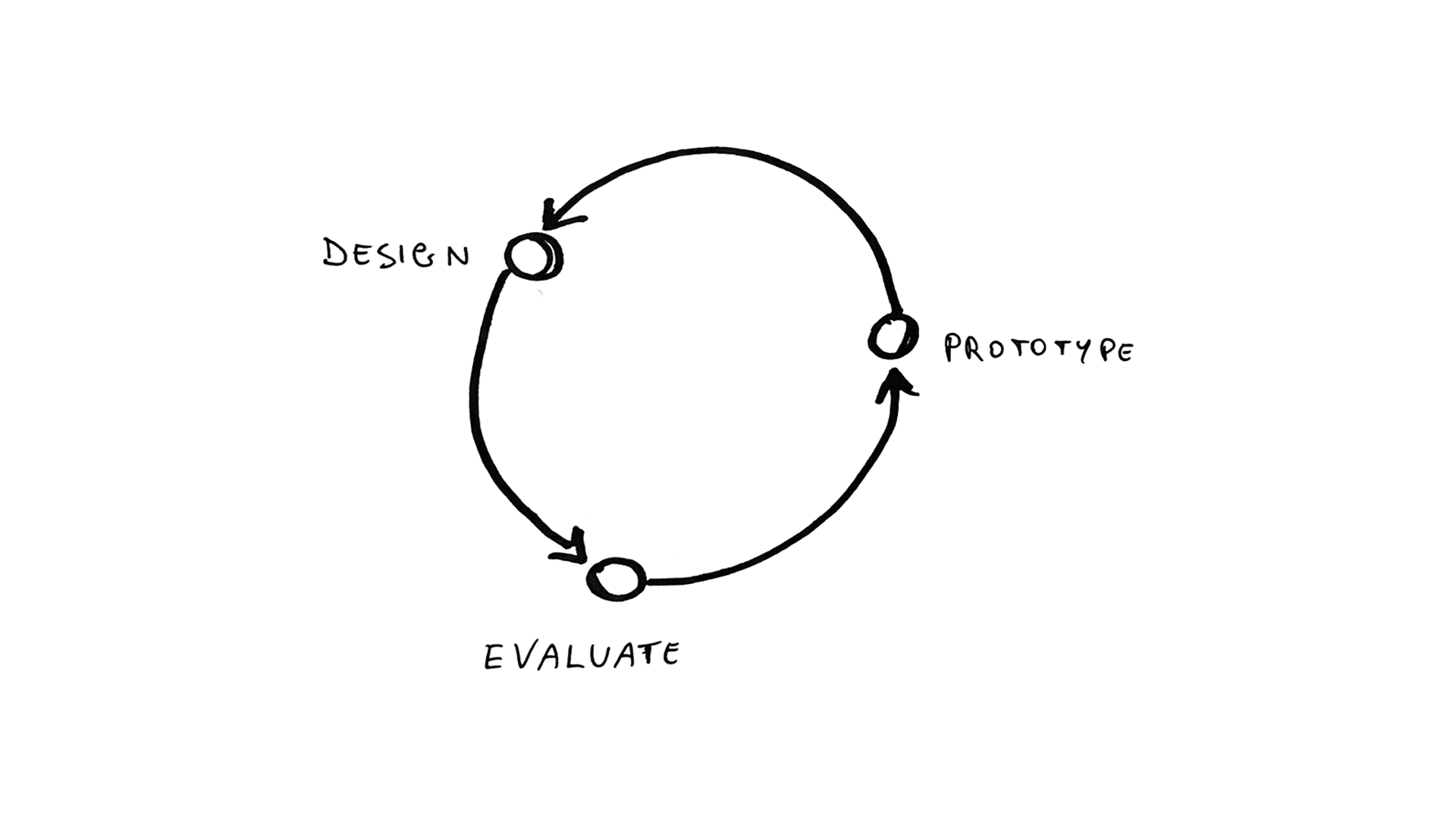
In the following article, we’ll discover my methodology to design an app user experience by going through the different prototyping stages. First of all, we’ll see how to define the core features of an app, trying to avoid overwhelming the experience with too many functions; then, we’ll see how to create an intuitive navigation flow by analyzing different options; finally, how to assemble the interface with definite assets component.
1. Defining the core features
Designing an app is a process in which the final result should be aesthetically attractive, and above all, it should work simply and intuitively. UX designers ideate solutions and create the flow and structure of the app, continuously finding and resolving issues (iterative process). The result is an app that looks nice and is easy to use.
Let’s say we want to build an app that lets users create a watchlist of movies and TV shows and receive recommendations based on what they add.
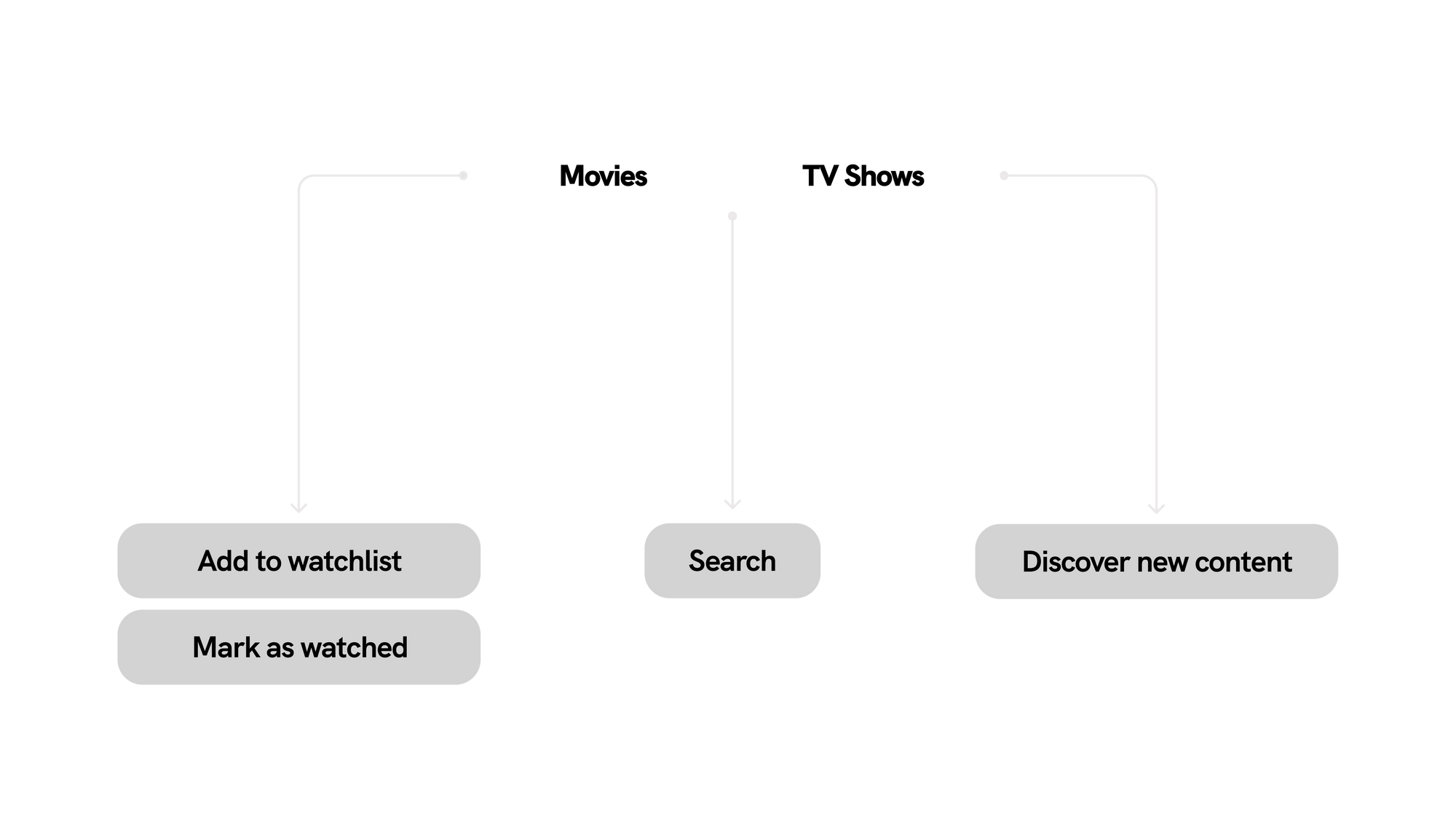
I usually start with listing the main features that the app should have, in this case, adding movies and TV shows to the watchlist, marking them as already watched, recommendations for discovering new content, and of course, the possibility to search.
To check if that’s all the app needs or if some functions are missing, I search and analyze already-existing apps of the same category, such as TV Time, Must, Letterbox, etc. These apps have a strong community branch: for example, you can find and write reviews about movies. The temptation to provide an app with many features is strong, but the question you have to ask yourself is: what is the primary purpose of my app?
About my app, the core is to create a watchlist in a fast and intuitive way and to check the details of specific movies and TV shows. So the users do not need a community that complicates the experience, and they don’t even need to create a profile. The users often prefer to avoid creating accounts, so why put them in this condition if there is no need? You won’t lose any data since there is synchronization via iCloud or Drive. Since we reached these first conclusions, the next step is to sketch a prototype of this hypothetical app.
2. Designing the flow and navigation: low-fidelity prototyping
Prototyping is a crucial phase in the design thinking methodology, placing the user at the core of the process to test your project. In the app development process, a prototype simulates the final interaction between the user and the interface of a complete app or a specific interaction. Prototyping helps you identify any usability or navigation issues in the early stages before you have invested too much time (or finances).
The level of fidelity of a prototype refers to how it conveys the look and feel of the final product. Although there are different types and levels of prototypes, the most common distinction is between low-fidelity and high-fidelity. However, the concept of fidelity inclines to conflate several orthogonal aspects of the artifact. For instance, if we take an app prototype as a reference, the level of fidelity can refer to visual polishment, functionality, content, or interactivity (among others).
Low-fidelity (lo-fi) prototyping is a fast and straightforward method to represent high-level design concepts into concrete and testable artifacts. The main objective of lo-fi prototypes is to review and test navigation and intuitiveness rather than the visual appearance. In other words, they are used to illustrate concepts and design alternatives, but they don’t demonstrate how the application works in detail.
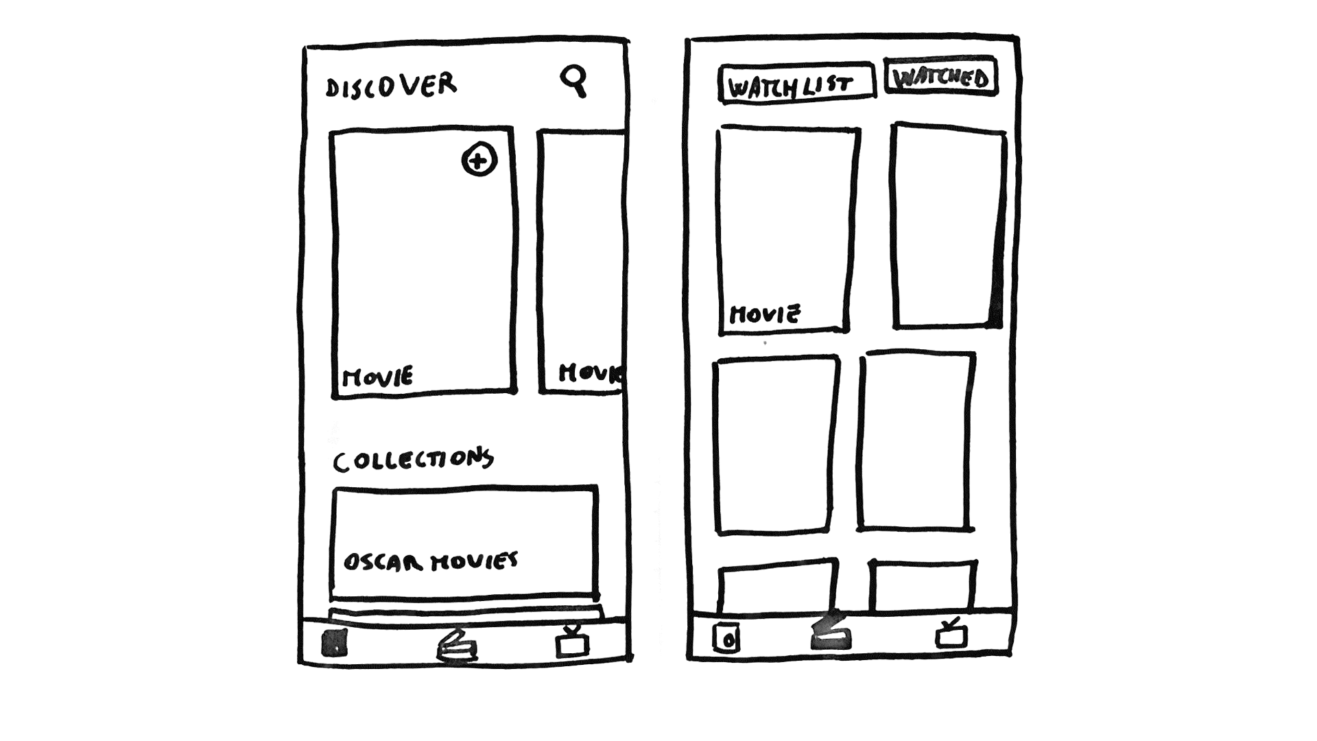
As a user experience designer, I sketch lo-fi prototypes on paper to design and construct the navigation: how the user goes from screen to screen and the placement of controls. Since we described the main features of the movie and TV shows app, let’s try to understand how to organize the content to define the navigation flow. Low-fi prototyping is a low-risk phase in the app development process, I suggest sketching paper prototypes so that the procedure of testing different navigation approaches becomes smoother.
First attempt: the navigation is hierarchical, meaning the content is in a single view with sub-screens, with the main Discover tab where the user can have movie and TV shows recommendations. Also, I added a draggable half-modal to show the watchlist divided according to the content. This design approach is very eye-catching, although it leads to some navigation and intuitiveness issues. There is too much information for a single view, and it is hard to place the already-watched content divided into movies and TV shows.
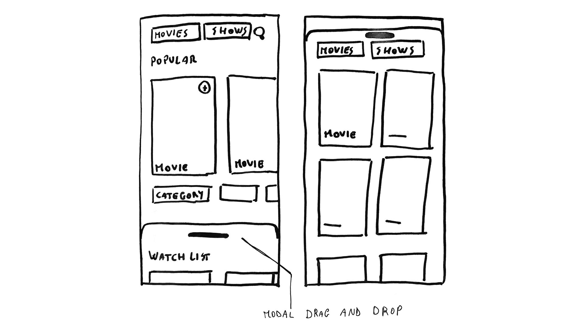
In the second iteration, I tried to organize the content in a less complex way, opting for flat navigation through the usage of a tab bar. The first Discover tab lets the users discover new content based on the Movies and TV shows added and watched. The other two tabs are Movies and Shows which give the user the possibility to search for specific content. Also, this division solves the placement of the already-watched content through the usage of a segmented control.
You can iterate and test different versions of the same interface to understand which one works best according to the user’s needs. In this case, the second approach is more intuitive (functionality over aesthetic), so we can see the next steps focusing on this prototype.
3. Making your design tangible: high-fidelity prototyping
Having designed a possible navigation flow, I will reproduce what I sketched on paper through design software (such as Figma or Sketch). Interactive wireframes will help the user test the app’s behavior, providing an outline of the structure and layout of the user interface.
Starting from this shaped interface, I can create a high-fidelity prototype (hi-fi). Hi-fi prototypes look like real apps, meaning users can deeply test flow, visuals, and navigation, and they can operate the prototype as if it was the final product.
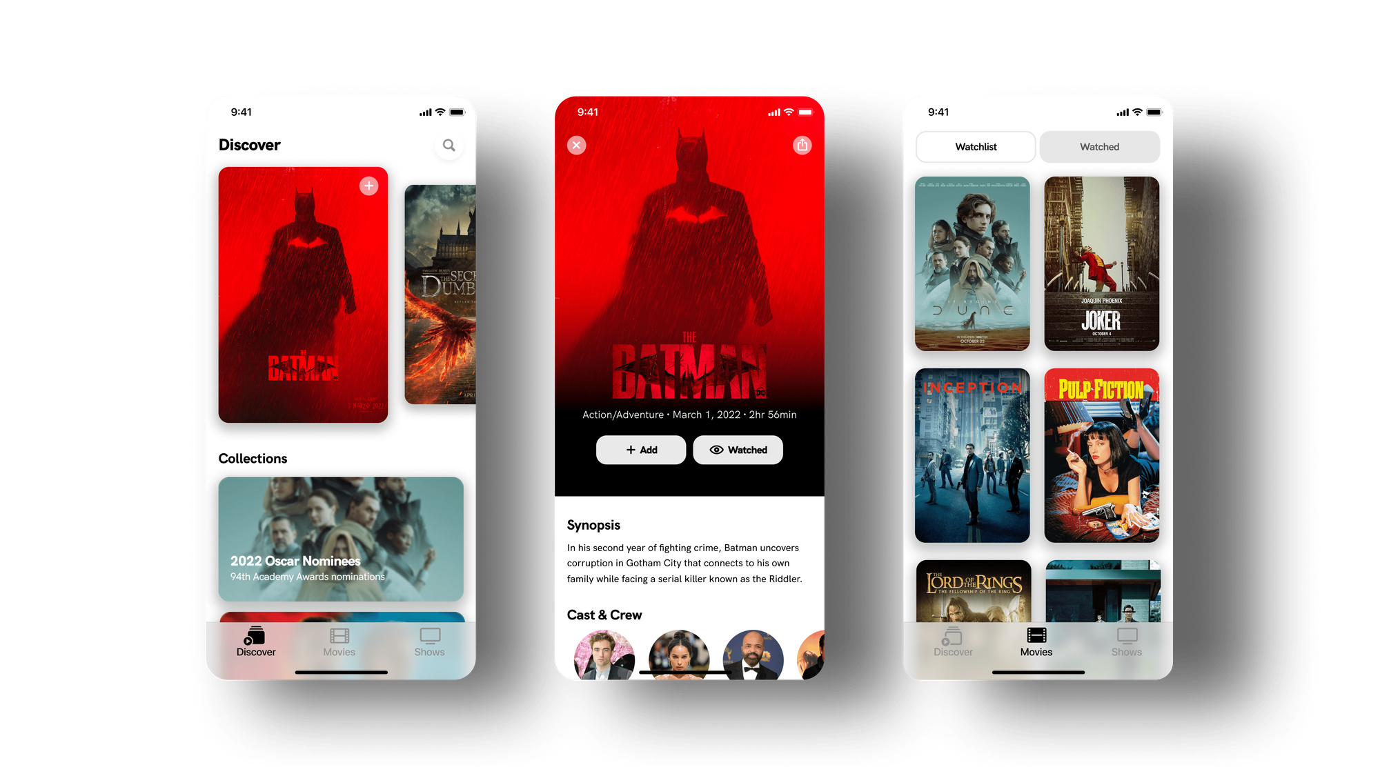
When you create the interface, the graphic assets, and the components, it is important to find inspiration while being aware of what is possible to achieve. By searching on some platforms (such as Dribbble or Pinterest), you can find eye-catching design projects with elaborate animations, but these samples have no concept or navigation logic. Moreover, they are hard or impossible to code in a reasonable amount of time. So be careful about these aesthetically pleasant but nonfunctional interfaces.
Conclusion
The process described in this article is the approach I usually conduct when I design a user experience, but of course, the use of the most appropriate type of prototype depends on various factors. It is evident that low-fi is used to test cognitive aspects of the design, such as the layout of controls and the navigation flow, but not physical aspects such as tactile, auditory, and visual feedback that requires a higher level of fidelity.
The three main points that we can extract from this article are:
- It is possible to acquire crucial information from user testing of lo-fi prototypes early in the design process (layout and navigation flow).
- According to the level of fidelity of the prototype, we can gain different types of information (cognitive or visual) from user testing.
- It is fundamental to gather cognitive design information before other issues, such as attractive visual assets.
At different stages of the development process, there are various tools that user experience designers can use to validate their concepts or designs. But, whatever prototype we may use, testing it is the only way that will help us learn about user interactions to enhance the user experience.
App design project on Behance.

