Creating view transitions in SwiftUI
Learn how to use create animated transitions in a SwiftUI using the transition and animation modifiers.
Transitions are animated visual effects that smoothen the change between different views or layouts when UI elements change state, preventing abrupt shifts.
They enhance the user experience by making interactions more fluid and polished. By providing visual feedback during interface changes the connection between different UI elements and actions is visually highlighted. Examples are:
- when navigating between screens;
- when adding or removing items from a list;
- when displaying modal views.
This guidance makes the app feel more cohesive, responsive, and easier to use.
We will explore how to implement built-in transitions and how to create custom ones for more tailored behaviors, using the transition(_:) method and the Transition protocol.
The transition(_:) modifier
SwiftUI offers pre-defined transitions that can be very easily implemented, like move, slide, push and scale.


These effects conform to the Transition protocol, which means they follow a specific structure that governs how the animation behaves when a view appears or disappears. To be implemented they must be passed as parameters to the method transition(_:).
if isOpen {
    // The view
    MyView()
        // 1.       // 2.
        .transition(.scale)
}

Button("Toggle") {
    withAnimation {
        isOpen.toggle()
    }
}
To start implementing a built-in transition:
- Call the
transition(_:)method to the view that has to transition when changing state. - Pass the transition as a parameter.
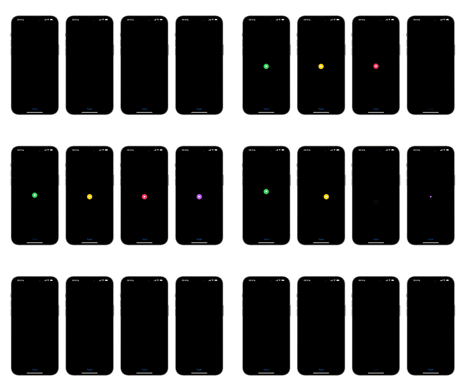
When the view appears or disappears, the transition will be automatically performed: toggling the bool from false to true, the Transition conforming type scale is applied while the view is being moved in the view hierarchy.
Combining built-in transitions
SwiftUI also provides room to combine different transitions at the same time. In the example below, the view scales and slides from one side to another while appearing and disappearing.

The method that allows to mix and match effects is combined(with:) .
.transition(
	// 1. The transition effect
	.scale
	// 2. The combine method with the slide effect
	.combined(with: .slide)
)
To start using the combined(with:) method:
- Set the transition effect
- Call
combined(with:)method from the transaction effect object passing another transition as a parameter.
Transition Protocol
Sometimes a custom transition may have to be implemented to have a more complex combination of transition behaviors.
struct CustomizedTransition: Transition {

    // 1. The conforming stub to the protocol
    func body(content: Content, phase: TransitionPhase) -> some View {

        // 2. The original view on which transitions are called
        content
            // 3. The rotation transition
            .rotationEffect(Angle(degrees: phase.isIdentity ? 360 : 0))
            // 3. The scale transition
            .scaleEffect(phase.isIdentity ? 1 : 0)
    }

}
To start implementing a customized transition, create a new structure conforming to the Transition protocol.
- Add its protocol conforming stub
body(content:phase:), a function that takes thecontentof the view as a parameter as well as the phase of the transition as aTransitionPhaseobject. - Then return the
contentparameter, the view on which the effects will be applied. - And don’t forget to apply the effects that must be called on that content.
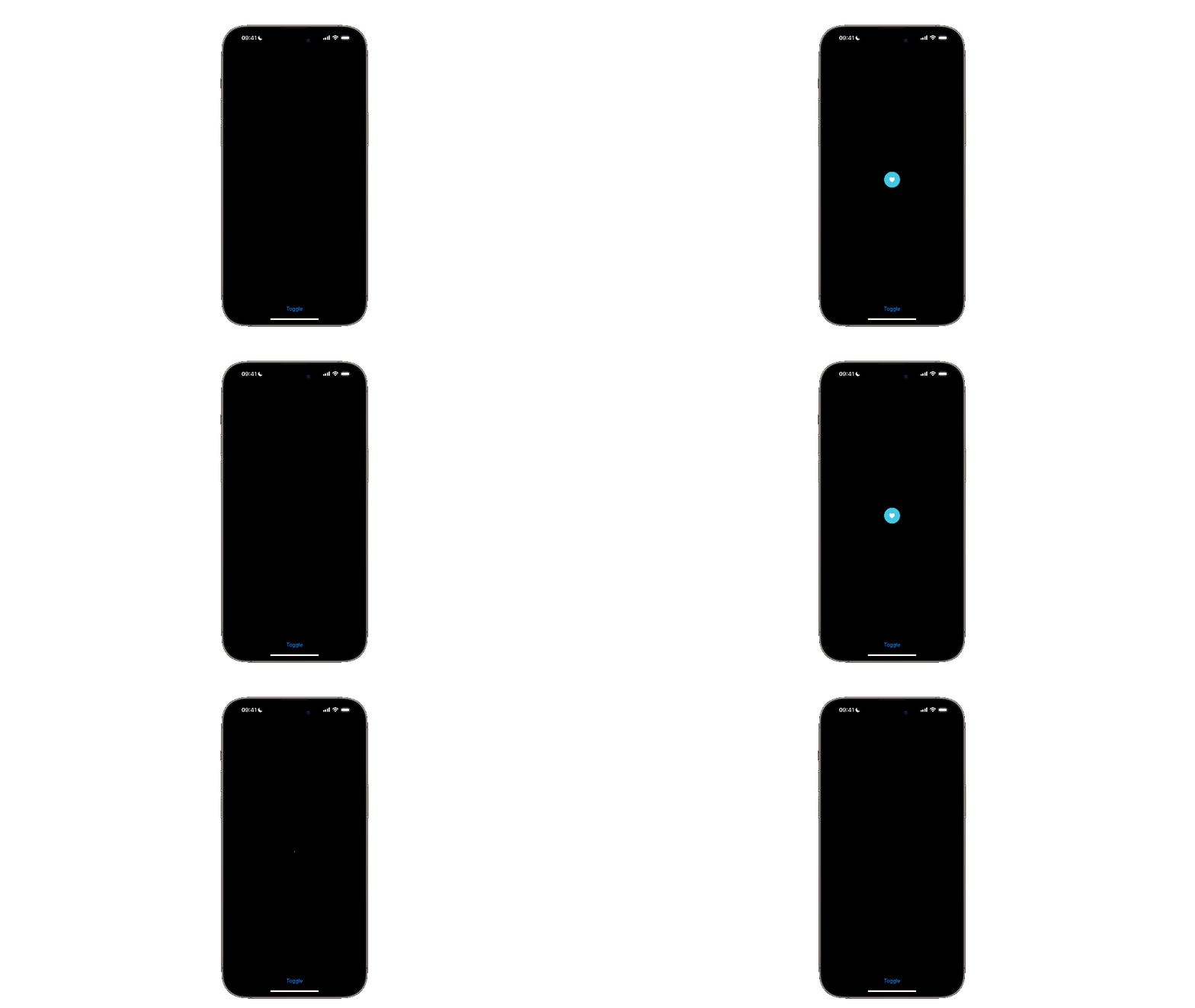
All the effects in the example above define their effect parameter with a ternary operator that checks the property isIdentity, a boolean that indicates whether the transition should have an identity effect or not. In the example, it makes the view scale from 0 to 1 and rotate 360 degrees while becoming fully visible or invisible.
VStack {
    if isOpen {
        // The View
        MyView()
            // 1. The Transition Method  with an animation
            .transition (
                // 2. The Customized Transition
                CustomizedTransition()
                    // 3. The animation for the transition
                    .animation(.easeInOut(duration: 0.8)
                )
            )
    }

    Spacer()

    Button("Toggle") {
        isOpen.toggle()
    }
}
To apply the customized transition to the view, the following steps are required:
- Call
transition(_:)method. - Pass the customized transition as its parameter.
- Add an animation to the effect to regulate the duration of the transition animation

Transition Customization using TransitionPhase values
In the Transition protocol, the TransitionPhase type represents the current stage of a transition. It changes depending on whether the view is already in the hierarchy, about to be inserted, or being removed. This enum has three possible states:
identity: the view is already in the hierarchy.willAppear: the view is about to be inserted.didDisappear: the view is being removed.
When a view appears, TransitionPhase transitions from willAppear to identity, and when disappearing, it moves from identity to didDisappear.
In this process, the phaseValue, a double value, moves from 0 when in the identity phase to -1.0 during the willAppear and 1.0 in the didDisappear.
The isIdentity property, the boolean value that indicates whether the transition should change or not the appearance of its view, switches on true at the identity phase meaning when the view is already in the view hierarchy, or false when the view is about to appear or is being removed from the hierarchy.
So, understanding which is the current phase, how TransitionPhase works and how to take advantage of it allows us to shape even more detailed transition behaviors.

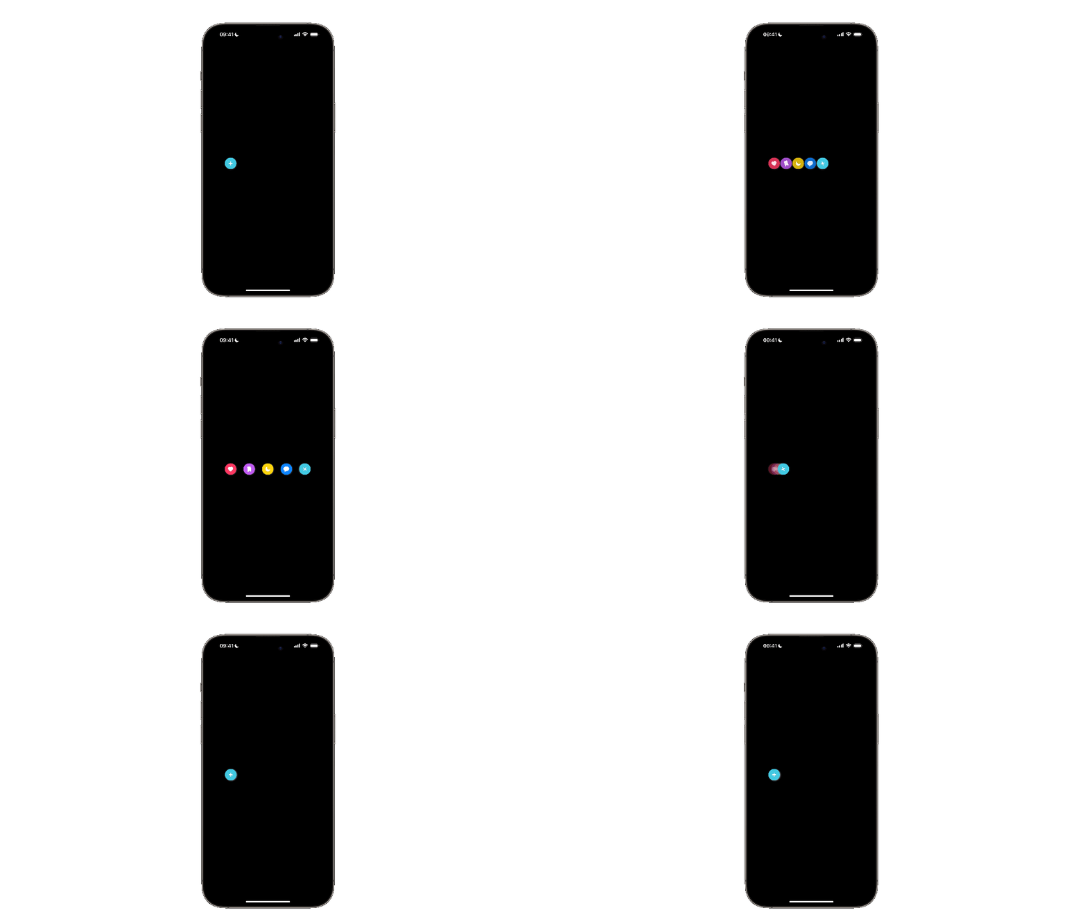
In the example above, we have 5 overlapping views that change their offset while rotating on themselves during the animated transition.
Let’s understand how to get this type of transition.
// 1. Custom Transition
struct CustomTransition: Transition {

    // The index of the current button
    var index: Int

    // The width of the frame containing all the overlapping views
    var frameWidth: CGFloat

    // The number of elements used to calculate the offsets
    var numberOfElements: Int

    func body(content: Content, phase: TransitionPhase) -> some View {

        let offsetValue: CGFloat = calculateOffset(index: index, frameWidth: frameWidth, phase: phase)

        return content
        // 2. The Opacity effect
            .opacity(phase.isIdentity ? 1 : phase == .didDisappear ? 0 : 0.2)

        // 3. The Rotation effect
            .rotationEffect(.degrees(phase.isIdentity ? 360*3 : 0))

        // 4. The Offset effect with an offset value not yet declared
            .offset(x: offsetValue)
    }

}- Create a struct conforming to the Transition protocol
- Add the opacity effect to the content and control its value to reach that fading effect while appearing and disappearing.
- Add the rotation effect to make them rotate only when they are in the view hierarchy.
- Add the offset effect by passing
offsetValueas a parameter.
TheoffsetValueis calculated according to the index of the element, the transition phase, and the width of the frame.
Here is the implementation of the method that calculates the offset for the transition:
// 1. Custom Transition
struct CustomTransition: Transition {

    var index: Int
    var frameWidth: CGFloat
    var numberOfElements: Int

    func body(content: Content, phase: TransitionPhase) -> some View { ... }

    // 1. The function to calculate the offset value
    private func calculateOffset(index: Int, frameWidth: CGFloat, phase: TransitionPhase) -> CGFloat {

        // The button frame width
        let buttonFrameWidth: CGFloat = 40.0

        // Spacing available in the frame containing the buttons
        let totalSpacing: CGFloat = frameWidth - buttonFrameWidth

        // 2. Spacing to distribute between the buttons
        let spacingPerCircle = totalSpacing / CGFloat(numberOfElements - 1)

        // 3. The offset to calculate
        var offSet: CGFloat

        // a. Not supposed to move when it's in the first position
        if index == 0 {
            offSet = 0
        } else {
            // b. Fully visible
            if phase.isIdentity {
                offSet = CGFloat(index) * spacingPerCircle
                // c. About to disappear or appear
            } else {
                offSet = CGFloat(index) * phase.value
            }
        }

        return offSet
    }

}- Create a function to calculate the offset.
- Calculate the amount of space to distribute between all the buttons.
- Calculate the offset based on the index of the current button:
- The first view doesn’t have to move, so if the index is 0, the offset is 0.
- If the transition has ended, the offset is calculated based on the index of the circle and the spacing to distribute among all the views, meaning each circle will be spaced apart accordingly.
- They will transition smoothly between their starting - overlapping - and final positions, with
phase.valueinterpolating their movement when they are about to be inserted in the view hierarchy or being removed.
Here is an example of the created custom transition being used on a SwiftUI view.
First, create a new type called CircleButton to store the information to create the buttons to be animated.
struct CircleButton: Identifiable {
    let id = UUID()
    let symbol: String
    let color: Color
    let action: () -> Void
}
Then create a CircleButtonView to be the buttons on our user interface:
struct CircleButtonView: View {
    var button: CircleButton
    var body: some View {
        ZStack {
            Circle()
                .fill(button.color)
                .overlay{
                    Image(systemName:button.symbol)
                        .foregroundColor(.white)
                        .bold()
                }
        }
        .frame(width: 40)
        .shadow(color: .gray.opacity(0.5), radius: 2.0,x: 1.0, y: 1.0 )
    }
}
Lastly the CustomTransitionView showcasing the usage of the custom transition created beforehand:
struct CustomTransitionView: View {

    @State var isOpen: Bool = false

    let buttons: [CircleButton] = [
        CircleButton(symbol: "heart.fill", color: .pink, action: { print("heart") }),
        CircleButton(symbol: "bookmark.fill", color: .purple, action: { print("bookmark") }),
        CircleButton(symbol: "moon.fill", color: .yellow, action: { print("moon") }),
        CircleButton(symbol: "message.fill", color: .blue, action: { print("message") }),
        CircleButton(symbol: "plus", color: .teal, action: { }),
    ]

    // The width of the frame of the container of all the views transitioning
    var frameWidth: CGFloat = UIScreen.main.bounds.width * 4/5

    var body: some View {
        HStack {
            ZStack(alignment: .leading) {
                ZStack(alignment: .leading) {

                    ForEach(0..<buttons.count, id: \.self) { index in
                        if isOpen && (index != buttons.count - 1) {
                            CircleButtonView(button:  buttons[index])
                                // 1. Defines the custom transition for each button
                                .transition(CustomTransition(
                                    index: index,
                                    frameWidth: frameWidth,
                                    numberOfElements: buttons.count
                                ))
                                .onTapGesture {
                                    buttons[index].action()
                                }
                        }
                    }

                }
                .frame(width: frameWidth, alignment: .leading)

                // Opening Button
                HStack {
                    if isOpen {
                        Spacer()
                    }

                    CircleButtonView(button: buttons.last!)
                        .rotationEffect(.degrees(isOpen ? 405.0*3 : 0))
                        .onTapGesture {
                            isOpen.toggle()
                        }
                }
                .frame(maxWidth: frameWidth, alignment: .leading)
            }
        }
        .frame(maxWidth: frameWidth, alignment: .leading)

        // 2. Regulates the duration and the animation
        .animation(.spring(duration: 1.8), value: isOpen)
    }

}- It calls the custom transition on the view that has to be applied.
- Adds the animation to the frame containing all the views that need to be animated.
Transitions are essential for creating smooth and engaging user interfaces in SwiftUI and enhancing the user experience. Built-in transitions like slide or scale offer quick effects, while custom transitions using TransitionPhase allow for more tailored behavior.
These animations add a polished and professional touch to your app, elevating its overall usability and visual appeal.

