
Embracing Imaginary Spatial User Experience in visionOS
Based on recent explorations and discoveries enjoy our spatial computing user experience guidelines.
User experiences are determined by a comprehensive approach to design that considers a product’s functionality, usability, and overall user satisfaction. In today’s digital world, where technology constantly evolves, creating meaningful and seamless user experiences has become a top priority for businesses and organizations across all industries. From mobile apps and websites to past augmented and virtual reality platforms to future spatial computing, the goal is to craft products and services that meet users’ needs, delight them, and engage them more profoundly.
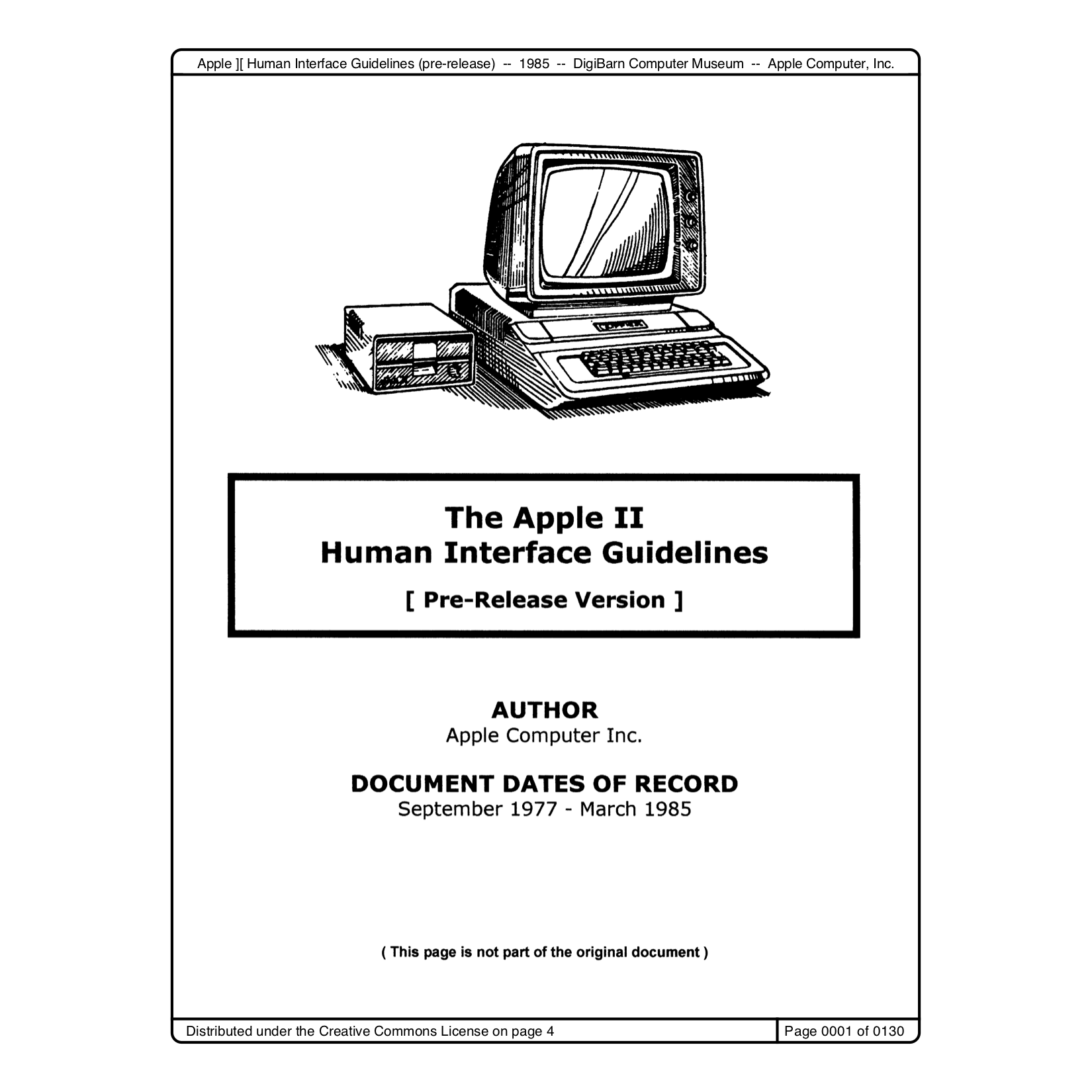
Apple is renowned for being the standard bearer of user experience and accessibility.
It has pioneered design innovation since 1982, when the H.I.G. (Human Interface Guidelines) were introduced. Spearheaded by Bruce Tognazzini more than 40 years ago, these principles remain pertinent today and are often overlooked despite age.
Foundational Principles of User Experience
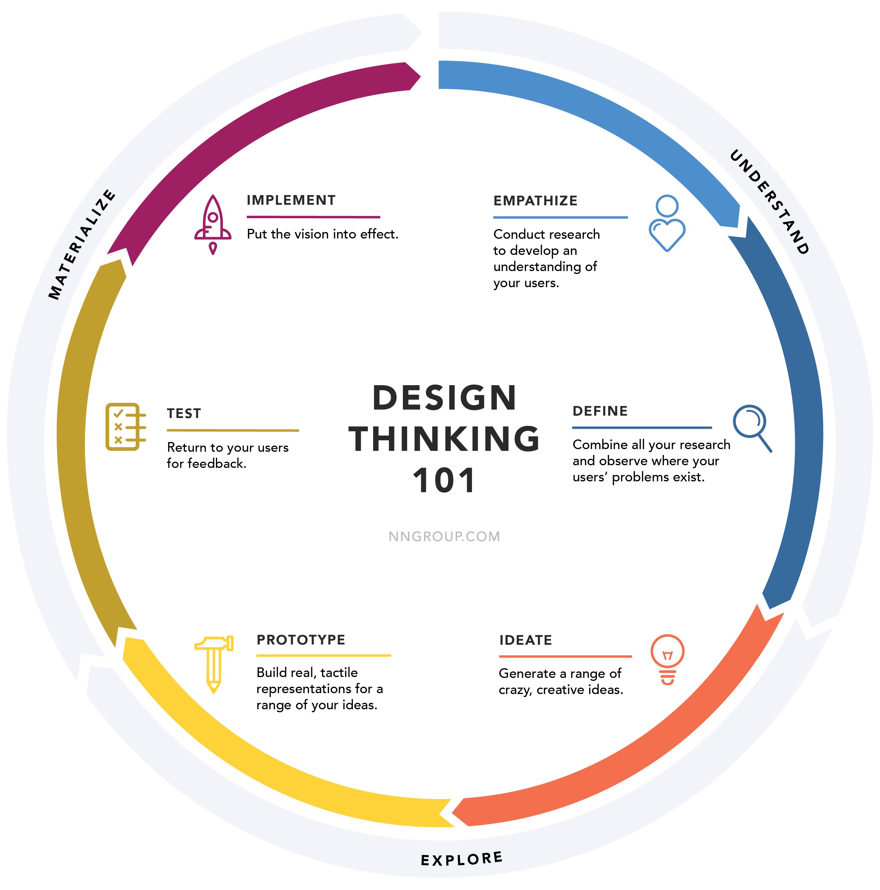
The User Experience (UX) model typically refers to a representation or framework that outlines and describes the various components and interactions involved in creating a positive experience for a product or service. Indeed, experts from the Norman Nielsen Group advocated for a UX approach that can be summarized as follows:
- User Research: Understanding the needs, behaviors, and preferences of the target users through methods like surveys, interviews, and observations.
- User Persona: Creating fictional characters or representations based on user research to embody different user types and their characteristics.
- Information Architecture: Organizing and structuring content in a way that is intuitive and easy for users to navigate.
- Wireframes and Prototypes: Developing low-fidelity sketches or digital representations to visualize a product’s basic layout and functionality before full-scale design and development.
- Interaction Design defines how users interact with a product, including the design of buttons, menus, and other interface elements.
- Visual Design: Enhancing the product’s aesthetics to create a visually appealing and cohesive user interface.
- Usability Testing: Conduct tests with real users to identify usability issues and gather feedback for improvement.
- Accessibility: Ensuring that the product is usable by individuals with different abilities and disabilities.
- Feedback and Iteration: Collecting feedback from users and stakeholders and incorporating it into ongoing design iterations.
- User Satisfaction Metrics: Utilizing Net Promoter Score (N.P.S.) or Customer Satisfaction (CSAT) to measure and evaluate overall user satisfaction.
Understanding the intersection of psychology and technology is crucial in app development, as it revolves around human experiences.
Contrary to popular belief, delving into psychological principles doesn’t necessitate a formal degree; many of these concepts are easily graspable yet wield substantial influence when properly applied. Again, at the Norman Nielsen Group NN/g, Don Norman, one of the esteemed principals, coined the term cognitive designer to underscore the importance of crafting systems that align with human cognition, regardless of the product type.
An outstanding research of psychological principles vital for crafting exceptional user experiences from NN/g and explores the following domains:
- Attention
- Gestalt Principles
- Memory
- Sensemaking
- Decision Making and Choice
- Motor Processes and Interaction
- Motivation
- Cognitive Biases
- Persuasion and Influence
- Emotion and Delight
- Attitudes toward Technology
Examining purpose, content, and context can also be illuminated through the UX pyramid, a structured model akin to Maslow’s hierarchy of needs that guides the different stages of a product’s design journey. It delineates six levels, ranging from Functional to Meaningful, each representing escalating user satisfaction and engagement degrees. The pyramid underscores the importance of progressing beyond functionality to cultivate delightful and meaningful user experiences.
Each category addresses different human needs, from basic physiological requirements to higher-level desires for self-improvement and fulfillment. Maslow’s hierarchy of needs provides a framework for understanding the fundamental human needs that drive behavior and motivation. Designers can foster greater engagement, loyalty, and satisfaction by creating experiences that resonate with users on a deeper emotional and psychological level.
Allow me to offer my perspective.
As an education professional and consultant, I’ve consistently upheld the following personal motto: “Users are not Lemmings.” Drawing inspiration from the iconic game Lemmings, users aren’t mindless instruction followers. They will NOT do what you strategically have ideated, designed, and developed without any testing or research.
This is a friendly rephrasing of Jakob Nielsen’s principles of User Testing.
Jakob Nielsen, a prominent figure in the field of usability, imparts a crucial lesson: “You are not the user.” This brief statement underscores the importance of recognizing one's inherent bias as a developer or insider within a project. Instead of designing based on personal preferences or assumptions, Nielsen advocates optimizing the user experience for outsiders—the actual end-users. He emphasizes the necessity of user testing as the antidote to the illusion of knowing what users want, urging developers to ascertain the needs of representative users. Nielsen’s wisdom reminds us that while it may be tempting to chase trends, the key to profitability lies in focusing on the fundamental aspects that customers genuinely value.
Historical Perspectives on Creative Problem-Solving
Spatial design, as discussed in the previous article Embracing Extended Reality (X.R.): diving deep into Spatial Design for visionOS, invites individuals to engage with virtual objects as if they were tangible, prompting them to suspend disbelief and imagine themselves interacting with these digital entities, much like a child uses their imagination to envision a sofa as a ship sailing across the ocean. Indeed, unlike a child’s imaginative play, in this scenario of spatial computing, we are encouraged to engage in problem-solving, fostering lateral thinking and creative problem-solving approaches through something new that we can call goal-oriented tasks.
Indeed, as we navigate the complexities of immersive technology, we draw inspiration from the timeless cases of creativity and curiosity that have driven human progress throughout history: using imagination to solve problems in later thinking mode is not new.
The legend of Archimedes’ discovery in the baths is a famous anecdote, but its historical validity is uncertain. The story tells that Archimedes noticed the rising water level while bathing and exclaimed, Eureka! (I have found it), thus realizing the principle of hydrostatic buoyancy, now known as Archimedes’ principle. Assuming this story is accurate, we could describe Archimedes’ activity as a lateral observation into imagination.
Surely he came to limelight in collective imaginary, embodying well the figure of a bizarre genius, in the shoes of Disney’s Gyro Gearloose (1) but “What does the modern cultured man know about him? [...] He just remembers that he did strange things: he ran naked along the streets shouting Eureka! He dipped crowns into the water, he drew geometrical figures while he was being killed and so on. The children anecdotes [...] equalize Archimedes more to the legendary and the mythological characters than to other thinkers. The result is that we remember him, but we do as a legendary character, completely out of history” (2) As for as the historical personage, only his death date is sure: 212 BC, because he died in the fault of Syracuse, in consequence of the roman siege, an epochal event related in the Annales.
The Genius of Archimedes: 23 Centuries of Influence on Mathematics, Science and Engineering: Proceedings of an International Conference held at Syracuse, Italy, June 8-10, 2010: 11 - P215
This term often indicates a problem-solving approach that diverges from the traditional line of thought. Instead of tackling the problem directly, lateral observation involves exploring unconventional approaches, usually based on intuition, creativity, or thinking outside the box.
Returning to our protagonist, Archimedes was challenged by the King of Syracuse to devise a method for discerning whether a crown was truly made of gold. Archimedes grappled with the problem relentlessly, attempting to solve it directly, until finally, exhausted, he sought refuge in a bath to relax and clear his mind. Archimedes was bathing; he noticed the water level rising as he submerged himself, leading him to realize a principle that would help solve the problem of determining the purity of the crown. Indeed, he stated that a body submerged in a fluid experiences an upward buoyant force equal to the weight of the fluid it displaces. This principle enabled Archimedes to devise a method for determining the purity of the crown by comparing its buoyancy to that of an equal volume of pure gold.
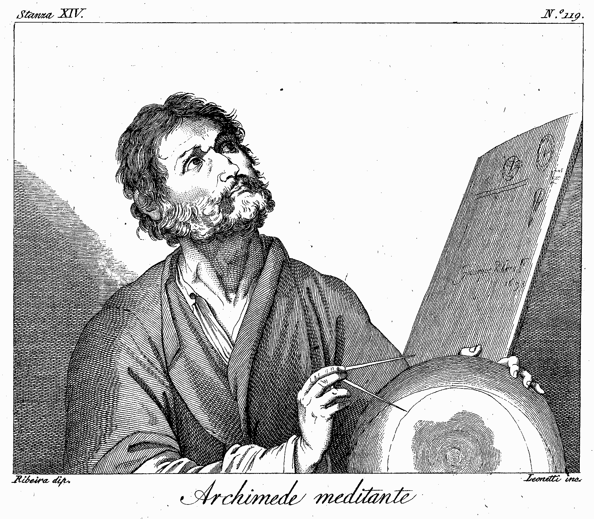
Describing this activity as lateral observation emphasizes that the discovery occurred in an unconventional context, during a moment of relaxation, rather than in a formal scientific environment. However, intuition and casual observation can also be part of the discovery process in scientific practice. Scientists often draw inspiration from seemingly casual experiences or intuitions to develop new scientific ideas and concepts.
While Archimedes was not a designer in spatial computing in the contemporary sense, his approach to applying imagination by playing with water in a bathtub evolved into an unexpected problem-solving discovery that could be interpreted as the first case history of imaginary experience.
Indeed, but what is this imaginary experience?
In the 1970s, psychologist Donald Wallace MacKinnon researched creativity at the University of California, Berkeley, discovering the concept of the open-ended design nature. He found that the most creative individuals, artists, engineers, scientists, or writers didn’t necessarily have higher IQs than their less imaginative peers. Instead, McKinnon observed that they had a knack for entering a mental state conducive to creativity, which he described as childlike playfulness.
MacKinnon’s findings highlighted two mental modes: Closed and Open. Closed mode is characterized by purposeful action, practicality, and results-driven behavior, while Openness fosters creativity and receptivity to new ideas.
McCrae (1987) describes openness to experience in detail, relying on the NEO personality inventory. Openness in this perspective involves a sensitivity to fantasy, feelings, aesthetics, ideas, actions, and values. McCrae and Sutin (2009) added that openness is characterized by an imagination and curiosity when considering new ideas, sensations, and feelings.
Mark A. Runco (Auth.) - Creativity: Theories and Themes: Research, Development, and Practice - Academic Press Inc (2014) - P281
The Italian designer and artist Bruno Munari described imagination as a mental space, a set of cognitive tools for creating new ideas and possibilities. He believed it was about visualizing something, understanding it, and transforming the world. Indeed, in the book Fantasia Invenzione, creatività e immaginazione nelle comunicazioni visive, Munari solved the fogginess about the concept of Creativity, Fantasy, or Invention by stating that:
- Fantasy is a mixing operation that starts with memories to obtain something new, but it is inaccurate and unrealistic.

- Creativity is a mixing operation that starts from memories and fantasy, and constraints are applied to create something new but real and achievable - like airplanes, born as an idea to mimic birds.
- Invention is an honest answer to a real problem without a Fantasy process - like more performing electric corkscrews (Who really needs them anyway?).
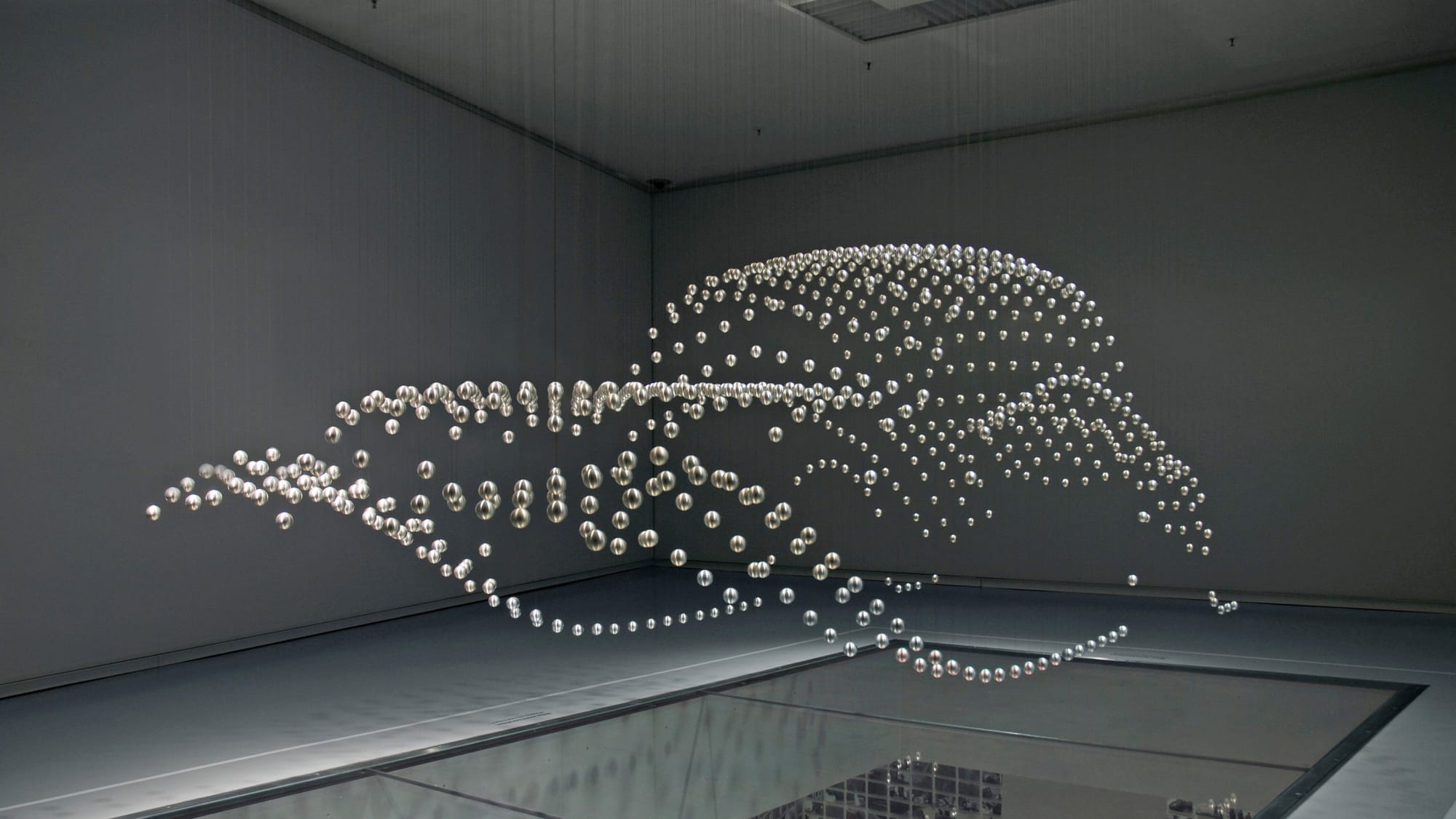
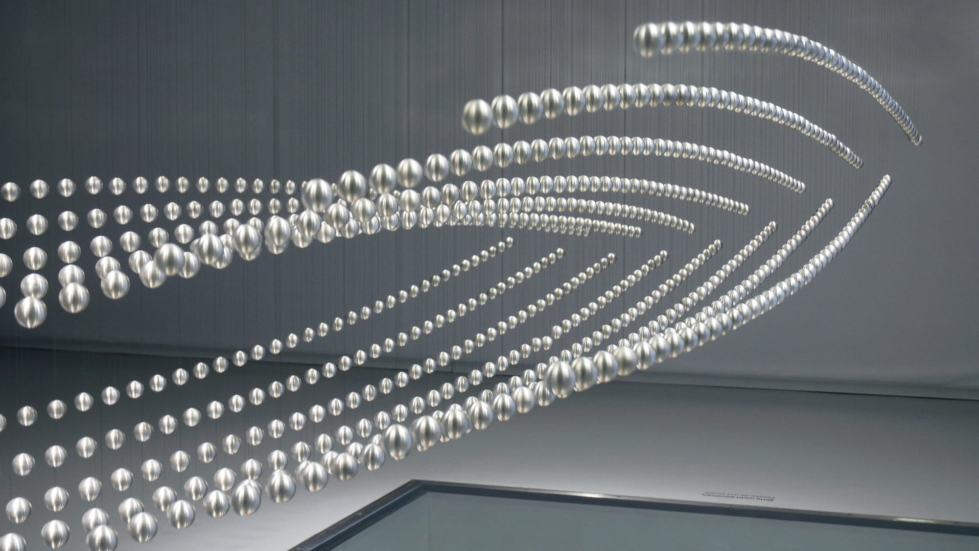
Fantasy, Creativity, and Invention are always running as a process inside our visual mind sandbox: Imagination. The idea of imagination as a sandbox isn’t just about self-referential outcomes but also about social outcomes. By chance, Bruno Munari, as an artist, years before the emergence of spatial computing through the Arte Programmata artistic movement, was also recognized as a kinetic artist. Kinetic art, emerging post-World War II amidst geometric abstraction’s decline, explores visual mechanisms, portraying dynamism, optical effects, and light through various artistic mediums. Departing from conventional art as mere expression, it immerses viewers in perceptual and psychological engagement. Rooted in Futurism, Dadaism, and Constructivism, early pioneers like Marcel Duchamp and Man Ray experimented with the movement, paving the way for the movement’s formal recognition.
However, Arte Programmata by the mid-1960s, the movement waned and met with skepticism and dissolution as criticism questioned its novelty.
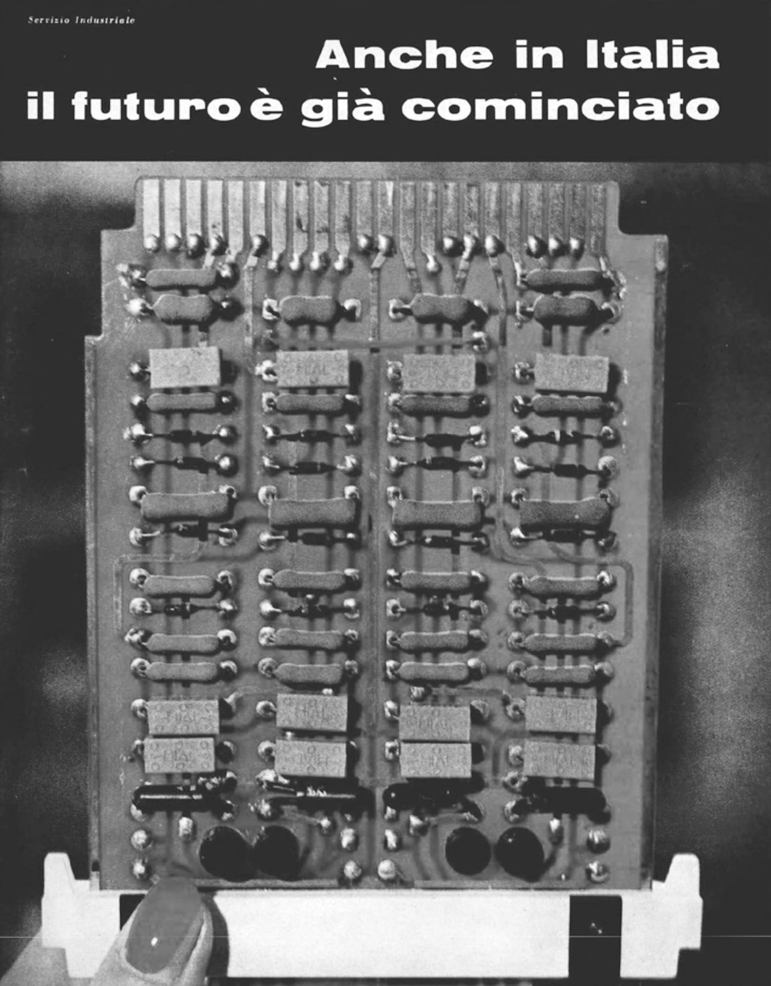
The 1962 Arte programmata exhibition was staged at the height of optimism about state led economic reform and the efficacy of a center-left majority, both of which were embraced by the leaders of the Olivetti company that sponsored the show and whose showrooms served as the sites for the exhibition in Italy. […]
[…] In Opera aperta, Eco draws on information theory, a field foundational to the development of computers, to describe open artworks as those that contain a multiplicity of possible interpretations. From kinetic “works- inmovement,” to musical compositions reconfigured for every performance, to novels with ambiguous signifiers, many understood the genre of arte programmata to espouse the same model of authorship as Eco’s notion of the open work. While “programmed art” stresses the openness of forms and Eco’s “open work” emphasizes the plurality of meaning, in both terms the author spawns a “field of possibilities” rather than a definitive work of art.
Lindsay Caplan - Arte Programmata: Freedom, Control, and the Computer in 1960s Italy. University of Minnesota Press (2022) - P16, P38
The parallelism between spatial computing user experience and kinetic art arises from the concept of programmed art and its relationship with the notion of the open work as defined by Umberto Eco. Eco explores the open work in his essay “Opera aperta,” emphasizing that open artworks contain multiple possible interpretations, echoing the principles of information theory that are foundational to computer development.
The user experience in spatial computing is appropriately an “Opera Aperta.”
This concept extends to various forms of expression, including kinetic artworks characterized by movement, musical compositions with ever-changing interpretations, and novels with ambiguous meanings. Eco’s open work underscores the plurality of meanings inherent in artistic creations in which the author or artist creator generates a “field of possibilities” rather than presenting a definitive or fixed work of art. This parallelism suggests that spatial design and Arte Programmata share a common approach to creating dynamic, open-ended experiences that invite user interpretation and engagement.
Everything is guided by the user’s imagination for practical, goal-oriented reasons.
In the Speculative Imaginary Spatial Design Canvas, we introduced the parallelism that visionOS volumes are equivalent to kinetic sculptures, embodying three-dimensional entities that dynamically interact with their environment. By incorporating movement into imaginary spatial computing, we create immersive experiences that react to the user’s actions and surroundings, enhancing engagement and interactivity. Like imaginary spatial computing, kinetic art movement is activated solely through human interaction; otherwise, it remains stationary.
The minimalist design approach borrowed from kinetic art is efficient in spatial computing because it emphasizes movement while eliminating visual clutter. This focus on simplicity allows users to concentrate on the essence of motion without being distracted by unnecessary elements. It communicates simplicity, purity, and essential themes, enriching the user’s experience by evoking deeper meanings and connections.
Our Guidelines for Designing Imaginary Spatial Objects (volumes in visionOS) are:
- Prioritize simplicity to allow users to focus on content without distractions or noise.
- Embrace minimalist design to emphasize movement and reduce visual clutter.
- Apply healthy movement and anti-cybersickness measures on spatial objects.
- Connect movement, preferably through human interaction, similar to kinetic art, featuring user control.
- Communicate essential themes like simplicity and purity through design to engage with the inner child and user creativity.
Apple Vision Pro and Spatial Computing broadened the interaction scope from the iPhone screen to indoor spaces in our homes, and we’ve grasped the new challenges posed by design changes influenced by neuroscience. Furthermore, it offers desktop computing capabilities similar to long-term software like Adobe Photoshop and Autodesk AutoCAD, which require niche-a-like developers, a wider team, and longer development times than standard iOS apps. According to experts in the technology field, Apple Vision Pro is poised to become one of the space computers of the future, representing a return to the original philosophy of the Macintosh.

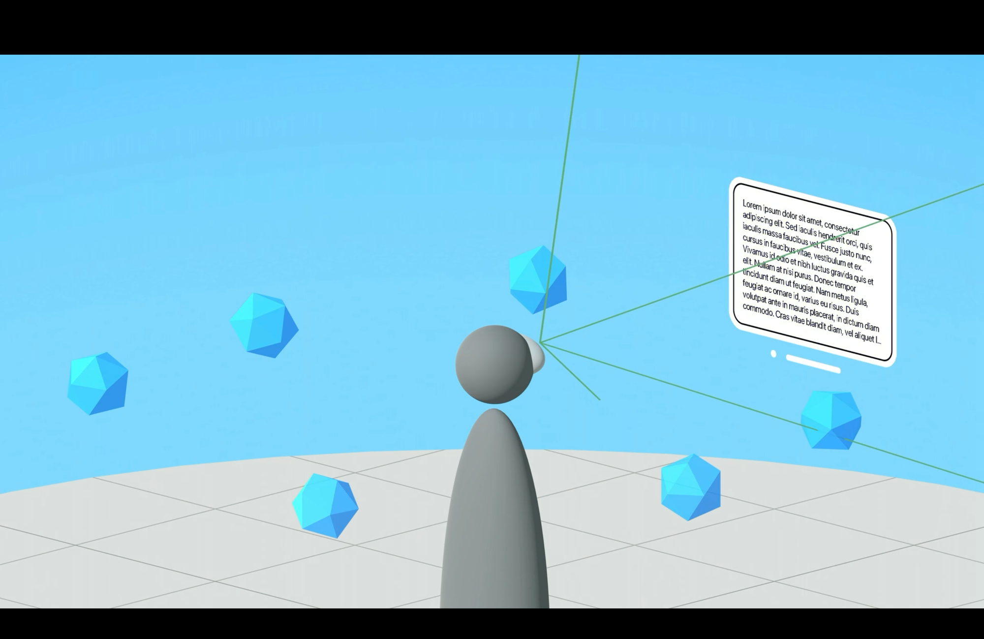
The iPhone user experience is designed for the masses, offering a straightforward, step-by-step approach focusing on time. In contrast, Apple Vision Pro provides an open-ended, nonlinear experience, multiple tasks simultaneously, and is fueled by goal-oriented imagination.
Imaginary Spatial User Experience (ISUE)
On a sunny day, you notice a peculiar sight amidst the clouds. Beside a cloud resembling a bunny, something familiar appears—a shape reminiscent of a hamburger bun. Coincidentally, a plane flies by and breaks apart some clouds nearby, revealing what seems to be a french fries shape. Suddenly, you’re greeted by the Apple Pay success sound effect, followed by Siri’s voice announcing, “In five minutes, the delivery rider will arrive with your order. Bon appétit!”
This narrative metaphor introduces the experience facilitated by spatial computing, where imagination plays a functional role in services or businesses. Transitioning from the iPhone to Apple Vision Pro, the User Experience evolves into an imaginary and spatial realm, enhanced by critical features such as intellectual stimulation, multisensory engagement, reflection facilitation, and accessibility. The Imaginary Spatial User Experience offers an open pathway to users, driven by goal-oriented imagination and lateral thinking, allowing for countless ways to approach the same task and achieve its objectives.
It occurs when a user spontaneously interacts with a volume or window in visionOS; in our context, we could refer to these entities in visionOS as Imaginary Spatial Objects. The Imaginary Spatial User Experience could be identified as having four imaginary depths, ranging from mimesis to fantasy. Each depth offers a different degree of immersion and creative stimulation:
Mimesis
Mimesis (originates from the Greek word meaning “copy” or “imitation”) focuses on accurately and realistically representing reality. These objects are designed to faithfully simulate the real-world experience without introducing fantastic or extravagant elements.
Hyper
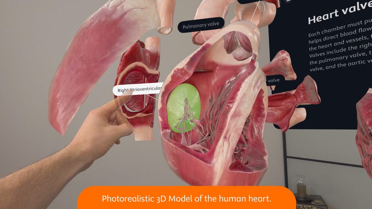
Hyper goes beyond mimesis to offer amplified or enhanced experiences compared to reality. These objects may include fantastical or surreal elements that enrich the user experience.
Liminal
Liminal objects challenge spacetime conventions and play with the user’s perception.
These objects can manipulate reality in surprising and extravagant ways, offering experiences that go beyond the boundaries of traditional logic and physics.

Fantasia
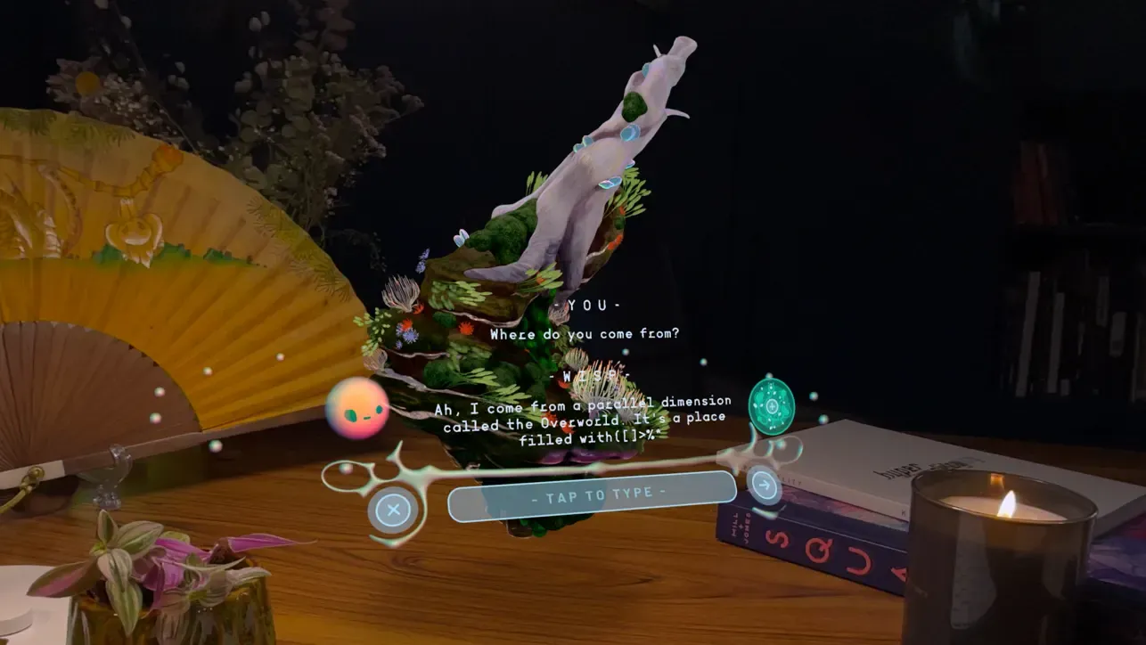
Fantasia (inspired by a groundbreaking Disney animated film) completely breaks free from the restrictions of reality to immerse users in fantastical and surreal worlds. These objects create extraordinary and breathtaking experiences where the user’s imagination is the only limitation.
Choosing the ideal depth for your spatial app involves considering various factors.
Firstly, you must assess the project context and understand its goals, target audience, and overall theme. Secondly, aligning the depth type with the app store category is essential to ensure consistency and appeal to users browsing. Finally, the chosen depth degree should complement the app's functionality and enhance the user experience, ultimately contributing to its success.
Here are the groups of apps based on immersive level from the visionOS App Store:
- Highly Immersive
- Entertainment
- Music
- Sports
- Games
- Moderately Immersive
- Education
- Health & Fitness
- Lifestyle
- Photo & Video
- Functional Apps with Lower Immersion
- Business
- Productivity
- Utility
- Shopping
- Weather
Indeed, while these are standard indications, it would be truly delightful to have a Highly Immersive Weather spatial app at our disposal in the future!
But how do you craft an Imaginary Spatial User Experience (ISUE)? Let’s review the Speculative Spatial Design Canvas update.
Speculative Spatial Design Canvas Update
The updated version of the Speculative Spatial Design Canvas is available on Gumroad.
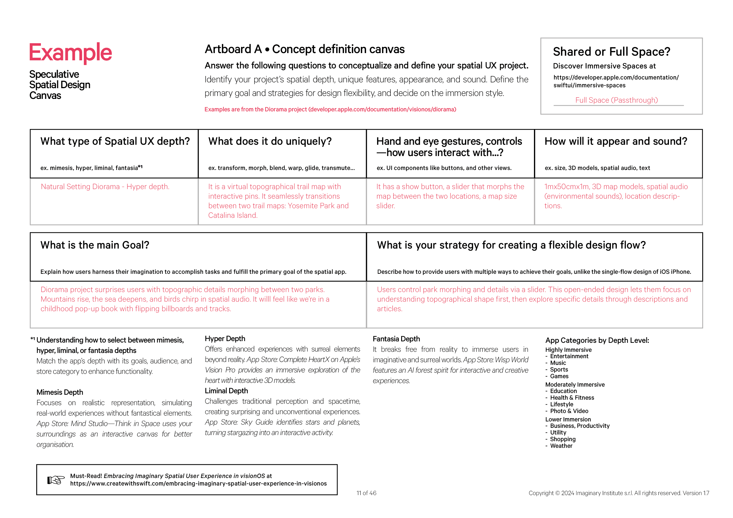
Let’s proceed immediately to see how this update changes the experience and helps us understand how to design an imaginary and spatial experience. The update is on Artboard A, where two new tabs have been added: Goal-Oriented Imagination at number 5 and Open-Ended Design at number 6. After selecting the depth of our experience in the Entity tab and following steps 2, 3, and 4, you will be prompted to answer the following questions: What is the main goal? How do users utilize their imagination to complete tasks and achieve the primary objective of the spatial app?
In the Diorama project by Apple, imagination recall happens through the magical surprise of topographic details morphing between two different parks - with mountains rising or the sea deepening, birds appearing with spatial audio, and flipping billboards and tracks providing a whimsical experience reminiscent of childhood pop-up books.
Lastly, point 6 introduces Open-Ended Design and asks: Does the process allow users to experiment and iterate until their solution aligns with their goals?
In this scenario, the user uses a slider to manage the morphing and details between the two parks. If the objective is to learn historical and topographical details, the design is open-ended because the slider regulates the information density. Consequently, users can first focus on understanding the topographical shape and then delve into specific details through descriptions and articles.
In the previous context of iOS, this pattern wouldn’t be feasible due to the step-by-step monodirectional design flow. This configuration, typical in education apps, utilizes hierarchical navigation similar to folders within folders within folders, which isn't supported. Visualizing a fully detailed diorama on a 5" display isn't practical; spatial audio isn't supported, and accessibility for 3D models would be challenging.
The Imaginary Spatial User Experience (ISUE) upgrades user interaction from the iPhone to Apple Vision Pro, offering intellectual stimulation, multisensory experiences, and enhanced accessibility. By embracing goal-oriented imagination and lateral thinking, users can navigate diverse, immersive depths, from mimesis to fantasia, each offering unique creative stimulation. Choosing the ideal depth for a spatial app involves evaluating project context, aligning with app store categories, and enhancing functionality to optimize user experience. Apps can be categorized based on their immersive level, ranging from highly immersive entertainment to functional apps with lower immersion, like business and productivity tools.
The Speculative Spatial Design Canvas update introduces new tabs for Goal-Oriented Imagination and Open-Ended Design, encouraging users to explore creative solutions and experiment until their goals are met.
Conclusions
Personalized, Multi-Sensory Experiences with Open-Ended Design.
The uniqueness of Apple Vision Pro and spatial apps lies in their ability to transcend traditional interfaces and offer immersive, interactive experiences through spatial design. Unlike conventional devices and applications, which rely primarily on two-dimensional interfaces, Apple Vision Pro leverages three-dimensional space to create dynamic environments where users can interact with virtual objects and information more naturally and intuitively - featuring for the first time Presence sense. This uniqueness enables spatial apps to cater to a wide range of needs and preferences, offering highly personalized experiences that engage users on a deeper level - it’s not customization yet available on iPhone, but it has an open-ended design. Additionally, the Speculative Spatial Design Canvas introduced in the previous article provides a framework for exploring creative solutions and pushing the boundaries of spatial design, further highlighting the innovative nature of Apple Vision Pro and spatial apps.
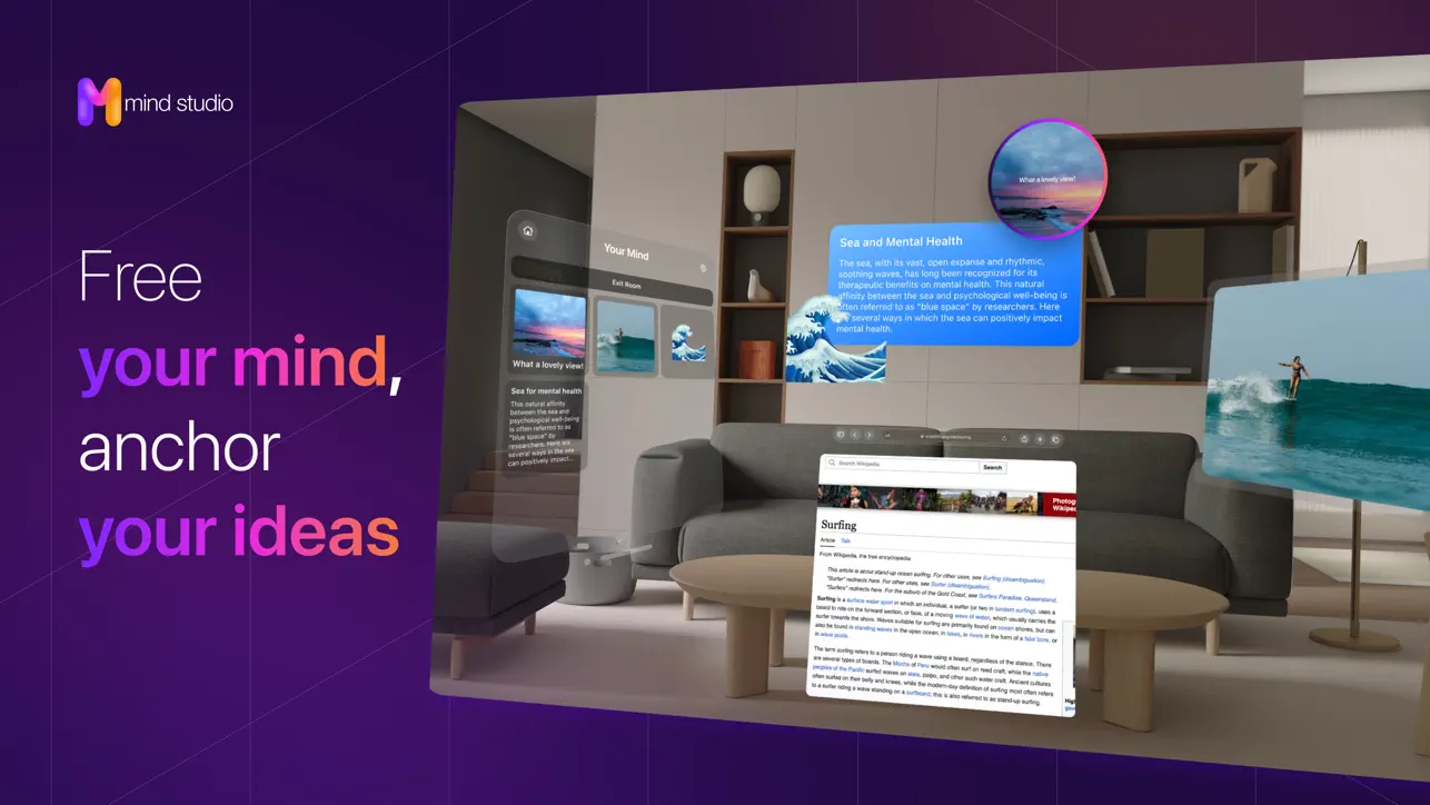
Spatial apps have practical applications across various industries and domains. For example, in productivity, apps like Mind Studio—Think in Space elevate productivity experiences by utilizing the power of spatial computing to organize and visualize thoughts and enhance efficiency. In healthcare, apps like Complete HeartX leverage spatial computing to provide immersive learning about anatomy, physiology, and pathology, no longer stuck as flat illustrations on a bi-dimensional screen or printed page; the best is yet to come.
Just like the apprentice sorcerer Mickey Mouse, who discovers the ability to control magic through his gestures and incantations, developers and designers for spatial computing environments harness the power of technology to conjure virtual objects, alter their surroundings, and perform tasks beyond conventional means.
In Fantasia (1940), Mickey Mouse, donning his sorcerer’s hat, unwittingly unleashes the power of magic upon a room filled with broomsticks.

Similarly, as we navigate the landscape of imaginary spatial computing, we must tread carefully and be mindful of the potential ramifications of our creations. As Mickey’s missteps led to chaos, our misjudgments in spatial design could have far-reaching implications, affecting us and those around us.
We are all sorcerer’s apprentices.
Do you enjoy this article? Does it ignite your imagination? We strongly believe in creativity and visual storytelling, so we thoroughly enjoyed creating the Imaginary Spatial User Experience illustration. Feel free to download the wallpaper or print the poster at no cost.
You can download the Imaginary Spatial User Experience Wallpaper below:

