
Embracing Spatial Computing: the Speculative Spatial Design Canvas
The Speculative Spatial Design Canvas guides developers for solid immersive visionOS experiences and user-friendly apps
The Speculative Spatial Design Canvas is a comprehensive framework that guides developers in creating immersive, user-friendly spatial computing experiences across various applications, from gaming to medical fields.
Grounded in data-driven principles and Neuroergonomics, the canvas addresses critical challenges such as cybersickness and fatigue. By helping developers outline spatial relationships and optimize interaction dynamics, the canvas facilitates the creation of environments that prioritize user comfort, engagement, and awareness.
Designed to be printed and sketched. By the end of the canvas, the goal is to analyze and refine ideas, document insights, prototype concepts, and communicate results to stakeholders, fostering ongoing collaboration.
A seamless third-party resource. Crafted to align with Apple’s Human Interface Guidelines and sessions presented at WWDC, which offer essential guidance and best practices for designing exceptional experiences across Apple platforms.
Unveiling the Speculative Spatial Design Canvas
Based on vulnerabilities discovered from scientific research in Neuroscience, the Speculative Spatial Design Canvas offers guidelines to support developers in processing and sketching spatial design layouts for their apps or games. A new, fresh, and experimental canvas has been created to achieve our goal of Spatial Design awareness.
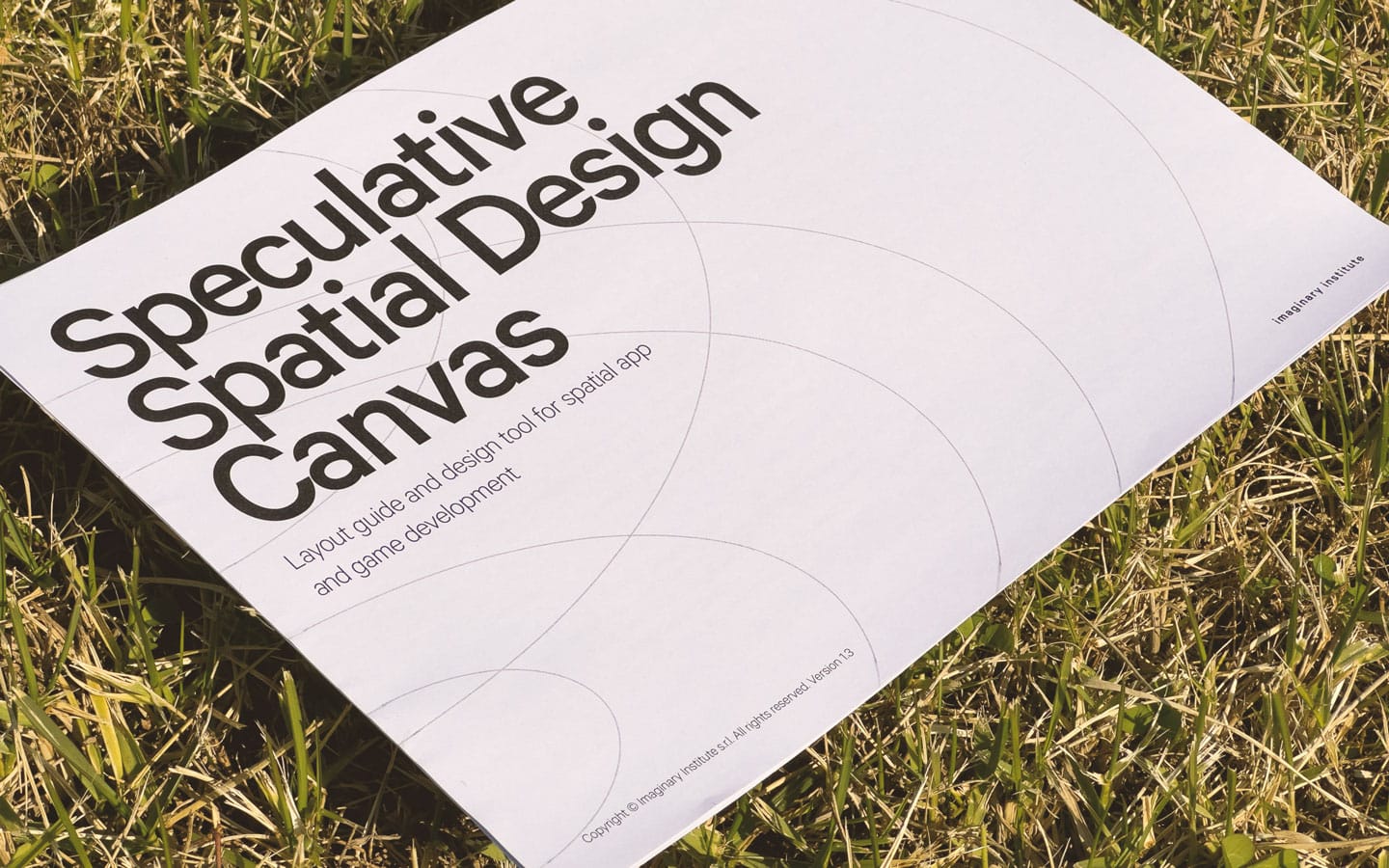
The value proposition of the Speculative Spatial Design Canvas is specifically designed to tackle two significant challenges: Cybersickness and Fatigue.
It is based on Distance and Field of View. Distance pertains to how far apart the user is from the virtual or augmented elements within the digital environment. Proxemics, initially introduced by sociologist Edward T. Hall, revolves around how users interact with these elements based on their spatial relationships.
On the Speculative Spatial Design Canvas, the Distance identifies areas between the user and the hyper-content. It is split into the following areas:
1. Public Area
The furthest interpersonal Distance is typically about 3,5 meters or more. Public Area is typical when individuals must address a large audience, such as a speaker addressing a crowd or a performer on a stage. It is a distance that allows for little to no direct physical interaction, and communication is often one-way.
2. Social Area
Social Area falls between 1,2 and 3,5 meters. It is the space maintained between acquaintances or people in social settings. In the social Area, individuals can comfortably have conversations and engage in social interactions while maintaining personal space and physical comfort.
3. Personal Area
Personal Area is the space that typically ranges from about 0,3 to 1,2 meters. This Distance is maintained in most everyday conversations and interactions with friends, family, or acquaintances. It is considered the comfort zone for personal communication and allows for more intimate conversation without feeling overly invasive.
4. Intimate Area
The intimate Distance ranges from close physical contact to about 0,5 meters. This level of proximity is reserved for individuals with a very close personal or family relationship. It is the most comparable level of interpersonal Distance and is often associated with physical contact, such as hugging, holding hands, or intimate experiences.
5. Forbidden Area
The User’s Eyes typically represent a forbidden area. It may disrupt the experience or lead to total discomfort, such as excessive motion or visual distortions and, even worse, fear, panic, and hysteria.
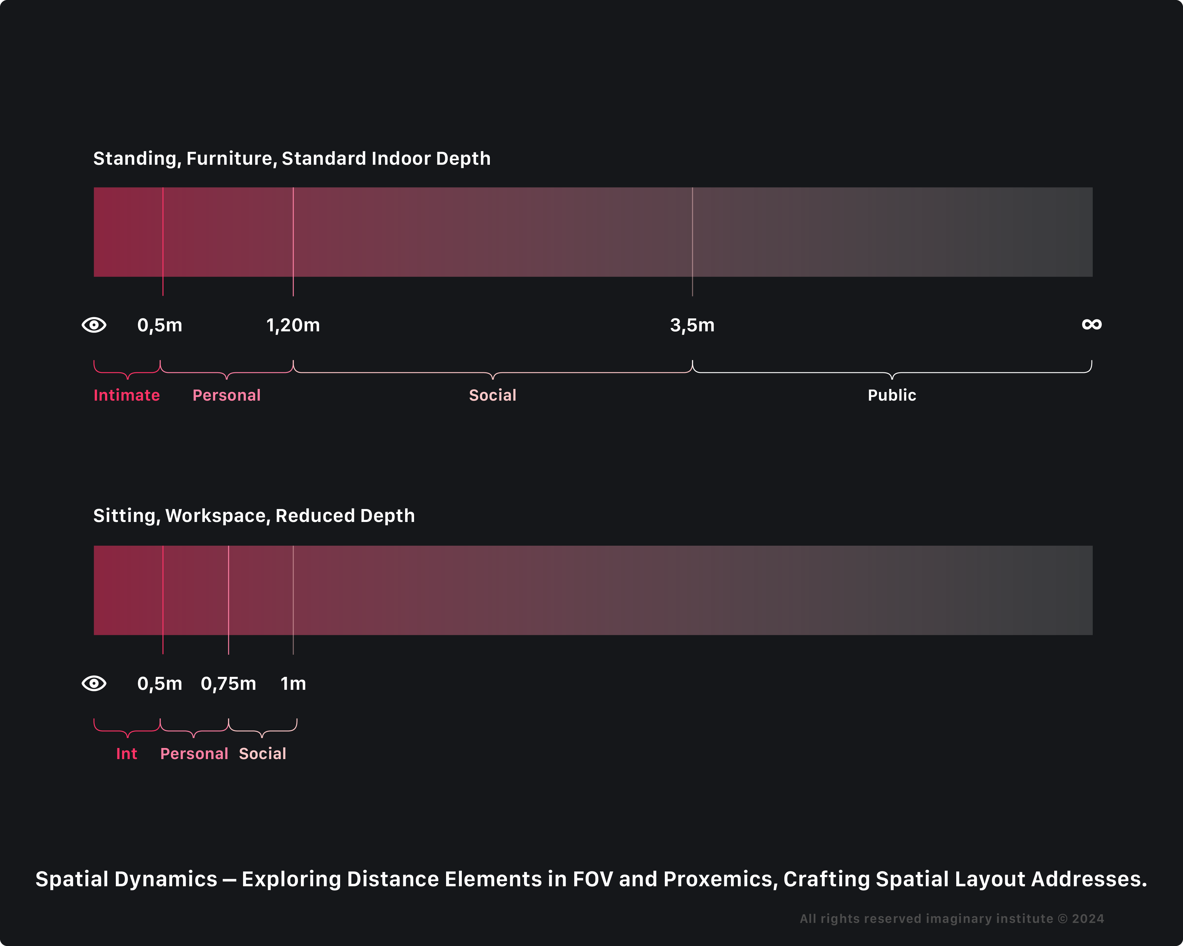
Spatial Computing depth of distance is dynamic within the context of physical scenarios indoors, where visionOS adjusts distances based on the varying arrangements of furniture in the room, thanks to artificial intelligence that is constantly scanning surroundings via an undisclosed proprietary Visual SLAM-like method (Simultaneous Localization and Mapping).
”The LiDAR Scanner and TrueDepth camera work together to create a fused 3D map of your surroundings, enabling Vision Pro to render digital content accurately in your space.”
Apple.com
Adaptive depth of distance exemplifies this dynamic process in four identified cases:
1. Standing, no furniture in front, Full Depth
In the first case, envision standing in an unfurnished space. The user finds themselves in an open area void of furniture, experiencing an unobstructed environment with ample space.
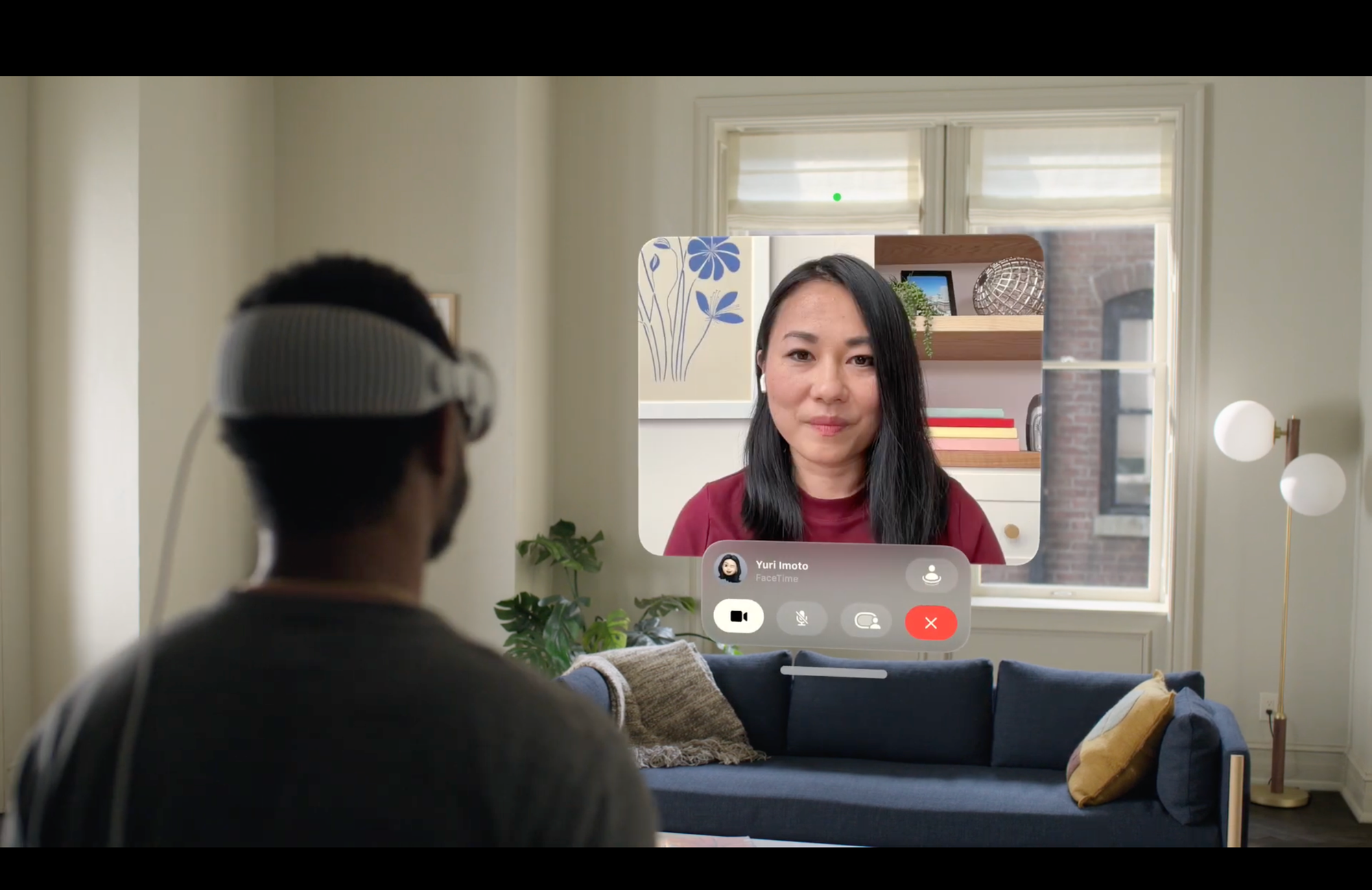
2. Standing, furniture in front, Close Depth
The second scenario involves standing with furniture ahead. Here, the user is upright, facing a piece of furniture that either obstructs their path or contributes to defining the surrounding environment.
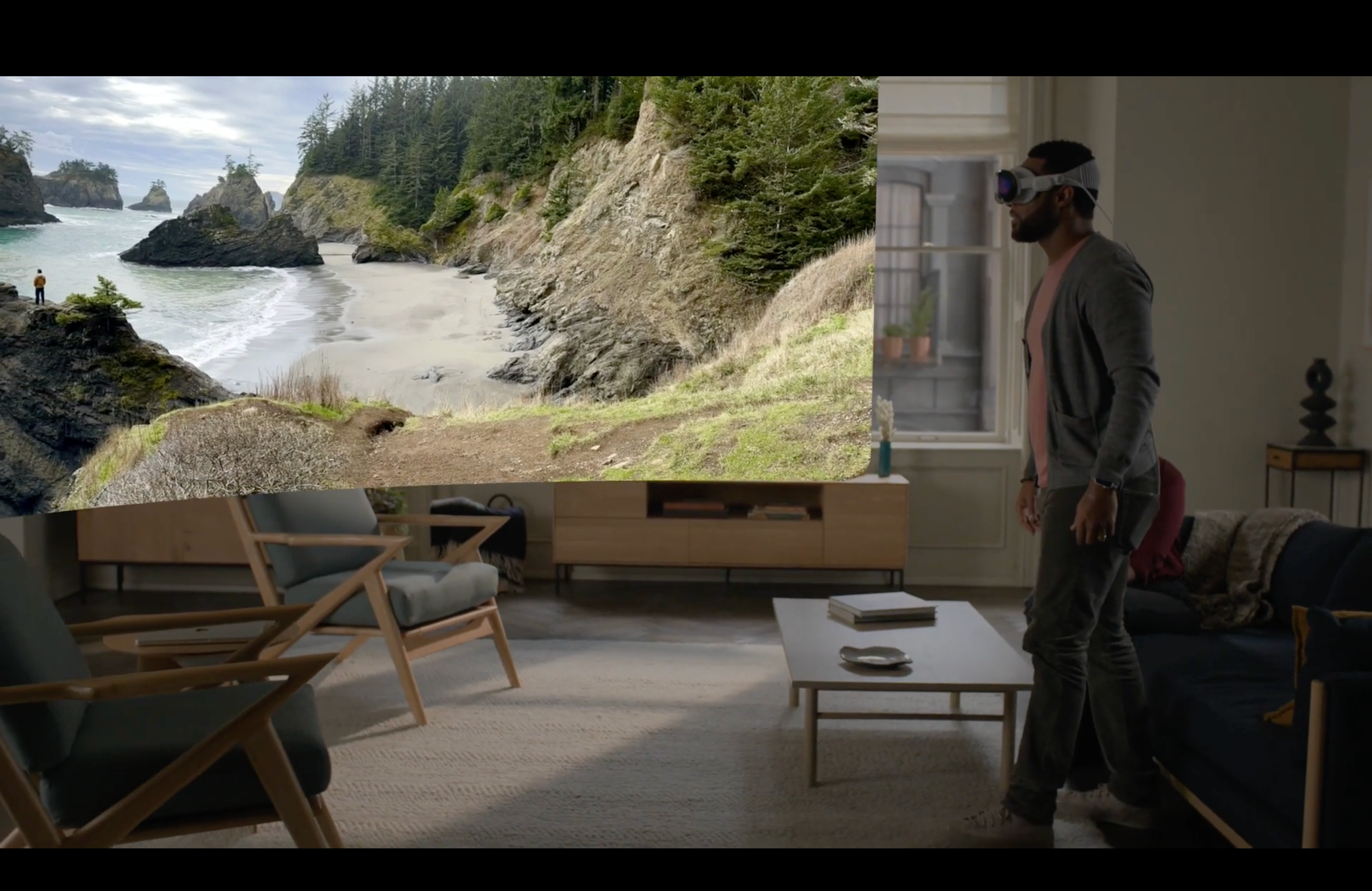
3. Sitting, Comfort, Close Depth
In the third case, imagine sitting on a sofa (Coach or Easy-chair). In this scenario, the user enjoys comfort on a sofa, likely situated in a living room or a similar setting, with the goal of entertainment.
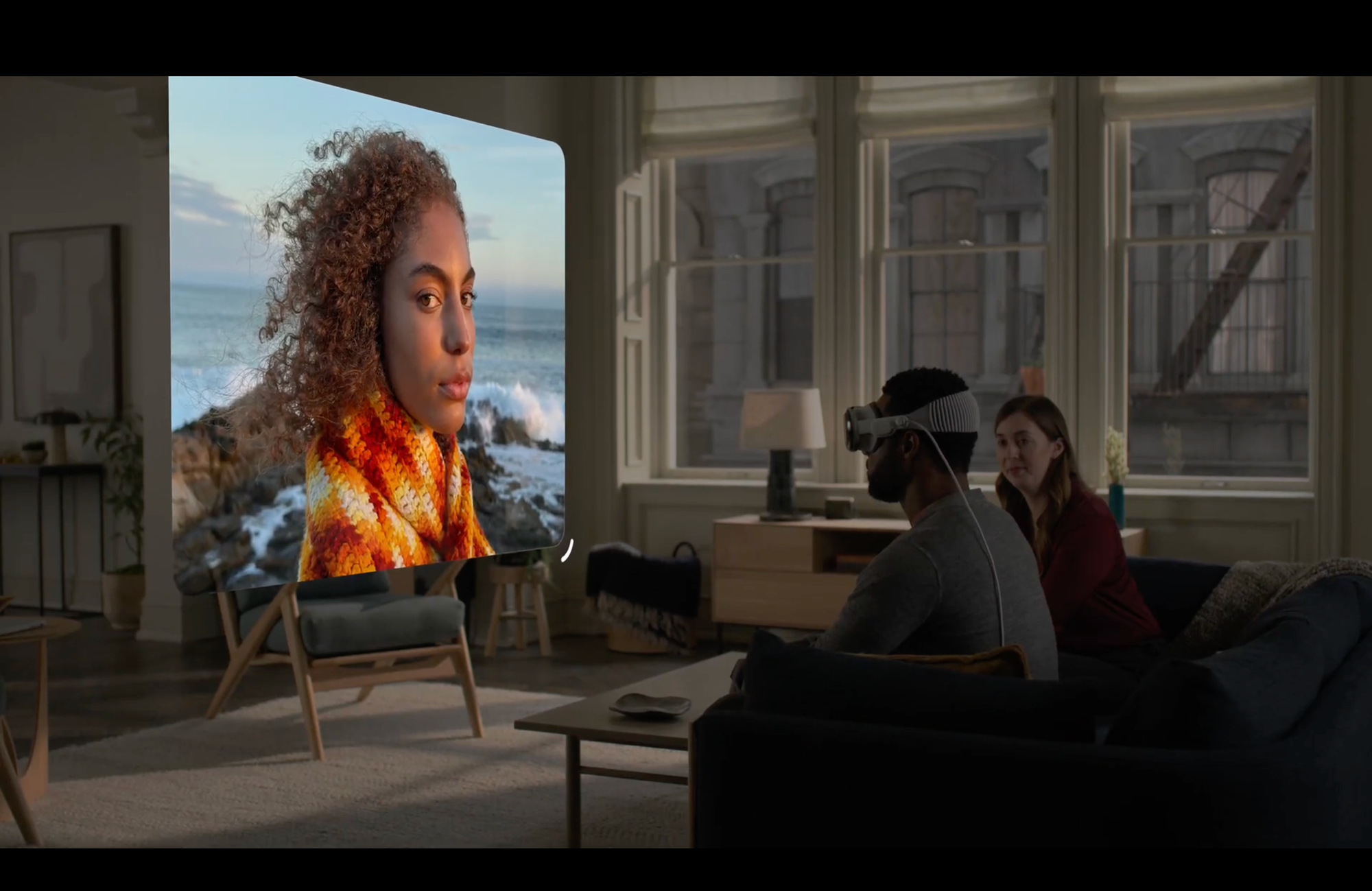
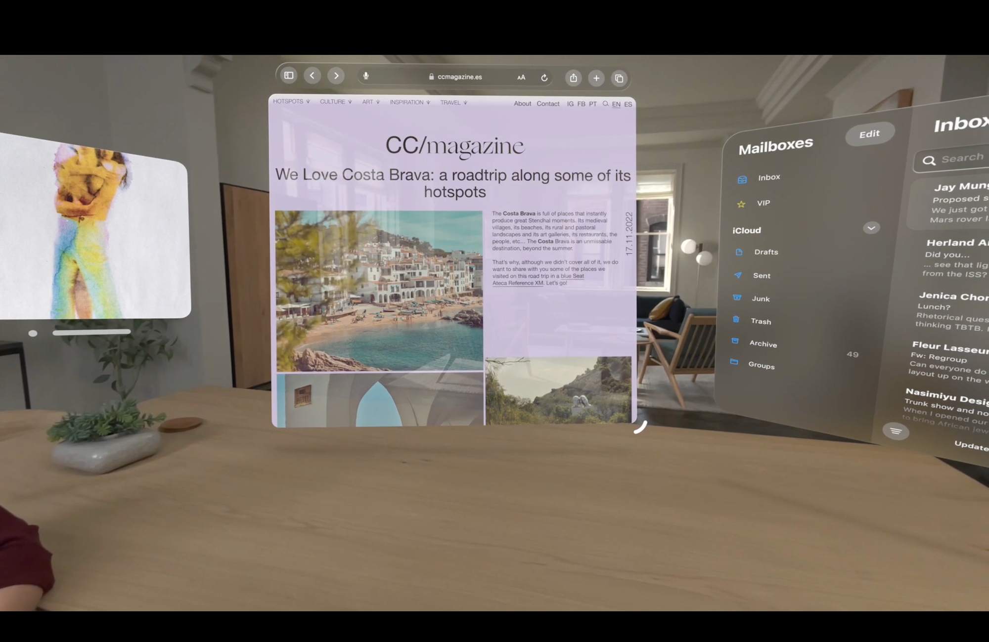
4. Sitting, Workspace, Reduced Depth
Lastly, consider being seated at a desktop. In this fourth case, the user is comfortably seated at a desk within an office environment, with the primary goal being work. This setting involves engaging in work-related activities or utilizing the space as a study area.
The Field of View (FOV) of human vision, also known as the human visual field, is the extent of the observable world that can be seen at any given moment without moving the eyes or head. The binocular Field of View typically encompasses an angular range of approximately 114-140 degrees horizontally and 135-150 degrees vertically.
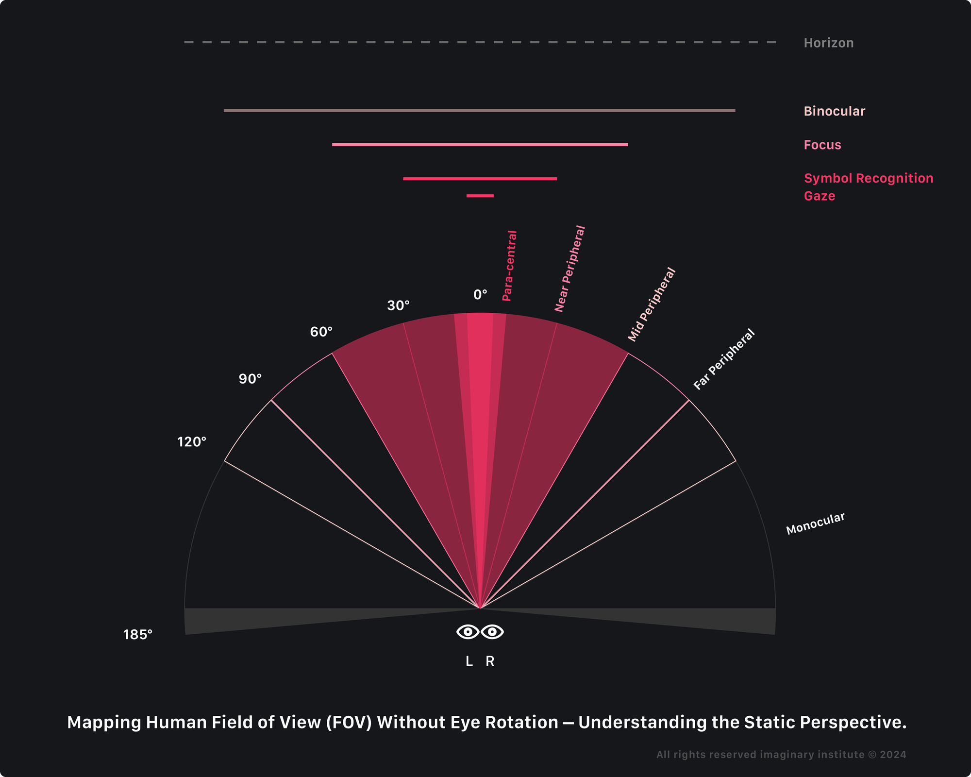
Human Vision does not provide a fixed, rectangular field like a camera or screen but is more of a complex, three-dimensional visual perception. Within this context, the central area of vision, characterized by the convergence of both eyes’ visual input, facilitates the perception of depth and affords high visual acuity.
The FOV (horizontal, vertical) dimension is measured in degrees, and it can vary from person to person, but here are some approximate values for a typical human:
- The Central vision, or Gaze area, constitutes the most precise and detailed region within the binocular field, typically covering the visual field’s significant horizontal 5 degrees from the center and vertical 0-10 degrees. It is vital for tasks demanding fine detail and acute focus, such as reading or recognizing intricate facial features and symbols.
- Para-central vision, or Task Area, extends beyond the central area, approximately 5-10 degrees horizontally from the center and 0-15 degrees vertically. It provides reasonably good visual acuity and is commonly employed for activities requiring a broader, yet still detailed, view, such as driving or performing tasks that necessitate a wide but clear field of vision.
- Near-peripheral vision, or Symbol Recognition Area, extends the visual field 15 degrees from the central point. Although it offers reduced understanding compared to the mid and para-central images, it is precious for promptly detecting objects or movements in the immediate surroundings without needing head or eye movement.
- Mid-peripheral vision, or Focus Area, ranges approximately 30 degrees from the visual center. It offers an expanded awareness of the environment but with a decrease in acuity. This area is frequently utilized for tasks that require a general understanding of the surroundings without the necessity for precise visual detail.
- Far Peripheral Vision. The far peripheral vision zone encompasses the outermost region of the visual field, extending up to the limits of the peripheral Field of View, which can approach nearly 180 degrees horizontally and over 100 degrees vertically. Although this area significantly reduces acuity, Monocular Vision is critical in detecting motion and light changes and maintaining situational awareness.
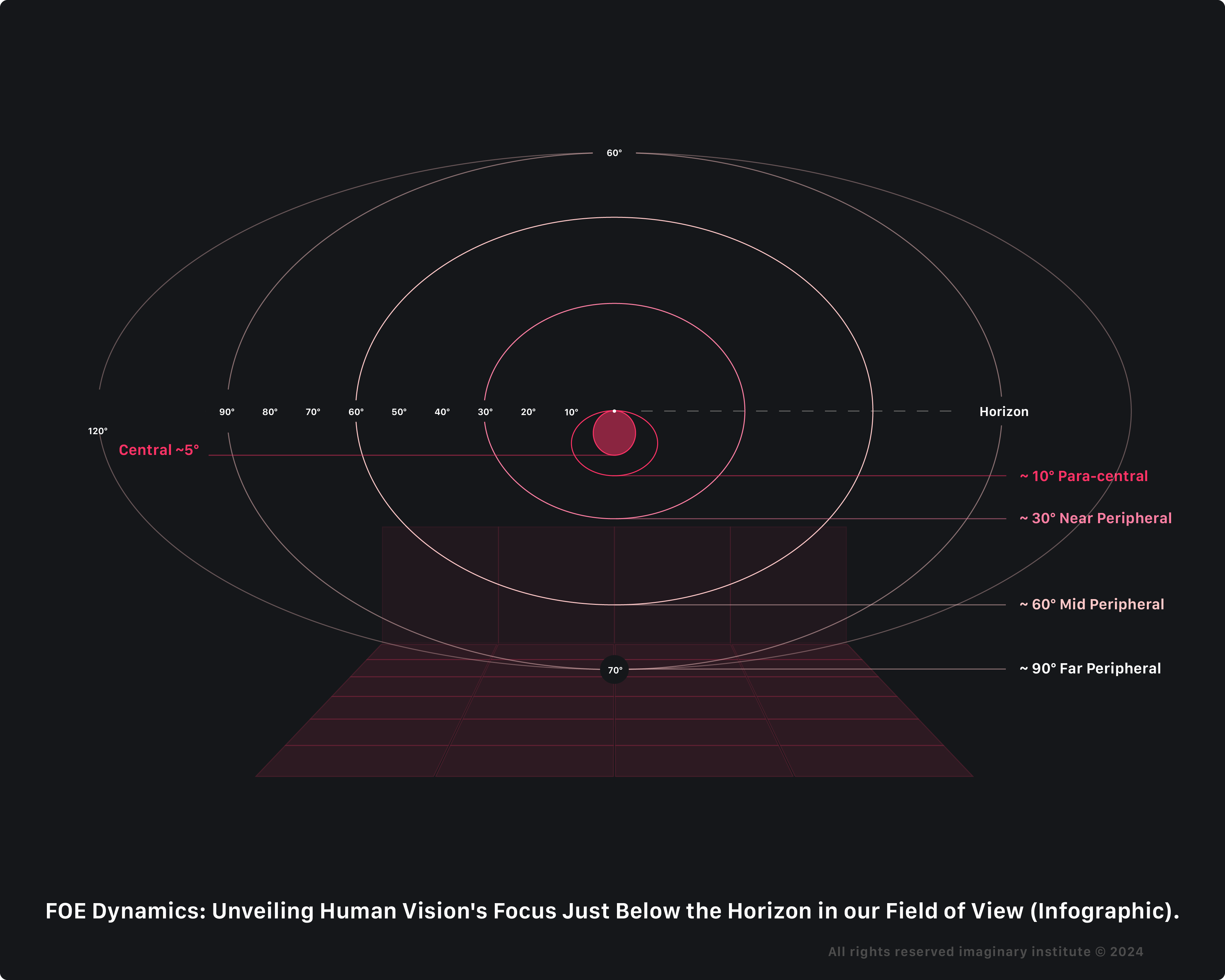
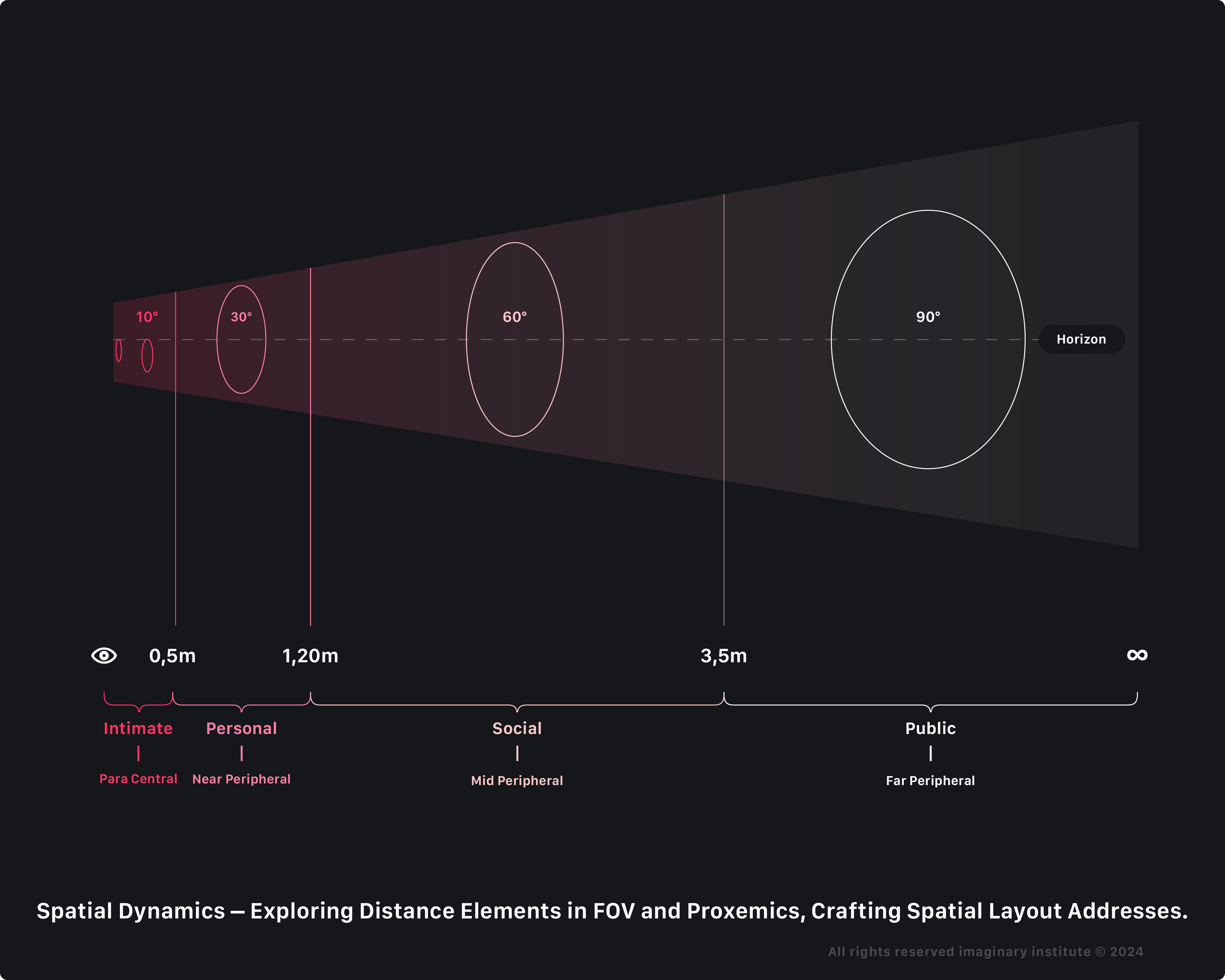
It is important to note that the Field of View is not a fixed, rigid frame but a dynamic and continuous perception. Our eyes constantly move and scan the environment, so we perceive a much larger visual space over time.
Additionally, the in-focus area in the FOV can vary based on eye movement, shape, and other individual differences: factors such as gaze and symbol recognition are subject to eye rotation and pupil skimming.
Unfortunately, the visionOS simulator creates an all-focus illusion, where the eyes are completely focused. The simulator behaves like Apple Vision Pro, a full-screen monitor. However, our eyes only focus on a portion at a time, which naturally changes with gaze and pupil movement.
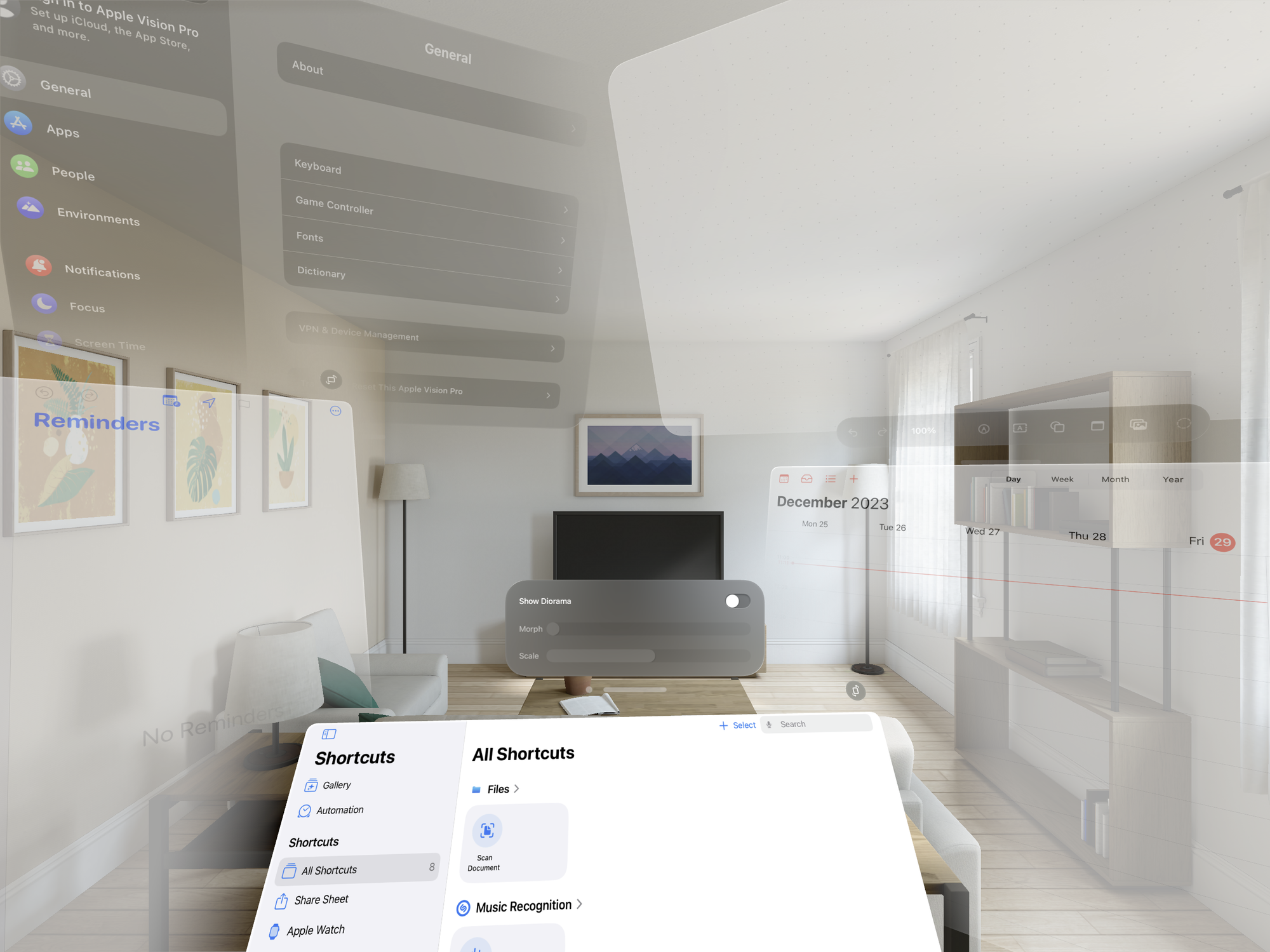
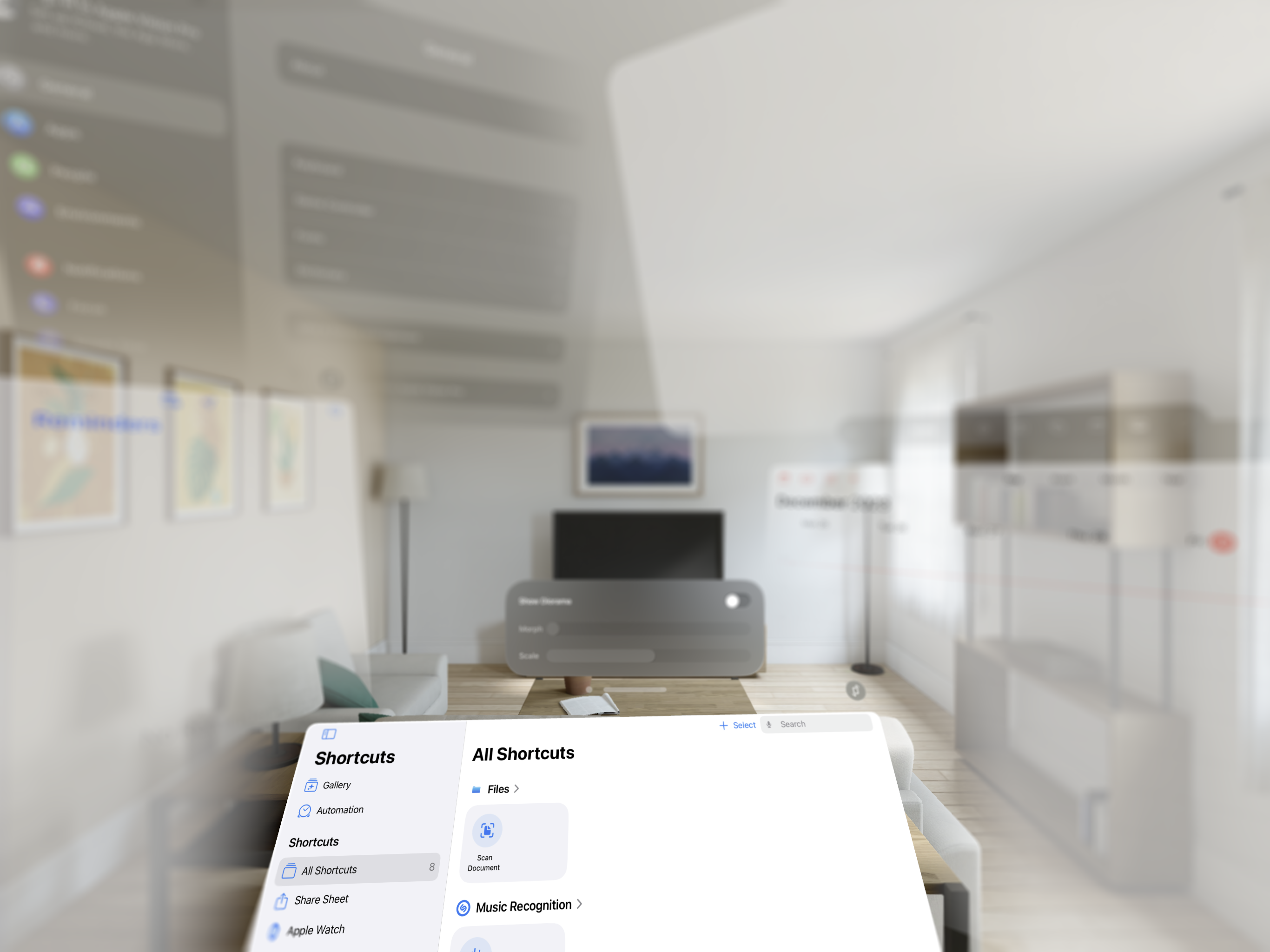

In addition to the mentioned process, the neuro activity known as the Focus of Expansion (FOE) indicates our travel direction - always as the brain perceives it. As you move towards a surface, the FOE activity highlights where your visual field converges. This convergence point is instrumental in perceiving the motion and spatial relationships between yourself and the observed surface.
Essentially, the FOE neuro activity assists in dynamically interpreting the visual cues associated with your changing proximity to the object, enriching your overall perception of the surrounding environment.
This propensity is ascribed to the human visual system’s intrinsic tendency to focus attention slightly below the horizon, a phenomenon rooted in optical expansion dynamics. According to Gibson, aligning our objective with the FOE is crucial for directing our movement. The FOE is defined by perspective geometry, representing the point away from which all other surface images radiate. Using simulated optical expansion, researchers discovered that people’s accuracy in recognizing the FOE varies depending on the situation, altering how we perceive and use this information in dynamic contexts.
In the Field of View (FOV), human vision naturally focuses slightly below the horizon due to the Focus of Expansion (FOE).
By considering factors such as distance, FOV, vergence-accommodation conflict, FOE, and design considerations, developers can create more user-friendly and immersive experiences while mitigating potential issues related to discomfort and fatigue.
However, how do we apply those factors in our design process?
Artboards and Development Process
The question arises for iOS developers lacking a background: how can they embark on crafting experiences for Spatial Computing?
Incorporating Spatial Design introduces novel elements into the software creation process, necessitating a shift in the traditional approach to accommodate the unique considerations and challenges posed by the immersive nature of XR environments.
Download the Speculative Spatial Design Canvas for free on Gumroad.
The Speculative Spatial Design Canvas is a pivotal tool for creating spatial computing experiences meticulously crafted and informed by scientific insights from Neuroscience.
It offers a comprehensive framework for developers to navigate the intricacies of spatial design with confidence and clarity. Rooted in data-driven design principles, the Speculative Spatial Design Canvas is a guiding beacon for developers, empowering them to craft immersive and user-friendly experiences while mitigating potential challenges such as cybersickness and fatigue.
By delineating spatial relationships and optimizing interaction dynamics, this canvas facilitates the creation of environments that prioritize user comfort and engagement.
This imaginative design tool emerged following a phase of creative ideation. Developers can ensure coherence and seamlessness in their design through a systematic breakdown of elements and thoughtful allocation within distinct spatial areas, fostering intuitive interactions and compelling narratives. From defining elements to sketching layouts and envisioning 3D interactions, each step in the canvas process is meticulously designed to enhance the user experience and propel spatial computing into a new era of innovation.
As we delve deeper into spatial design, it becomes evident that the Speculative Spatial Design Canvas represents not only a tool for creation but also a testament to the boundless potential of human imagination. With its guidance, developers can embark on a journey of exploration, innovation, and creation, shaping the future of visionOS and redefining the boundaries of the app and game development as we know it.
The Speculative Spatial Design Canvas is organized into Artboards to guide developers through the spatial layout creation.
Best practices
Crafting immersive spatial experiences involves enveloping users in a carefully designed environment, aligning inputs with their movements for coherence and presence, prioritizing neuro-wellness, and optimizing design for engagement.
1. Set up an immersive cocoon
By embedding users in a carefully designed spatial environment, we can control the sensory inputs they receive, ensuring that visual and auditory stimuli align with their physical movements and expectations.
This cocooned immersion helps to maintain a sense of coherence and presence within the virtual environment, reducing the likelihood of discomfort or disorientation.
Additionally, strategically allocating elements within this immersive space can enhance spatial awareness and focus user attention on relevant content, ultimately providing a more engaging and enjoyable spatial computing experience.
2. Prioritize neuro-wellness
By prioritizing neuro-wellness, we acknowledge the potential risks, such as cybersickness, fatigue, and cognitive overload. There is a critical need to consider the impact of these experiences on users’ mental and cognitive health.
Therefore, integrating strategies to promote neuro-wellness involves implementing design principles that minimize these risks, such as optimizing spatial design, pacing content delivery, and providing adequate breaks to prevent mental fatigue.
Prioritizing neuro-wellness entails fostering a positive emotional experience within spatial design environments, promoting relaxation, mindfulness, and stress reduction.
3. Learn from Kinetic Art
In spatial computing, volumes are equivalent to kinetic sculptures, embodying three-dimensional entities that dynamically interact with their environment. By incorporating movement into spatial computing, we create immersive experiences that react to the user’s actions and surroundings, enhancing engagement and interactivity.
Like spatial computing, kinetic art movement is activated solely through human interaction; otherwise, it remains stationary. The minimalist design approach borrowed from kinetic art is efficient in spatial computing because it emphasizes movement while eliminating visual clutter. This focus on simplicity allows users to concentrate on the essence of motion without being distracted by unnecessary elements. It communicates simplicity, purity, and essential themes, enriching the user’s experience by evoking deeper meanings and connections.
Applying an App Idea on the Canvas
Before starting, a developer needs an app idea pitch, and for this article, we will use, as an example, the Diorama project by Apple. To keep logic in this example, we will use the idea pitch of:
An app for nature lovers to explore and interact with stunning landscapes via a morphing diorama indoors.
Artboard A • Concept definition canvas
Applying this application idea in the Speculative Spatial Design Canvas flow on Artboard A • Concept definition canvas, we will meticulously enumerate and delineate each element from our brainstorming that is crucial to the spatial design for the visionOS app and game development.
This involves a systematic breakdown from the app idea pitch, emphasizing elucidating their features, cognitive load considerations, and the anticipated audio-video quality.
By intricately detailing each constituent, developers acquire a lucid comprehension of the fundamental building blocks, cultivating a more productive and enlightened design process.
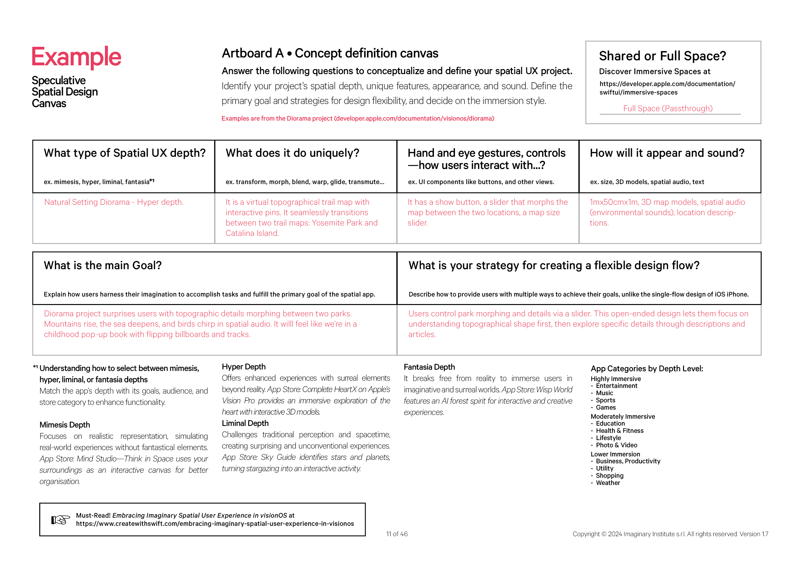
This structured breakdown facilitates a granular examination of each element, providing a comprehensive understanding of its role in spatial design. The detailed exploration of features, cognitive load, and hyper-content ensures that developers have a nuanced perspective, allowing for a more refined and purposeful integration of elements into the visionOS experience.
Artboard B • Neuroergonomic match ’n sketch
Once the elements are defined, Artboard B • Neuroergonomic match ’n sketch comes into play. It involves the strategic allocation of these elements within the spatial environment. This step is vital in optimizing user experience, ensuring seamless interactions, and creating a cohesive and immersive environment.
The allocation process considers the spatial relationships between elements to enhance functionality and visual coherence.
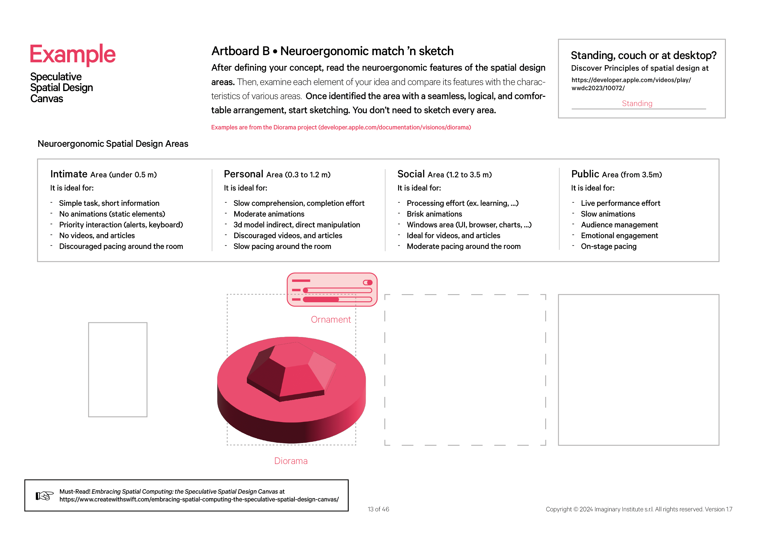
In allocating elements within various spatial areas, we focus on optimizing the immersive experience in Extended Reality (XR) while prioritizing the prevention of Cybersickness resulting from heightened nervous system stimulation. To achieve this, we carefully align the features of elements with the designated characteristics of each area on the SSD Canvas.
All of this is necessary to uphold our promise of:
- Prevention of Cybersickness
The feature list considers factors such as motion, pacing, and content consumption restrictions to mitigate the risk of Cybersickness. This is key for preventing physical discomfort and creating an environment where users can comfortably engage.
- Fatigue Management
Considering pacing, animations, and media in different areas helps manage user fatigue. By tailoring the level of engagement and visual stimuli to each zone, developers can create an immersive experience without causing undue strain on users.
- Spatial Awareness
Users are guided through different spatial contexts with varying levels of engagement, concentration, and emotional involvement. This spatial awareness enhances the overall understanding of the virtual environment and promotes a more intuitive user experience.
- Content Prioritization
The feature list helps prioritize different types of content based on the user's proximity to virtual elements. For example, more interactive and dynamic content may be prioritized in social areas, while concentrated and immersive content is reserved for public areas.
- Optimized Interaction
Features are tailored to the characteristics of each spatial area, ensuring that interactions and tasks are well-suited to the user’s proximity to virtual or augmented elements. This optimization enhances the overall usability of the visionOS environment.
In summary, the feature list is instrumental in crafting a thoughtful and purposeful spatial design for visionOS, considering user comfort and engagement and preventing potential issues such as Cybersickness and Fatigue.
When deciding where to place the Diorama object, we consider each area’s characteristics. Understanding the features of the Intimate, Personal, Social, and Public areas outlined in the project guidelines helps us determine the most suitable environment for incorporating the Diorama object.
This thoughtful consideration ensures that the placement aligns with the nature of the Diorama, optimizing the overall user experience in Extended Reality (XR) and minimizing the risk of Cybersickness.
In the example project we are using, the optimal placement for the Diorama object is within the Personal Area (0.5 to 1.5 m).
This designated space is characterized by an environment conducive to slower comprehension and completion efforts, making it well-suited for the Diorama’s nature. The guidelines recommend allowing moderate animations and supporting 3D model interactions through indirect and direct manipulation. However, videos and articles are discouraged in this area. Additionally, slow pacing around the room aligns with the characteristics of the Personal Area, ensuring a coherent and user-friendly experience for individuals interacting with the Diorama object in Extended Reality (XR).
Artboard C • Mixed reality sketch
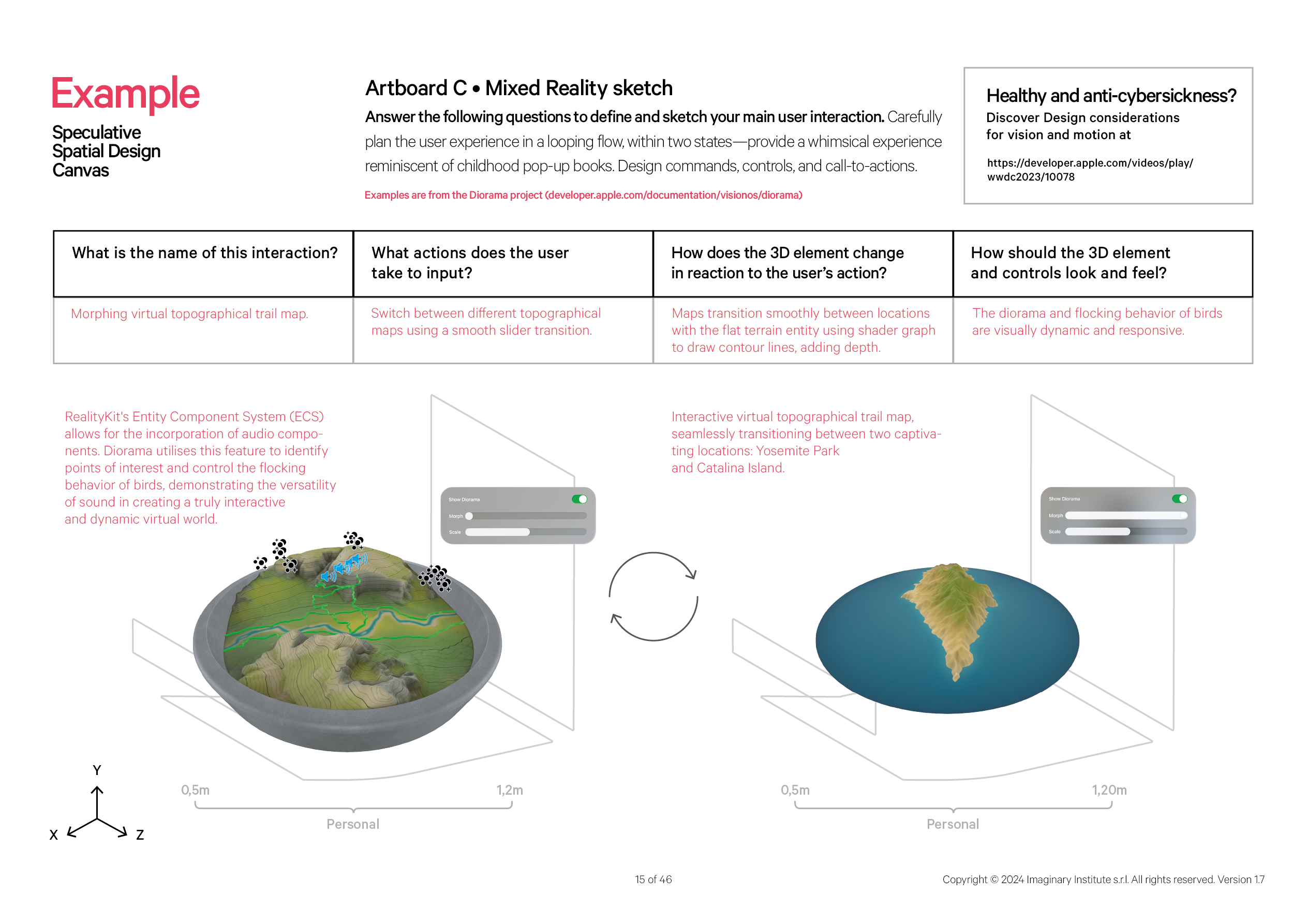
Advancing to Artboard C • Mixed reality sketch, the Indirect and Direct Manipulation section utilizes an isometric perspective to showcase interactions and processes associated with manipulating elements within a 3D model.
This technical approach is aligned with the 6 Degrees of Freedom concept, providing an enhanced visualization of element manipulation within a spatial context.
Employ the isometric perspective to illustrate interactions before and after, outlining the processes of manipulating an element within a 3D model. Ensure the design incorporates Ornaments to define commands, controls, and call-to-actions clearly.
Artboard D • User interface sketch
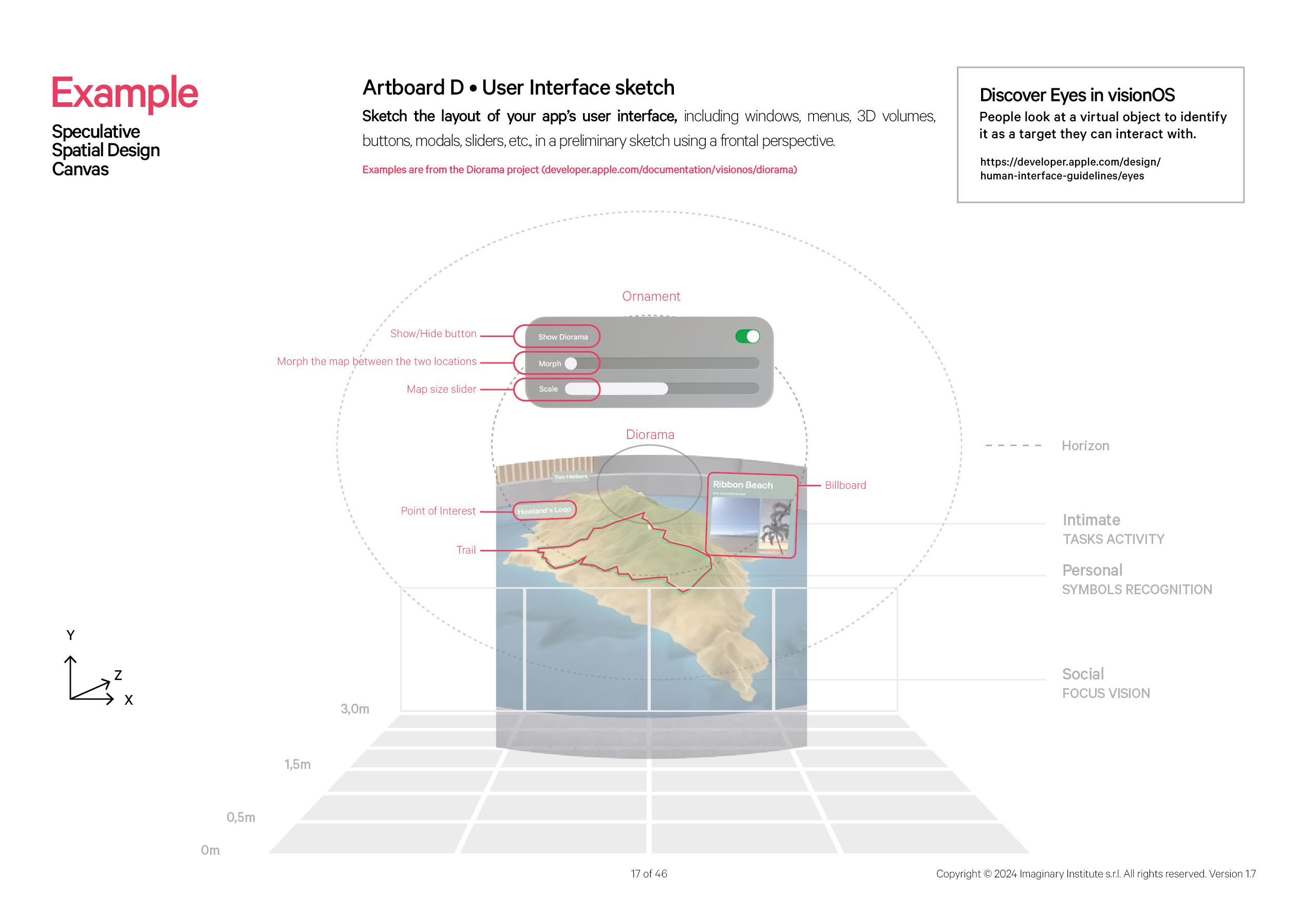
Moving to Artboard D • User interface sketch, the Front View adopts a frontal perspective, employing circular guides to delineate element positions and organize the content within windows.
A crucial recommendation is to ensure that the primary action consistently unfolds within the user's comfort zone, strategically placing the primary task just below the horizon for optimal engagement. Begin the design process by outlining and numbering the components of your app's user interface—windows, menus, 3D volumes, buttons, modals, sliders, etc.—in an initial sketch utilizing a frontal perspective.
Employ circular guides for precise element placement and to structure the content within windows. It is advisable to position the main action comfortably within the user's primary field of vision, ensuring the primary task is situated just below the horizon for an enhanced user experience.
(For more information on Designing for spatial computing: from iOS and iPadOS to visionOS

For more information on Designing for spatial computing: from iOS and iPadOS to visionOS
Artboard E • Spatial audio
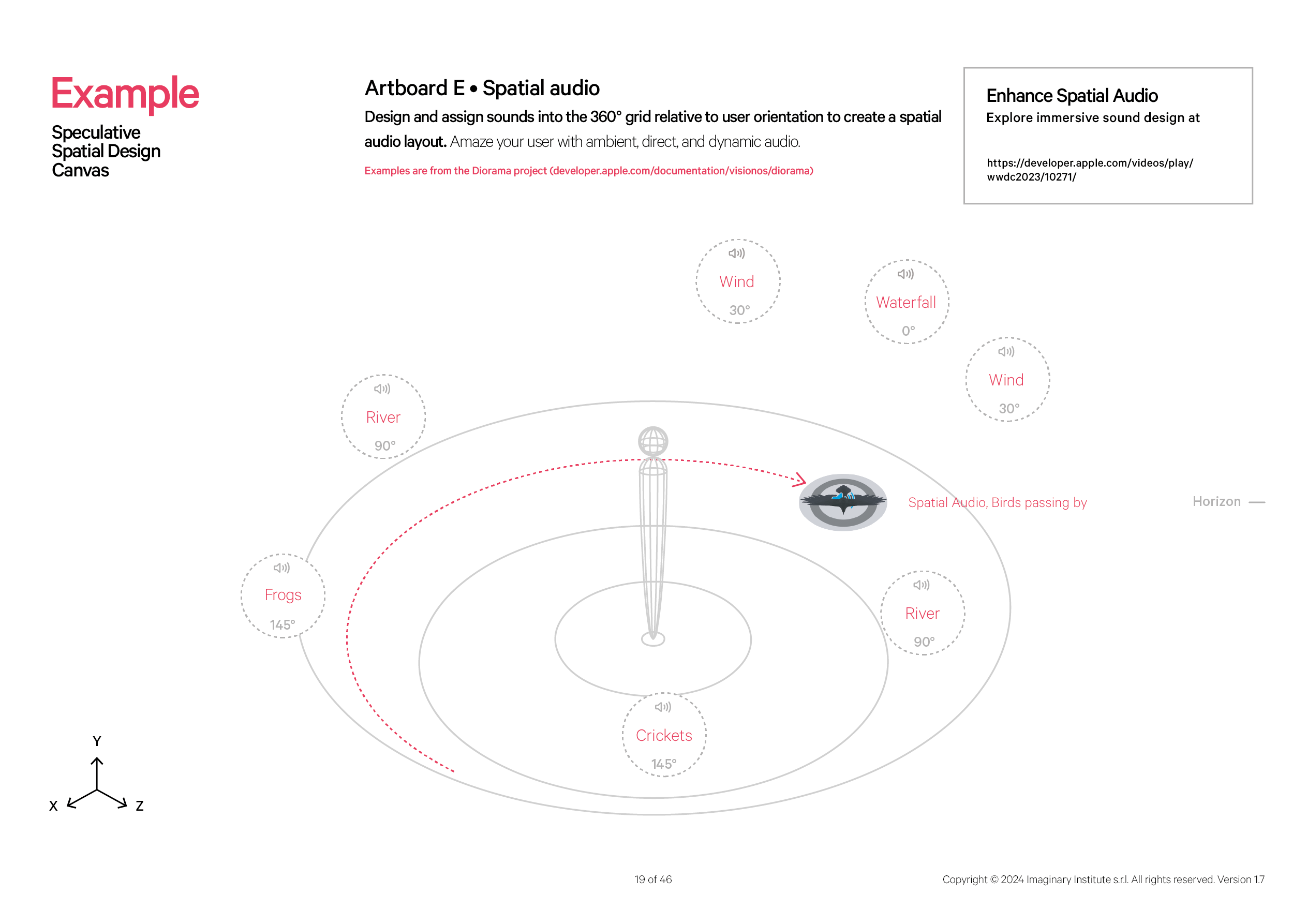
Wrapping up with Artboard E • Spatial audio, developers are encouraged to captivate users with an immersive experience by applying lateral thinking to craft a unique yet concise encounter.
Indeed, we underscore the importance of moderation, as excessive brain stimulation can result in fatigue, headaches, disorientation, and, unfortunately, nausea. To captivate the user experience with immersive Ambient Direct and Spatial Audio, 360° balloons are provided relative to the user's orientation.
At the end of the canvas, we encourage you to collaborate with your talented developers and fellow designers as the next step. Please share your artboards and actively engage with the simulator to provide valuable feedback. This phase transforms our creative concepts into a tangible and immersive user experience.
Empirical Testing on visionOS Simulator
What occurs when we stress-test the Speculative Spatial Design Canvas on the visionOS simulator? How effectively does the Speculative Spatial Design Canvas empower designers to envision and craft groundbreaking Spatial Computing experiences? Let us put our data-driven model to the test on the visionOS simulator and gather resources from Apple WWDC23.
Our exploration extends beyond theoretical considerations to the practical efficiency of this canvas in guiding developers through the complexities of Spatial Design in XR. Through empirical testing, we seek to assess the real-world impact and effectiveness of the Speculative Spatial Design Canvas in shaping innovative and captivating experiences.
Applying the Field of View (FOV) and Focus of Expansion (FOE) models to analyze the video resources from WWDC2023
This test aims to assess the practical implications and effectiveness of implementing the FOV and FOE model in the context of the WWDC2023 video content.
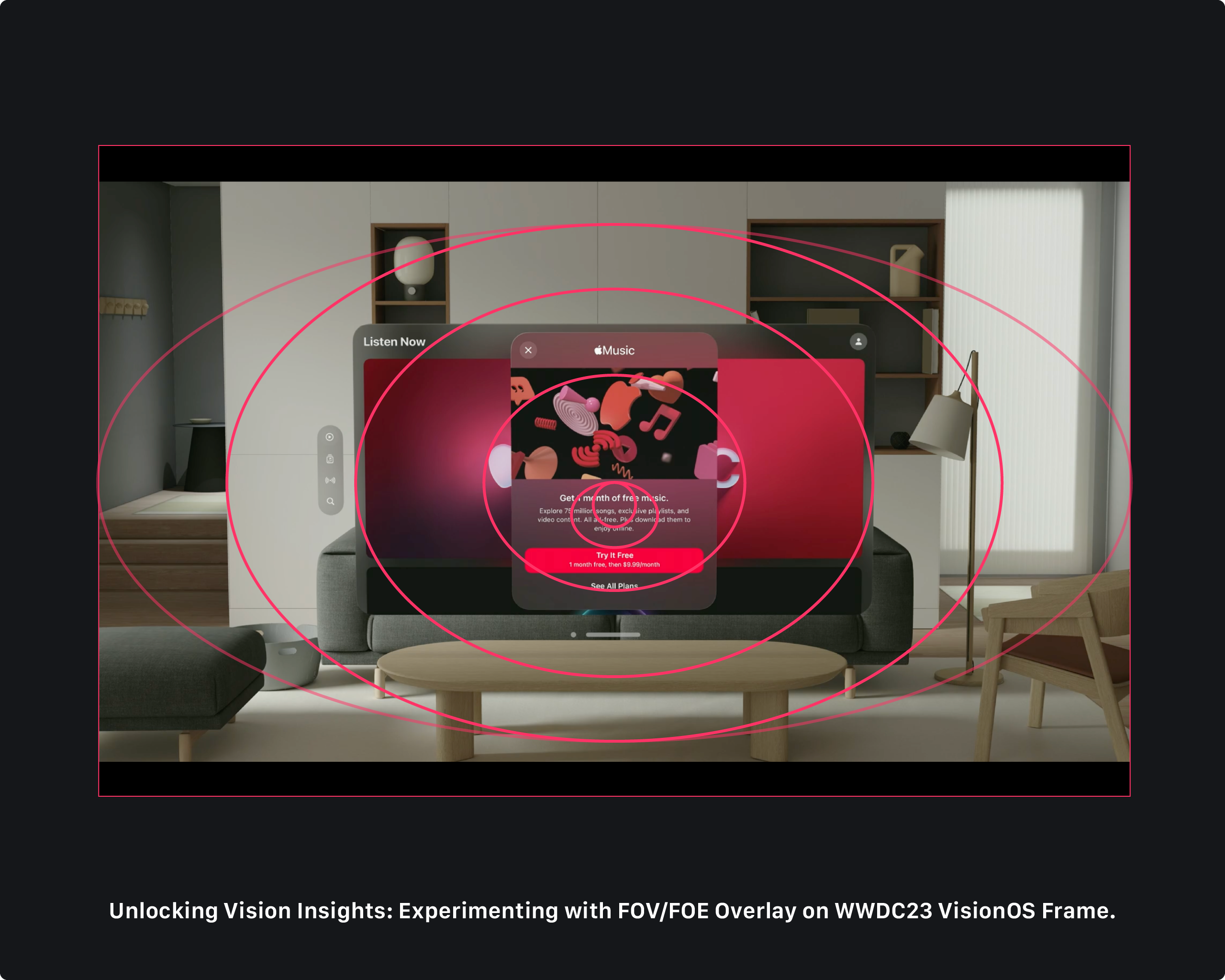
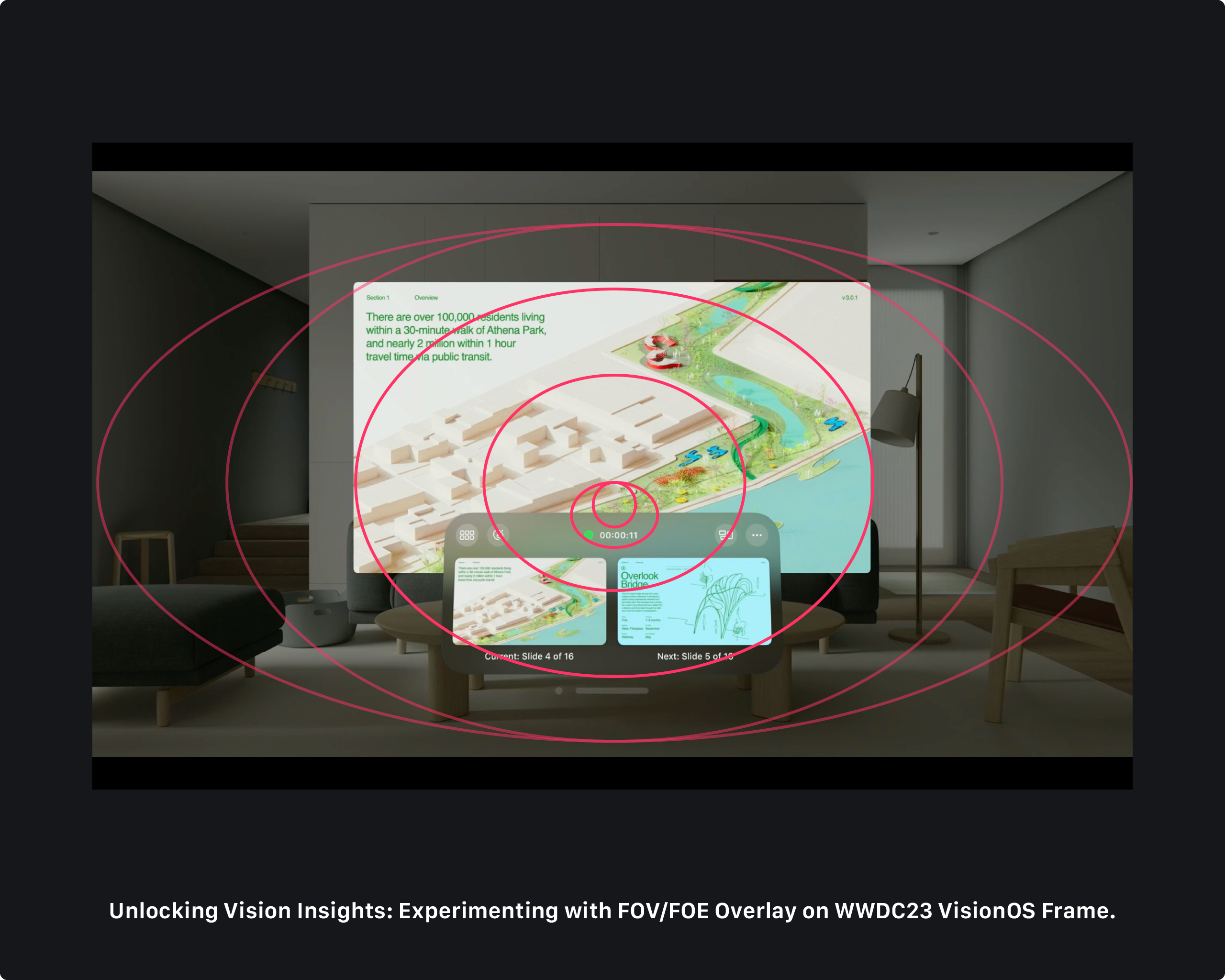
Screenshots taken from WWDC23 Principles of spatial design video.
In both screens featuring the Keynote app and the Music app, the first task buttons strategically appear within the paracentral area, aligning with the understanding that this region, extending approximately 5-10 degrees horizontally from the central point, provides reasonably good visual acuity. Placing essential buttons in this zone optimizes users’ ability to interact with them quickly and accurately.
A key finding is the meticulous design choice, ensuring that window elements never overlay outside the focus zone of 60 degrees. This aligns with the principles of maintaining a clear and detailed visual field, enhancing the user's ability to engage with content within the optimal range of their vision.
The thoughtful consideration of FOV and FOE in implementing interface elements reflects a user-centric approach, ensuring a seamless and visually practical experience in the Extended Reality (XR) environment.
Notably, in the Keynote application, the counter and proximity buttons are strategically positioned adjacent to the paracentral vision, aligning with the human visual system’s capacity for reasonably good understanding in this region.
This placement ensures that users can swiftly and accurately engage with these crucial elements. In contrast, the Apple Music application for visionOS takes a unique approach by positioning its most pivotal call to action, “Try for Free”, slightly below the horizon. This deliberate placement adheres to the understanding that the central vision, characterized by the convergence of both eyes’ visual input, facilitates optimal engagement when content is situated just below the horizon.
Moreover, in conducting a comprehensive second test with the visionOS simulator, the experiment mixed the Reminder app for visionOS in conjunction with the SwiftSplash project on a mockup. We overlayed the applications on purpose to manipulate visionOS behavior.
The results revealed a fascinating alignment of crucial interface elements with the designated spatial areas.
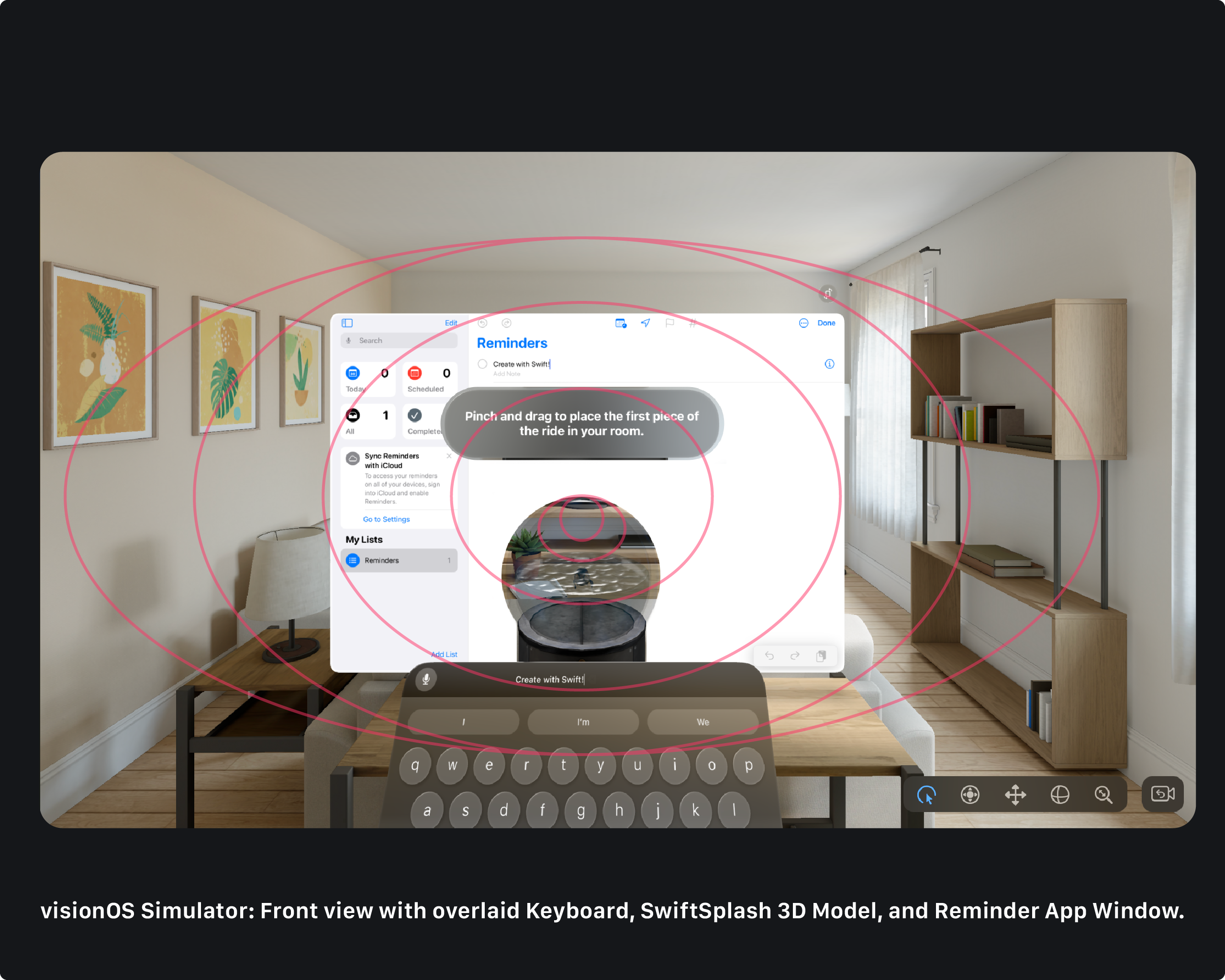
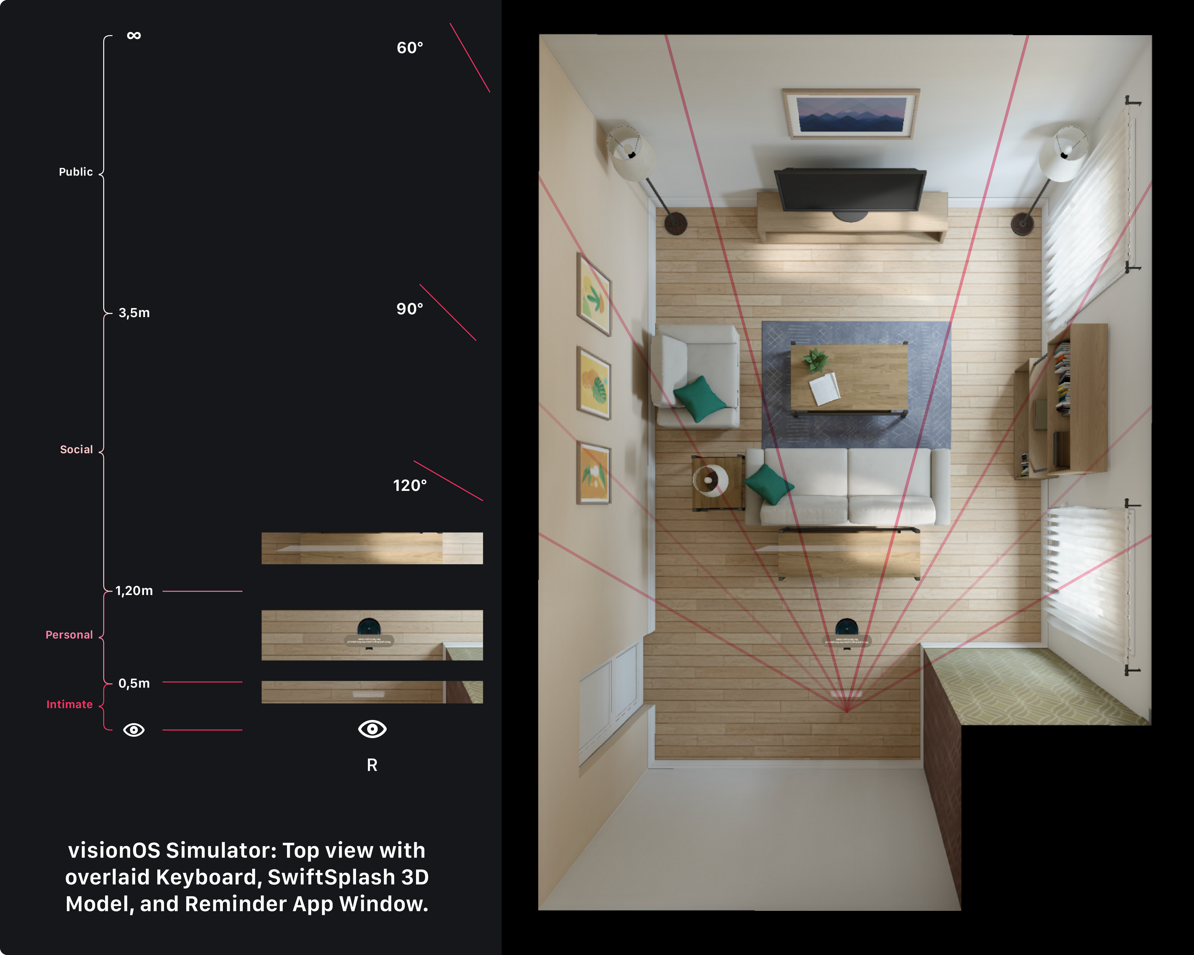
From both the front and top view perspectives, the keyboard was strategically positioned within the intimate zone, optimizing user engagement for more personal interactions. Simultaneously, the SwiftSplash toy found its place in the personal area, catering to slower comprehension efforts and allowing moderate animations.
Remarkably, the window element was located in the Social area, supporting activities requiring processing effort and accommodating moderate and brisk motion.
This intricate spatial orchestration not only ensures a seamless and user-friendly experience but also underscores the meticulous attention given to the alignment of visual elements with the specific characteristics of each spatial zone. Ultimately, the discovery that the degree marches corresponded with the angle vision of the FOV adds an extra layer of sophistication to the design, showcasing the depth of consideration given to spatial and visual factors in crafting immersive experiences within the visionOS ecosystem.
The tests underlined that the Speculative Spatial Design Canvas effectively translates these scientific principles into actionable design decisions within the visionOS environment, at least for the visionOS simulator beta. The correspondence between the degree marches and the angle of vision in the FOV further reinforces the canvas’s effectiveness in creating immersive and visually optimized experiences.
Conclusions
The challenges posed by Spatial Computing's first-person perspective, particularly Cybersickness, are explored. Cybersickness introduces concerns like limited engagement duration, ineffective content delivery, and physical/psychological risks. Addressing these challenges requires a nuanced understanding of human cognition, consciousness, and factors like self-location and proprioception.
The Speculative Spatial Design Canvas is highlighted as a valuable tool for iOS developers in Spatial Computing and visionOS development. Its data-driven and scientifically informed approach and empirical testing position it as a robust framework for creating immersive, visually optimized, and user-friendly XR experiences.
As the canvas evolves with technology and user feedback, it holds promise in shaping the future of Spatial Design in XR. To further aid you in this exploration, we invite you to download our Speculative Spatial Design Canvas, a tool crafted to empower designers in envisioning and crafting groundbreaking experiences. This canvas encapsulates the essence of Spatial Design, offering a structured framework to speculate, innovate, and bring to life the extraordinary possibilities that lie at the intersection of design and extended reality.
This article on research and innovation is indebted to the dedication of numerous scientists and academics with advanced knowledge in their fields. Their contributions form the foundation of our work, enabling us to explore the frontiers of Spatial Computing.
We extend our profound appreciation to these intellectual giants, recognizing their pivotal role in shaping the innovation landscape.


