Exploring Interactive Bottom Sheets in SwiftUI
Explore how to effectively use presentation detents to create interactive customized sheets like those in the Apple Maps, Find My and Stocks apps.
In apps like Maps, Find My and Stocks there’s a variation of sheets that remain visible at all times, giving users immediate access to specific features without overshadowing the background view, maintaining interaction.
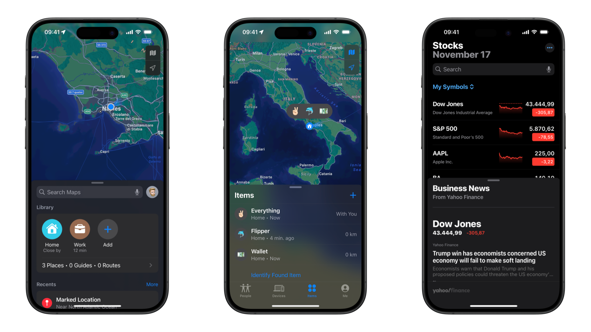
In this article, we’ll explore how to effectively use presentationDetents and related modifiers to create interactive customized sheets like those in the mentioned apps.
Sheets and Presentation Detents
Sheets in SwiftUI are a way to present modal content over the current view. Traditionally, sheets would cover the entire screen when presented.
In the Human Interface Guidelines in the Platform considerations for iOS and iPadOS there is also the mention of resizable sheets.
A resizable sheet expands when people scroll its contents or drag the grabber, which is a small horizontal indicator that can appear at the top edge of a sheet. Sheets resize according to their detents, which are particular heights at which a sheet naturally rests. Designed for iPhone, detents specify particular heights at which a sheet naturally rests.
Apple Human Interface Guidelines
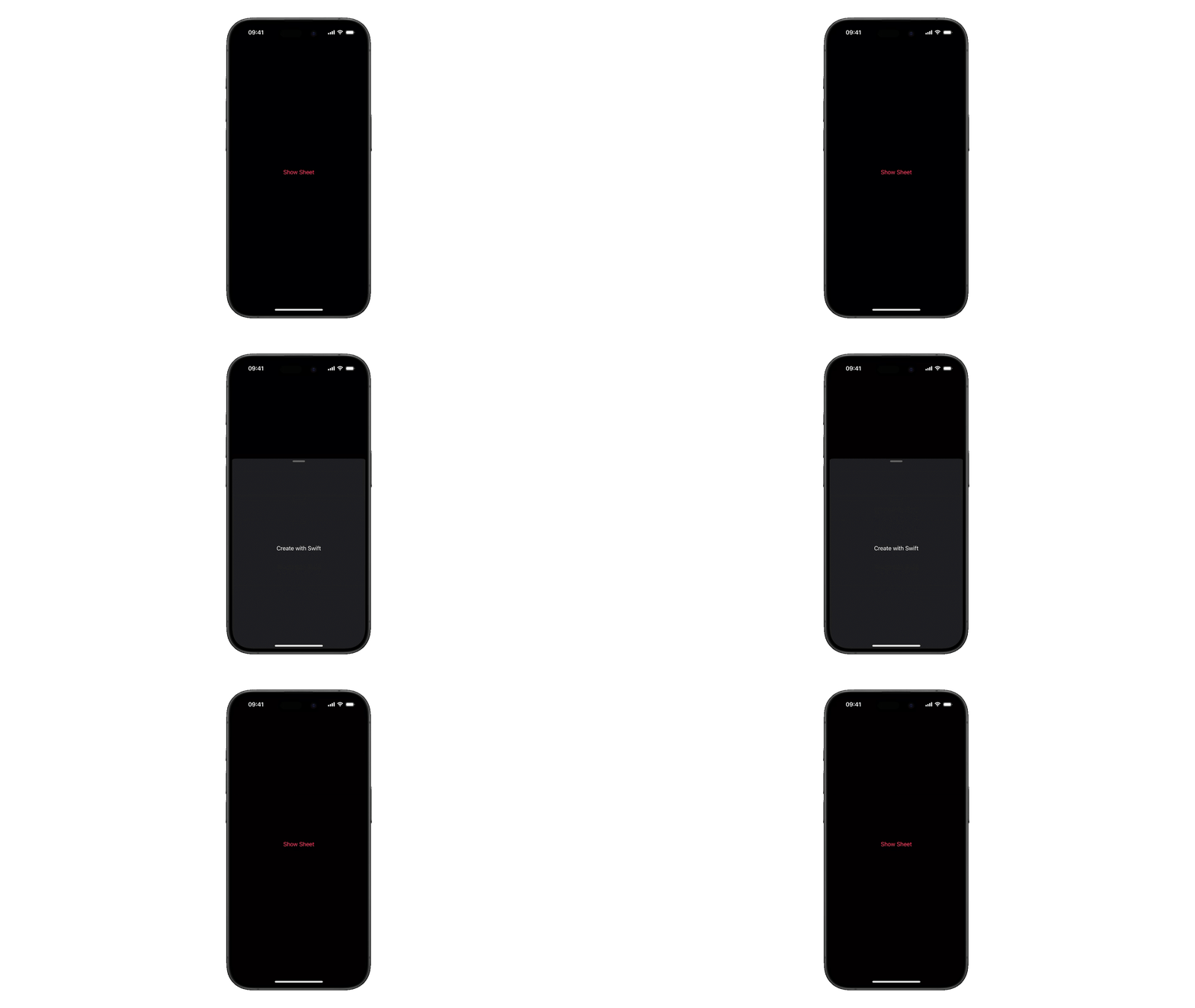
Detents were introduced in WWDC 2021 in UIKit as a way to create a layered and customized sheet experience allowing developers to specify preset heights for sheets. Presentation detents are predefined stopping points for sheet presentations in SwiftUI. They allow you to specify multiple height options for a sheet, giving users the ability to resize the sheet to different positions. With iOS 16, SwiftUI introduced detents and the presentationDetents(_:) modifiers allowing the creation of customized sheets, without the need to create a representation of the UISheetPresentationController.
struct ContentView: View {
    @State private var isSheetPresented = false

    var body: some View {
        Button("Show Sheet") {
            isSheetPresented.toggle()
        }
        .sheet(isPresented: $isSheetPresented) {
            Text("Create with Swift")
                .presentationDetents([.medium, .fraction(0.7), .large])
        }
    }
}
Built-in Sizes
SwiftUI provides two standard detent sizes:
struct ContentView: View {
    @State private var isSheetPresented = false

    var body: some View {
        Button("Show Sheet") {
            isSheetPresented.toggle()
        }
        .sheet(isPresented: $isSheetPresented) {
            Text("Create with Swift")
                .presentationDetents([.medium, .large])
        }
    }
}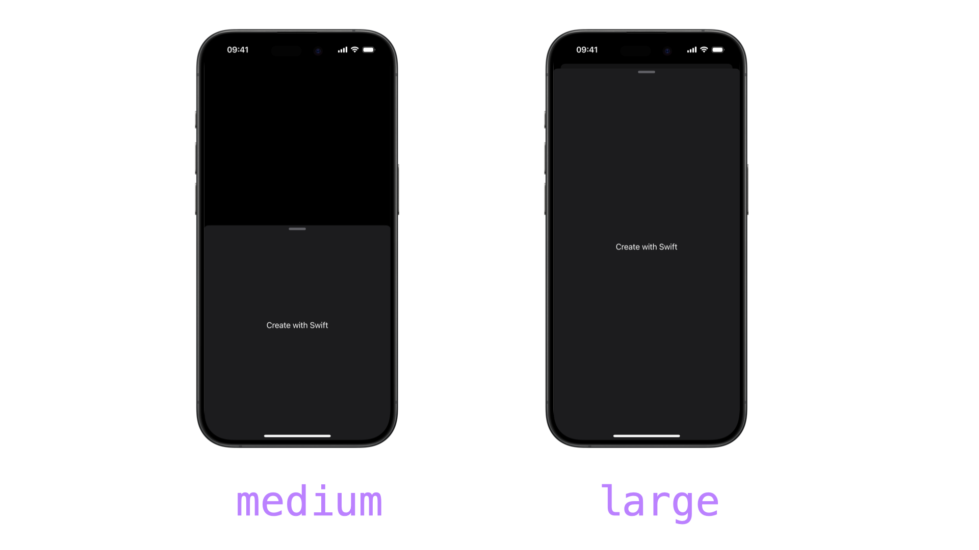
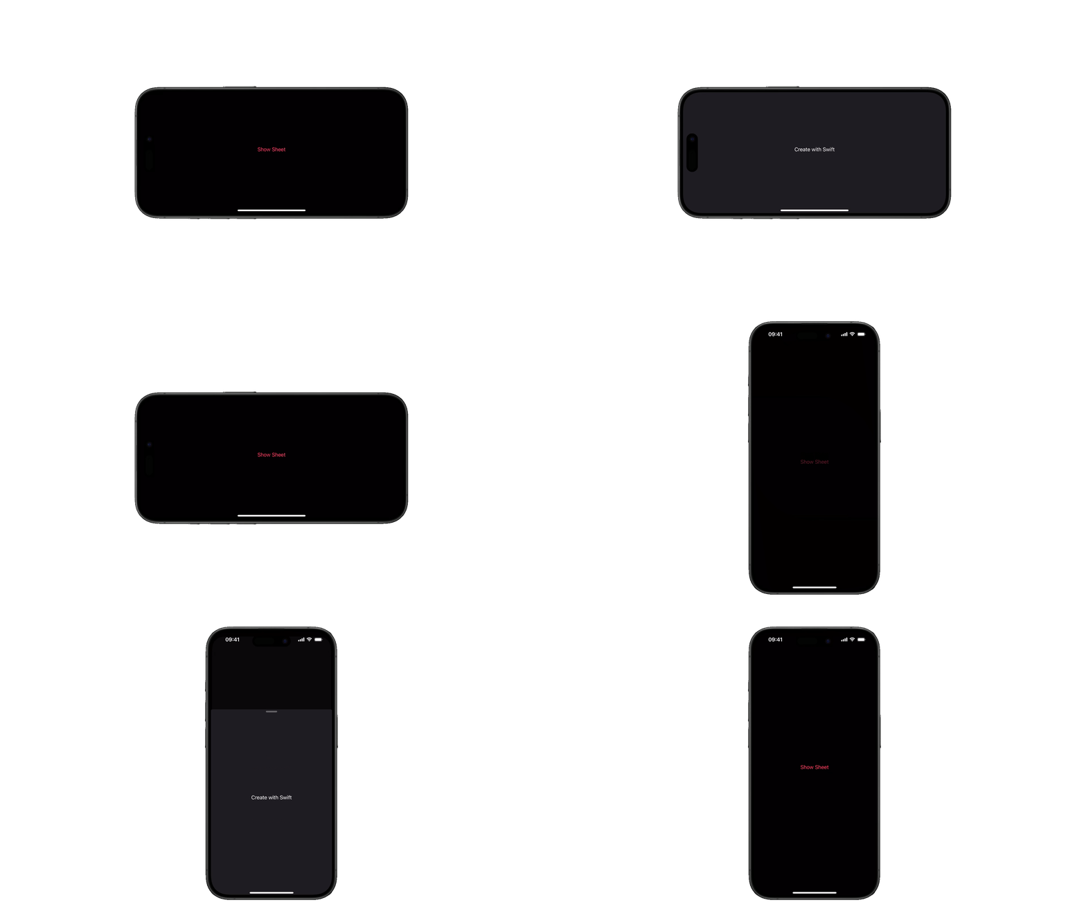
The medium detent is automatically disabled in landscape orientation to preserve usable space. All sheets will use the large detents in the landscape orientation independently of what is specified in the modifier.
Custom Sizes
For more precise control, SwiftUI offers several options for custom detents:
fraction(_ fraction: CGFloat)specifying
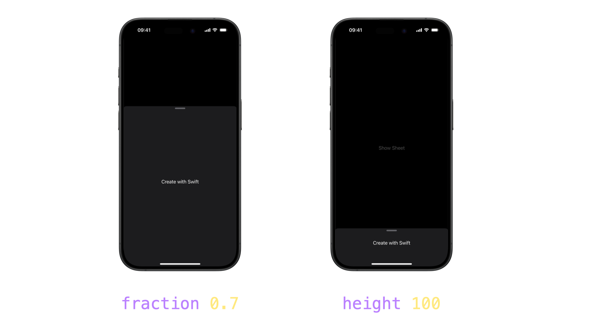
Specify a percentage of screen height (e.g.:.fraction(0.30)for 30% height)height(_ height: CGFloat)
Set an exact point heightcustom(_:)
A custom detent you defined with a calculated height.
struct ContentView: View {
    @State private var isSheetPresented = false

    var body: some View {
        Button("Show Sheet") {
            isSheetPresented.toggle()
        }
        .sheet(isPresented: $isSheetPresented) {
            Text("Create with Swift")
                .presentationDetents([.fraction(0.7), .height(100)])

        }
    }
}
You can also create a custom detent by conforming to the CustomPresentationDetent protocol and specifying the height.
private struct SmallDetent: CustomPresentationDetent {
    static func height(in context: Context) -> CGFloat? {
        return 100
    }
}

private struct CompactDetent: CustomPresentationDetent {
    static func height(in context: Context) -> CGFloat? {
        max(50, min(context.maxDetentValue * 0.3, 200))
    }
}
The first detent is the one we used before, which returns just a detention of a specific height. The second calculates a height between 50 and 200 points, but no more than 30% of the available height.
struct ContentView: View {
    @State private var isSheetPresented = false

    var body: some View {
        Button("Show Sheet") {
            isSheetPresented.toggle()
        }
        .sheet(isPresented: $isSheetPresented) {
            Text("Create with Swift")
                .presentationDetents([.custom(SmallDetent.self), .custom(CompactDetent.self)])
        }
    }
}

private struct SmallDetent: CustomPresentationDetent {
    static func height(in context: Context) -> CGFloat? {
        return 100
    }
}

private struct CompactDetent: CustomPresentationDetent {
    static func height(in context: Context) -> CGFloat? {
        max(50, min(context.maxDetentValue * 0.3, 200))
    }
}
To simplify usage across your app, extend PresentationDetent:
struct ContentView: View {
    @State private var isSheetPresented = false

    var body: some View {
        Button("Show Sheet") {
            isSheetPresented.toggle()
        }
        .sheet(isPresented: $isSheetPresented) {
            Text("Create with Swift")
                .presentationDetents([.small, .compact])
        }
    }
}

private struct SmallDetent: CustomPresentationDetent {
    static func height(in context: Context) -> CGFloat? {
        return 100
    }
}

private struct CompactDetent: CustomPresentationDetent {
    static func height(in context: Context) -> CGFloat? {
        max(50, min(context.maxDetentValue * 0.3, 200))
    }
}

extension PresentationDetent {
    static let small = PresentationDetent.custom(SmallDetent.self)

    static let compact = PresentationDetent.custom(CompactDetent.self)
}Drag Indicator Behavior
If only one detent is available the sheet won't display the drag indicator.
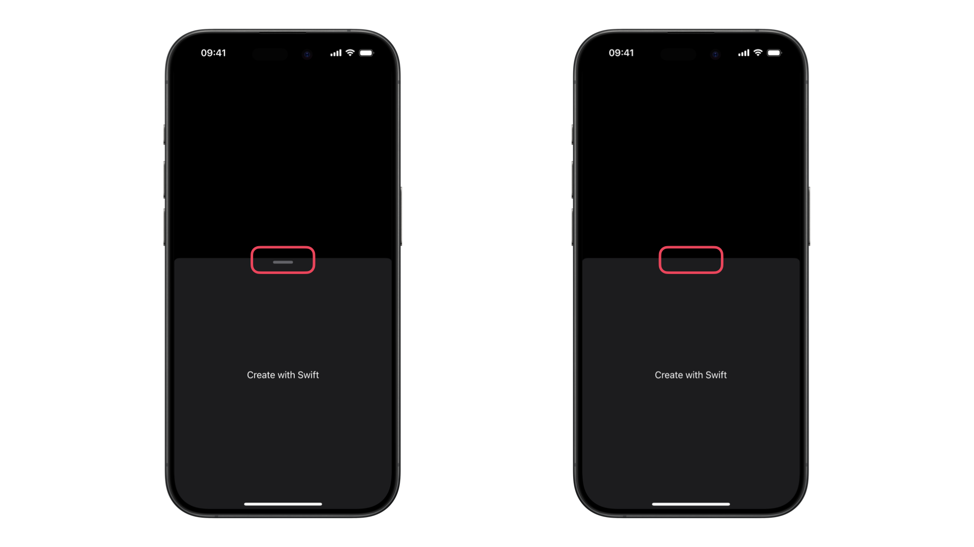
In fact, the drag indicator's visibility is automatically managed:
- Single detent:
Drag indicator hidden - Multiple detents:
Drag indicator visible
You can override this behavior with the presentationDragIndicator(_:) modifier. Set the visibility to visible to show the indicator even when only one detent is defined.
struct ContentView: View {
    @State private var isSheetPresented = false

    var body: some View {
        Button("Show Sheet") {
            isSheetPresented.toggle()
        }
        .sheet(isPresented: $isSheetPresented) {
            Text("Create with Swift")
                .presentationDetents([.medium])
                .presentationDragIndicator(.visible)
        }
    }
}
Or you can set the visibility to hidden to hide the indicator even when multiple detents are available:
struct ContentView: View {
    @State private var isSheetPresented = false

    var body: some View {
        Button("Show Sheet") {
            isSheetPresented.toggle()
        }
        .sheet(isPresented: $isSheetPresented) {
            Text("Create with Swift")
                .presentationDetents([.medium, .large])
                .presentationDragIndicator(.hidden)
        }
    }
}
Dynamically check or control the height
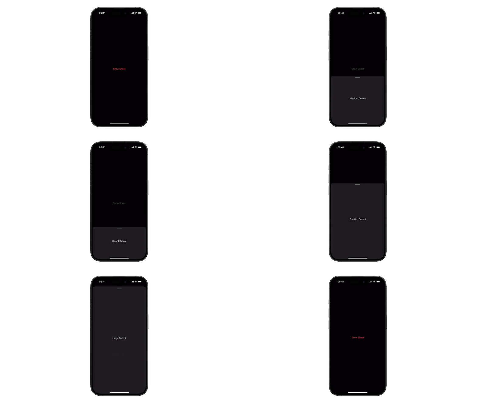
You may want to change the content of your sheet according to the space available. For this, you can dynamically check or control the sheet's height using a binding:
struct ContentView: View {
    @State private var selectedDetent: PresentationDetent = .medium
    @State private var isSheetPresented = false

    var body: some View {
        Button("Show Sheet") {
            isSheetPresented.toggle()
        }
        .sheet(isPresented: $isSheetPresented) {
            sheetContent
                .presentationDetents([.height(100), .medium, .fraction(0.7), .large], selection: $selectedDetent)
        }
    }

    @ViewBuilder
    private var sheetContent: some View {
        switch selectedDetent {
        case .medium:
            Text("Medium Detent")
        case .fraction(0.7):
            Text("Fraction Detent")
        case .large:
            Text("Large Detent")
        case .height(100):
            Text("Height Detent")
        default:
            Text("Unknown Detent")
        }
    }
}
Preventing Sheet Dismissal
In the examples above the user is able to dismiss the sheet. To replicate interfaces like Maps you can prevent the interactive dismissal of the sheet from the user with the interactiveDismissDisabled(_:) modifier and have it always presented by setting up a constant value for the isPresented parameter, using the Binding.constant(_:) method.
struct ContentView: View {
    @State private var selectedDetent: PresentationDetent = .height(100)

    var body: some View {
        Text("Create with Swift")
            .sheet(isPresented: .constant(true)) {
                VStack {
                    Image(systemName: "swift")
                        .resizable()
                        .scaledToFit()
                        .padding()
                        .foregroundStyle(Color.accentColor)
                    if (selectedDetent != .height(100)) {
                        Text("We can’t wait to see what you will Create with Swift!")
                    }
                }
                .presentationDetents([.height(100), .medium, .large], selection: $selectedDetent)
                .interactiveDismissDisabled()
        }
    }
}isDisabled parameter. 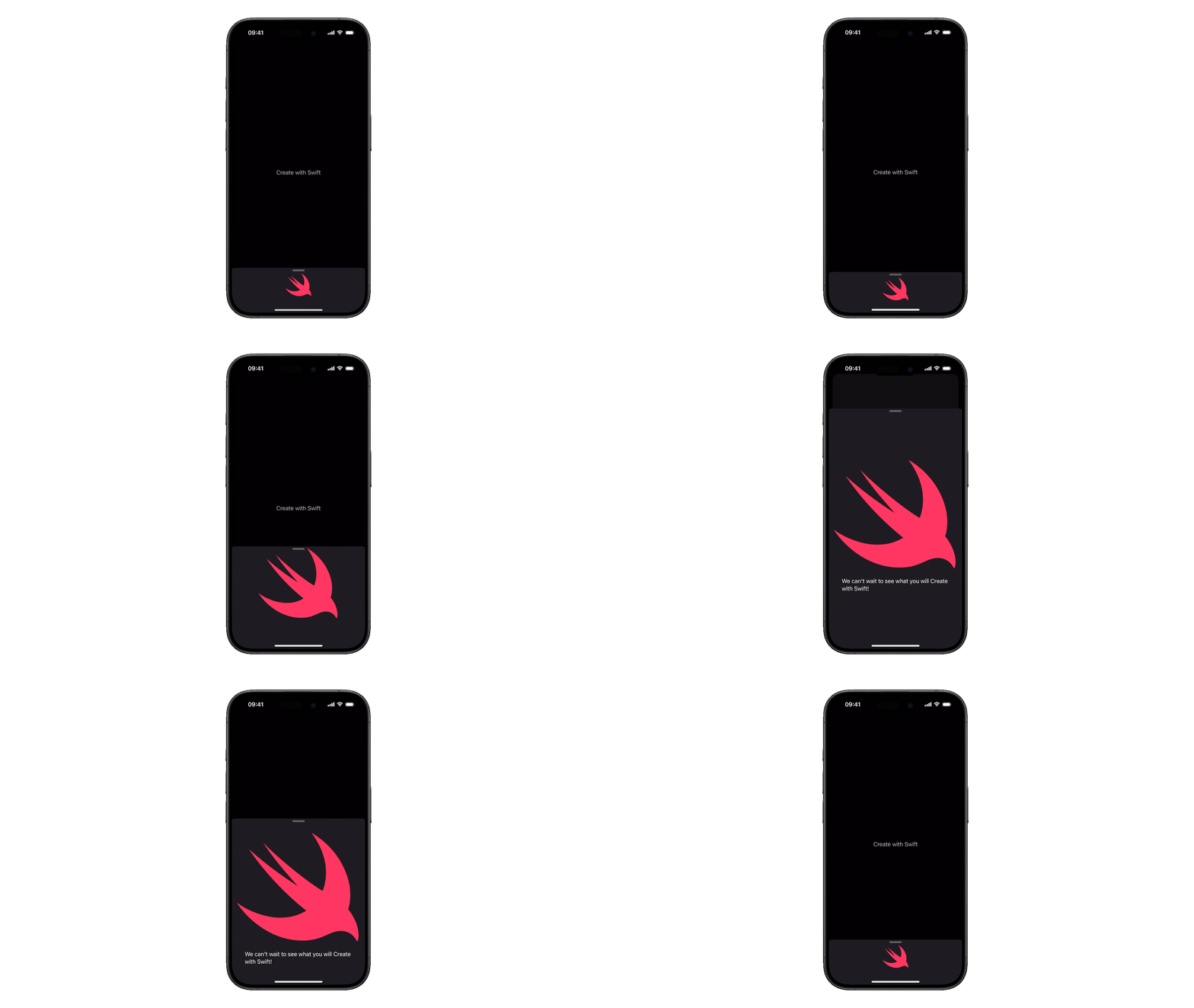
Background Interaction
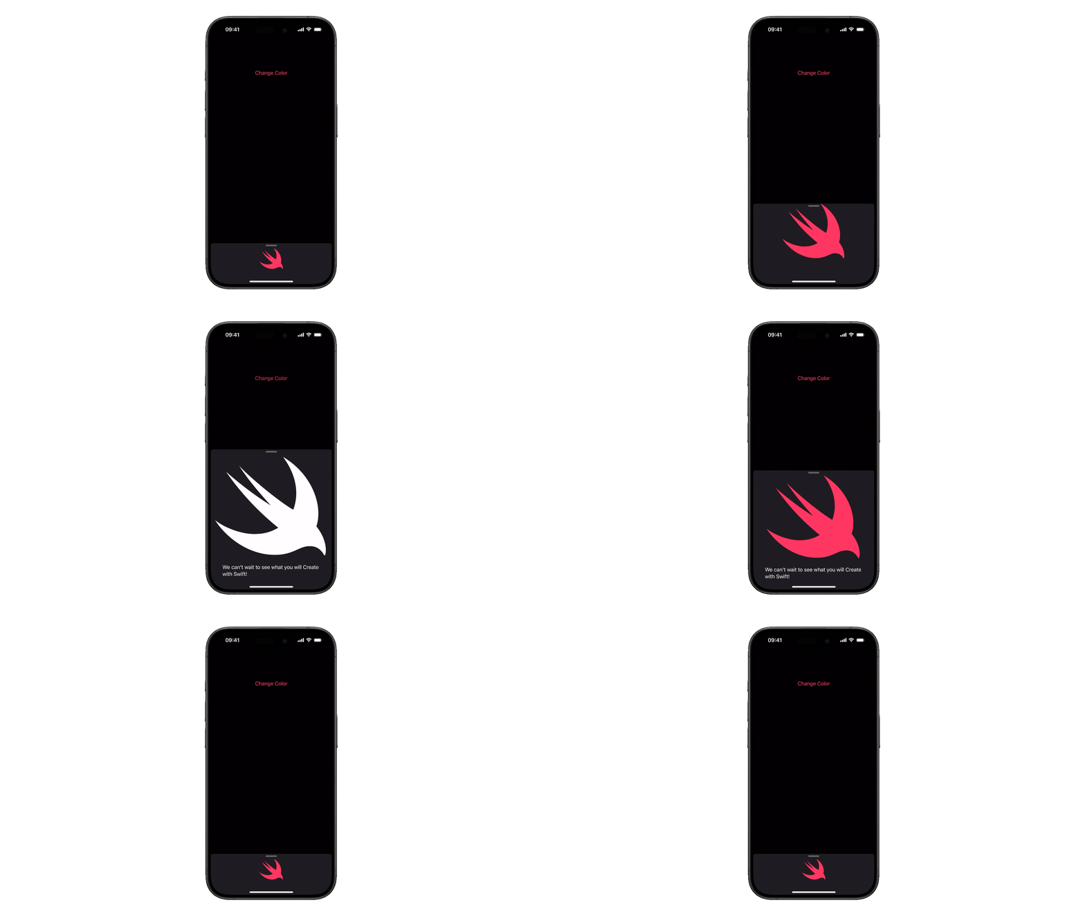
All the previous implementations of a sheet leave the background view non-interactive. In default sheet configurations, the background view is usually non-interactive while the sheet is active, preventing accidental touches. If you want to allow the user to interact with the background view while a sheet is presented use the presentationBackgroundInteraction(_:) modifier.
struct ContentView: View {
    @State private var selectedDetent: PresentationDetent = .height(100)

    @State private var selectedColor: Color = Color.accentColor

    var body: some View {
        VStack {
            Button("Change Color", action: {
                selectedColor = selectedColor == .accentColor ? .white : .accentColor
            })
            .padding(.top)
            Spacer()
        }
            .sheet(isPresented: .constant(true)) {
                VStack {
                    Image(systemName: "swift")
                        .resizable()
                        .scaledToFit()
                        .padding()
                        .foregroundStyle(selectedColor)
                    if (selectedDetent != .height(100)) {
                        Text("We can’t wait to see what you will Create with Swift!")
                    }
                }
                .presentationDetents([.height(100), .medium, .large], selection: $selectedDetent)
                .interactiveDismissDisabled()
                .presentationBackgroundInteraction(.enabled)
        }
    }
}
Conditional Background Interaction
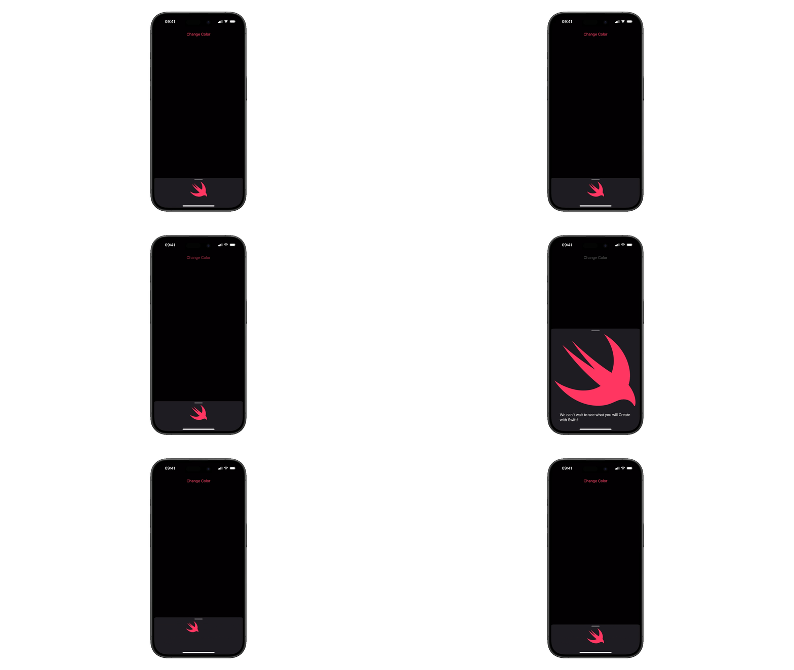
You can even specify which detent level background interaction is permitted with the upThrough parameter. For example, .enabled(upThrough: .medium) enables interaction with the background view when the sheet is at or below the medium detent, while the background remains non-interactive at the large detent.
struct ContentView: View {
    @State private var selectedDetent: PresentationDetent = .height(100)

    @State private var selectedColor: Color = Color.accentColor

    var body: some View {
        VStack {
            Button("Change Color", action: {
                selectedColor = selectedColor == .accentColor ? .white : .accentColor
            })
            .padding(.top)
            Spacer()
        }
            .sheet(isPresented: .constant(true)) {
                VStack {
                    Image(systemName: "swift")
                        .resizable()
                        .scaledToFit()
                        .padding()
                        .foregroundStyle(selectedColor)
                    if (selectedDetent != .height(100)) {
                        Text("We can’t wait to see what you will Create with Swift!")
                    }
                }
                .presentationDetents([.height(100), .medium, .large], selection: $selectedDetent)
                .interactiveDismissDisabled()
                .presentationBackgroundInteraction(.enabled(upThrough: .height(100)))
        }
    }
}
We explored how SwiftUI's presentation detents and background interaction modifiers make sophisticated interfaces easy to implement. Through a combination of customizable heights, drag indicators, and interactive backgrounds, developers can now create sheets that enhance rather than interrupt the user experience. These features enable the creation of persistent, interactive interfaces that maintain context while providing additional functionality.

