Exploring Tab View Styles in SwiftUI
Explore the different styles a tab view can have in a SwiftUI app on iOS and iPadOS.
The TabView container is essential for creating simple and effective navigation within our apps. While the default appearance of this component is sufficient for most cases, there are instances where there is a need for something that looks different.
By applying the tabViewStyle() modifier to a TabView, you can enhance and customize both its interaction and appearance by using one of the built-in objects that conform to the TabViewStyle protocol.
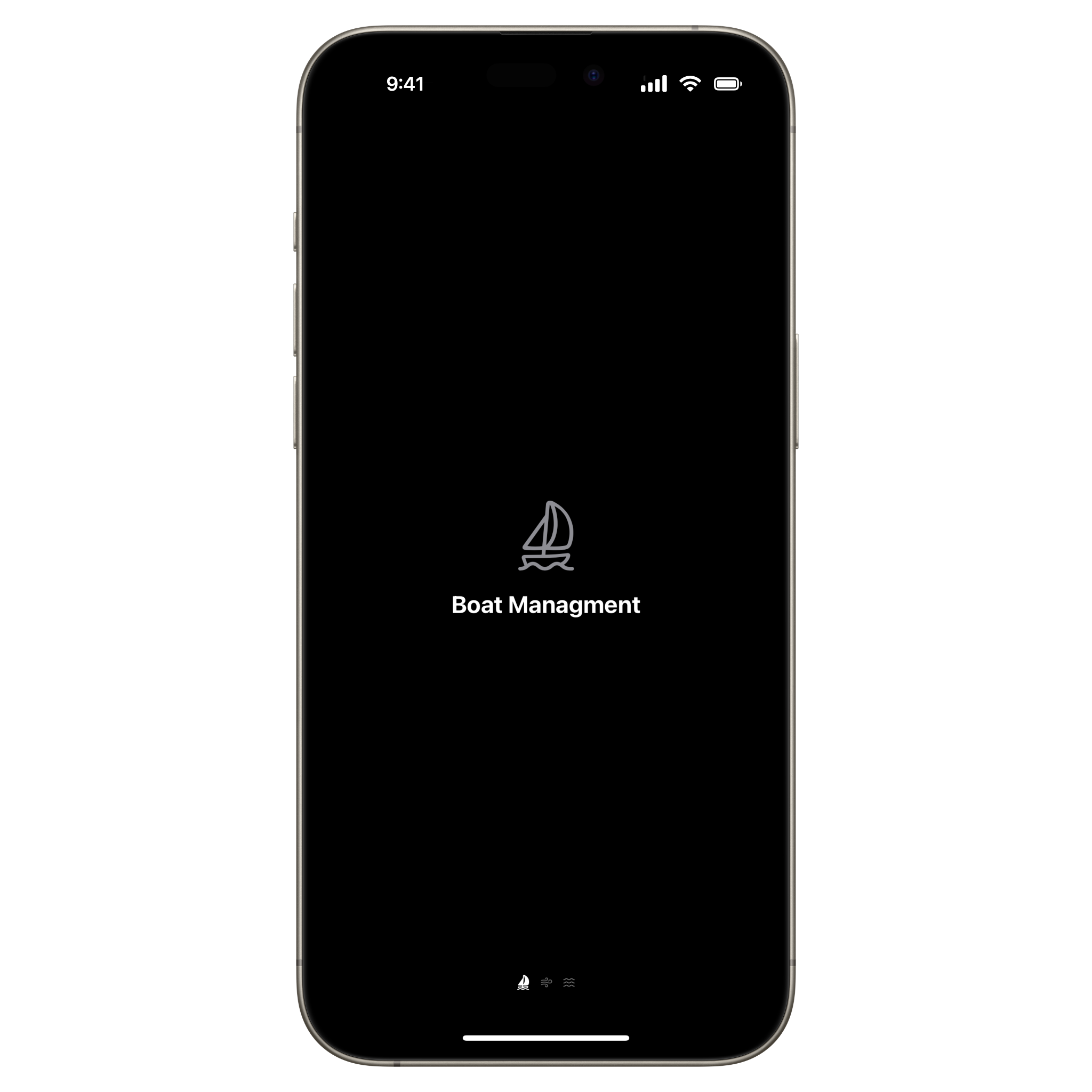
One example is the page style that will present the different sections as horizontal scrolling pages.
import SwiftUI

struct ContentView: View {

    var body: some View {
        TabView {
            Tab("Boat", systemImage: "sailboat") {
                BoatView()
            }

            Tab("Wind", systemImage: "wind") {
                WindConditionView()
            }

            Tab("Sea", systemImage: "water.waves") {
                WaterConditionView()
            }
        }
        .tabViewStyle(.page)
    }
}
We can also customize the way the page index view is presented using the indexViewStyle(_:) modifier. The following example uses the page(backgroundDisplayMode: .always) value:

iPadOS
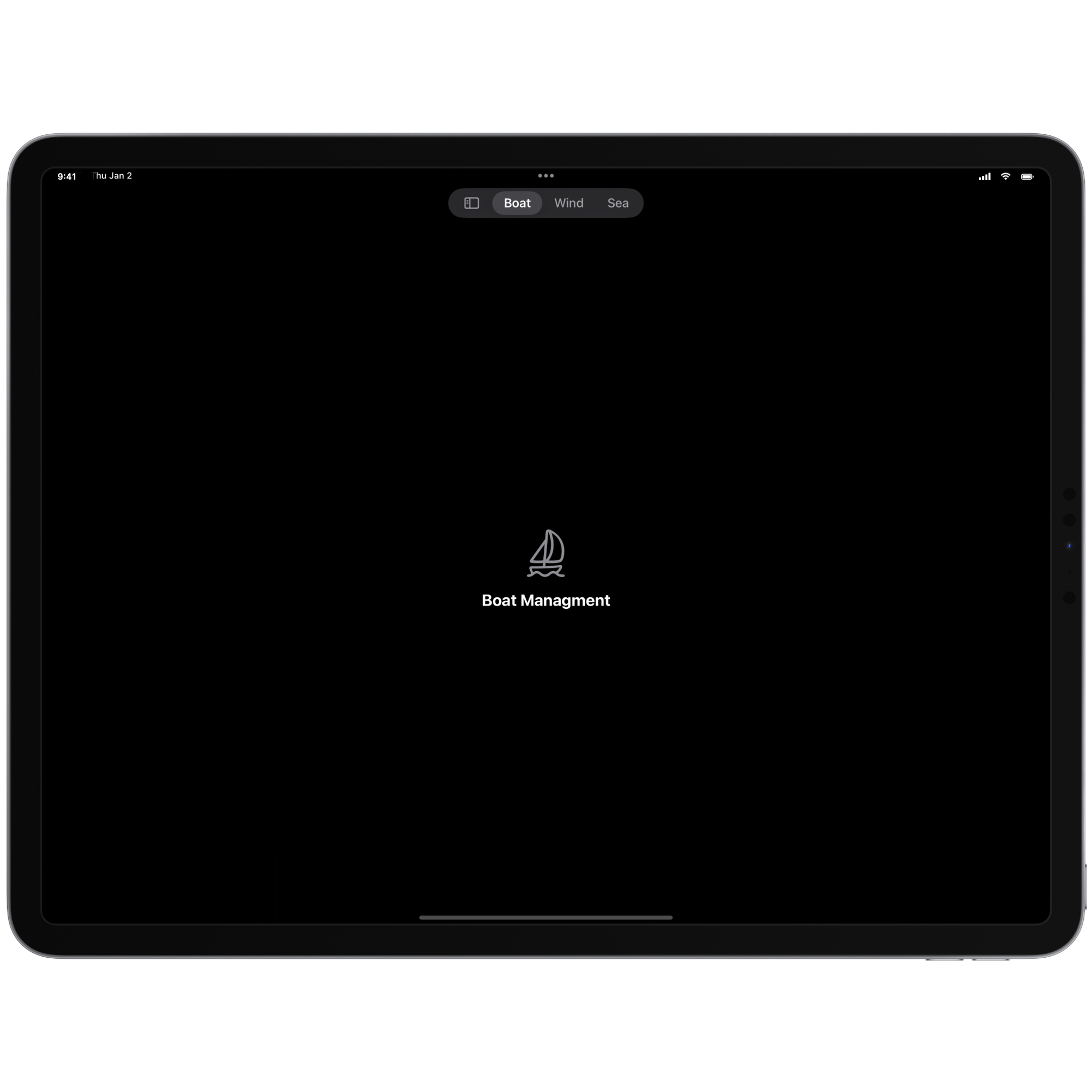
Something that deserves particular attention is the new sidebarAdaptable style specifically designed for iPadOS. It allows us to customize different aspects of the tab bar, such as the connection with a sidebar, the order of the different tabs, and the possibility of creating sections within the sidebar itself.
import SwiftUI

struct ContentView: View {

    var body: some View {
        TabView {
            Tab("Boat", systemImage: "sailboat") {
                BoatView()
            }

            Tab("Wind", systemImage: "wind") {
                WindConditionView()
            }

            Tab("Sea", systemImage: "water.waves") {
                WaterConditionView()
            }
        }
        .tabViewStyle(.sidebarAdaptable)
    }

}

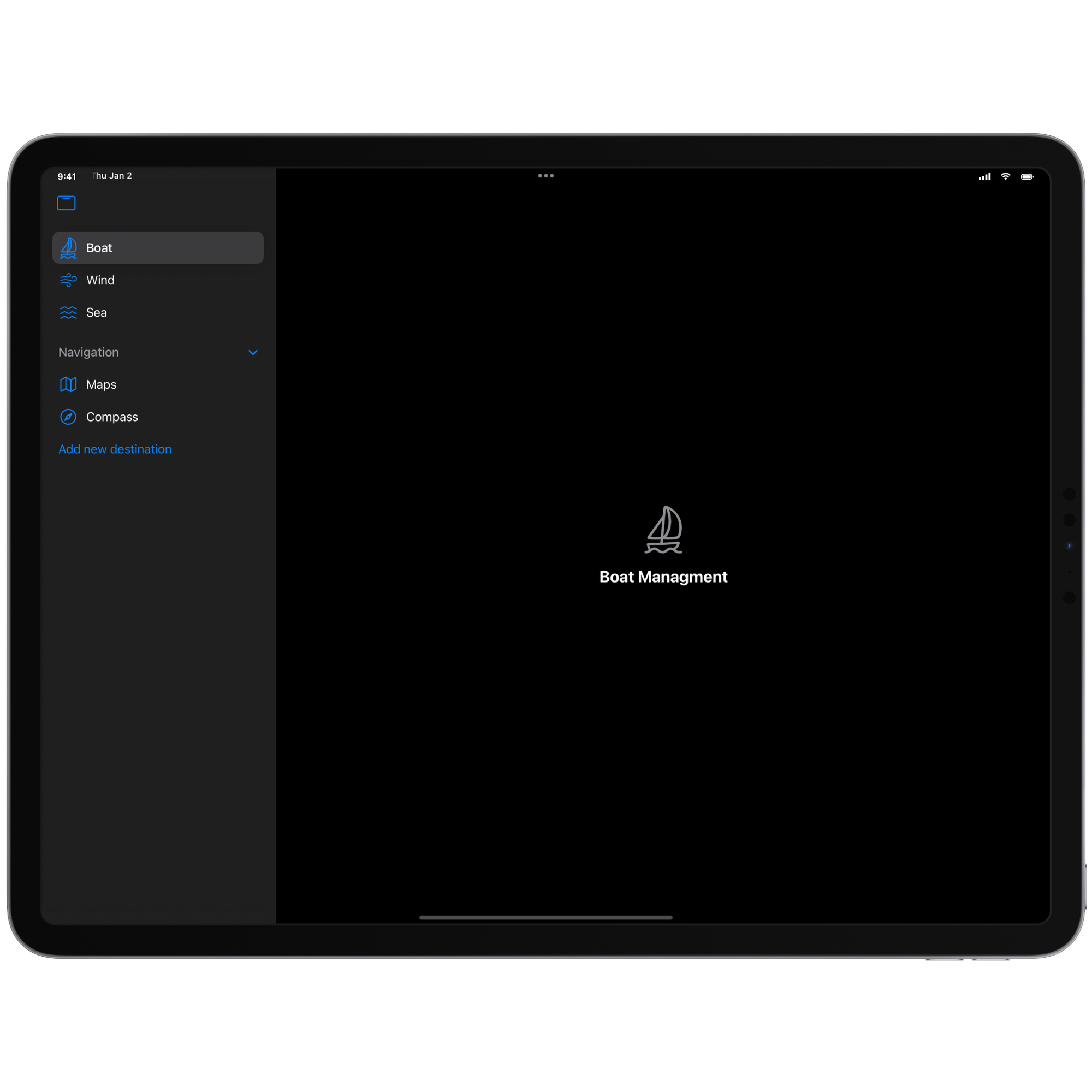
By applying the sidebarAdaptable style, the floating tab bar presents a button that allows users to view it as a sidebar. Once it is presented, the sidebar can host a more comprehensive set of options for the developer, including the ability to group tabs into sections using the TabSection container.
Additionally, developers can provide controls within the sidebar to execute specific actions using the sectionActions(content:) modifier.
import SwiftUI

struct ContentView: View {

    var body: some View {
        TabView {
            Tab("Boat", systemImage: "sailboat"){
                BoatView()
            }
            Tab("Wind", systemImage: "wind"){
                WindConditionView()
            }
            Tab("Sea", systemImage: "water.waves"){
                WaterConditionView()
            }

            TabSection {
                Tab("Maps", systemImage: "map") {
                    Text("Maps")
                }
                Tab("Compass", systemImage: "safari") {
                    Text("Compass")
                }
            } header: {
                Label("Navigation", systemImage: "folder")
            }
            .sectionActions {
                Button("Add new destination"){}
            }
        }
        .tabViewStyle(.sidebarAdaptable)
    }

}
A particularly powerful feature is the ability to customize the tabs displayed in the tab bar, allowing users to select the sections they use most frequently.
To implement it create a TabViewCustomization object. It can be persisted using the @AppStorage property wrapper, leveraging UserDefaults to store and manage the user’s sidebar preferences.
import SwiftUI

struct ContentView: View {

    @AppStorage("sidebarCustomization") var sidebarCustomization: TabViewCustomization

    var body: some View { ... }
}
Each tab must be marked with the customizationID(_:) modifier, assigning a unique identifier to each tab. Apple recommends using a unique identifier that adheres to the following pattern:
com.AppName.TabName
import SwiftUI

struct ContentView: View {
    @AppStorage("sidebarCustomization") var sidebarCustomization: TabViewCustomization

    var body: some View {
        TabView {
            Tab("Boat", systemImage: "sailboat") {
                BoatView()
            }
            .customizationID("com.Sailwise.Boat")

            Tab("Wind", systemImage: "wind") {
                WindConditionView()
            }
            .customizationID("com.Sailwise.Wind")

            Tab("Sea", systemImage: "water.waves") {
                WaterConditionView()
            }
            .customizationID("com.Sailwise.Sea")

            TabSection {
                Tab("Maps", systemImage: "map") {
                    Text("Maps")
                }
                .customizationID("com.Sailwise.Maps")

                Tab("Compass", systemImage: "safari") {
                    Text("Compass")
                }
                .customizationID("com.Sailwise.Compass")
            } header: {
                Label("Navigation", systemImage: "folder")
            }
            .customizationID("com.Sailwise.NavigationSection")
            .sectionActions {
                Button("Add new destination") { }
            }
        }
        .tabViewStyle(.sidebarAdaptable)
        .tabViewCustomization($sidebarCustomization)
    }

}
By applying the tabViewCustomization(_:) modifier to the tab view passing the sidebarCustomization object every customization chosen by users will remain stored and applied.
To let the user customize the order of the tabs we can enable drag and drop capability for each tab just by adding the draggable(_:) modifier:
import SwiftUI

struct ContentView: View {

    @AppStorage("sidebarCustomization") var sidebarCustomization: TabViewCustomization

    var body: some View {
        TabView{
            Tab("Boat", systemImage: "sailboat") {
                BoatView()
                    .draggable("boat")
            }
            .customizationID("com.Sailwise.Boat")

            Tab("Wind", systemImage: "wind") {
                WindConditionView()
                    .draggable("wind")
            }
            .customizationID("com.Sailwise.Wind")

            Tab("Sea", systemImage: "water.waves") {
                WaterConditionView()
                    .draggable("Water")
            }
            .customizationID("com.Sailwise.Sea")

            TabSection {
                Tab("Maps", systemImage: "map") {
                    Text("Maps")
                        .draggable("Maps")
                }
                .customizationID("com.Sailwise.Maps")

                Tab("Compass", systemImage: "safari") {
                    Text("Compass")
                        .draggable("Maps")
                }
                .customizationID("com.Sailwise.Compass")
            } header: {
                Label("Navigation", systemImage: "folder")
            }
            .customizationID("com.Sailwise.NavigationSection")
            .sectionActions {
                Button("Add new destination"){
                }
            }
        }
        .tabViewStyle(.sidebarAdaptable)
        .tabViewCustomization($sidebarCustomization)
    }

}
To programmatically reset the order of section items, you can use resetVisibility(). It will restore the default arrangement of sections in the sidebar.
If you want to keep a TabSection visible in the sidebar only use the defaultVisibility(.hidden, for: .tabBar) modifier on it:
import SwiftUI

struct ContentView: View {
    @AppStorage("sidebarCustomization") var sidebarCustomization: TabViewCustomization

    var body: some View {
        TabView {
            Tab("Boat", systemImage: "sailboat") {
                BoatView()
                    .draggable("boat")
            }
            .customizationID("com.Sailwise.Boat")

            Tab("Wind", systemImage: "wind") {
                WindConditionView()
                    .draggable("wind")
            }
            .customizationID("com.Sailwise.Wind")

            Tab("Sea", systemImage: "water.waves") {
                WaterConditionView()
                    .draggable("Water")
            }
            .customizationID("com.Sailwise.Sea")

            TabSection {
                Tab("Maps", systemImage: "map") {
                    Text("Maps")
                        .draggable("Maps")

                }
                .customizationID("com.Sailwise.Maps")

                Tab("Compass", systemImage: "safari") {
                    Text("Compass")
                        .draggable("Maps")
                }
                .customizationID("com.Sailwise.Compass")
            } header: {
                Label("Navigation", systemImage: "folder")
            }
            .sectionActions {
                Button("Add new destination"){}
            }
            // Defines the visibility of the TabSection
            .defaultVisibility(.hidden, for: .tabBar)
        }
        .tabViewStyle(.sidebarAdaptable)
        .tabViewCustomization($sidebarCustomization)
    }
}
For enhanced customization, developers can utilize three additional modifiers to extend the functionality of the sidebar:
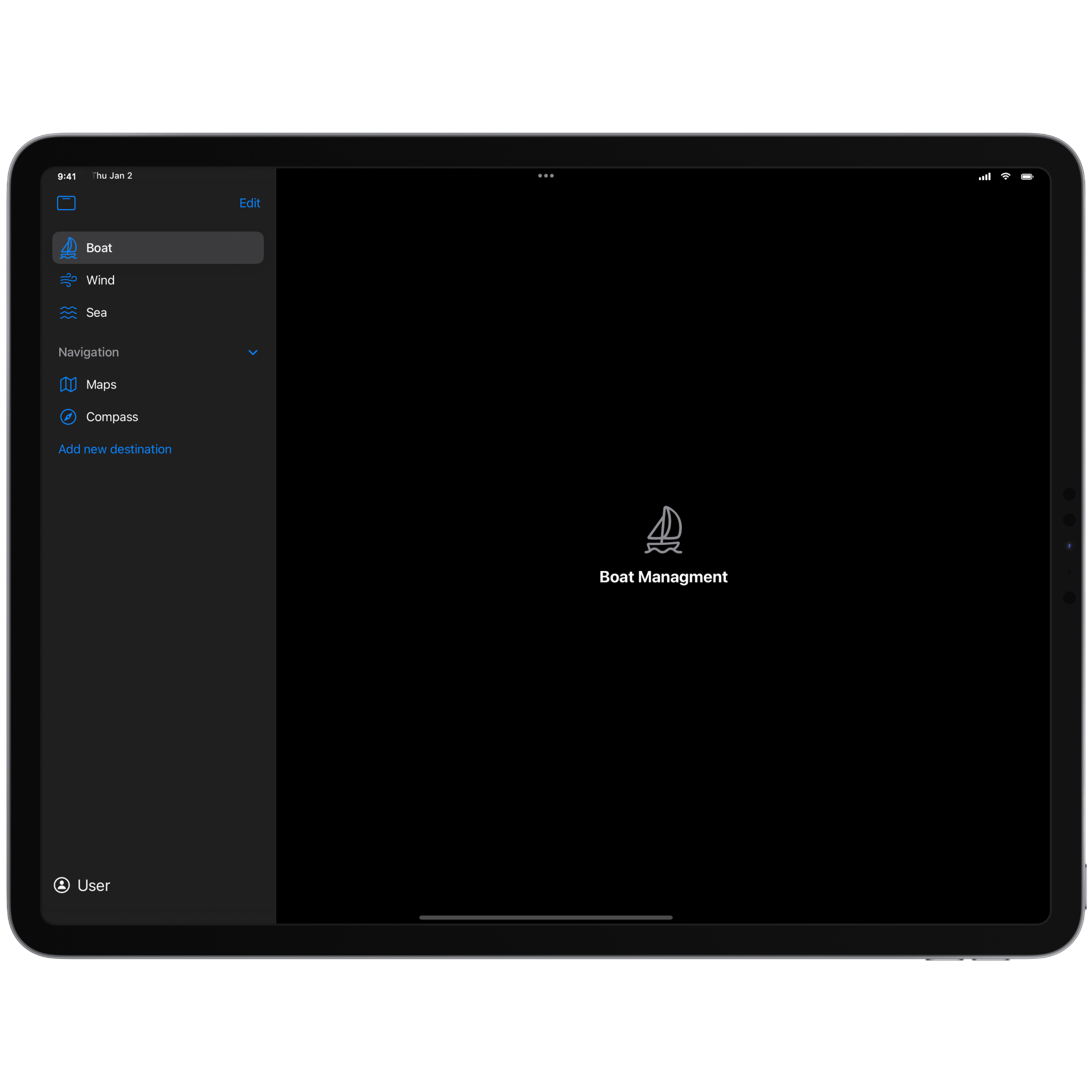
tabViewSidebarHeader: Allows you to specify content to display at the top of the sidebar, ideal for branding, user profiles, or navigation aids.tabViewSidebarFooter: Enables the addition of content at the bottom of the sidebar, commonly used for supplementary links, copyright notices, or compact summaries.tabViewSidebarBottomBar: Provides a dedicated space for a bottom bar, suitable for persistent controls, actions, or quick-access buttons.
With these modifiers, you can pass any custom View content to be displayed in the corresponding section of the sidebar.
struct ContentView: View {
    @AppStorage("sidebarCustomization") var sidebarCustomization: TabViewCustomization

    var body: some View {
        TabView {
            Tab("Boat", systemImage: "sailboat") {
                BoatView()
                    .draggable("boat")
            }
            .customizationID("com.Sailwise.Boat")

            Tab("Wind", systemImage: "wind") {
                WindConditionView()
                    .draggable("wind")
            }
            .customizationID("com.Sailwise.Wind")

            Tab("Sea", systemImage: "water.waves") {
                WaterConditionView()
                    .draggable("Water")
            }
            .customizationID("com.Sailwise.Sea")

            TabSection {
                Tab("Maps", systemImage: "map") {
                    Text("Maps")
                        .draggable("Maps")
                }
                .customizationID("com.Sailwise.Maps")

                Tab("Compass", systemImage: "safari") {
                    Text("Compass")
                        .draggable("Maps")
                }
                .customizationID("com.Sailwise.Compass")
            } header: {
                Label("Navigation", systemImage: "folder")
            }
            .sectionActions {
                Button("Add new destination") { }
            }
            .defaultVisibility(.hidden, for: .tabBar)

        }
        .tabViewStyle(.sidebarAdaptable)
        .tabViewCustomization($sidebarCustomization)

        .tabViewSidebarHeader {
            // Add views to show on the header of the sidebar
        }

        .tabViewSidebarBottomBar {
            Label("User", systemImage: "person.circle")
                .font(.title2)
                .padding()
                .frame(maxWidth: .infinity, alignment: .leading)
        }
    }
}

