
Exploring the Navigation Split View
Explore the NavigationSplitView on different platforms, how to use it and the related modifiers.


The NavigationSplitView is a user interface component that enables a sidebar-detail interface, where the primary view (sidebar) controls the content of the secondary view (detail). This design pattern is particularly effective for applications that manage a collection of items and need to display detailed information about a selected item.
We can implement this type of navigation in our apps by using the NavigationSplitView container, that works exactly as the NavigationStack that we place at the root of our app to create navigation inside our app, to create multi-column interfaces.
The appearance across different OS
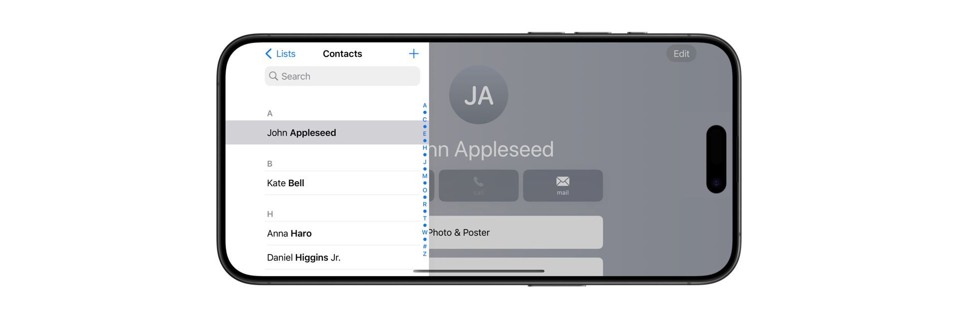
iPadOS
On iPadOS, the NavigationSplitView makes full use of the larger screen by occupying the entire display. Users can hide the sidebar by pressing the Sidebar button and bring it back by swiping from left to right for a quick view, or by pressing the button again to keep it fixed. This behavior remains consistent in both portrait and landscape modes.
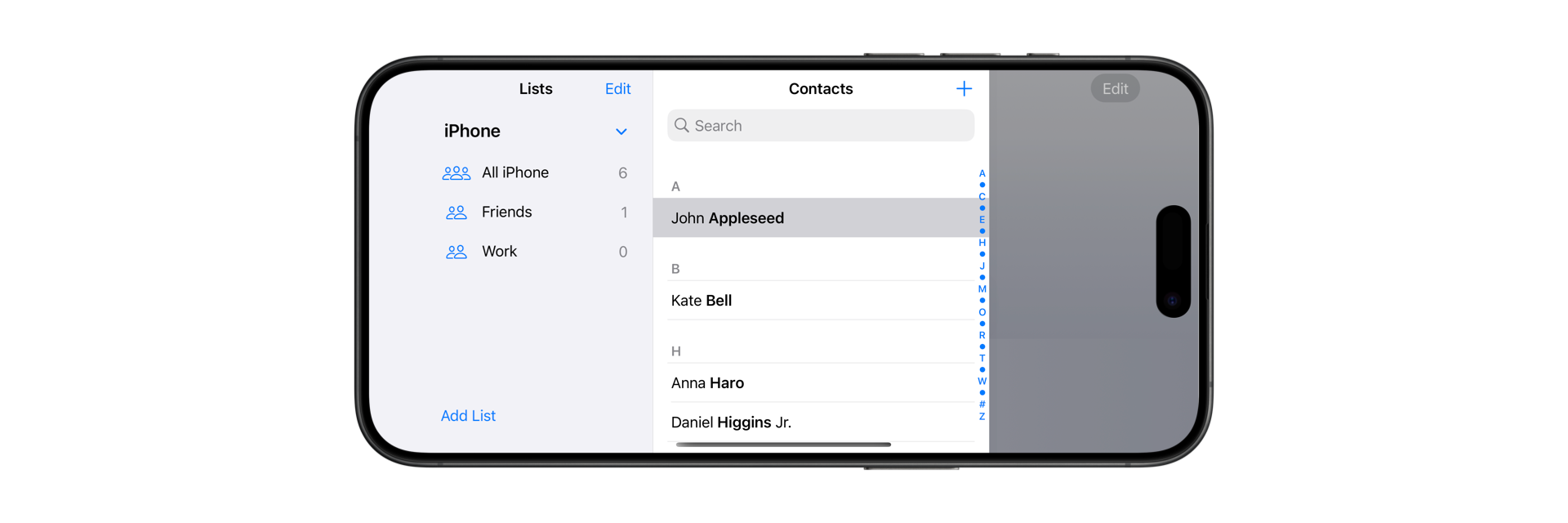
macOS
On macOS, the NavigationSplitView integrates smoothly into the desktop environment with a translucent Sidebar, enhancing the contrast between the sidebar and the content.
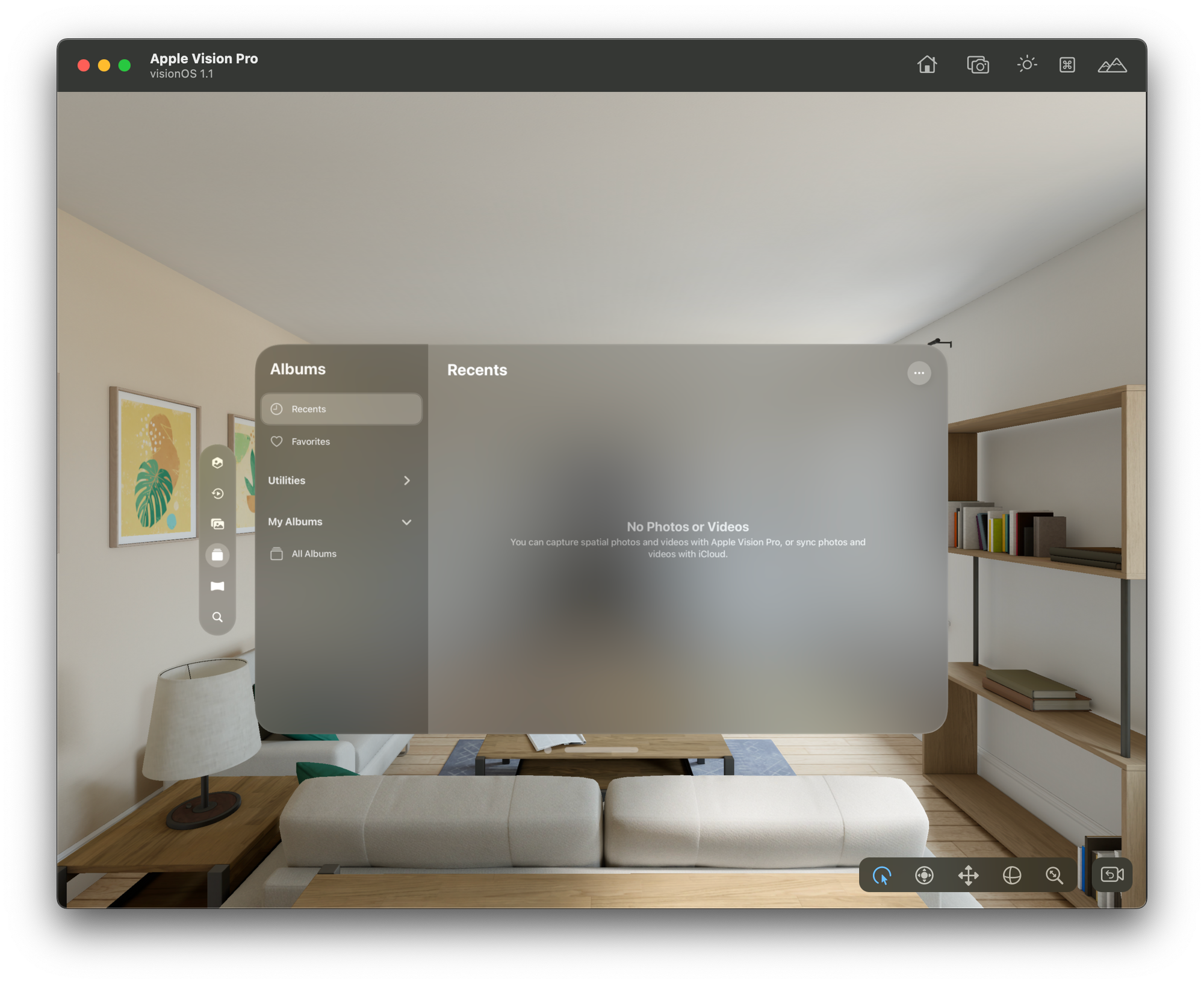
VisionOS
In visionOS, the NavigationSplitView combines elements of both macOS and iPadOS. The sidebar features a glass material that distinguishes the entire operating system. Additionally, visionOS allows combining the tab bar and sidebar, creating a more structured hierarchy for content.
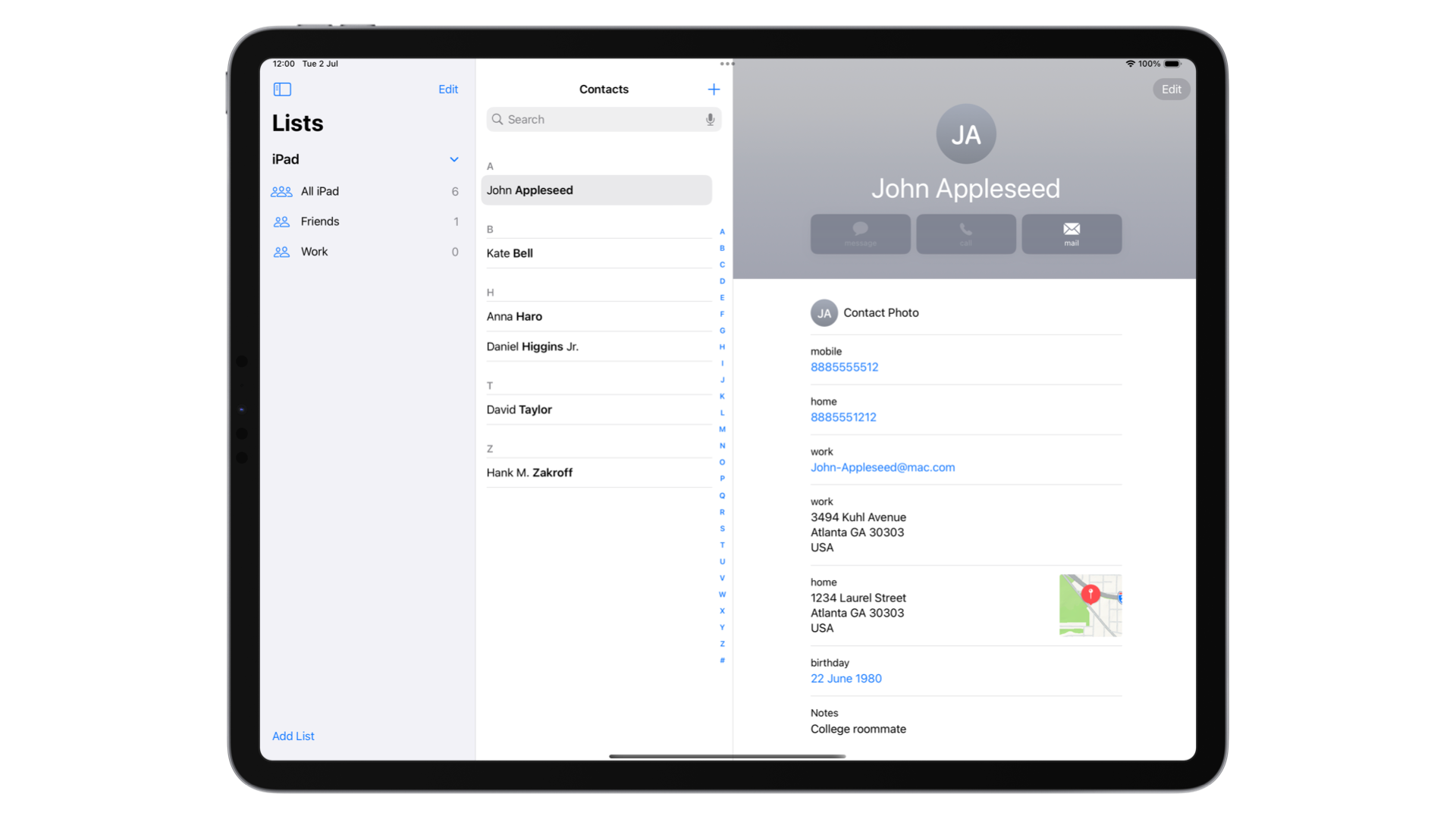
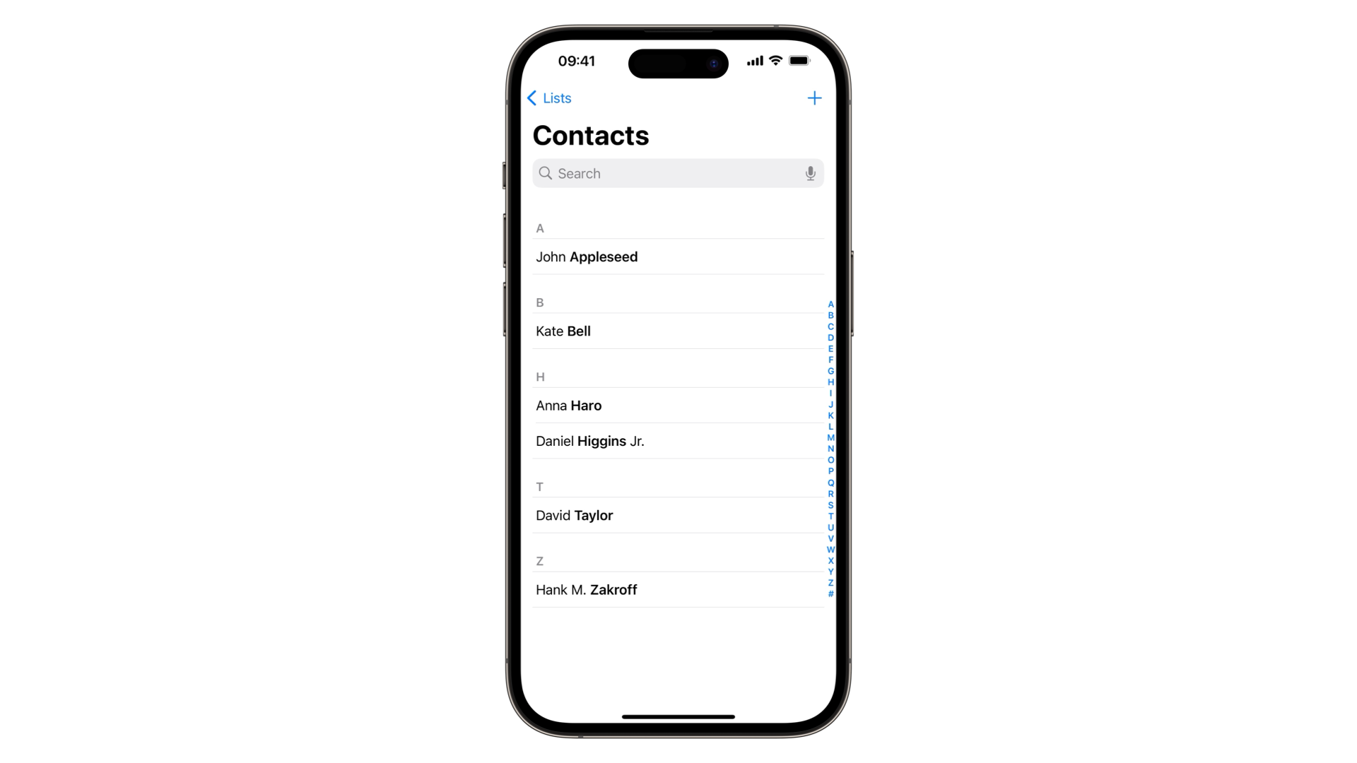
iOS
On iOS, the NavigationSplitView is optimized for larger devices like the iPhone Max models. In landscape mode, it prioritizes the detail section while maintaining access to the sidebar, making efficient use of the additional screen space. In portrait mode, the NavigationSplitView behaves like a NavigationStack, ensuring compatibility and ease of use across multiple platforms. This adaptability allows developers to support multi-platform navigation.
In portrait mode, the NavigationSplitView will function the same as the NavigationStack, making it easy for us to support multi-platform navigation.
How to use it
You can create a simple two-column layout using the NavigationSplitView container. You can achieve this by passing a List component for the sidebar section. Each element of the list will be a NavigationLink, which will display a new View in the detail section of the container.
import SwiftUI

struct ContentView: View {
    var body: some View {
        NavigationSplitView {
            List {
                NavigationLink("Item 1", destination: Text("Destination 1"))
                NavigationLink("Item 2", destination: Text("Destination 2"))
            }
            .navigationTitle("Sidebar")
        } detail: {
            ContentUnavailableView("Select an element from the sidebar", systemImage: "doc.text.image.fill")
        }
    }
}
As you can see, we need also to define the view that the user will see before selecting an item from the sidebar. In this case, we are using a ContentUnavailableView.
If you don't know what it is and how to use it, check out this article:
 Pasquale Vittoriosi
Three column layout
Using the init(sidebar:content:detail:) initializer, we can create a three-column layout. In this layout, selecting an item in the sidebar updates the content section, and selecting an item in the content section updates the detail section.
import SwiftUI

struct ContentView: View {

    @State private var visibility: NavigationSplitViewVisibility = .all

    var body: some View {
        NavigationSplitView(columnVisibility: $visibility) {
            List {
                NavigationLink("Category 1", destination: CategoryView(category: "Category 1"))
                NavigationLink("Category 2", destination: CategoryView(category: "Category 2"))
            }
            .navigationTitle("Sidebar")
        } content: {
            ContentUnavailableView("Select an element from the sidebar", systemImage: "doc.text.image.fill")
        } detail: {
            ContentUnavailableView("Select an element from the list", systemImage: "doc.text.image.fill")
        }
    }
}

struct CategoryView: View {
    let category: String

    var body: some View {
        List {
            NavigationLink("\\(category) Item 1", destination: DetailView(item: "\\(category) Item 1"))
            NavigationLink("\\(category) Item 2", destination: DetailView(item: "\\(category) Item 2"))
        }
        .navigationTitle("Content")
    }
}

struct DetailView: View {
    let item: String

    var body: some View {
        Text("Details for \\(item)")
            .navigationTitle("Detail")
    }
}
In this example, we also defined a property named visibility of type NavigationSplitViewVisibility to manage the visualization of each section of the NavigationSplitView container.
Modifier
To customize the appearance of the NavigationSplitView container, we can use modifiers to specify the dimensions of each section. There are two different modifiers available:
- The
navigationSplitViewStyle(_:)modifier that has two options:prominentDetail: Sets the detail section as the section with the highest priority. This means that the detail view will retain its full size at all times, and the sidebar and the content view will slide over the detail view.balanced: Reduces the size of your detail view as the sidebar or content bar is shown.
navigationSplitViewColumnWidth(_:): This allows us to assign a fixed size to each column of the NavigationSplitView container.
The NavigationSplitView in SwiftUI is a versatile and powerful container that enhances the navigation experience across various Apple operating systems. By leveraging the unique characteristics of each platform—whether it’s the full-screen utilization on iPadOS, the translucent sidebar on macOS, the glass material and hierarchical structure on visionOS, or the adaptive behavior on iOS —NavigationSplitView provides a consistent and intuitive user interface.