From Icon to Identity: The Essentials of Branding Your App
Discover how effective branding impacts user experience and app success, turning users into loyal advocates.
Branding is essential for setting your app apart.
In the App Store’s crowded categories like "Productivity" or "Health," many apps offer similar core features and that's where branding becomes the foundation for capturing attention and retaining users. It is more than just visuals—it’s the identity that communicates your app's purpose, personality, and values, helping it resonate with your users.
Branding shapes the experience and perception of your app at every touchpoint, whether users are scrolling through icons, browsing screenshots, or interacting with the app interface. Think of it as your app’s voice, guiding users’ expectations and building trust.
To start branding effectively, developers need to answer key questions that clarify their app’s identity:
- Who is your target audience, and why would they choose your app?
- What’s the app’s core purpose, and how does the design convey that?
- What emotions and personality should your app evoke?
- What makes your app unique among its competitors?
Why branding matters in the mobile app ecosystem
In a market where thousands of new apps launch daily, branding isn’t just an advantage—it’s essential.
Brand identity goes beyond the app icon and color scheme; it’s present in the user's experience as a whole. A strong brand guides users, making the app recognizable and memorable. From a consistent color palette to the typeface that reflects your app's tone, each visual and experiential element works to build a cohesive identity that resonates with users.
Creating a memorable brand identity means crafting visual and intangible components—such as color, shapes, typefaces, tone, and even naming conventions. Together, these elements communicate your app’s personality, guiding every design decision along the way.
Designing your App Icon as a start
As pointed out by Flora in Crafting better App Icons, the app icon is the initial point of contact between users and applications.
Your app’s icon is a powerful piece of branding and it’s often better to separate it from your corporate logo, using design to reinforce brand identity. Of course, using the logo as the app icon can be a valid choice, but it will really depend on a company's strategy.
For mobile branding, an app icon should be unique and tailored for mobile displays. While some brands use their corporate logo, successful apps often create distinct icons specifically for mobile, optimizing them for app store visibility and smaller screens.
A great example of intentional app branding is (Not Boring) Habits by Andy Works. The app reflects a cohesive and visually striking design language, reinforcing its identity across every image, animation and design display. By creating an app icon that represents its unique feel, the brand ensures quick recognition and builds a lasting visual identity.
Colors and Typeface
Colors and Typeface are key to establishing a brand’s feel. Explore how intentional choices can draw users in and make your App Memorable.
Color selection is crucial in branding—it’s often the first thing users notice, and it influences perceptions on a subconscious level. A thoughtful color palette reflects your app's mission, vision, and personality. Colors not only guide users, but they can also evoke emotions that align with your app’s purpose. Consider color psychology, brand identity, and competitor analysis to create a palette that fits your target audience.
Similarly, choosing the right typeface impacts usability and brand perception. Typeface influences readability and conveys mood, shaping user experience and app accessibility. Many brands design custom typefaces to capture their unique identity.
Apple’s use of the San Francisco font is an example of how a custom typeface can shape an app’s identity. San Francisco was designed for the Apple ecosystem, ensuring legibility across devices while maintaining a modern feel. It is used across all Apple platforms, creating a consistent experience for users and making interactions feel intuitive and seamless.
Establishing Unique Brand Parameters
Building a memorable brand means defining the core values, personality, and vision that set your app apart.
Alongside visual design, clear brand parameters like your app’s mission, naming, tagline, and values help shape a cohesive brand strategy. These elements reflect the character of your app, reinforcing a sense of purpose for users. Developing a brand voice, personality, and cohesive identity strengthens user connection, guiding every design and marketing decision.
Headspace Brand Identity
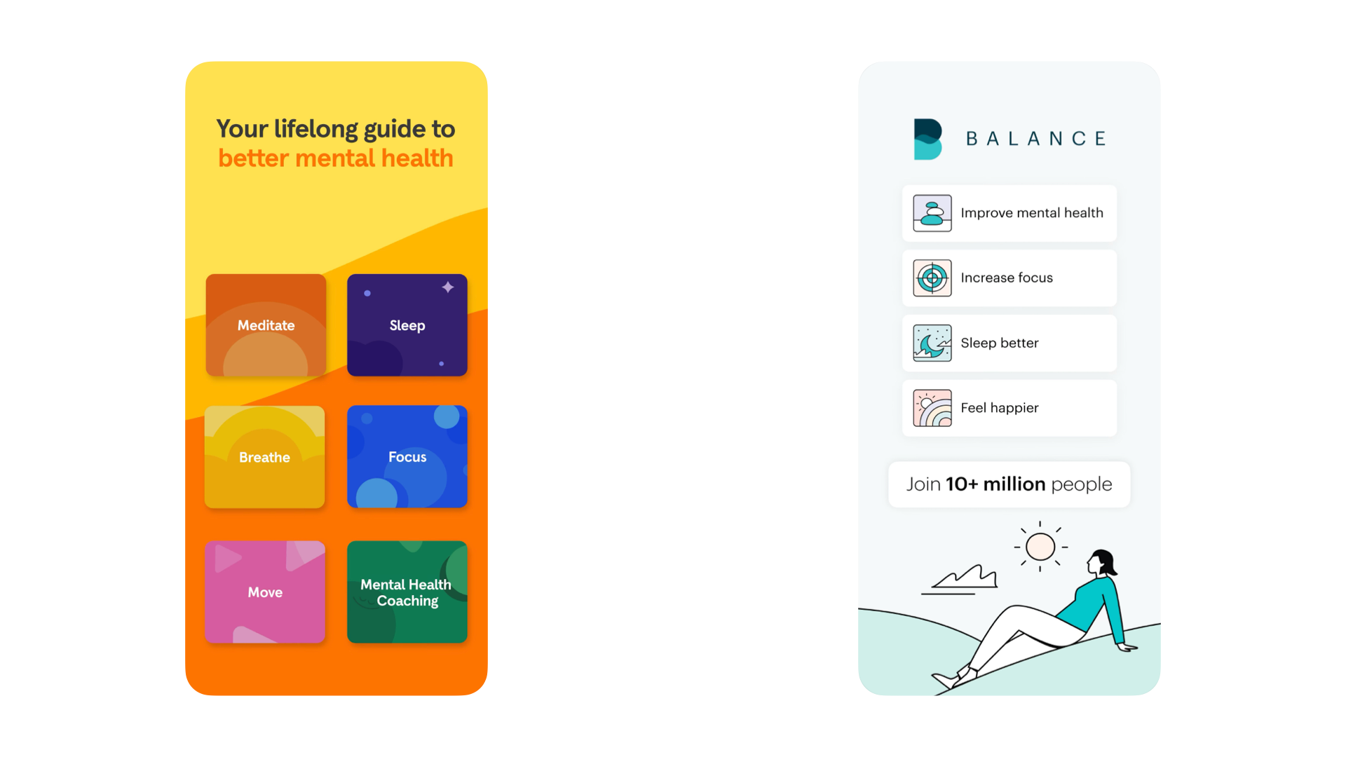
An app that exemplifies strong brand parameters — through its clear mission, personality, and cohesive identity — is Headspace. Headspace’s mission is to ‘provide every person access to lifelong mental health support’. It focuses on mindfulness, meditation, and mental well-being.



Images from Headspace Press Kit
Headspace’s brand personality is gentle, calming, and supportive. It uses soothing language and a warm, friendly tone to create a sense of safety and trust. The app’s personality shines through in its content, voice narration, and visual design — there’s an emphasis on helping users feel relaxed and at ease from the first moment they open the app.
Headspace’s visual identity is playful, inviting, and simple, using bright, soothing colors and calming animations. The clean, minimalist design reflects the app’s core focus on simplicity and mindfulness. Iconography and illustrations often make the experience feel less intimidating and more approachable —especially for users who may be new to meditation.
Duolingo Brand Identity
Another app that exemplifies strong brand parameters is Duolingo. Duolingo’s mission is to make language learning easily available to everyone. It combines technology with the power of play to make language learning a joy, not a chore. And since Duolingo is free, you can consider it accessible to everyone. Their tagline is Everyone can Duolingo.
You can check Duolingo's brand guidelines on their official website
The name "Duolingo" combines two key elements: “Duo”, meaning two, and “lingo”, which is slang for language. It reflects the app's focus on learning multiple languages and the ability to master a "second" or even "third" language through the platform. It’s easy to say, easy to remember, and effectively conveys the brand’s mission.
Duolingo’s brand personality is inspiring, inclusive, curious and quirky. The app uses humor and a playful tone to make language learning feel less like a chore and more like an engaging game. The friendly owl mascot, Duo, has become an iconic symbol of the brand, often used in humorous, motivational ways to keep users engaged. The playful character of Duo, the green owl, is instantly recognizable and helps to humanize the brand.
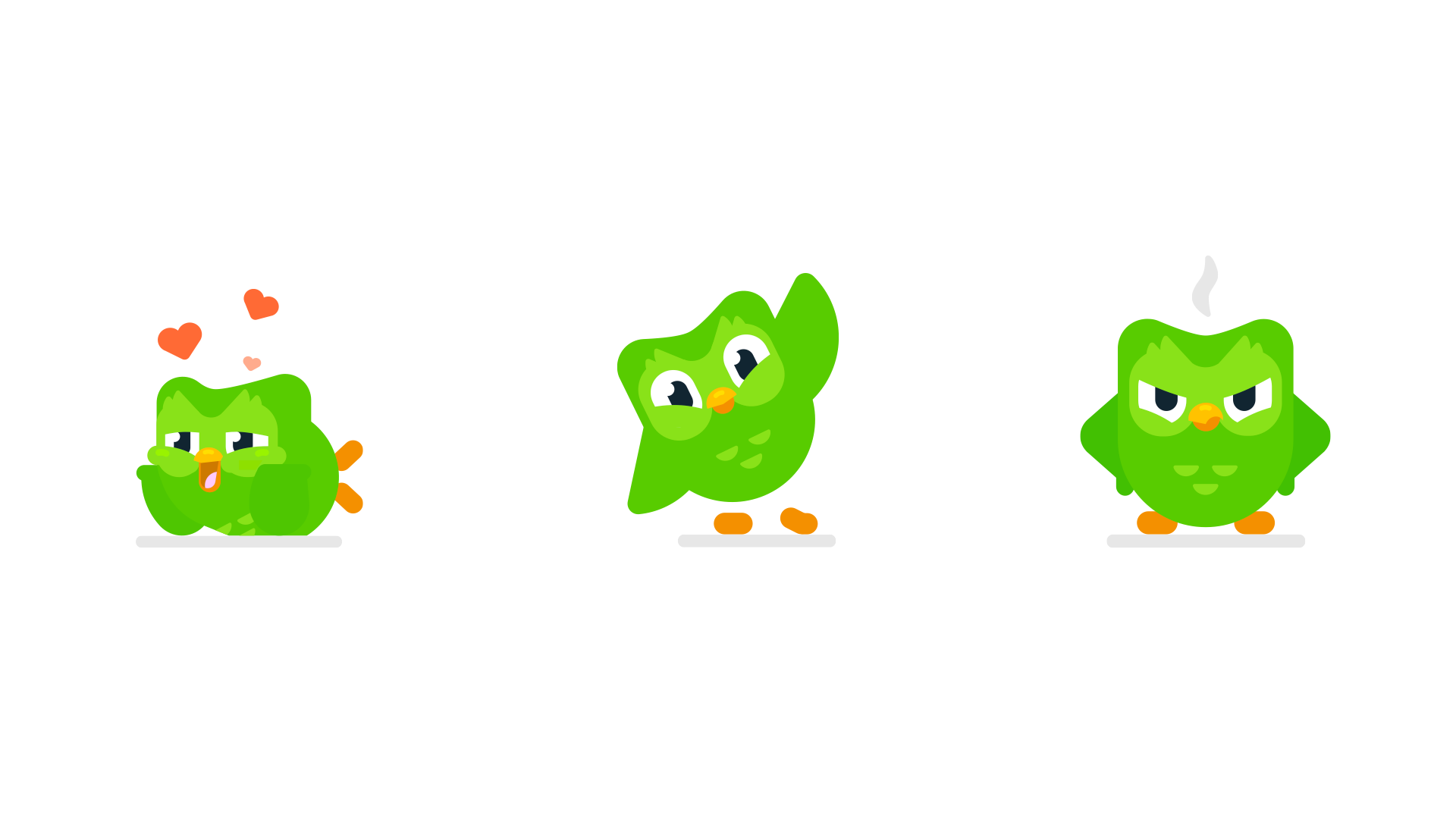
Duolingo’s visual identity is bright, colorful, and welcoming, with bold, simple graphics that make the learning experience feel lighthearted and non-intimidating.
Duolingo's brand consistency shines through in the way its app, website, social media presence, and marketing all align with its core message. Duolingo has successfully created a unique brand that combines the power of education with the appeal of playing. Through its clear brand parameters, Duolingo stands out in the crowded world of educational apps and has become a leader in the category.
Streamline Your Branding Journey
If you’re looking to simplify and bring clarity to your branding there are many different tools you can use. The Brand Design Deck, for example, is a thoughtfully designed tool with the goal of making it easy to structure your brand identity by aligning your design choices with your core values, personality, vision and more. It ensures consistency across your brand while inspiring creative, purposeful design decisions.
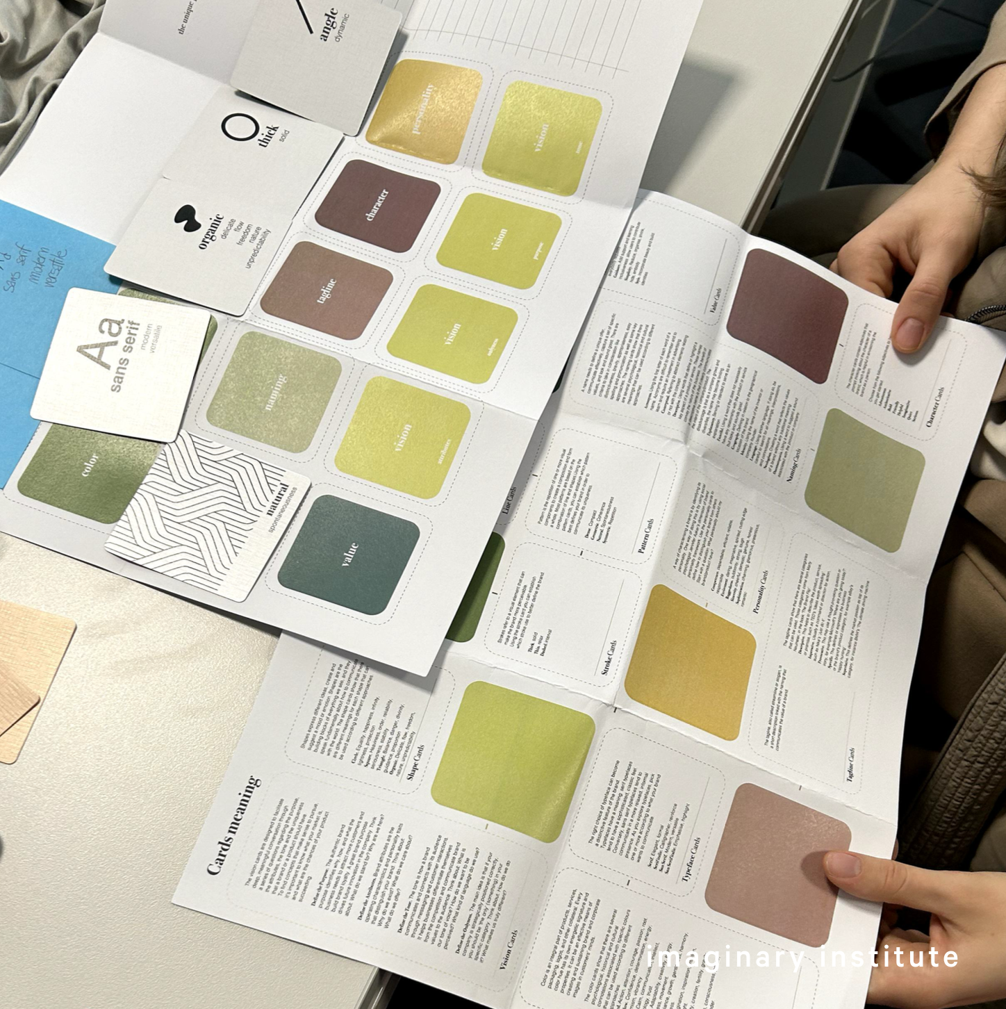
For a structured branding approach, the Brand Design Deck offers visual and conceptual cards that prompt meaningful discussions about brand identity, covering everything from colors and typefaces to abstract qualities like personality and naming. Each card includes a noun, adjective, or verb to spark creative ideas and direct design choices, making the process both intentional and insightful.
Remember to start your branding journey with purpose!
Branding an app goes beyond visuals; it’s about crafting a compelling identity that resonates with users and stands out in the marketplace. With tools like the Brand Design Deck developers can create an intentional and consistent brand identity that not only attracts users but turns them into loyal fans.


