Giving depth to your App Icons
Learn how to enhance your App Icon’s design by adding depth effects.

Icons have always lived in our displays, serving as the first point of contact between the user and the interface. They encapsulate the greatest value of your product at a glance and act as the business card of your application across different contexts.
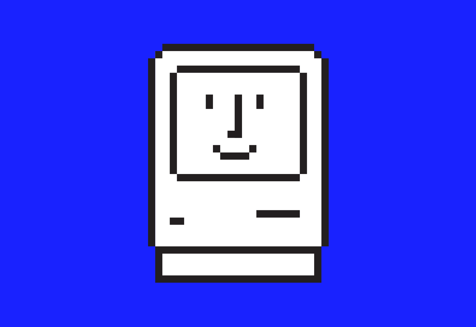
Susan Kare, the mother of icon design, is considered the first pixel artist in history, thanks to her icon set for the Macintosh interface in 1984.
The concept of the App Icon, as we know it today, was born out of a need: to recognize at a glance the pieces of software that live in our pockets.
App icons history
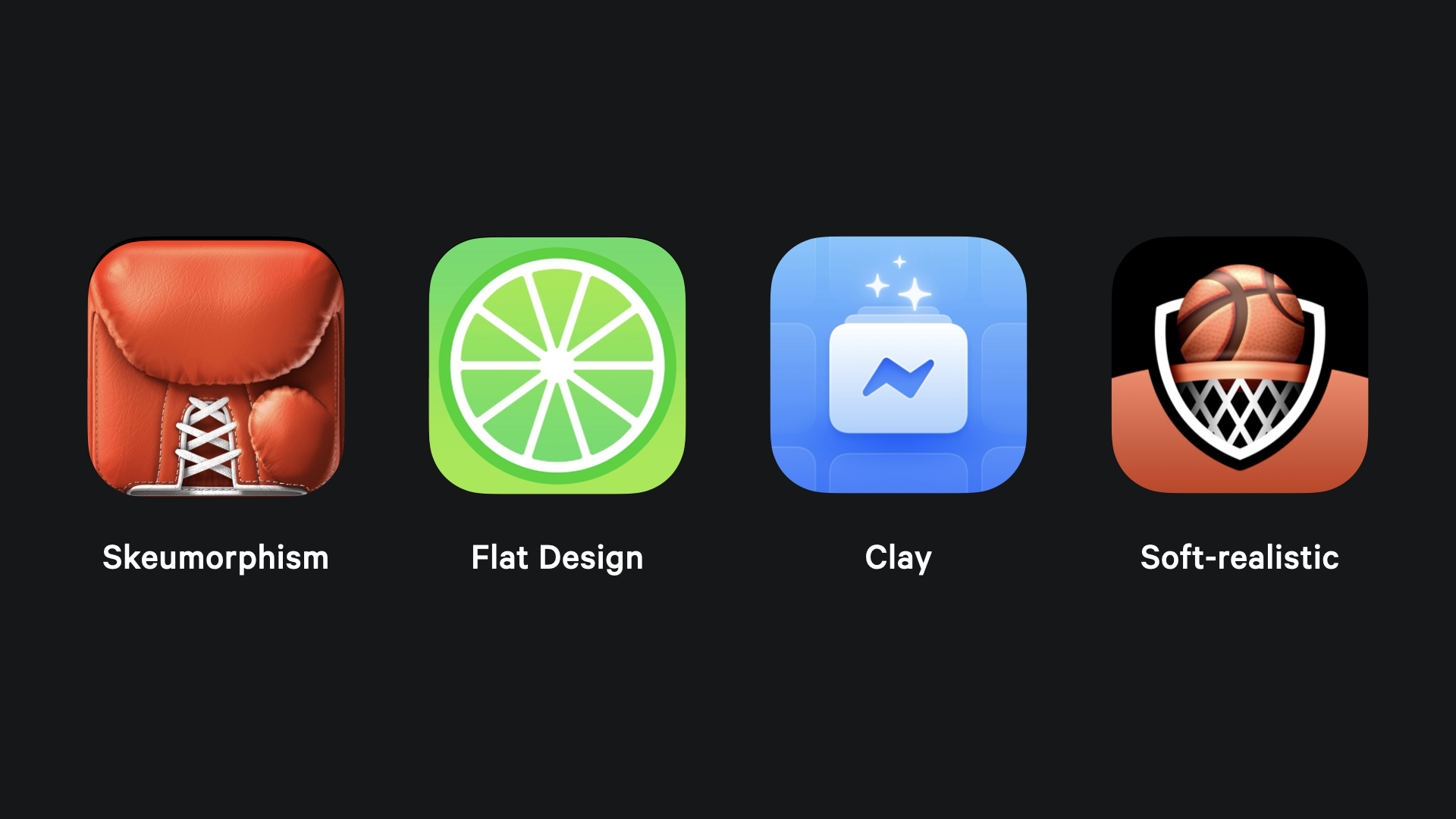
When the iPhone came out in 2007, it changed the history of technology forever. It also established the visual standard of the time, both in terms of icons and interface design. Every shape and color was carefully refined to resemble reality, emulating the forms, materials, lighting, and shadows of the world around us. Everything felt meticulously crafted from a graphic design perspective.
This approach is known as skeuomorphism, which dominated Apple’s screens until 2013.
Then we witnessed a revolution: the Flat Design revolution with the arrival of iOS 7. The third dimension was removed, and everything was filled with soft gradients.
In 2020, we saw a return of some third-dimensional elements, thanks to the new aesthetic introduced with Big Sur on macOS, featuring a style that reminds us of soft play dough.
Now, we are heading in a direction that gently nods to skeuomorphism while still embracing the softness of the previous clay-like style.
Starting from the paper
To support your creative process, it is fundamental to research the best conventions for conveying your app’s essence. For guidance and resources, check the previous article:
 Flora Damiano
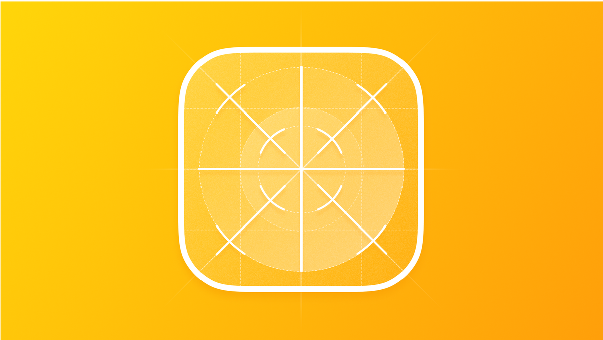
Once you have some concepts of app icons to implement in your design, it’s beneficial to let your ideas take shape through sketches.
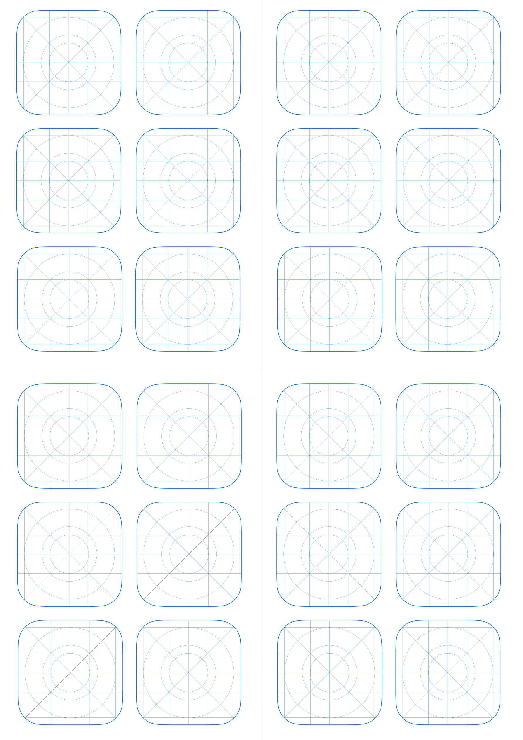
You can start with pencil and paper, or opt for digital sketches, such as using an iPad. Both are excellent ways to unleash your creativity and embrace an iterative sketching process, which is easy to correct and evolve. Whatever tool you choose, it is essential to use a specific App Icon grid for the OS you are designing for. This will help you construct primitive shapes and maintain system consistency.
If you’re starting with paper and designing for iOS, printing this file can be helpful:
It can be used also digitally. If you need different digital grids, you can consult this Figma community template.
Rendering process
To begin the rendering process, pick your tool of choice: you can use a vector-based tool (Figma, Sketch, Adobe Illustrator...) to take advantage of vector scalability, or a raster tool (Photoshop, Pixelmator, Procreate...) for more control over individual pixels. The steps are the same, regardless of the tool.
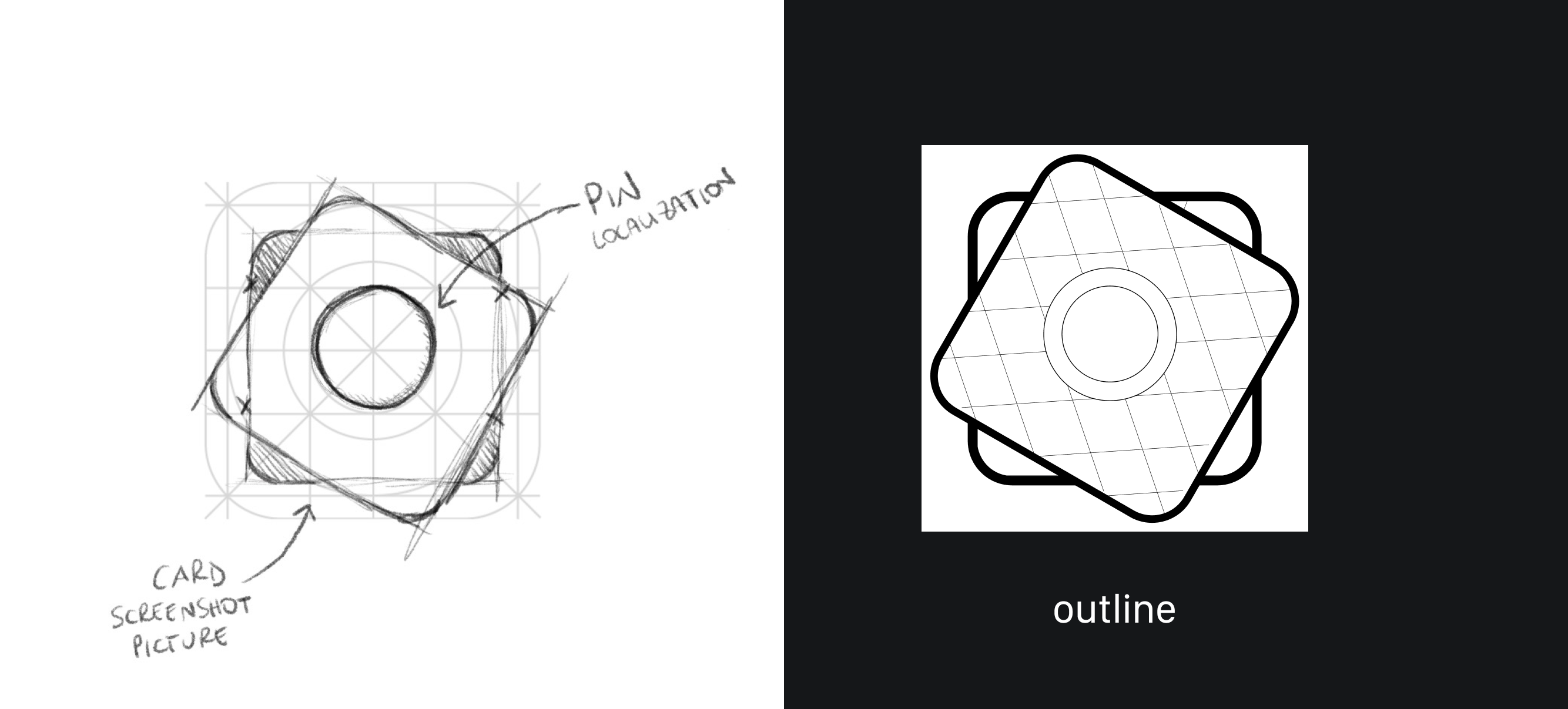
After multiple iterations, select the sketch that best suits your app icon idea. Start by tracing the outlines of the icon at full size, 1024x1024 pixels.
Use pure white (#FFFFFF) for the fills and black (#000000) for the strokes. Focus on using simple, primitive shapes rather than drawing complex ones from scratch, as this will make rendering and manipulation easier later in the process. You can adjust stroke sizes to emphasize specific areas or subjects within the icon.
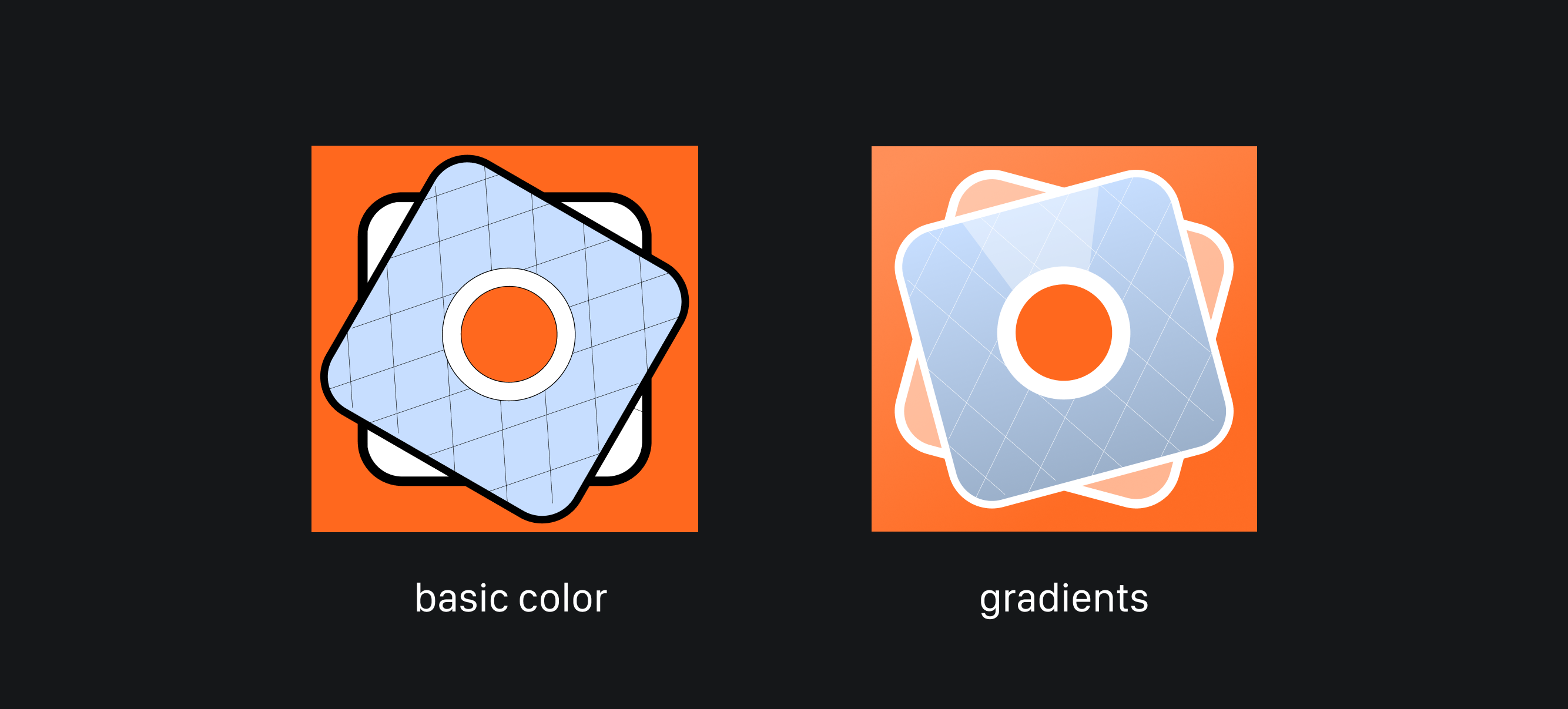
The next step is to add basic colors to your design. Choose one flat color for the background, add 1-2 colors to your subject, and ensure the combination works well in terms of harmony and contrast.
Tools like Adobe Color CC and similar web apps can help you find a good color combination and check the contrast of your chosen colors to keep the icon distinguishable at any size. During this phase, give yourself the freedom to experiment with the positioning of elements, proportions, and scale.
After selecting your 1-2 colors, revisit the outlines to determine whether they need to be removed or kept as part of the artwork. Play with their colors and maintain consistent sizing, but be careful not to overcrowd the icon to avoid visual noise, especially at smaller sizes.
With the colors in place, it's time to add depth to the artwork by considering a light source. A good starting point is to apply a linear gradient with two endpoints of the same color but different brightness levels: in system icons, the lighter color typically goes on top, and the darker one at the bottom. Keep the gradient bright and ensure smooth color transitions.
Another common lighting approach is to place the light source in the top-left corner. Different directional gradients can create more dramatic effects, such as light coming from below.
This is also a good time to experiment with the transparency of the various layers in your icon.
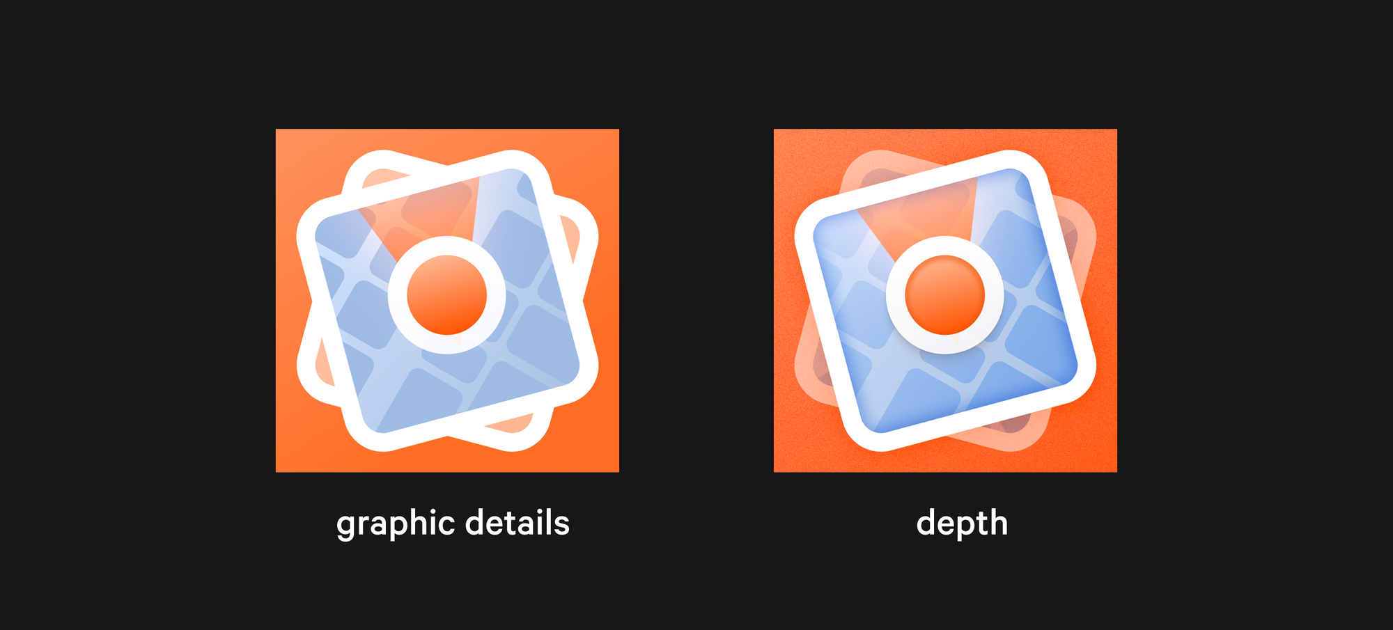
Once the main linear gradients are set, focus on the smaller details of the icon. Ensure that elements such as stroke thickness, corner radius, and transparency are consistent across the different layers.
Now it’s time to add depth to your artwork! There are many ways to introduce depth effects, with the most common being inner shadows, drop shadows, and textures.
First, identify the various levels within your composition and decide where to place emphasis or create elevation.
Inner shadows are an effective way to add depth to a shape, creating a convex-like illusion. Keep them light and soft to avoid adding too much noise to your artwork. You can also use multiple inner shadows on the same shape if this best conveys the depth you desire. Consider experimenting with different blending modes or adding a specific color to the shadow.
Drop shadows suggest elevation for the shapes in your artwork. Softer shadows are perceived as more elevated, while harsh shadows can introduce excessive detail from a distance. If you need to create elevation at multiple levels, add extra soft shadows based on the light direction. The drop shadow should always fall on the opposite side of the established light source (e.g., if the light is from the top left, the shadow will fall on the bottom right).
Textures can add materiality to different parts of your App Icon. Using image fills with a picture of the desired texture can be a good starting point.
Set the opacity to around 30% and use blending modes like Soft Light or Overlay. If the result isn’t satisfactory or you need to achieve specific light effects, try different combinations to emulate materials that reflect light in particular ways.
Noise textures can add an opaque effect to increase the depth and distance between the foreground and the background. It can be applied through image fill or through specific plug-ins such as Noise & Texture in Figma.
Conclusion
App Icons are the first touchpoint with your user and they serve as business cards of your product. Adding depth to it can elevate your App’s personality in an impactful way! Make sure to experiment with sketches, blending modes and shadows to find the rendering process that best conveys your style and the level of realism you were looking for.