Grouping Controls with ControlGroup
Understand how to use control groups, improving the user experience of your SwiftUI apps.

ControlGroup is a SwiftUI component introduced with iOS 15 that allows arranging together semantically connected controls. This container view helps to improve the app user experience by adding:
- clarity - as visual organization enables easier understanding;
- discoverability - as it makes related actions easier to be found and used;
- consistency - as it provides a consistent visual pattern for related actions.
All resulting in a more intuitive and user-friendly interface.
There are several options on how to create an instance of ControlGroup:
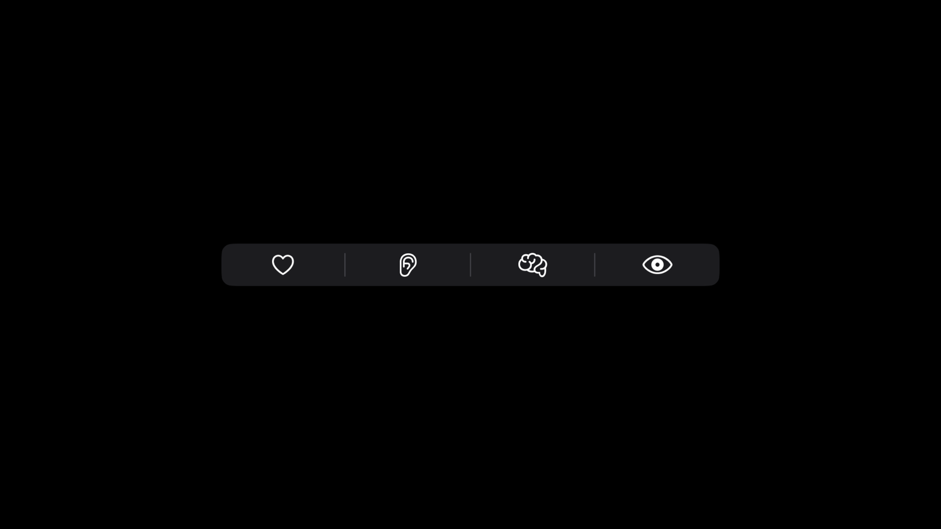
init(content:)initializer: passing the children views in the content closure.
ControlGroup {

    // The content
    Button(action: {
        print("Loved")
    }, label: {
        Image(systemName: "heart")
            .imageScale(.large)
            .foregroundStyle(.tint)
    })

    Button(action: {
        print("Heard")
    }, label: {
        Image(systemName: "ear")
            .imageScale(.large)
            .foregroundStyle(.tint)
    })

    Button(action: {
        print("Thought")
    }, label: {
        Image(systemName: "brain")
            .imageScale(.large)
            .foregroundStyle(.tint)
    })

    Button(action: {
        print("Seen")
    }, label: {
        Image(systemName: "eye")
            .imageScale(.large)
            .foregroundStyle(.tint)
    })

}init(_:content:)initializer: provides a string value that will work as a label, alongside the children's views in the content closure. Available from iOS 16.
ControlGroup("Senses", content: {
    // Content here
})init(content:label:)initializer: allows defining the label of the control group with a view. Available from iOS 16.
ControlGroup(content: {
    // Content here
}, label: {
    Label("Senses", systemImage: "circle")
})init(_:systemImage:content:)initializer: takes a string value as title and an SF Symbol name as icon. Available from iOS 16.
ControlGroup("Senses", systemImage: "circle", content: {
    // Content here
})init(_:image:content:)initializer: provides a string value for the label and anImageResourceas icon. Introduced with iOS 17.
ControlGroup("Senses", image: ImageResource("imageName", bundle: .main), content: {
    // Content here
})
All these different ways to create an instance of a ControlGroup allows to have more flexibility on how to style the whole set, especially when using the controlGroupStyle(_:) modifier to define its rendering style.
By default, the rendering style is set to automatic, which means that it doesn’t show any label or title but only the content. Alongside automatic, there are 4 other built-in styles.
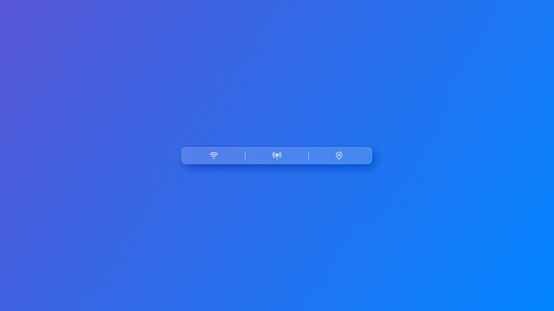
The navigation style groups together controls related to navigation, such as back/forward buttons or timeline navigation controls. The layout depends on the platform, e.g. on iOS it consists of individual borderless buttons.
ControlGroup("Senses", systemImage: "circle", content: {
    // Content here
})
.controlGroupStyle(.navigation)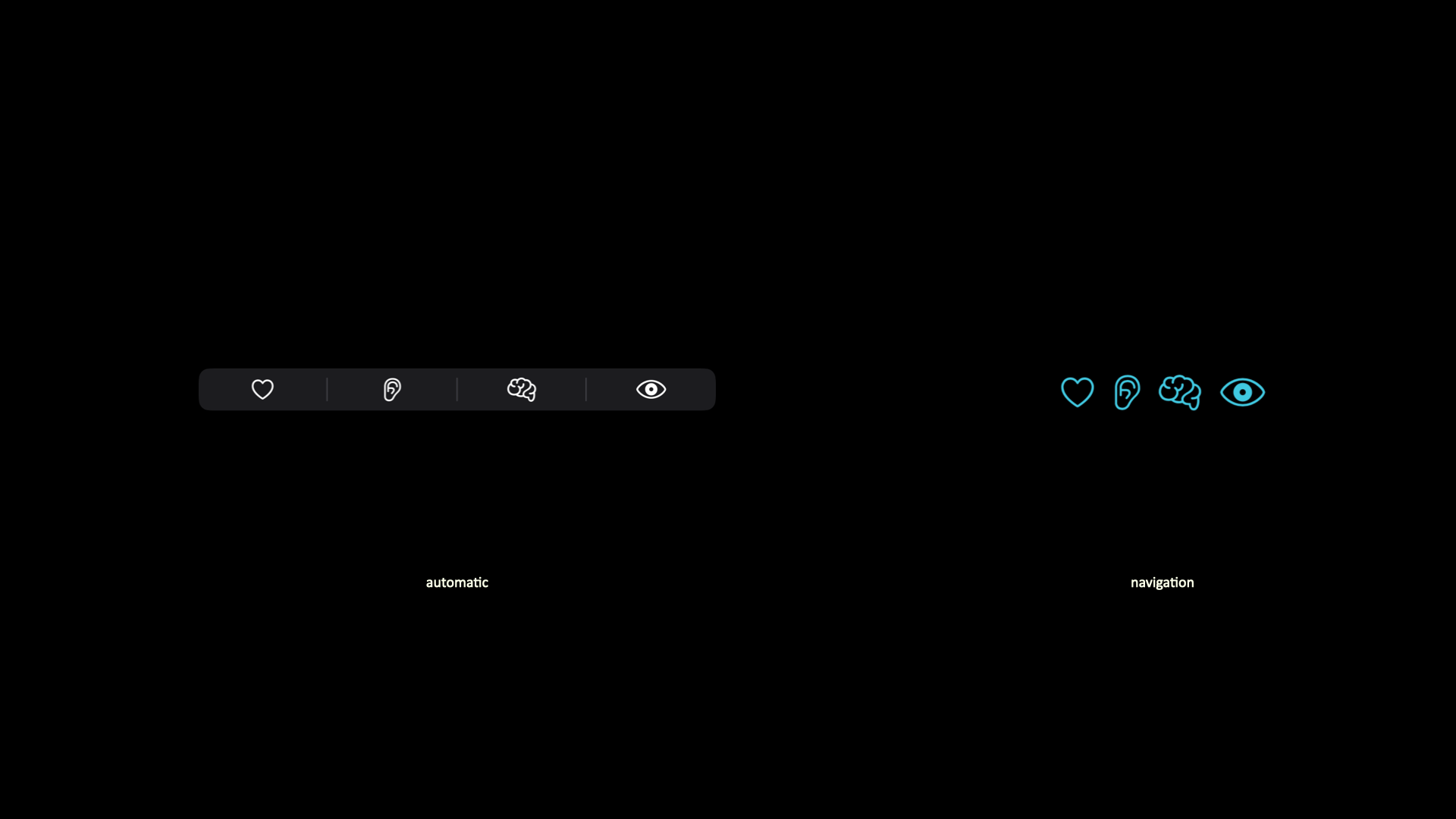
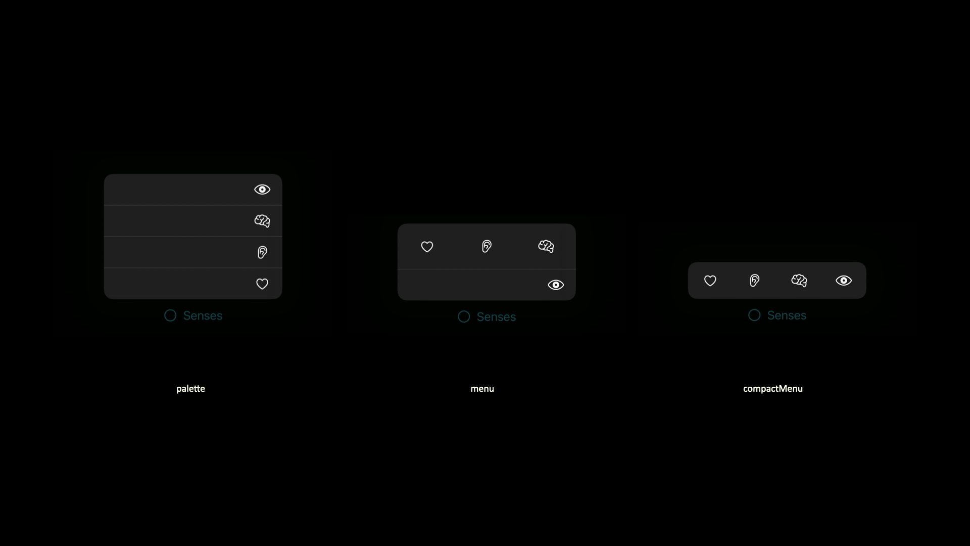
The three other styles, instead, display both the label and the icon:
palette: presents the content as a vertical list of options.menu: styles the content as a menu when the user presses the control, or as a submenu when included in a larger menu;compactMenu- arranging the content as a compact menu when the user presses the control, or as a submenu when included in a larger menu.
Using ControlGroup with a label significantly enhances accessibility by providing context for grouped controls. Labels help users, especially those relying on assistive technologies, to understand the purpose of the group at a glance. By combining text and visual elements, labels ensure clear navigation and interaction, making the interface more inclusive and user-friendly.
In addition, it‘s possible to create customized styles by using the following initializer, init(_ configuration:). It allows the creation of a control group based on a custom-style configuration. It has to be used inside a makeBody(configuration:) method, accessible when you create a custom type conforming to the ControlGroupStyle protocol.
To start creating customized control group style:
- Declare a new struct that conforms to the
ControlGroupStyleprotocol. - In the
makeBody(configuration:)method, it will create a view representing the body of a control group using theconfigurationpassed as parameter. Theconfigurationvalue is aControlGroupStyleConfigurationthat stores, among its properties, thelabeland thecontentof aControlGroup. - Create an instance of
ControlGroupusing theinit(_ configuration:)and create the personalization you wish to display.
// 1. The custom struct conforming to ControlGroupStyle
struct CustomizedControlGroupStyle: ControlGroupStyle {
// 2. The makeBody method
func makeBody(configuration: Configuration) -> some View {
// 3. The init(_ configuration:)
ControlGroup(configuration)
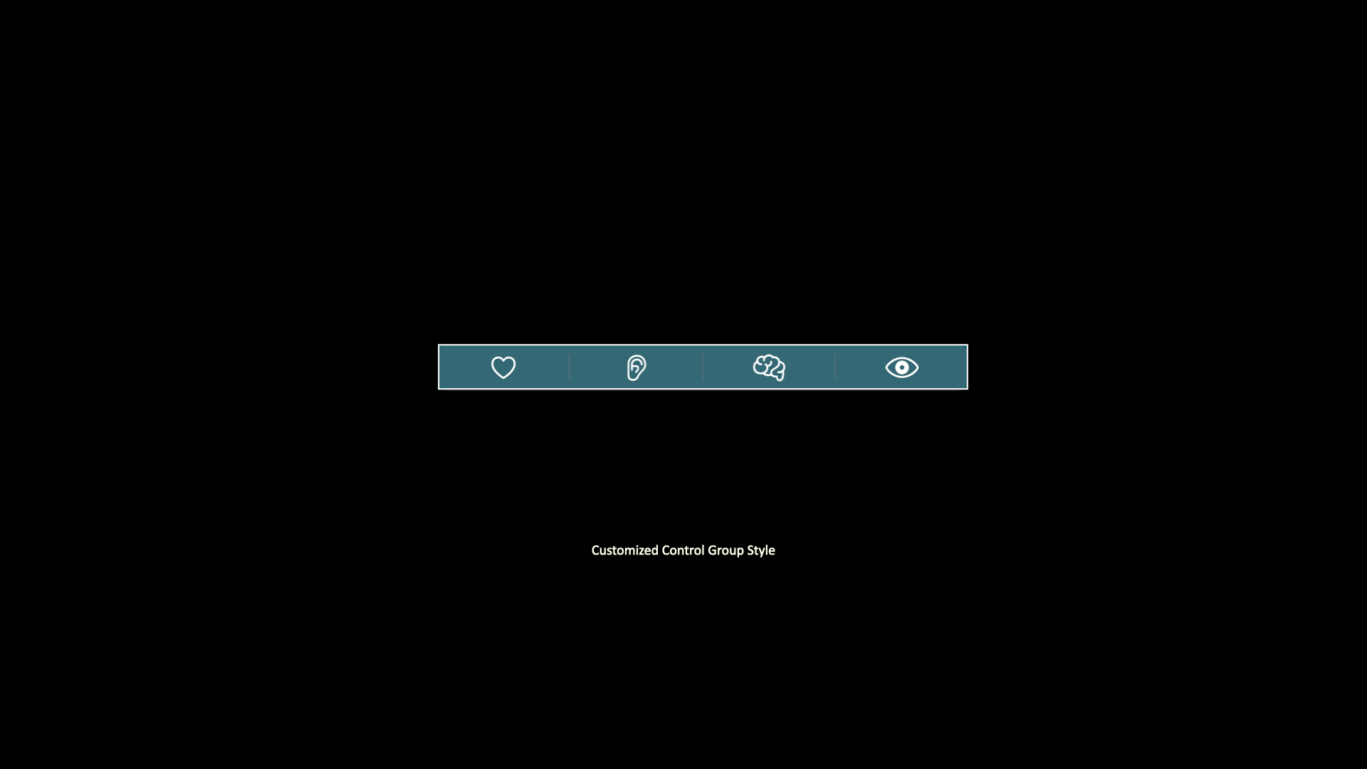
// Customization
.background(.teal.opacity(0.5))
.border(.white)
.padding()
}
}In the example above, the background color has been changed and a border has been added. To apply the new style use the controlGroupStyle(_:) modifier.
ControlGroup("Senses", systemImage: "circle", content: {
    // Content here
})
.controlGroupStyle(CustomizedControlGroupStyle())