Making charts accessible with Swift Charts
Make charts accessible by making them compatible with assistive technologies within a SwiftUI app.


Charts enable users to quickly interpret data, but charts are not inherently accessible for people who are blind or have low vision. Apple has made significant efforts to ensure the charts are compatible with Assistive Technologies, particularly VoiceOver.
With Swift Charts, VoiceOver can interpret the data displayed on the chart, extract valuable information, and construct audio graphs automatically, making it accessible to all users. With VoiceOver rotor particularly, users have three different options to access the data.
Accessibility within charts
Describe Chart
Using the rotor, users can have a quick overview of the chart through VoiceOver explaining the representation of the x and y axes and the number of data series present.
Selecting the “Describe Chart” function using the VoiceOver rotor by swiping vertically twice.
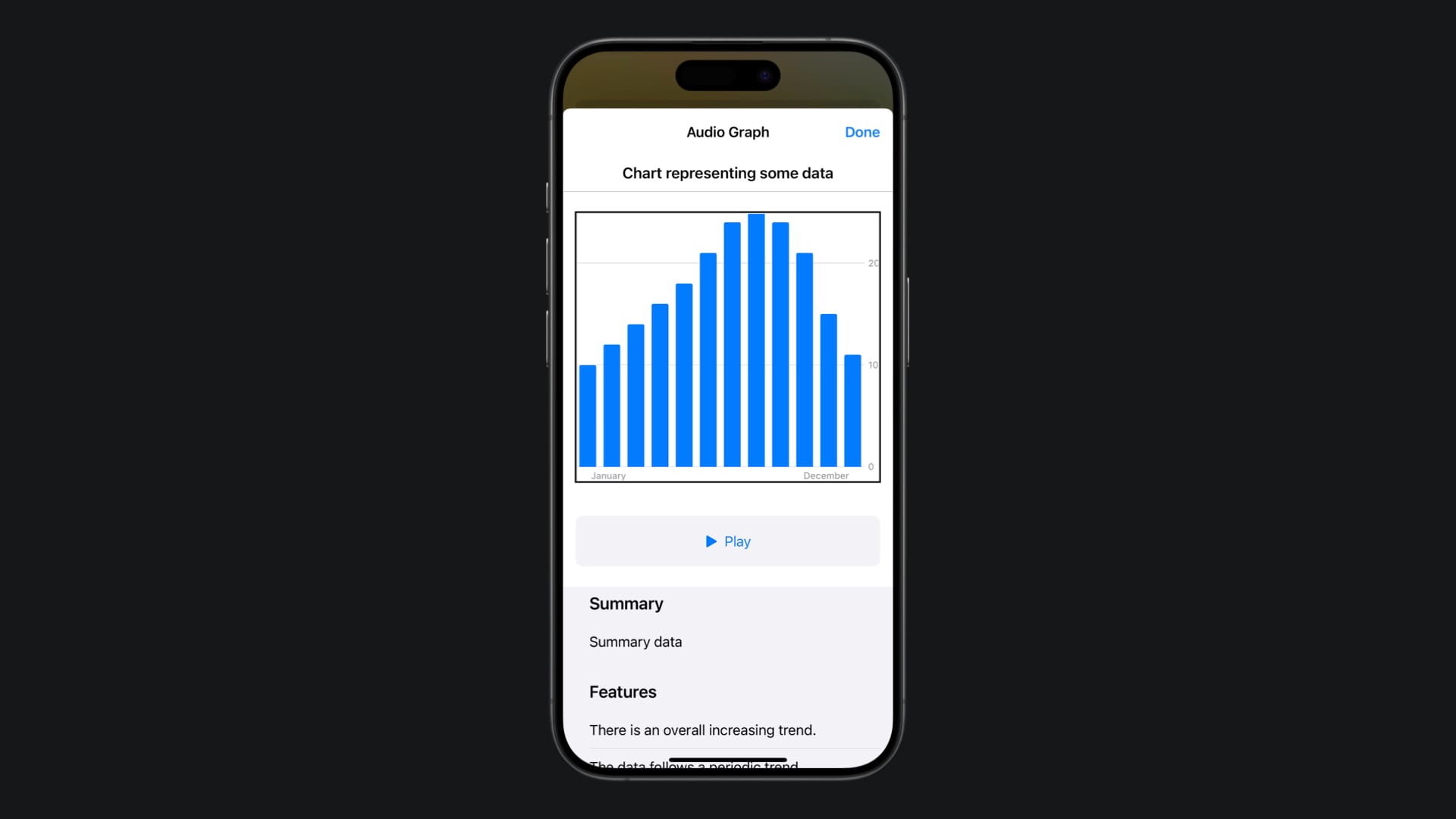
Audio Graph
VoiceOver will use a pitch to represent the data on the screen. The higher the pitch, the higher the value, the lower the pitch, the lower the value.
Selecting the “Audio Graph” function using the VoiceOver rotor by swiping vertically twice.
Chart Detail
This will open a separate modal window, with the possibility to play the audio graph and access detailed content, like a summary of the chart, and some features of the chart, like a periodic or decreasing trend.
Selecting the “Chart Detail” function using the VoiceOver rotor by swiping vertically.
Additionally, the chart detail page offers an interactive mode. Within it, VoiceOver users can double-tap, hold and then drag to listen to the data at their own pace. If they pause, VoiceOver will read the data value corresponding to the user's current position in the audio graph.
Swift Charts
In the tutorial Using Swift Charts on a SwiftUI app a beautiful visual representation of our data is created with just a few lines of code. Since its introduction, the Swift Charts framework supported all the accessible features listed above.
Swift Charts automatically constructs an accessibility tree for your chart, grouping the elements based on the data. Additionally, the framework can extract valuable information from the data to create summary information in the audio graph section. That accessible experience can be enhanced in our charts by working on the details of its representation.
Meaningful labels
Ensure that users besides having access to the data, also understand its context. This allows them to interpret the information in graphs accurately. To achieve this, it’s important to use clear and meaningful labels that effectively describe the data presented in your charts.
A meaningful label for a chart representing the average temperature for each month could be as follows:
• Title: “Average Monthly Temperature in Celsius for the Year 2023”
• X-Axis Label: “Months of the Year”
• Y-Axis Label: “Average Temperature in Degrees Celsius”
January: “January, average temperature 15 degrees Celsius”
Color contrast
To make sure that the data on your chart is always visible ensure a higher contrast ratio between the colors used to keep high visibility and perfect readability of your data. Another factor to take into account is color blindness, where your user might not be able to understand your chart.
You can address this by checking the contrast ratio of the chart and using colors readable by individuals with different types of color blindness.
If you want to know more about how to use colors to display information check the following article:

Symbols
There might be some cases in which the user cannot see any type of color. Using symbols we ensure that they don’t have to rely on color to distinguish different pieces of information and understand the chart.
In this article, we talk about how to use visual elements to make our app accessible:
Accessibility Chart Descriptor
One of the most useful options in VoiceOver for reading a chart is using the Chart Detail. To support it in our custom charts we need to create an AXChartDescriptor object to provide all the necessary information about the chart for the Chart Detail page.
We can start by creating a struct that conforms to the AXChartDescriptorRepresentable protocol to generate an AXChartDescriptor object. This object will provide information about a chart and its data for a more accessible experience with VoiceOver or other assistive technologies.
The AXChartDescriptor class has the following properties:
title: A string property that indicates the chart's titlesummary: An optional string property that describes the chart's featuresxAxis: AnAXDataAxisDescriptorobject representing the data on the x-axisyAxis: AnAXNumericDataAxisDescriptorobject containing the values on the y-axisadditionalAxes: An array for any additional axesseries: An object representing a series of data points
struct ChartDescriptor: AXChartDescriptorRepresentable {

    var dataCollection: ViewModel

    func makeChartDescriptor() -> AXChartDescriptor {

        let xAxis = AXCategoricalDataAxisDescriptor(
            title: "Month",
            categoryOrder: dataCollection.data.map(\.month)
        )

        let max = dataCollection.data.map(\.temperature).max() ?? 0.0

        let yAxis = AXNumericDataAxisDescriptor(
            title: "Temperature",
            range: 0...max,
            gridlinePositions: []
        ) { value in
            "\(value) points"
        }

        let series = AXDataSeriesDescriptor(
            name: "",
            isContinuous: false,
            dataPoints: dataCollection.data.map {
                .init(x: $0.month, y: $0.temperature)
            }
        )

        return AXChartDescriptor(
            title: "Chart representing some data",
            summary: "Summary data",
            xAxis: xAxis,
            yAxis: yAxis,
            additionalAxes: [],
            series: [series]
        )
    }
}
Then you just need to use the accessibilityChartDescriptor(_:) modifier providing an instance of the chart descriptor object.
struct ChartView: View {

    var dataCollection: ViewModel

    var body: some View {

        Chart(dataCollection.data) {
            LineMark(
                x: .value("Month", $0.month),
                y: .value("Average Temperature", $0.temperature)
            )
        }
        .accessibilityChartDescriptor(
            ChartDescriptor(dataCollection: dataCollection))
    }
}
After applying these changes the information displayed on the Chart Detail page will change according to what we defined inside the ChartDescriptor object: