
Mastering Forms in SwiftUI: Creating and Styling
Learn how to create and customize the appearance of data-entry interfaces using forms in SwiftUI apps.
Applications, in order to deliver value to their user, often rely on user-generated data to work with. A reminders app needs reminders, a calendar app needs events, a contacts app needs contact information, and apps that rely on tracking, in general, need the user to input the information in the app.
User-created content comes in many shapes and forms and one of the most common use cases for user input is by presenting a form for them to fill.
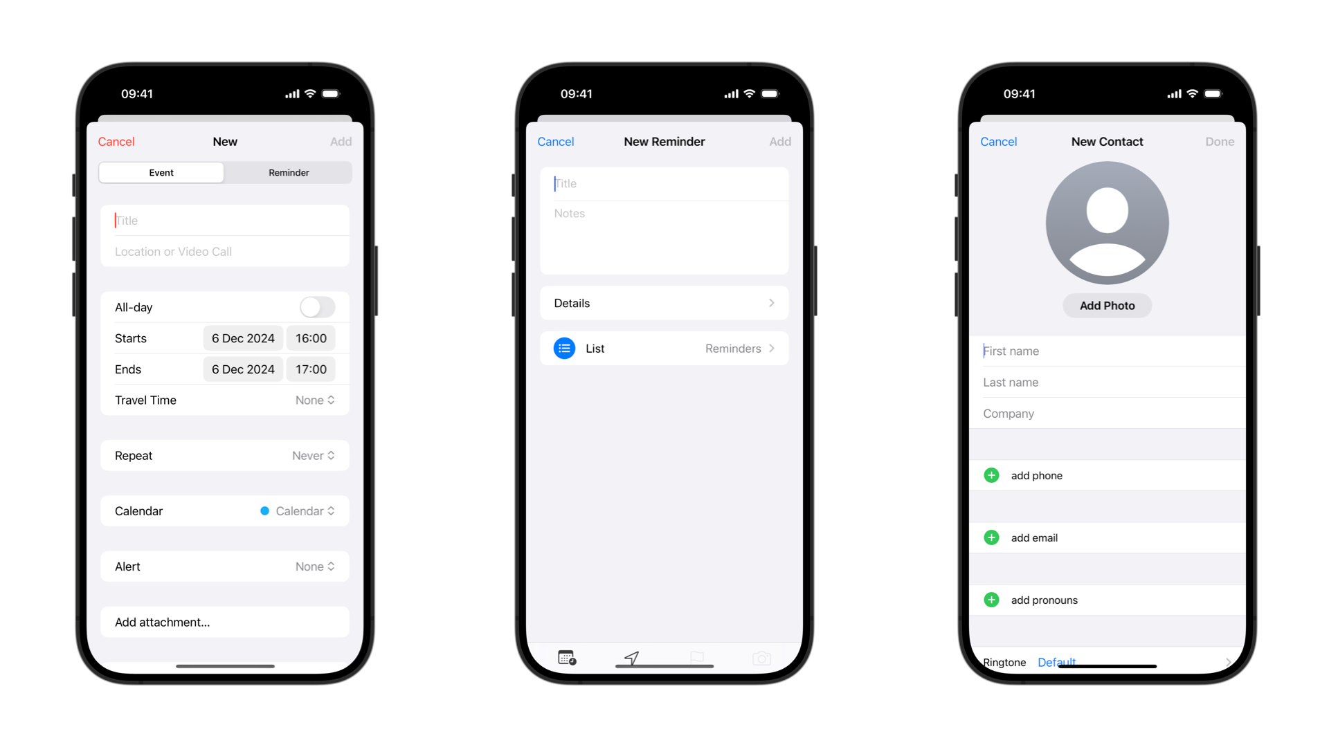
Forms serve as the backbone for user interaction, presenting an interface for data entry. Whether it's signing up for a service, making a purchase, or providing feedback, they are everywhere.
On SwiftUI the Form container provides a standardized look and feel for data input experiences, very similar to the List container. The different types of views and controls you place inside it will be organized in a list-like fashion, with scrolling working and the ability to create sections.
Forms
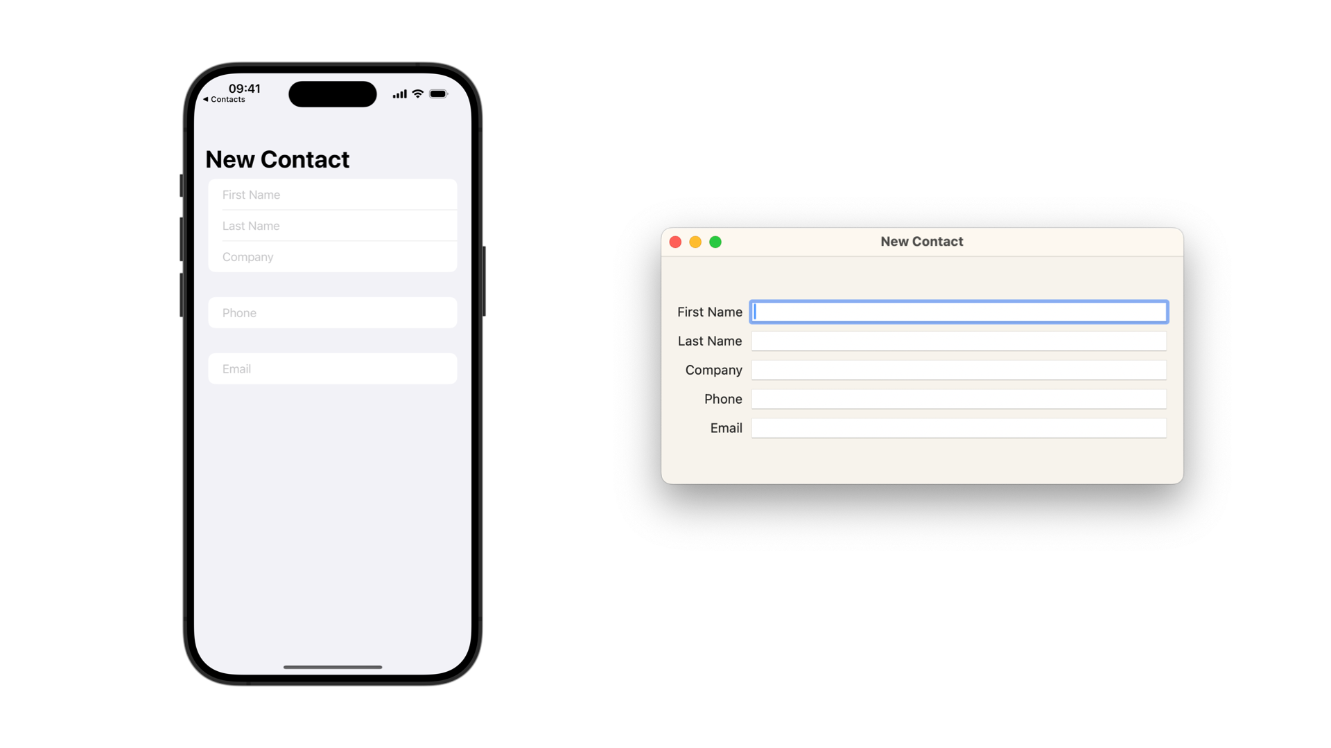
To create a form in SwiftUI use the Form view and place the views and controls you need inside the content block.
Form {
    Section {
        TextField("First Name", text: $firstName)
        TextField("Last Name", text: $lastName)
        TextField("Company", text: $company)
    }

    Section {
        TextField("Phone", text: $phone)
    }

    Section {
        TextField("Email", text: $email)
    }
}
.navigationTitle("New Contact")
#if os(macOS)
.padding()
#endif
When creating multi-platform apps, the way the form will render the views and controls will automatically adapt to present them in the most appropriate way for that platform.
Form Layout
To better organize the fields in your form use the Section view. Its purpose is to visually group fields that have something in common.
Form {
    Section {
        TextField("First Name", text: $firstName)
        TextField("Last Name", text: $lastName)
        TextField("Company", text: $company)
    }

    Section {
        TextField("Phone", text: $phone)
        TextField("Email", text: $email)
    }

    Section {
        TextField("Phone", text: $professionalPhone)
        TextField("Email", text: $professionalEmail)
    }
}
A section in a form can have a header and/or a footer view associated with it, providing further explanation of the purpose of that particular part of the form.
Form {
    Section {
        TextField("First Name", text: $firstName)
        TextField("Last Name", text: $lastName)
        TextField("Company", text: $company)
    }

    Section {
        TextField("Phone", text: $phone)
        TextField("Email", text: $email)
    } header: {
        Text("Personal Information")
    }

    Section {
        TextField("Phone", text: $professionalPhone)
        TextField("Email", text: $professionalEmail)
    } header: {
        Text("Professional Information")
    }
}
The footer of a section is often used to present form validation messages when a field is empty or is filled with invalid information. It can also further explain an aspect of a particular field or group of fields in the form.
Section {
    SecureField("Password", text: $textForSecureField)
} footer: {
    Text("Invalid password. Please use a minimum of 8 characters, mixing uppercase and lowercase letters, numbers and symbols.")
        .foregroundStyle(.red)
}
Form Style
The appearance of Forms in SwiftUI can be set using the formStyle(_:) modifier. There are three different form styles available:
Automatic Style
It is the default style setting, but if you want to enforce it, by setting the style to automatic you will leave the system to decide what is the most appropriate way to render the form.
Form {
    Section {
        TextField("First Name", text: $firstName)
        TextField("Last Name", text: $lastName)
        TextField("Company", text: $company)
    }
}
.formStyle(.automatic)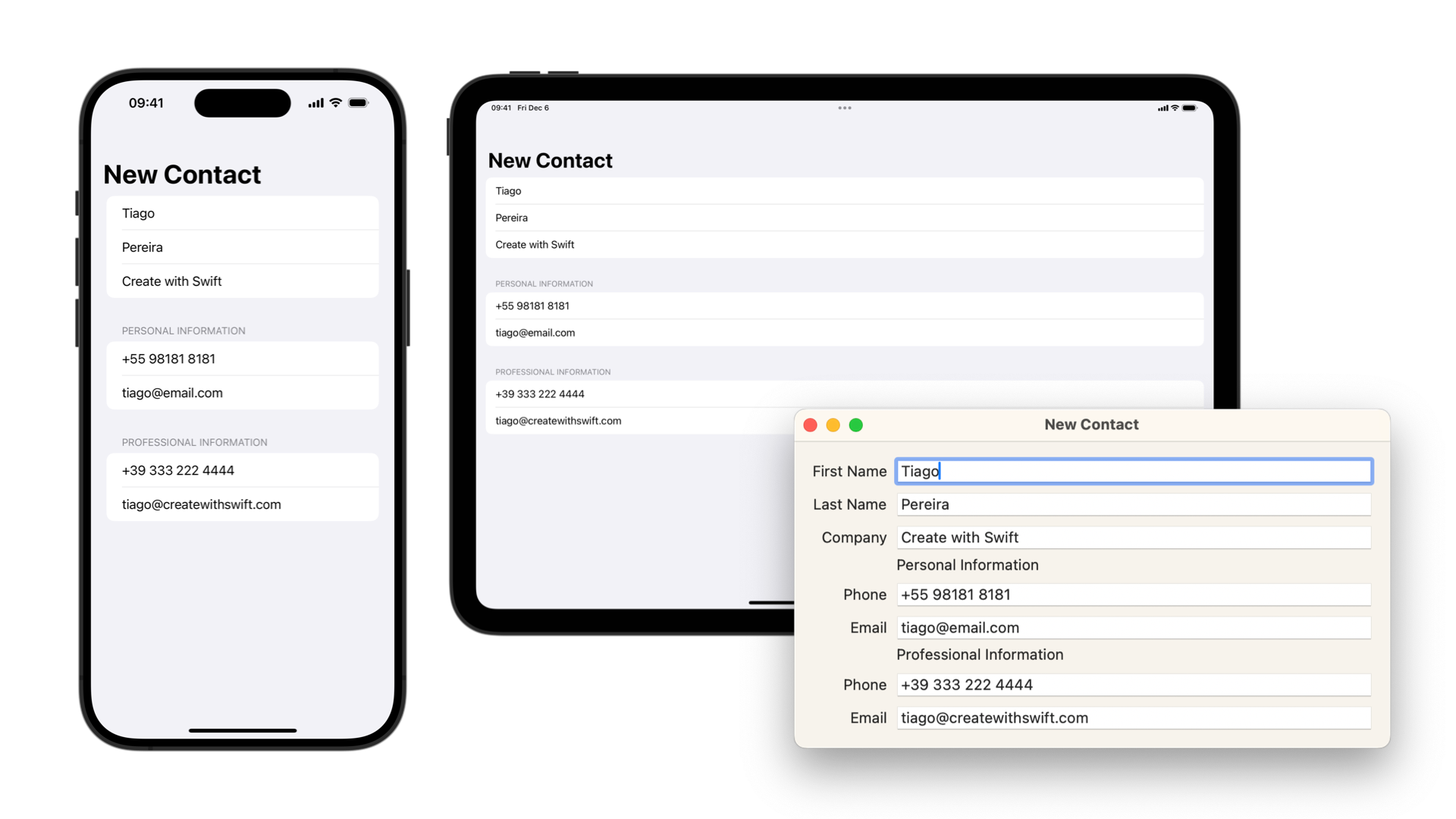
Columns Style
By setting the form style to columns the form will be organized in two columns. The first one to display the labels associated with the form fields trailing aligned and the second one will display the values associated with the labels leading aligned.
Form {
    Section {
        TextField("First Name", text: $firstName)
        TextField("Last Name", text: $lastName)
        TextField("Company", text: $company)
    }
}
.formStyle(.columns)
To better take advantage of this form layout use the LabeledContent view to wrap the fields that benefit from having a label associated with them.
LabeledContent("Email") {
    TextField("Email", text: $email)
}
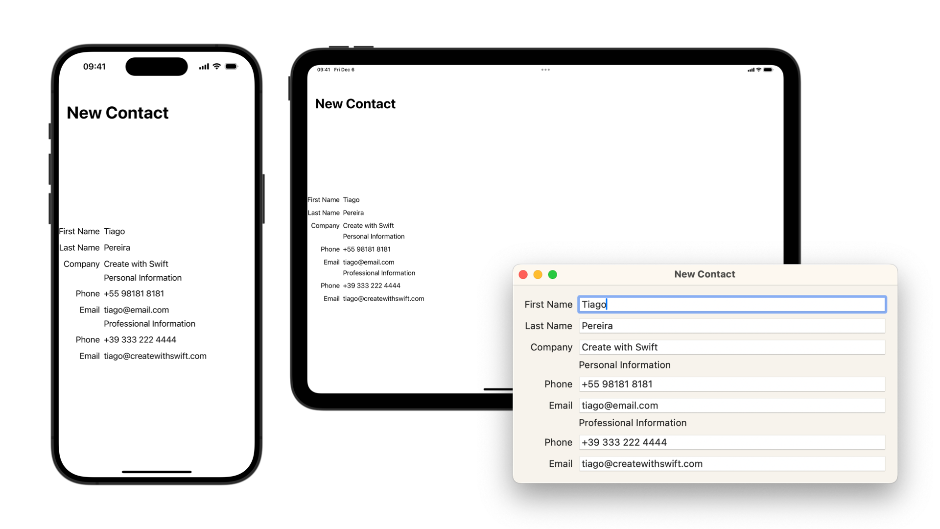
As you can see, the columns layout in iOS and iPadOS requires further customization on the appearance of the form to appear properly.
Grouped Style
A form style with visually grouped rows and sections. By setting the form style to grouped you will receive the default look and feel of iOS applications, with leading aligned labels, trailing aligned controls and white background grouped rows. The overall form background is light gray.
Form {
    Section {
        TextField("First Name", text: $firstName)
        TextField("Last Name", text: $lastName)
        TextField("Company", text: $company)
    }
}
.formStyle(.grouped)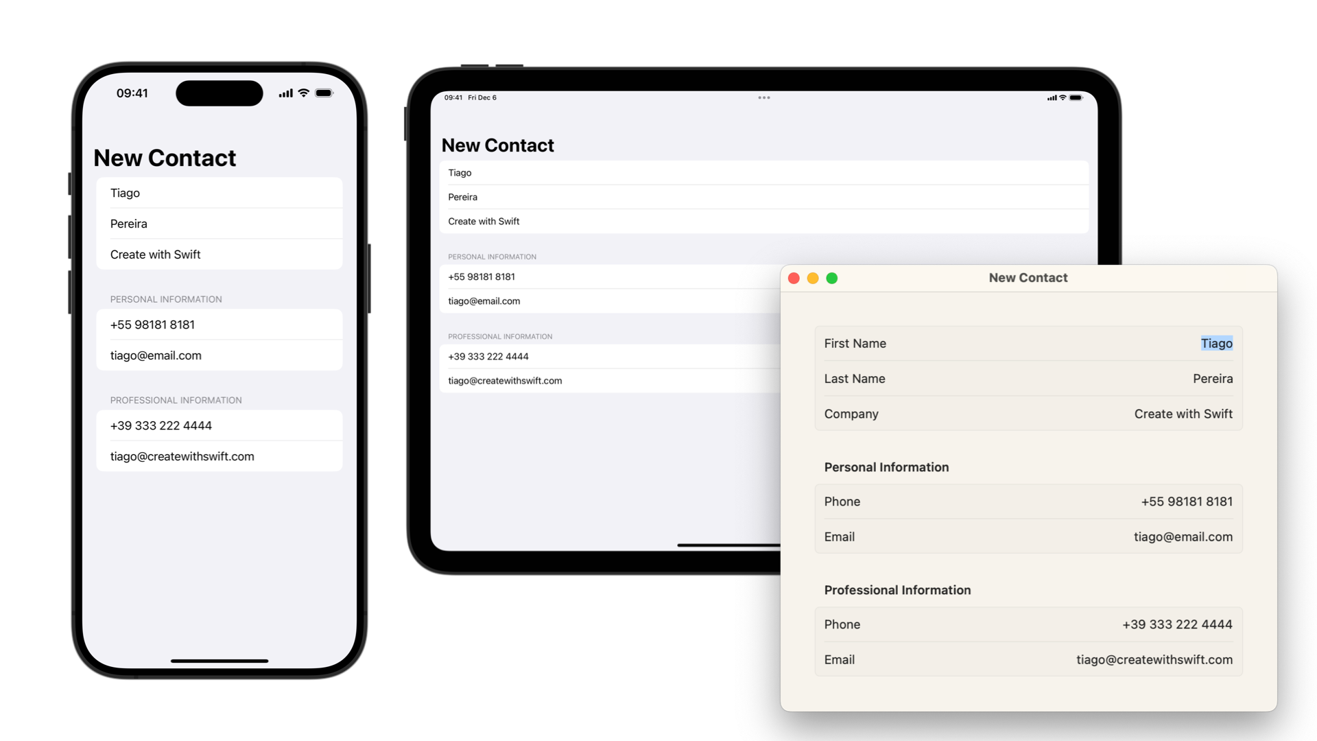
Useful modifiers
When working with Form in SwiftUI, most of the modifiers available for customizing the appearance of lists can be used to apply changes to how the elements inside the form are rendered.
For spacing and the appearance of sections, rows and separators, check the following modifiers:
listSectionSpacing(_:)listSectionSeparator(_:edges:)listSectionSeparatorTint(_:edges:)listRowSeparator(_:edges:)listRowInsets(_:)listRowBackground(_:)
To control the visibility of the labels of the data-entry fields in the form use the following modifiers:

