
Mastering Forms in SwiftUI: Selecting Information
Learn how to use picker, date picker and color picker controls to provide a proper single data selection data-entry experience in a form in SwiftUI apps.
When creating data-entry experiences in iOS apps, SwiftUI's Picker view offers a solution that allows users to select from a list of distinct options. This component enhances form interfaces by providing an intuitive and efficient way to make selections across various app contexts like settings screens and profile configurations.
For best practices on how to use a Picker in your application’s user interface check the dedicated page on Apple’s Human Interface Guidelines

SwiftUI has three controls for single-value selection: Picker, DatePicker and ColorPicker. They present multiple visual configurations so you as a developer can choose the one that better adapts to the needs of your user experience.
Picker View
To implement a picker you need the following:
- A variable to be bound to the picker and store the selected option
- The content to be displayed as the options in the picker
- A label for the picker
// The options to choose from
enum Repetition: String, CaseIterable, Identifiable {
    var id: Self { self }

    case never = "Never"
    case everyDay = "Every Day"
    case everyWeek = "Every Week"
    case every2Weeks = "Every 2 Weeks"
    case everyMonth = "Every Month"
    case everyYear = "Every Year"
    case custom = "Custom"
}

// A variable to be bound to the picker
@State private var selectedRepetition: Repetition = .never

// The definition of the picker
Picker("Repeat", selection: $selectedRepetition) {
    ForEach(Repetition.allCases) { repetition in
        Text(repetition.rawValue)
    }
}
If the data type of the options in the Picker conforms with the Identifiable protocol, it will be able to distinguish between the options, since ForEach will automatically assign a tag to the selection views. You can override the tag assigned to the selection views by using the tag(_:includeOptional:) modifier.
Text(repetition.rawValue)
    .tag(repetition.rawValue)
Picker in Forms
The exact appearance of the picker depends on the context where it is inserted and the operational system your application is running on. In a List view a picker with a navigation format to perform the selection would be more appropriate, while in a Form view a picker presenting the options in a dropdown menu would provide a better experience.
Ideal picker style on a List view container and on a Form view container.
There are many predefined styles you can choose from to define which one fits the best data-entry experience in your app. Use the pickerStyle(_:) modifier to define which picker style you want to be rendered.
Form {
    Section("Picker Example") {
        Picker("Label", selection: $selectedOption) {
            Text("Option 1").tag("1")
            Text("Option 2").tag("2")
            Text("Option 3").tag("3")
        }
        .pickerStyle(.automatic)
    }
}
#if os(macOS)
.formStyle(.grouped)
#endif
grouped form style since it renders the form and its sections in a more organized manner.Inline Picker
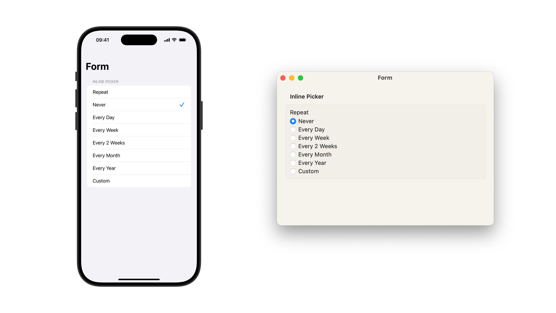
When using the inline picker style, On iOS and iPadOS, all the options of the picker will be rendered as rows in the Form, with a checkmark symbol on the trailing side of the row indicating the selected option. The appearance of the label can mix up with the appearance of the options in the picker.
On macOS, it is rendered by default with the style of a radio group picker.
Form {
    Section("Picker: Inline") {
      Picker("Repeat", selection: $selectedRepetition) {
          ForEach(Repetition.allCases) { repetition in
              Text(repetition.rawValue)
                  .tag(repetition.rawValue)
          }
      }
      .pickerStyle(.inline)
    }
}
Menu Picker
Menu picker style on iOS.
In every operational system, the menu picker style renders the picker as a dropdown menu, presenting the options after the user taps or clicks on the picker.
On iOS and iPadOS, the difference between the automatic style and the menu style is that on the menu style, the label showing the selected value applies an accent color to the text.
Form {
    Section("Picker: Menu") {
        Picker("Repeat", selection: $selectedRepetition) {
            ForEach(Repetition.allCases) { repetition in
                Text(repetition.rawValue)
                    .tag(repetition.rawValue)
            }
        }
        .pickerStyle(.menu)
    }
}
Segmented Picker
Segmented picker style on iOS with and without modifiers to proper visualize it.
On all operational systems, the segmented picker style displays the options in a segmented control.
Form {
    Section("Picker: Segmented") {
        Picker("Frequency", selection: $selectedFrequency) {
            ForEach(Frequency.allCases) { frequency in
                Text(frequency.rawValue)
                    .tag(frequency.rawValue)
            }
        }
        .pickerStyle(.segmented)
    }
}
On iOS and iPadOS the grouped form style will create the picker inside a row with a white background. You can apply the following modifiers on the Picker to remove it.
// Removes the internal padding of the row
.listRowInsets(EdgeInsets(top: 0, leading: 0, bottom: 0, trailing: 0))
// Removes the white background of the row
.listRowBackground(EmptyView())
Palette Picker
Palette picker style on iOS and macOS, when embedded in a Menu view container.
On all operational systems, when a picker style is set to palette in a Form view it is rendered as a segmented control.
Form {
    Section {
        Menu("Repeat") {
            Picker("Repeat", selection: $selectedRepetition) {
                ForEach(Repetition.allCases) { repetition in
                    Text(repetition.rawValue)
                        .tag(repetition.rawValue)
                }
            }
            .pickerStyle(.palette)
        }
    } header: {
        Text("Picker: Palette")
    } footer: {
        Text("Needs to be inside a Menu view to be rendered as a palette. Outside it will be rendered as a segmented control.")
    }
}
The ideal usage of the palette style is inside a Menu view, and on iOS, if there are more than 6 options to choose from the picker will scroll horizontally. On macOS it renders the options as icons, so use a Label view with SF Symbols to initialize each option.
Navigation Link Picker
Navigation Link picker style on iOS.
The navigationLink picker style is not available on macOS. On iOS and iPadOS it generates a navigation link to a List view presenting all the options to choose from. It’s very useful when there are many different options to choose from.
Form {
    Section("Picker: Navigation Link") {
        Picker("Repeat", selection: $selectedRepetition) {
            ForEach(Repetition.allCases) { repetition in
                Text(repetition.rawValue)
                    .tag(repetition.rawValue)
            }
        }
        .pickerStyle(.navigationLink)
    }
}
Wheel Picker
Wheel picker style on iOS.
The wheel picker style is not available on macOS. On iOS and iPadOS it renders the classic Apple picker interface, showing all the available options in a scrolling wheel, with the selected option highlighted in the center of the control and hinting at the other available options around it.
Form {
    Section("Picker: Wheel") {
        Picker("Repeat", selection: $selectedRepetition) {
            ForEach(Repetition.allCases) { repetition in
                Text(repetition.rawValue)
                    .tag(repetition.rawValue)
            }
        }
        .pickerStyle(.wheel)
    }
}
Radio Group Picker
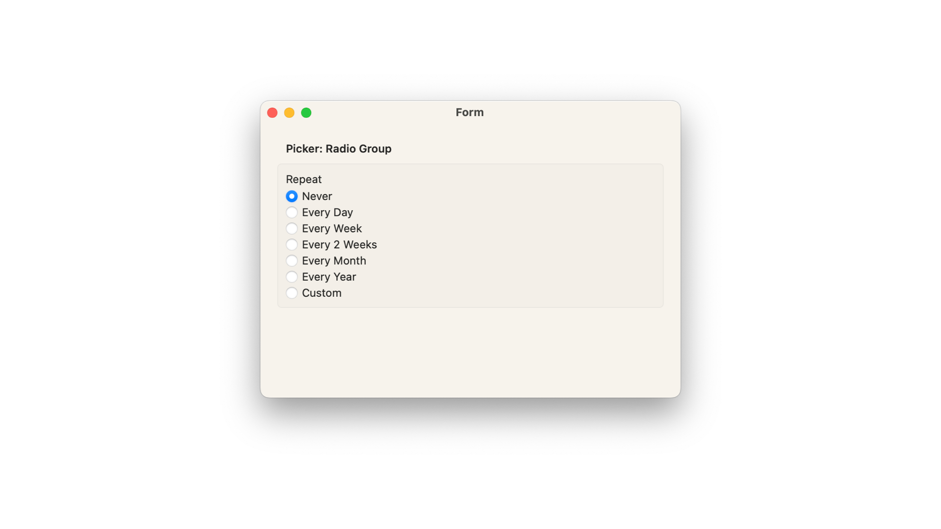
Only available for macOS, the radioGroup picker style presents the options of the picker as radio buttons, rendering a circular icon that fills up to represent the selected option.
Form {
    Section("Picker: Radio Group") {
        Picker("Repeat", selection: $selectedRepetition) {
            ForEach(Repetition.allCases) { repetition in
                Text(repetition.rawValue)
                    .tag(repetition.rawValue)
            }
        }
        .pickerStyle(.radioGroup)
    }
}
Date Picker in Forms
The DatePicker is a control that provides the ideal experience for selecting a date and time, depending on the context of the application.
// Variable to store the selected value
@State private var selectedDate: Date = Date()

DatePicker("Date and Time", selection: $selectedDate)
If the data the user needs to enter is limited to only a date or only time you can define it on its initializer as well.
DatePicker("Date only", selection: $selectedDate, displayedComponents: [.date])

DatePicker("Time only", selection: $selectedDate, displayedComponents: [.hourAndMinute])
Date only, date and time and time only examples of date pickers on iOS.
Like pickers, you can also render a DatePicker in different styles by using the datePickerStyle(_:) modifier. In a Form view a DatePicker uses the compact date picker style as default.
Form {
    Section("Date Picker") {
        DatePicker("Date and Time", selection: $selectedDate)
            .datePickerStyle(.graphical)
    }
}
- The
compactdate picker style renders the date and the time selection in a row, alongside the label of the picker. By interacting with the date button you will be presented with a calendar to pick the date from. By interacting with the time button you will be able to select the hour and minutes on a simplified wheel interface. - The
graphicaldate picker style renders a full calendar view in aForm. - The
wheeldate picker style renders the selection of the date and time in the classic Apple wheel interface.
Compact, graphical and wheel date picker style on iOS.
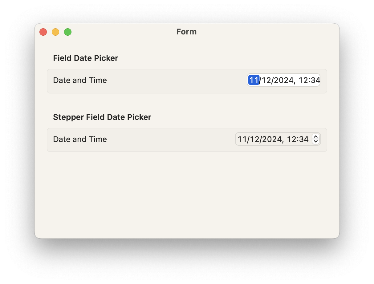
- The
fielddate picker style is available only on macOS. The date components will be displayed in an editable field - The
stepperFielddate picker style is available only on macOS. The date components will be displayed in an editable field with a stepper that can be used to increment and decrement the values.
Color Picker in forms
Color Picker with and without opacity support on iOS.
The ColorPicker is a control that provides the ideal experience for selecting colors, depending on the operational system where the application is running. You can define if the selection will support opacity or not and provide a customized label to the component as well.
Section("Color Picker") {
    ColorPicker("Calendar Color", selection: $selectedColor)

    // Not supporting opacity in the selection controls
    ColorPicker("Calendar Color", selection: $selectedColor, supportsOpacity: false)

    // Customized label
    ColorPicker(selection: $selectedColor) {
        HStack {
            Image(systemName: "paintpalette.fill")
                .foregroundStyle(selectedColor)
            Text("Calendar Color")
        }
    }
}


