Mastering Forms in SwiftUI: Text Fields
Learn how to use text fields and secure field controls in forms in SwiftUI apps.
An essential type of information collected by filling out forms is text. It could be a simple entry, like the username for an account, or a longer text entry, like the bio for a user profile. SwiftUI has multiple types of views to support form-based data-entry experiences.
The importance of providing a good user experience for collecting text-based information cannot be overlooked, and when it is it communicates to the user a lack of care by the developer. Apple’s Human Interface Guidelines provide a set of best practices and platform considerations when using text fields in your application user interface.

Using Text Fields
An editable text interface, ideal for simple text entries in a form. A TextField needs a label to be used as a placeholder and a binding value value to store the String value input by the user.
@State private var firstName: String = ""

Form {
    Section("Identification") {
        TextField("First name", text: $firstName)
    }
}
When initializing a TextField you can also define if the text written should grow horizontally or vertically when it gets long by defining its axis. You can limit how much a text field grows vertically by using the lineLimit(_:) modifier.
TextField("First name", text: $firstName, axis: .horizontal)
TextField("First name", text: $firstName, axis: .vertical)
If there is a need for further customization of the appearance of the label, use the TextField initializer that takes a view builder to define the label which will allow you to use modifiers as well.
TextField(text: $firstName) {
    Text("First name")
        .fontDesign(.monospaced)
        .bold()
}
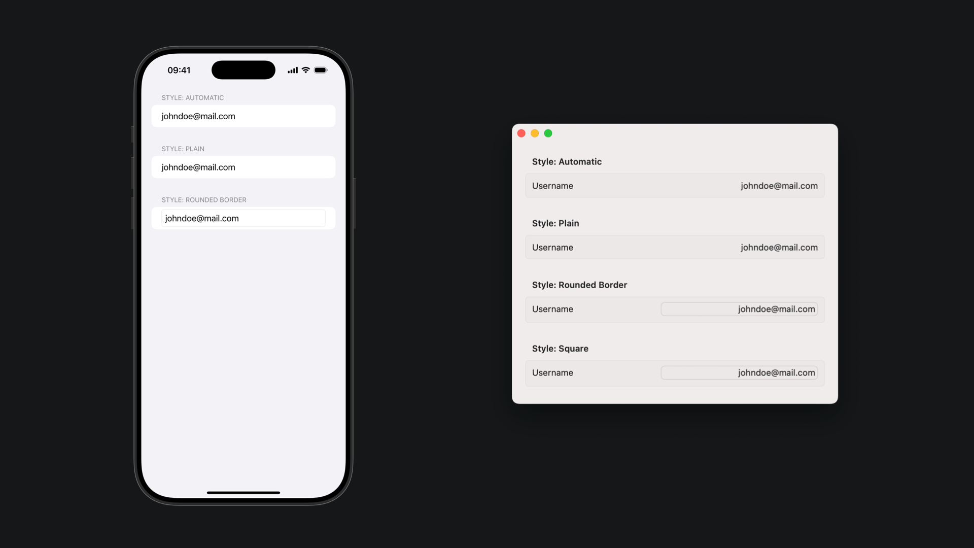
You can also apply different styles to text fields with the textFieldStyle(_:) modifier. The available styles are:
automatic: Applies the default text field style based on the context.plain: Applies a simple text field style with no decoration.roundedBorder: Applies a text field style with a rounded border.squareBorder: Available only on macOS, applies a style with a squared border. If the form style is set asgroupedthe appearance of asquareBordertext field is the same as the appearance of theroundedBorder.

You can further customize a text field with the following modifiers:
keyboardType(_:)submitLabel(_:)autocorrectionDisabled(_:)textInputAutocapitalization(_:)scrollDismissesKeyboard(_:)onSubmit(of:_:)
Keep in mind that you can also take advantage of modifiers that customize text properties as well, such as:
Using Secure Field
When you need to guarantee that the text in the text field is hidden, use the SecureField control. It’s commonly used to protect sensitive information, like payment-related information or passwords of any kind.
Section("Log in") {
    TextField("Username", text: $username)

    SecureField("Password", text: $password)
        .autocorrectionDisabled()
        .textInputAutocapitalization(.never)
}
You can also take advantage of the onSubmit(of:_:) modifier to perform form validation and authentication actions when the user presses the return button on their keyboard.
SecureField("Password", text: $password)
    .onSubmit {
        if validateForm() == true {
            authenticateUser()
        } else {
            provideValidationFeedback()
        }
    }


