
Mastering Forms in SwiftUI: Toggles
Learn how to create and customize the appearance of toggles in a form-based experience with SwiftUI.

A constant presence in any form-based experience is to provide answers to yes-or-no questions. They can also be found within an app user interface, most commonly on settings or customization panels, as options to turn on or off.
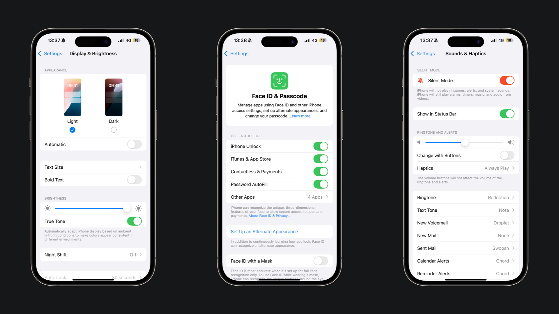
The toggle is the UI element that translates this use case in the user interface, and it can be visually represented as a switch (on mobile interfaces and when representing an on and off state), a toggled button, or a checkbox (on desktop interfaces or when representing a metaphor of “inclusion”)
Creating a toggle
The default version of a toggle needs a title that describes what the toggle changes and a binding to the variable that will store the Boolean value to be toggled.
struct WifiSettingsView: View {
    @State var isWifiOn: Bool = false

    var body: some View {
        Form {
            Section {
                Toggle(toggleLabel, isOn: $isWifiOn)
            }
        }
    }
}
Simple toggle being switched on and off
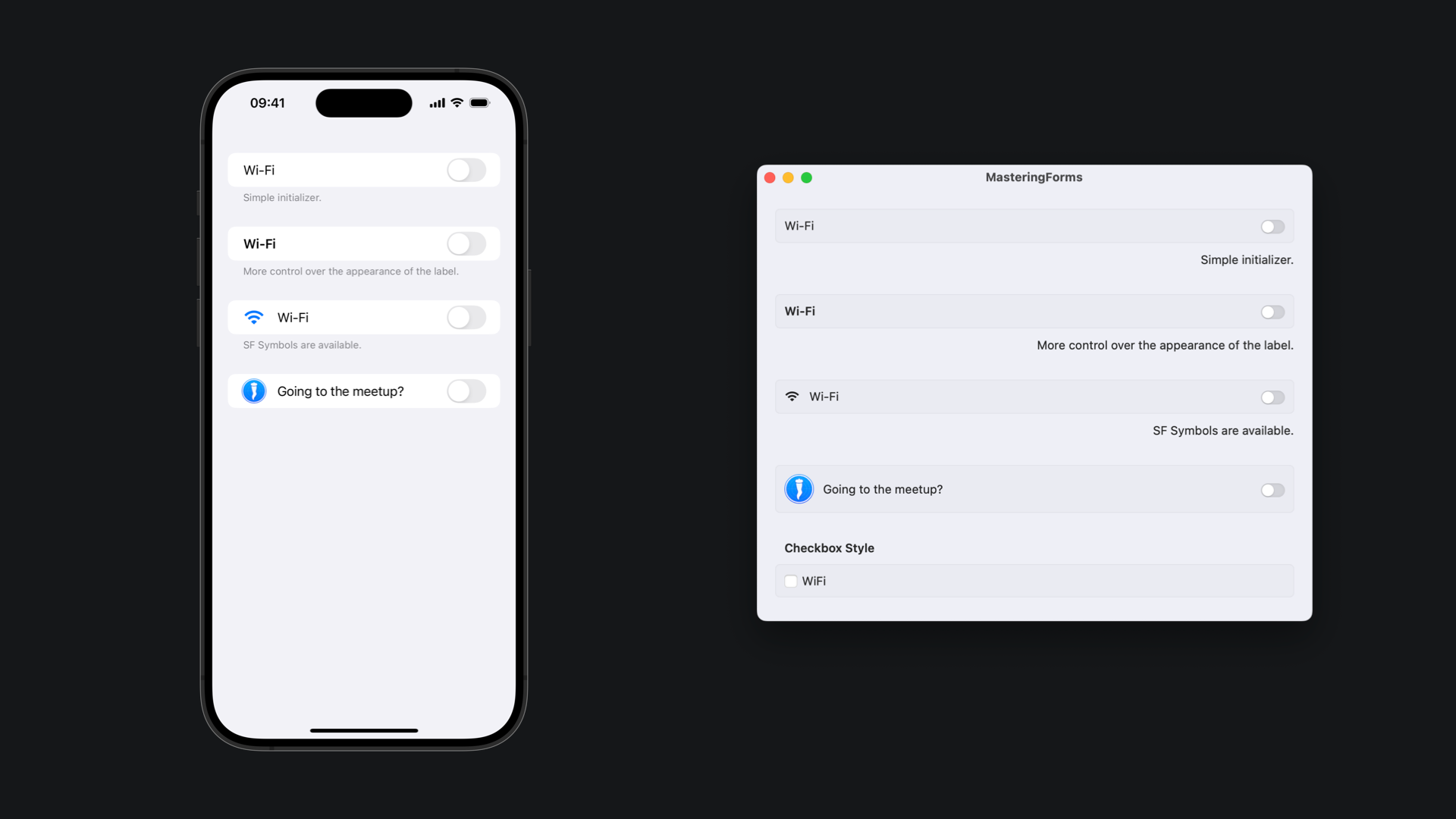
There are different ways of initializing a toggle, providing you with more or less control over how its label looks.
// Simple initializer.
Toggle("Wi-Fi", isOn: $isWifiOn)

// More control over the appearance of the label
Toggle(isOn: $isWifiOn) {
    Text("Wi-Fi")
        .bold()
}

// Initialize with an SF Symbol on the label
Toggle("Wi-Fi", systemImage: "wifi", isOn: $isWifiOn)

// Initialize with an image as icon
Toggle(
    "Going to the meetup?",
    image: ImageResource(name: "meetup-icon", bundle: Bundle.main),
    isOn: $isGoingToMeetup
)
Different initializers for a toggle with different ways of defining its label
The appearance of a toggle adapts to the operational system where the application is running. For better visualization on macOS, apply the grouped style on the Form container using the formStyle(_:) modifier.
Toggling multiple options at once
To toggle multiple options at once, you can use one of the toggle initializers for collections.
// Simple collection toggle initializer
Toggle("Add all extras", sources: $options, isOn: \.isOn)

// Collection toggle initializer with a custom label
Toggle(sources: $options, isOn: \.isOn) {
    Text("Add all extras")
}

// Collection toggle initializer with SF Symbol as icon
Toggle("Add all extras", systemImage: "cart", sources: $options, isOn: \.isOn)
Different ways of initializing a toggle for a collection of values
Here is an example of how to use it:
struct Option: Hashable, Identifiable {
    var id = UUID()
    var isOn: Bool = false
    var description: String = ""
}

struct BurgerExtrasView: View {
    @State var options = [
        Option(isOn: false, description: "Extra hamburger"),
        Option(isOn: false, description: "Extra mayonnaise"),
        Option(isOn: false, description: "Extra salad"),
        Option(isOn: false, description: "Extra pickles")
    ]

    var body: some View {
        Form {
            Section("Extras") {
                ForEach($options) { $option in
                    Toggle(option.description, isOn: $option.isOn)
                }
            }

            Section {
                Toggle("Add all extras", sources: $options, isOn: \.isOn)
            }
        }
    }
}
Example of how to set up a toggle for a collection of values
Styling a toggle
As with many of the available controls for SwiftUI, toggles have different visual styles, so you can decide which visual metaphor better fits your user interface.
Use the toggleStyle(_:) modifier to apply one of the available styles:
switch: the default appearance of a toggle in a form on iOS, iPadOS, and macOS, presenting a switch metaphor turning on and off.button: presents the toggle as a button that changes appearance when clicked or tapped.checkbox: macOS only, presents a classic checkbox visual and behavior.
Toggle("WiFi", isOn: $isWifiOn)
    .toggleStyle(.automatic)

Toggle("WiFi", isOn: $isWifiOn)
    .toggleStyle(.switch)

Toggle("WiFi", isOn: $isWifiOn)
    .toggleStyle(.button)

// macOS only
Toggle("WiFi", isOn: $isWifiOn)
    .toggleStyle(.checkbox)
Different available toggle styles on SwiftUI
Example of the different toggles styles on iOS and macOS
Create a new toggle style conforming to the ToggleStyle protocol to define a custom appearance and behavior for a toggle.
// Declare a type that conforms to the ToggleStyle protocol
struct TodoListToggleStyle: ToggleStyle {
        // Implement the appearance and behaviors of the style
    func makeBody(configuration: Configuration) -> some View {
        HStack {
            Image(systemName: configuration.isOn ? "checkmark.circle.fill" : "circle")
                .foregroundStyle(configuration.isOn ? Color.accentColor : .secondary)

            configuration.label
                .foregroundStyle(configuration.isOn ? .secondary : .primary)
                .strikethrough(configuration.isOn, pattern: .solid, color: .secondary)
        }
        .onTapGesture {
            configuration.isOn.toggle()
        }
    }
}
Creating a custom toggle style
To use a custom toggle style, provide easy access by extending the ToggleStyle type and declaring a static variable to initialize it, then apply it to a Toggle view with the toggleStyle(_:) modifier.
extension ToggleStyle where Self == TodoListToggleStyle {
    static var todo: TodoListToggleStyle { .init() }
}
struct Todo: Hashable, Identifiable {
    var id = UUID()
    var isDone: Bool = false
    var description: String
}

struct TodoListView: View {

    @State var todos = [
        Todo(description: "Create Xcode project"),
        Todo(description: "Write article body"),
        Todo(description: "Create article cover"),
        Todo(description: "Upload article on Ghost"),
        Todo(description: "Review article"),
        Todo(description: "Create image assets"),
        Todo(description: "Schedule article")
    ]

    var body: some View {
        Form {
            Section("Task List") {
                ForEach($todos) { $todo in
                    Toggle(todo.description, isOn: $todo.isDone)
                        .toggleStyle(.todo)
                        .listRowSeparator(.hidden)
                }
            }
        }
    }
}
Example of the usage of a custom toggle style on an app UI