Navigating Pitfalls: The Do's and Don'ts of Gestural Interfaces
Explore the current state of gestures in user interfaces and user experiences on Apple mobile operating systems.
The revolution happens through small actions, and gestures are some of the elements that revolutionized the interaction between humans and digital interfaces. Just thinking that with a single swipe or tap, users can navigate, communicate, and create in a way that feels almost second nature.
Like any powerful tool, gestures come with a set of unique challenges and criticisms that demand careful consideration. When not thoughtfully implemented, they can interfere with accessibility, limit discoverability, and clash with core system functions, leaving users frustrated instead of empowered.
Understanding the evolution that gestures have undergone over time and their categorization is crucial in order to accurately design an experience that is intuitive, inclusive and has the user at the center of the interaction.
Understanding Gesture Challenges in Navigation
Designing the right user experience is an art, especially when the focus is on the user's interaction with a digital interface. Of these interactions, gestures are the most immediate and recognizable, and cover a large part of the user experience of a digital product; just think that navigation in an app is strictly based and structured on certain types of gestures, yet they also bring specific limitations that can impact usability if not carefully considered. Their flexibility is both a strength and a vulnerability: poorly designed gestures can easily negatively impact navigation or overlap with system and accessibility features, frustrating users and limiting their ability to fully engage with an app.
Relying on gesture-based interactions means that designers must understand how they relate to and depend on the system, and avoid arriving at obvious conclusions. In short, in these cases we must follow the advice of the great master Yoda: “You must unlearn what you have learned”. This is particularly relevant here, as designers need to discard the assumption that gestures are universally intuitive. Misuse of gestures can overlap with existing system gestures, especially those reserved by iOS for functions like VoiceOver or Zoom.
One-finger double-tap for VoiceOver, three-finger tap for Zoom
One of the distinctive elements of gestures is their hidden nature. Not being able to enjoy the same immediacy as buttons and icons, the user needs to understand them intuitively or be guided. When gestures are difficult to discover or remember, users may struggle to access core app features.
A common example of this can be seen with system-wide gestures on iOS, like the swipe-up action to access the Home screen. When apps override this gesture, it disrupts users' muscle memory, making it challenging to exit. Similarly, if an app uses a three-finger swipe, that is usually reserved for undo/redo actions or accessibility functions, users unintentionally activate these system features, interrupting their workflow.
Another common problem is the reliance on complex multi-finger gestures for primary actions. These gestures can be hard for users with limited motor skills or those who are unfamiliar with advanced gestures. Additionally, they increase cognitive load because users must remember the specific function of each gesture.
Intuitive Gestures
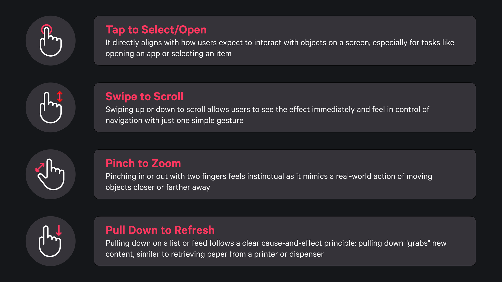
Certain touch gestures feel natural to users, reflecting real-life actions and providing immediate feedback. A simple tap on the screen, for example, is akin to pressing a button and has become the standard for selecting or opening items. This “tap to select” function feels universally intuitive, aligning with the way users expect to interact with objects, whether they’re opening an app or selecting an option.
Swiping is another gesture that resonates with users due to its resemblance to how people might handle physical items. Swiping up or down to scroll through content mimics the act of moving paper, giving users control over navigation with a simple motion. Pinching to zoom, a gesture achieved by moving two fingers together or apart, follows a similar real-world logic, as if one were adjusting the distance of a photo or map to see it closer or further away.
Other gestures, like swiping left to delete or archive an item, have become associated with discarding or archiving, especially in apps like email. Pulling down to refresh a feed is another intuitive action; it simulates the act of retrieving something as if pulling down on a lever to access new content.

Hard-to-Discover Gestures
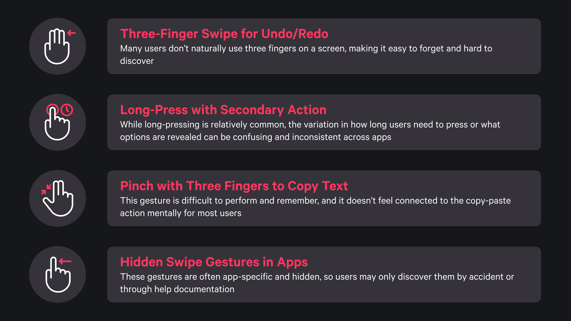
Some gestures, while functional, are less intuitive and often harder for users to remember or discover on their own. For example, swiping with three fingers to undo or redo an action may be beneficial in some contexts, but the three-finger swipe is not a natural movement for most users. Similarly, a long-press action on an icon can reveal secondary options, but users often don’t know how long to press, and the variations in actions across different apps can create inconsistency and confusion.
Certain gestures also require an unconventional use of fingers or motions that lack a clear connection to the task. For instance, using a three-finger pinch to copy text and a reverse three-finger pinch to paste it may feel awkward or disconnected from the action it performs. Meanwhile, gestures such as scrolling from the top right-hand corner to open the Control Centre are specific to newer device models, a totally different approach to those of the past where it was done from the bottom. This makes them difficult to discover intuitively; indeed, in cases like this, there is a graphical reference indicating the possible action.
Evolution of gestures for accessing Control Centre from iOS 7 to iOS 18
Other hidden gestures, such as swiping within Safari to close a tab, can be highly useful but remain obscure without explicit guidance. Such gestures often go unnoticed unless users stumble upon them or learn about them through instructions.

Avoiding Overlap with Accessibility Tools
When designing gesture-based interactions, it is essential to recognize that many iOS gestures are dedicated accessibility settings, crucial for assisting users with visual, motor, or cognitive impairments. System-reserved gestures serve a key role in allowing these users to navigate, interact, and control their devices effectively. Repurposing or overlapping these gestures within an app can unintentionally create barriers, disrupt the user’s flow, and ultimately compromise accessibility.
Apple’s accessibility tools, including VoiceOver, Zoom, Switch Control, and AssistiveTouch, each use specific multi-finger gestures, taps, and swipes. For instance, VoiceOver users navigate with gestures such as a two-finger double tap to start or stop an action and a one-finger swipe to move between elements.
If you want to know more about VoiceOver and some of the associated gestures read these articles:


Redefining these gestures within an app interferes with the system functionality these users rely on, leading to frustration and limiting access to essential features.
Similarly, Zoom uses three-finger taps and swipes to adjust magnification levels or move around the screen. When an app reassigns these standard gestures, users may unintentionally activate accessibility tools, disrupting both task completion and the app’s overall usability.
This overlap in gesture functionality introduces a complex set of challenges, particularly from a user experience perspective. For users who depend on accessibility tools, conflicting gestures increase cognitive load, requiring them to second-guess actions and mentally track which gestures perform specific tasks in the app versus on the system.
Without careful design considerations, an app’s gesture conflicts can alienate these users, adding unnecessary complexity to the interaction and undermining the intended user experience.
A robust approach to resolving this issue involves proactive adherence to Apple’s Human Interface Guidelines, coupled with comprehensive testing under accessibility modes.
Testing with VoiceOver, Zoom, and other accessibility tools enabled can help teams identify gesture conflicts early, allowing for adjustments that respect system-reserved actions. Additionally, providing customizable gesture options within the app can empower users to tailor their experience, reducing the likelihood of accidental overlaps and enhancing accessibility.
Designing with inclusivity in mind helps developers to foster a user experience that not only aligns with Apple’s guidelines but also ensures that gestures enhance, rather than hinder, the digital journey. Respecting accessibility gestures is a fundamental step toward a user-friendly, inclusive interface that seamlessly integrates with the system’s accessibility features, reducing friction and creating a more welcoming environment for all users.
Designing User-Friendly Gestures
Designing intuitive and user-friendly gestures involves a thoughtful balance of accessibility, functionality, and simplicity. The goal is to create gestures that feel natural and easy to learn, thereby reducing cognitive load. By concentrating on basic gestures such as taps, swipes, and pinches, we ensure that users feel familiar with the interactions, which helps minimize the learning curve for new users.
Providing visible alternatives to gesture-based actions is essential for accessibility. Including buttons, icons, or other controls ensures that all users have options, especially those who may struggle with certain gestures. For example, instead of relying solely on a swipe gesture to delete an item, a visible delete button can make this action accessible to everyone.
Three flows to delete a note: left using list editing and selection, centre using force touch and right using swipe left
As said before, gestures are invisible by nature, which means that guiding users through tutorials or tooltips is helpful, especially for less common interactions. Rather than overwhelming users, hints introduced at the right time support progressive learning, while providing feedback (whether visual, tactile, or auditory), is another best way to inform users that their actions have been recognized and registered by the system.
Shazam button highlighting the visual and haptic effects once pressed
Streamlining the number of gestures helps to minimize confusion. By dedicating a single gesture to each action, you enhance clarity and make it easier for users to remember their functions, resulting in a more seamless navigation experience.
Additionally, conducting tests with a wide range of users, including those who use accessibility features, can pinpoint areas where gestures might need improvement. Observing how different groups interact unveils real-world usability challenges, ensuring gestures perform effectively across various devices and scenarios.
Perfecting Gestures Through Testing and Iteration
Creating a successful gesture-based interface is not a one-time project; it’s a continuous cycle of testing, feedback, and iteration that evolves alongside user needs and accessibility standards. This iterative process helps ensure that gestures not only perform as intended across devices but also support a wide range of users’ needs, aligning the app with an inclusive design philosophy.
Testing gestures on various devices and screen sizes helps confirm consistency in performance, as different platforms may respond uniquely to the same gesture. Each platform may interpret gestures slightly differently based on factors like screen sensitivity and user hand size, which can influence gesture recognition.
As developers, observing how users who rely on accessibility tools, interact with gestures can reveal potential conflicts with system functionalities or areas where gestures might benefit from refinement.
A real-time analysis not only helps understand user interactions more deeply but also informs necessary adjustments that can enhance overall satisfaction. Adopting a flexible and open-minded approach to gesture design, we can adapt interfaces to evolving user expectations and remain responsive to ongoing technological advancements.
In conclusion
Gestures have a unique power in touch-based design, transforming digital interactions by enabling intuitive and fluid navigation. However, with this power comes the responsibility to design gestures thoughtfully, respecting system-reserved actions and accessibility needs. When gestures clash with core system functionalities or overlook inclusivity, they risk frustrating users and creating unnecessary barriers.
With the evolution of digital interfaces the approach to gesture-based design must also adapt, maintaining a commitment to accessibility and usability. Thoughtful gesture design fosters an environment where technology is inclusive, intuitive, and accessible, empowering every user to navigate confidently and smoothly in a digital world designed with them in mind.


