Placing UI components within the Safe Area Inset
Learn how to place views and controls on the borders of a view container in a SwiftUI app.

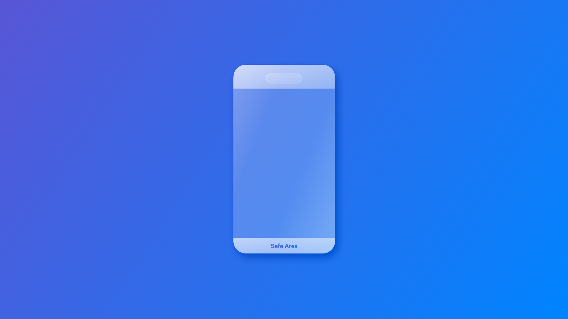
The safe area is the screen portion that remains unobstructed by system UI elements such as the status bar, navigation bar, tab bar, Dynamic Island, and home indicator.
By default, SwiftUI ensures that views are placed within this safe area to maintain visibility and accessibility. However, there are cases where developers need more control over how views interact with these boundaries.
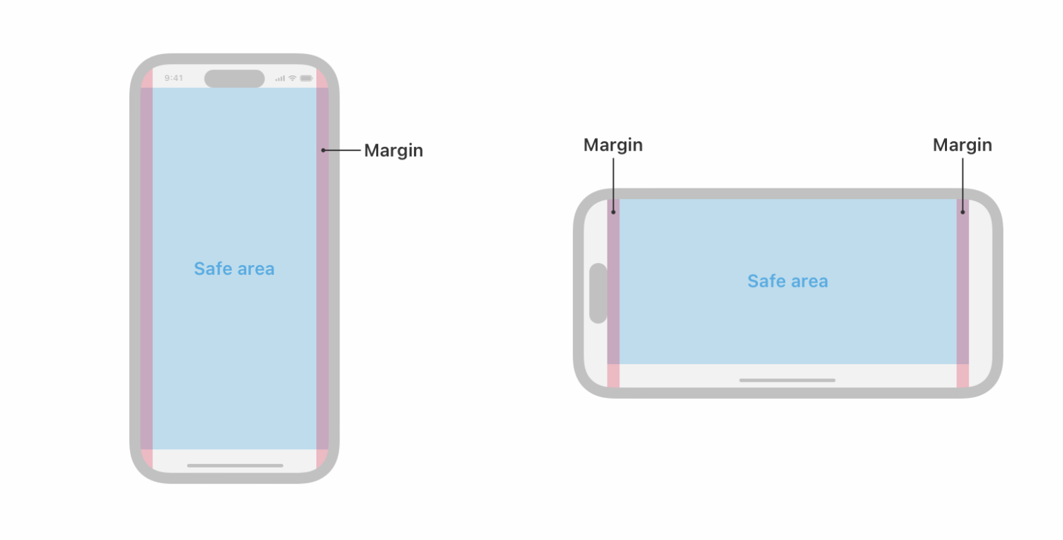
Safe Area Inserts allow developers to adjust the positioning and padding of views relative to the safe area. For example, they can create a custom navigation bar that extends to the screen's top edge or position overlays like tooltips, popovers, and floating buttons.
The safeAreaInset(edge:alignment:spacing:content:) modifier allows us to insert additional content along a specified edge of a view’s safe area. We need to provide the following properties:
edge: Specifies the edge of the view’s safe area (e.g.,.top,.bottom,.leading, or.trailing).alignment: It's optional and determines how the inserted content is aligned.spacing: It's optional and adds spacing between the inset content and the main content.content: A closure that returns the view you wish to insert on that edge of the safe area.
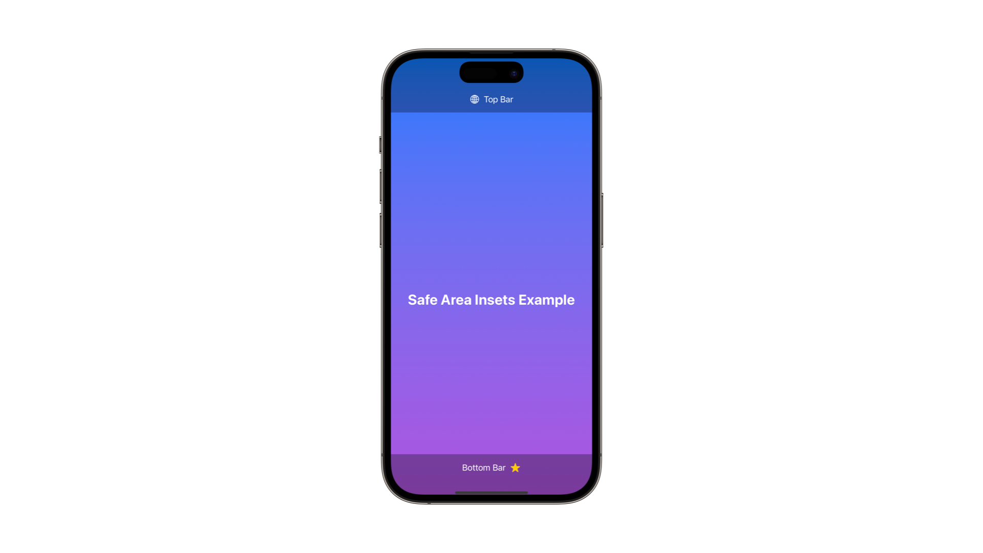
import SwiftUI

struct ContentView: View {
    var body: some View {
        ZStack {
            LinearGradient(colors: [.blue, .purple], startPoint: .top, endPoint: .bottom)
                .ignoresSafeArea()

            VStack(spacing: 20) {
                Text("Safe Area Insets Example")
                    .font(.title)
                    .fontWeight(.bold)
                    .foregroundColor(.white)
            }
        }
        .safeAreaPadding(.top, 64.0)

        .safeAreaInset(edge: .top, spacing: 0) {
            safeAreaComponent(text: "Top Bar", symbolName: "globe")
        }

        .safeAreaInset(edge: .bottom, spacing: 0) {
            safeAreaComponent(text: "Bottom Bar", symbolName: "star.fill")
        }
    }

    func safeAreaComponent(text: String, symbolName: String) -> some View {
        HStack {
            Text(text)
                .foregroundColor(.white)
            Image(systemName: symbol)
                .foregroundColor(.yellow)
        }
        .frame(maxWidth: .infinity)
        .padding()
        .background(Color.black.opacity(0.3))
    }
}
By attaching the safeAreaInset(edge:alignment:spacing:content:) modifier to a container View, specifically the ZStack, we can position UI elements within the desired safe area region.
Additionally, we can use the safeAreaPadding(_:_:) modifier for adjusting the safe area by a specified amount, either on all edges or a selected subset.
import SwiftUI

struct ContentView: View {
    var body: some View {
        ZStack {
            LinearGradient(colors: [.blue, .purple], startPoint: .top, endPoint: .bottom)
                .ignoresSafeArea()

            VStack(spacing: 20) {
                Text("Safe Area Insets Example")
                    .font(.title)
                    .fontWeight(.bold)
                    .foregroundColor(.white)
            }
        }
        .safeAreaPadding(.bottom, 80.0)

        .safeAreaInset(edge: .top, spacing: 0) { ... }

        .safeAreaInset(edge: .bottom, spacing: 0) { ... }
    }
}