Preparing your App Icon for dark and tinted appearance
Discover the new requirements for app icons introduced with iOS 18.
During WWDC24, Apple announced major changes to how App Icons are displayed on the Home Screen. Users can now customize the App Icons to adapt to a fixed Dark Mode or apply a color tint to them.
Adapting existing App Icons
To ensure consistency with the system, you will need to provide 3 different variants of your App Icon: Light Mode, Dark Mode, and Tinted
It is highly recommended that all these variants are provided, even if Dark Mode is not mandatory.
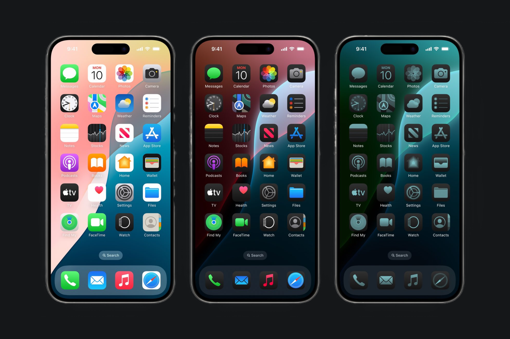
Your icon should always feel consistent in every mode it’s used. Starting your design process from the Light version of the App Icon is a great starting point.
Since it will be subject to user customization and might lose some contrast in different modes, ensure that your App Icon is essential and clear, with recognizable shapes at every size.
To support developers and designers in the creation of customizable App Icons, Apple released an updated version of the App Icon Template on the official design resources.
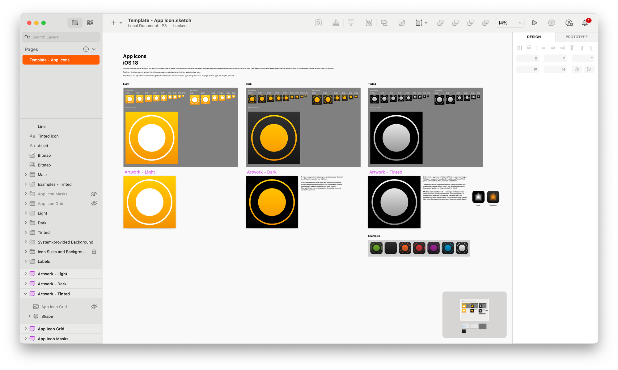
Let’s take an example of an already-designed App Icon with an orange and textured background and a white-shaded foreground, and see how it adapts to different required modes.
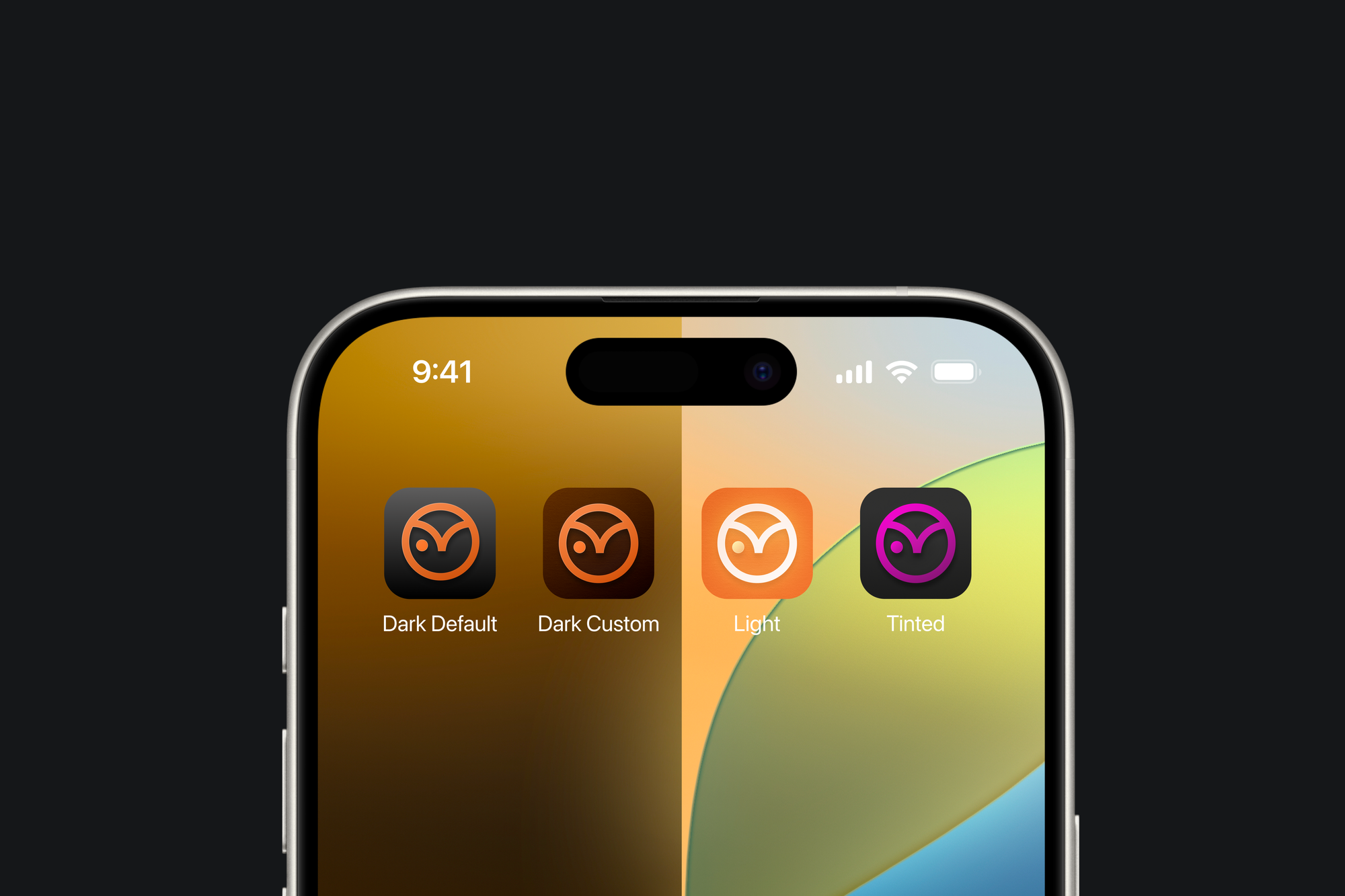
Dark Mode
When creating your Dark App Icon, it should match the style of the dark system icons and stay true to your original App Icon. You can keep the original color scheme and use the main color in the foreground of your icon. Just keep in mind that the foreground color may need to be made lighter for better contrast with the background. Check the Dark Mode colors page of the Apple Human Interface Guidelines for guidance.
By default, you can omit the background, then the system will automatically apply a dark background.
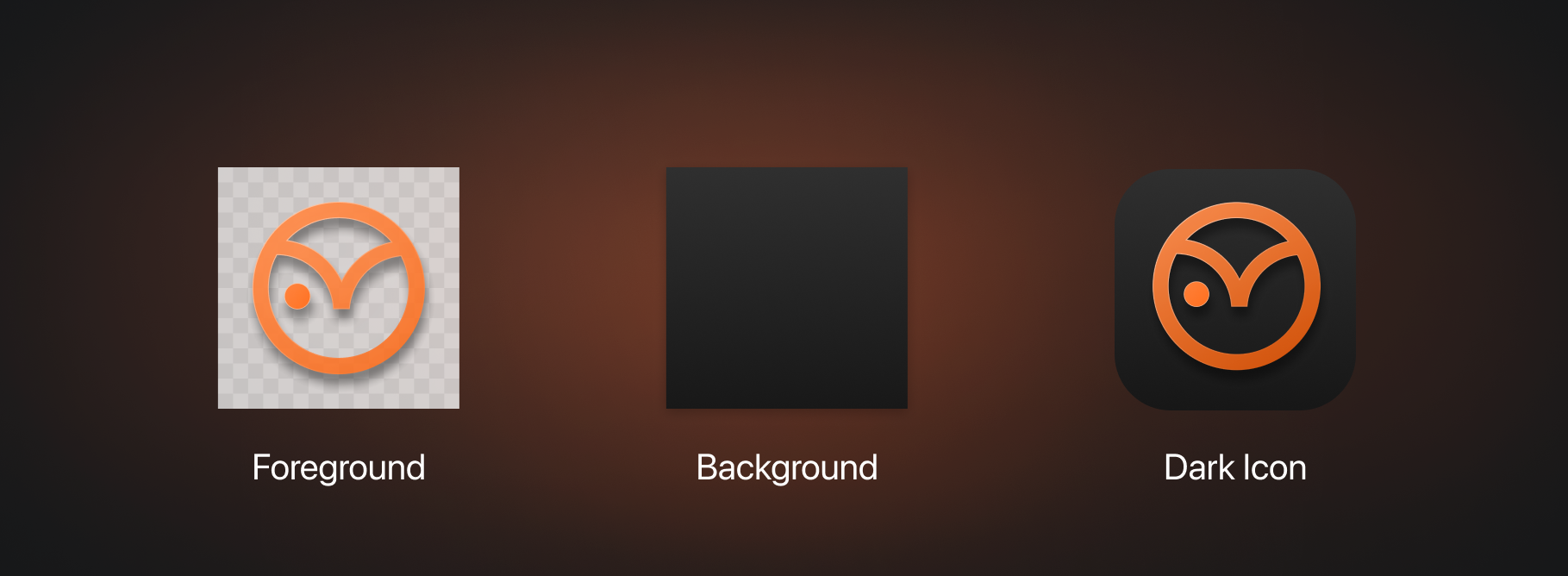
However, you still can import the full icon and customize your background with dark-shaded tints.
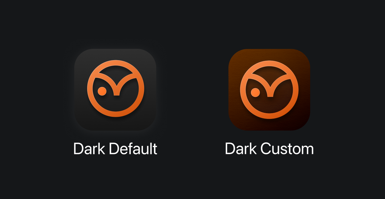
App Icons with dark background
Certain app icons default to a dark background. System apps like Wallet, Stocks, TV, and Watch have only one version, which remains the same in both light mode and dark mode. Additionally, some icons, like in Clock, have been slightly adapted or redesigned.
Tinted
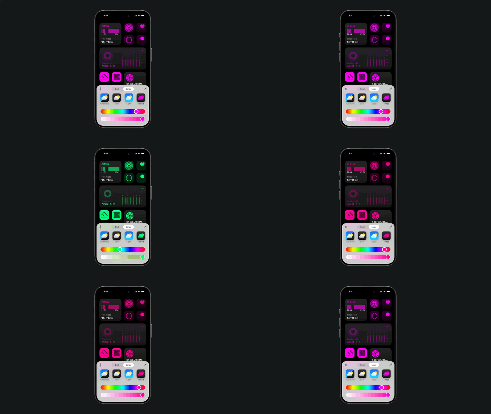
When using the tinted appearance feature, users can change the color of all App Icons on the Home Screen by adjusting the hue and saturation using a set of sliders. These changes will also apply to widgets, giving a cohesive look based on the chosen tint.
To prepare an App Icon for the tinted appearance, a fully opaque grayscale image is required. The system provides the default gradient background that will be applied to your icon.
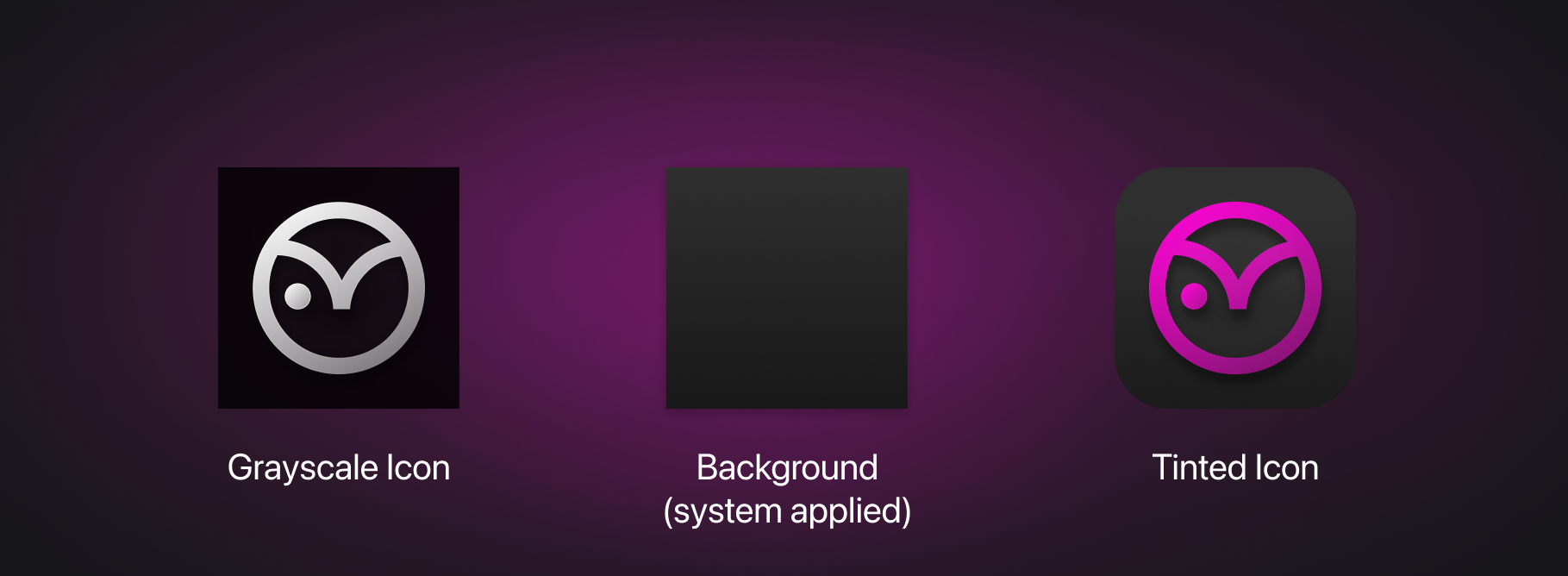
In some cases, different levels of contrast with various elements in the icon design may be desired. Different tones of gray, gradients, or flat designs can help achieve a consistent look and desired depth.
Be aware that if a variant of the icon for the tinted version is not provided, the system will apply the tint over the original icon, potentially resulting in an undesired look.
It's also possible for a user to change the size of the displayed App Icons on the Home Screen. Switching from the default size to the "large" option increases the displayed size and removes the label under the icon.
In conclusion, dark mode and tinted mode present a new challenge in creating App Icons. Providing a consistent look and feel across different modes may be challenging, but it also represents an opportunity to express the value of the app in various ways.

Check the official documentation for additional guidance on the iOS 18 & iPadOS 18 new App Icons guidelines.
