
Presenting an Inspector with SwiftUI
Learn how to use the inspector API to provide details in your user interface in SwiftUI.

Introduced with iOS 17, iPadOS 17 and macOS 14, the inspector is a SwiftUI element that displays extra information about selected content. It can be implemented by using the inspector(isPresented:content:) modifier. It is usually used when you need to inspect, edit or customize properties of an object, actions or files in a more detailed and structured way.
The way inspector(isPresented:content:) renders the content changes according to the operating system and the device's orientation: in iOS, it is usually presented as a sheet, while on iPadOS and macOS, it is a trailing sidebar, as you can see from the examples below.
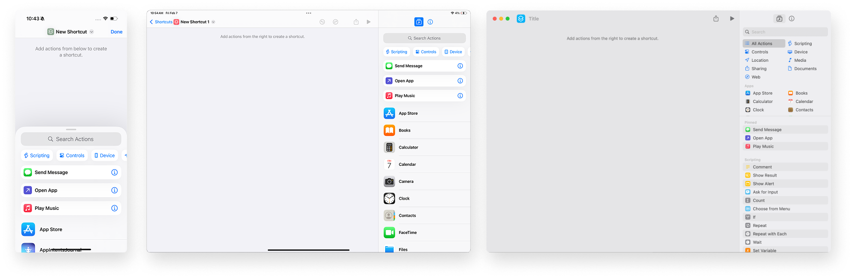
In the Shortcuts app, for instance, the inspector allows users to configure and fine-tune automation details, showing the library of available apps and actions as a sheet in iOS and a trailing sidebar for iPadOS and macOS.
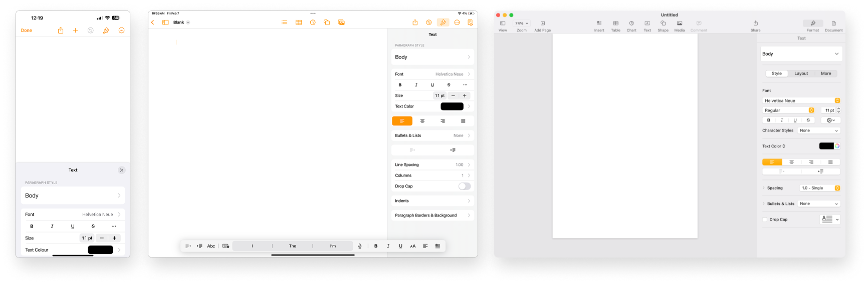
In the Pages macOS app, the inspector is used for showing formatting actions and document information, it follows the same pattern.
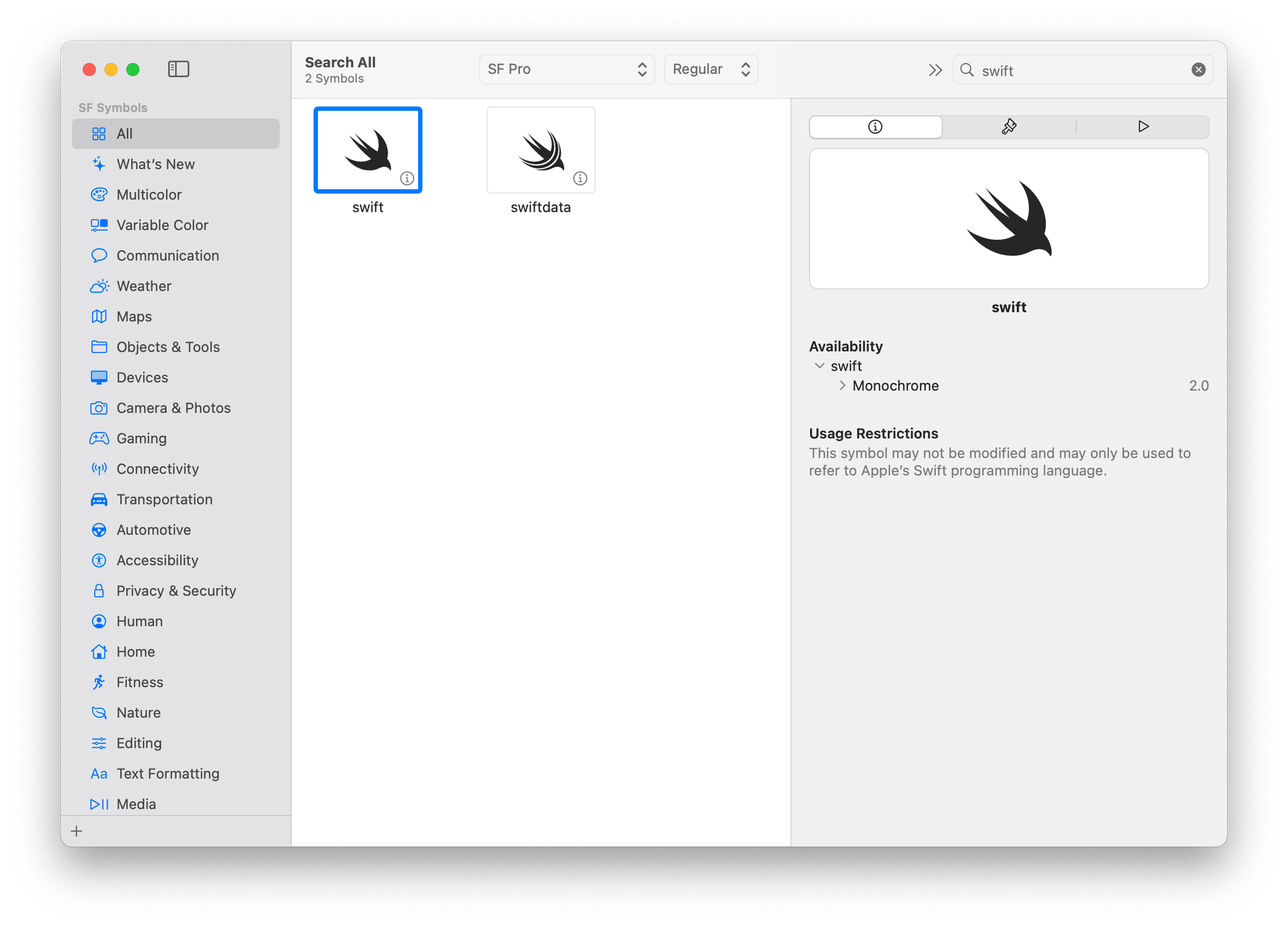
As well as in SF Symbols macOS app, the inspector allows to create and modify the rendering and animating metadata for the annotations.
The inspector(isPresented:content:) modifier works as follows.
import SwiftUI

struct ContentView: View {
    // The binding controlling the presentation
    @State var isPresented: Bool = true

    var body: some View {

        // The view
        VStack {
            Image(systemName: "globe")
                .imageScale(.large)
                .foregroundStyle(.tint)
            Text("Hello, world!")
        }

        // The inspector modifier
        .inspector(
            // 1. The binding controlling the presentation
            isPresented: $isPresented,
            // 2. The content to be displayed
            content: {
                VStack {
                    Image(systemName: "heart.fill")
                        .imageScale(.large)
                        .foregroundStyle(.red)
                    Text("This is an inspector")
                }
        })
    }
}
It is attached to a view container and takes two parameters:
isPresented- the binding boolean value that controls the presentation.content- the content to be displayed in the inspector view.
There are many different possibilities on how to implement the inspector, render it and the possible toolbar it can include - as you can decide to keep it as part of the navigation bar or keep it and its elements differentiated.
Let’s see how to implement it.
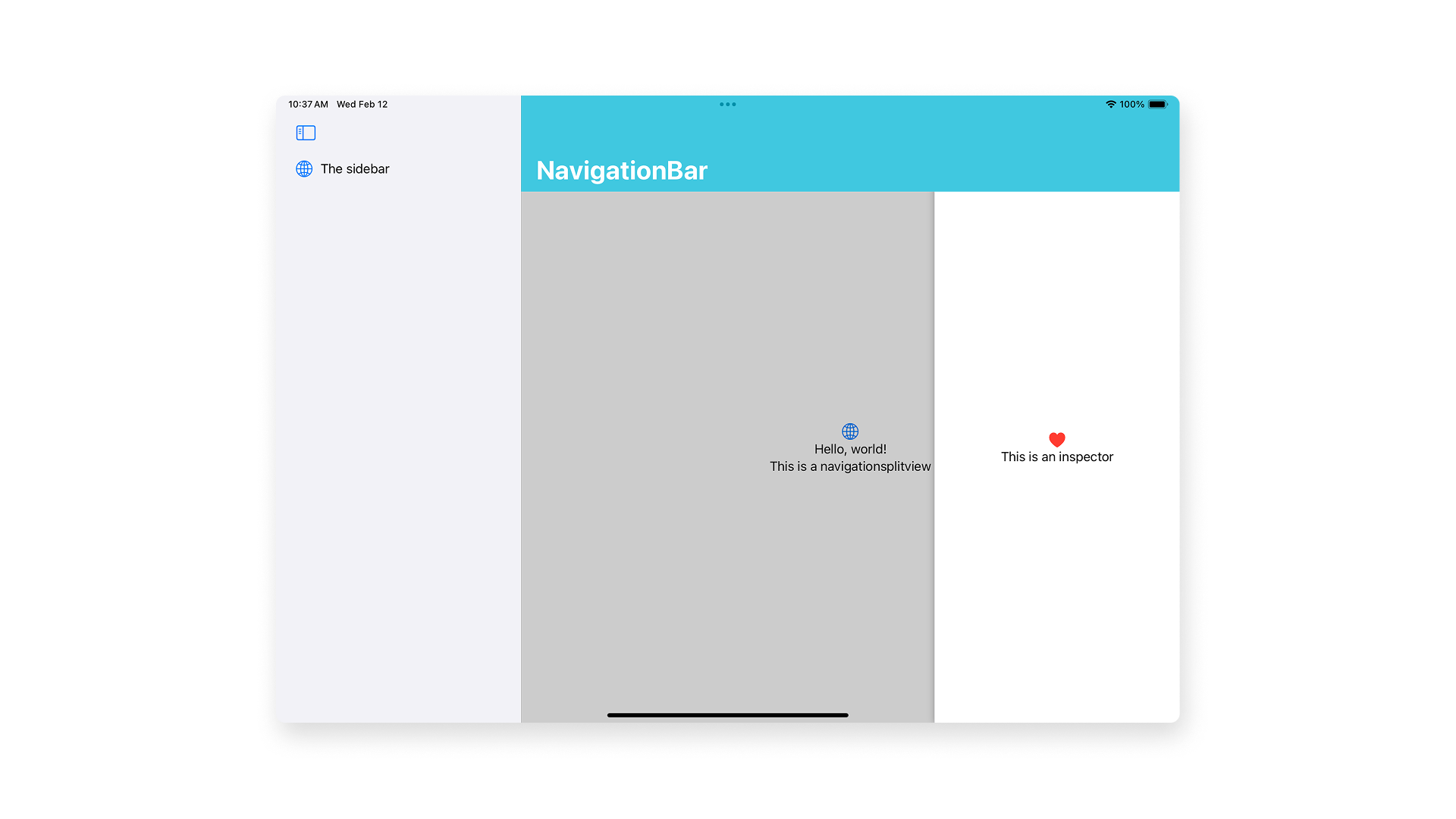
It can be attached to a view container as shown before or to a navigation structure like NavigationStack or NavigationSplitView - in this case the navigationBar will always overlay the inspector.
NavigationSplitView {
    // The sidebar
    List {
        HStack{
            Image(systemName: "globe")
                .imageScale(.large)
                .foregroundStyle(.tint)
            Text("The sidebar")
        }
    }
    // The content to show
} detail: {
    VStack {
        Image(systemName: "globe")
            .imageScale(.large)
            .foregroundStyle(.tint)
        Text("Hello, world!")
        Text("This is a navigationsplitview")
    }

    // The inspector modifier
    .inspector(isPresented: $isPresented, content: {
        VStack {
            Image(systemName: "heart.fill")
                .imageScale(.large)
                .foregroundStyle(.red)
            Text("This is an inspector")
        }
    })

    // NavigationBar modifiers
    .navigationTitle("NavigationBar")
    .toolbarBackgroundVisibility(.visible, for: .navigationBar)
    .toolbarBackground(.teal,for: .navigationBar)
    .toolbarColorScheme(.dark)

}
If the navigation structure used is a NavigationSplitView, the inspector should be attached to the view that defines the detail’s column’s of the split view.
You can choose to have a toolbar as well, whose rendering will depend on where you place the toolbar accordingly to the inspector.
- If the toolbar content is placed inside the inspector
NavigationStack {
VStack {
Image(systemName: "globe")
.imageScale(.large)
.foregroundStyle(.teal)
Text("Hello, world!")
Text("This is a navigationStack")
}
.frame(maxWidth: .infinity, maxHeight: .infinity)
.background {
Color.teal.opacity(0.15)
.ignoresSafeArea()
}
// The inspector modifier
.inspector(isPresented: $isPresented) {
VStack {
Image(systemName: "heart.fill")
.imageScale(.large)
.foregroundStyle(.red)
Text("This is an inspector")
}
.toolbar {
Button {
// Button action here
} label: {
Image(systemName: "slider.horizontal.3")
}
Button {
// Button action here
} label: {
Image(systemName: "wand.and.sparkles")
}
Button {
// Button action here
} label: {
Image(systemName: "eraser")
}
}
.toolbarBackgroundVisibility(.visible, for: .automatic)
.toolbarBackground(.teal.opacity(0.6),for: .navigationBar)
.toolbarColorScheme(.dark)
}
.navigationTitle("NavigationBar")
.toolbarBackgroundVisibility(.visible, for: .navigationBar)
.toolbarBackground(.teal,for: .navigationBar)
.toolbarColorScheme(.dark)
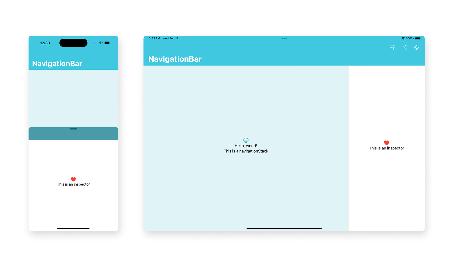
}The inspector doesn’t overlay the navigation bar and the toolbar actions are placed in it. In iOS, the inspector presents a toolbar but it’s not possible to see the content.
- If the toolbar content is placed outside the inspector.
NavigationStack {
    VStack {
        // The content column
    }
    .inspector(isPresented: $isPresented) {
        // The content to show in the inspector
    }
    .toolbar {
        // Actions of the toolbar
    }
}
The inspector still doesn’t overlays the navigationBar, and the toolbar is placed in the navigationBar always.
The inspector can also be implemented outside the navigation structure, in this case the navigation bar won’t overlay the inspector. Still, you can choose to have a toolbar too.
- If you place the toolbar content inside the inspector
NavigationStack {
    // The content to show
    ...

    // The navigationBar modifier
    ...
}

.inspector(isPresented: $isPresented) {
    // The content to show in the inspector
    ...

    // The toolbar to show
    .toolbar(content: {
        ...
    })

    // The toolbar modifiers
    ...
}
The inspector will overlays the navigationBar and have a toolbar or it-self - that can be customized - where to display the toolbar content. In iOS, the toolbar content is in the sheet.
- If you place the toolbar content outside the inspector
NavigationStack {
    // The content to show
    ...

    // The toolbar to show
    .toolbar(content: {
        ...
    })

    // The navigationBar modifier
    ...
}
// The inspector modifier
.inspector(isPresented: $isPresented) {
		// The content to show in the inspector
    ...
}
The inspector overlays but doesn’t have a toolbar.
As you can see in the example the inspector uses the grouped style by default. When presented as a trailing column, you can set the width size by applying the inspectorColumnWidth(_:) modifier on the content.
.inspector(isPresented: $isPresented) {
    // The content of the inspector
}
.inspectorColumnWidth(300)
As it is not resizable by default, you can also use inspectorColumnWidth(min:ideal:max:) modifier to provide a flexible, preferred width. You will need to set the minimum allowed width for the trailing column inspector, the initial width and the maximum allowed width.
.inspector(isPresented: $isPresented) {
    // The content of the inspector
}
.inspectorColumnWidth(min: 100, ideal: 200, max: 300)
Width size flexibility is available only for some platforms and it may vary if the current presentation environment doesn’t support the specified width.
When presented as a sheet it can be dismissed or presented when needed. Use the interactiveDismissDisabled(_:) modifier to prevent non-programmatic dismissal of the inspector, for example when there is an action that must be taken before being able to dissmiss it.
Further customization
You can customize the inspector by using a series of sheet methods that allows an higher degree of personalization such as:
presentationDetents(_:)- specify the height of the sheet;presentationBackground(_:)- set the background of a presentation and allows views behind the presentation to show through translucent styles. It is also possible to choose among different material to pass as parameter;presentationBackgroundInteraction(_:)- enable interactions with the background content;presentationBackgroundInteraction(.enabled(upThrought:)- to allow interaction only from a certain height;presentationCornerRadius(_:)- to modify the corner radius of the presentation;presentationContentInteraction(_:)- configure the behavior of swipe gestures on a presentation;presentationCompactAdaption(_:)- specify how to adapt a presentation to compact size classes.
.inspector(isPresented: $isPresented) {
    VStack {
        // The content of the inspector
    }
    .presentationDetents([.height(200), .medium, .large])
    .presentationBackground(.thinMaterial)
    .presentationBackgroundInteraction(.enabled(upThrought: .height(200))
}Last but not least, it is possible to take advantage of InspectorCommands, a built-in set of commands that allows the manipulation of the visibility of inspectors, toggling the presented state of the inspector with the keyboard shortcut ⌘⌃I.
@State var isPresented = true

WindowGroup {
    ContentView()
    .inspector(isPresented: $isPresented) {
        // The content of the inspector
    }
}
.commands {
    InspectorCommands()
}
Inspector provides contextual details while maintaining a clean UI. You can customize the user experience across iOS, iPadOS, and macOS by implementing it in a navigation structure, standalone view, or with a toolbar.
Its adaptability allows for tailored implementations, such as flexible widths on macOS, custom sheet views on iOS, or using InspectorCommands for keyboard shortcuts. However, use the inspector only when detailed configuration is necessary - keep interactions simple with quick access controls.
Integrate and customize the inspector in your SwiftUI projects to enhance usability and maintain platform consistency.