Symmetrical and asymmetrical transitions in SwiftUI with the Scroll Transition modifier
Learn how to implement animated scroll transitions when the view enters and exits the visible area in a SwiftUI application.

The modifier scrollTransition(_:axis:transition:), introduced with iOS 17, allows animating views between different visual states as they appear or disappear in a scrollable container. It is a great way to create dynamic and visually engaging scroll-based effects and draw attention to specific views entering or exiting the visible area.
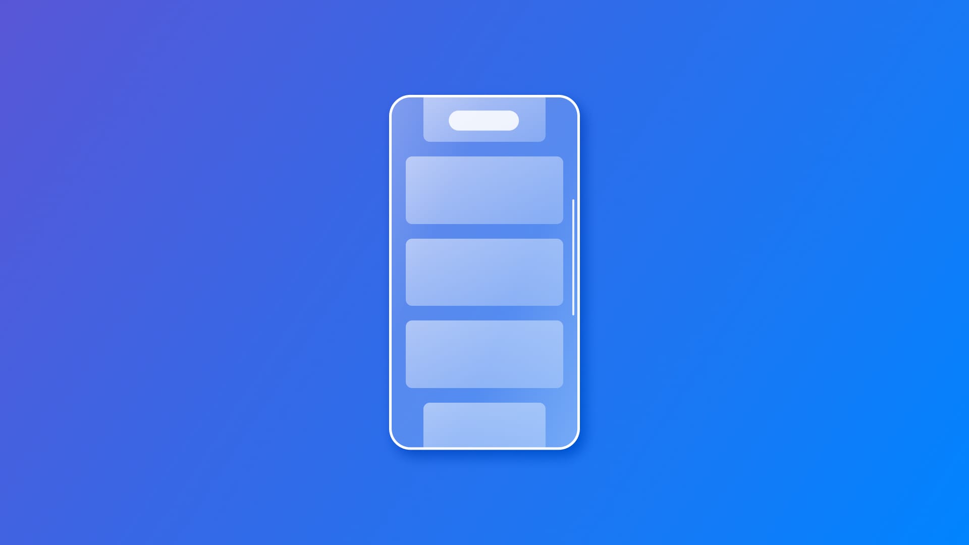
When scrolling a container like a ScrollView, views inside the container will disappear and appear and can transition between different visual effects based on their position. The transition dynamically animates between predefined phases as the view enters, remains in, or exits the visible region of the scroll view. The scrollTransition(_:axis:transition:) modifier allows control and customization of this behavior.
There are two different variations:
scrollTransition(_:axis:transition:)- This method applies a single, symmetrical transition effect as the view enters or exits the visible region. It's supposed to be used when implementing the same behavior when the view appears or disappears.scrollTransition(topLeading:bottomTrailing:axis:transition:)- It allows the definition of separate transition configurations as the view enters from the top/leading edge or exits through the bottom/trailing edge. It's supposed to be used when the transition behavior differs when the view enters and exits the visible area.
Symmetrical transitions
.scrollTransition(
    .interactive(timing curve: .easeInOut),
    axis: .vertical
) { content, phase  in
    let scaledContent = content.scaleEffect(phase.isIdentity ? 1 : 0.5)
    return scaledContent
}
Examples of an symmetrical scroll transition
This method takes the following parameters:
configuration- of typeScrollTransitionConfigurationto control how the transition behaves;axis- specifies the scroll axis, by default, it’s set onnil, which uses the innermost scroll view’s axis (orverticalif both are scrollable);transition- a closure that defines the visual effect for the transition, while accessing thecontentof the view and theScrollTransitionPhase.
In the example above, the view reduces its size only when entering and exiting the visible area while maintaining its regular size while the item is fully visible.
To achieve this kind of result, take advantage of the ScrollTransitionPhase which describes the phase in which the transition is. It will be set on one of the following values:
identity- when the scroll transition is being applied to a view that is fully visible in the container, the effect should be minimal or neutral in this phase;topLeading- when the scroll transition shows the view that is about to enter the visible area from the top edge (vertical scroll) or the leading edge (horizontal scroll);bottomTrailing- when the scroll transition is applied to the view that is about to exit the visible area through the bottom edge (vertical scroll) or the trailing edge (horizontal scroll).
It is described by the following properties:
isIdentity- a boolean value that tells if the transition phase is set asidentity, meaning fully visible;value- stores a value of type Double linked to the phase. Useful for effects that modify the item according to the phase. It changes from -1 to 1 as the phase switches fromtopLeadingtoidentitytobottomTrailing.
The current phase is passed to the transition closure, allowing the definition of how the view transforms based on its position.
Here is what it looks like when integrating it within a SwiftUI view like this:
import SwiftUI

struct ContentView: View {

    var body: some View {
        // The scrolling container
        ScrollView (.vertical){
            VStack(spacing: 20) {
                ForEach(0..<10) { index in
                    ColorView(index: index)
                        .frame(height: 200)

                        .scrollTransition(
                            .interactive(timingCurve: .easeInOut),
                            axis: .vertical
                        ) { content, phase  in
                            let scaledContent = content.scaleEffect(phase.isIdentity ? 1 : -0.2 * phase.value)

                            return scaledContent
                        }
                }
            }
            .padding()
        }
    }

}

struct ColorView: View {
    let index: Int

    var body: some View {
        RoundedRectangle(cornerRadius: 20)
            .fill(colorForIndex(index))
            .overlay(
                Text("Item \(index + 1)")
                    .font(.largeTitle)
                    .fontWeight(.bold)
                    .foregroundColor(.white)
            )
    }

    func colorForIndex(_ index: Int) -> Color {
        let colors: [Color] = [.red, .orange, .yellow, .green, .blue, .purple, .pink, .teal, .cyan, .brown]
        return colors[index % colors.count]
    }
}
Asymmetrical transitions
.scrollTransition(
    // The topLeading configuration
    topLeading: .interactive(timingCurve: .easeIn),
    // The bottomTrailing configuration
    bottomTrailing: .animated(.bouncy(duration: 0.8)),
    // The axis
    axis: .vertical
) { content, phase in
    content
    	// The transition for the topLeading configuration
       .rotationEffect(.degrees(phase == .topLeading ? -90 * phase.value : 0))
       // The transition for the bottomTrailing configuration
       .scaleEffect(phase == .bottomTrailing ? 1 + 0.5 * phase.value : 1)
       // Fading in and out
       .opacity(1 - phase.value)
}
Examples of an asymmetrical scroll transition
This method takes the following parameters:
topLeading- theScrollTransitionConfigurationthat defines the behavior when the view enters the visible area from the top/leading edge;bottomTrailing- theScrollTransitionConfigurationdefines the behavior when the view exits the visible area through the bottom/trailing edge;axis- it specifies the scroll axis, by default it’s set onnil;transition- a closure that applies visual effects as a function of the provided phase.
In the above example, when the view enters or exits the visible area from the "Top Leading" position, it rotates with an interactive configuration. At the same time, when doing so from "Bottom Leading" it scales with an animated bouncy one.
The Scroll Transition Configuration
It controls when and how transitions are applied to a view based on its visibility within the scrollable region. It comes with three built-in configurations:
identity- the configuration when the view is fully visible, in this case, the view is expected not to be changed;animated- the configuration that discretely animates the effect when the view becomes visible;interactive- the configuration that interpolates the effect interactively based on the scroll position.
And two additional methods for creating customized configurations:
animated(_:)- to create personalized animated configuration, it allows defining the animation to use when transitioning between states that can be passed as parameter;
.animated(.bouncy(duration: 0.8))
interactive(timingCurve:)- to create personalized interpolated configuration, taking aUnitCurveas parameter , the curve that adjusts the pace at which the effect is interpolated between phases of the transition.
.interactive(timingCurve: .easeInOut)
The main difference is that interactive transitions change gradually as you move as the phases are interpolated, while animated transitions change all at once when a specific point, the Threshold , is reached.
animated - interactive