Understanding VoiceOver rotor
Understand how the VoiceOver rotor works and how to create custom rotor controls within your application.


In our article Understanding VoiceOver and How to Use It, we explained what VoiceOver is, how it works, and how it helps users with partial or no sight.
In this article, we will focus on an essential component of VoiceOver, the VoiceOver rotor. Through the rotor users can change some VoiceOver settings, select specific content types to focus on, and more, personalizing the navigation of the user interface.
Using the VoiceOver rotor the user can, for example, navigate through a specific collection of related elements, like Headings, of the Accessibility tree (the translation of UI for assistive technologies) reducing the number of necessary swipes.
What is the VoiceOver rotor?
The VoiceOver rotor is a contextual wheel with specific commands, where only one command is active at a time. As you rotate the wheel, a new command is spoken aloud and becomes active.
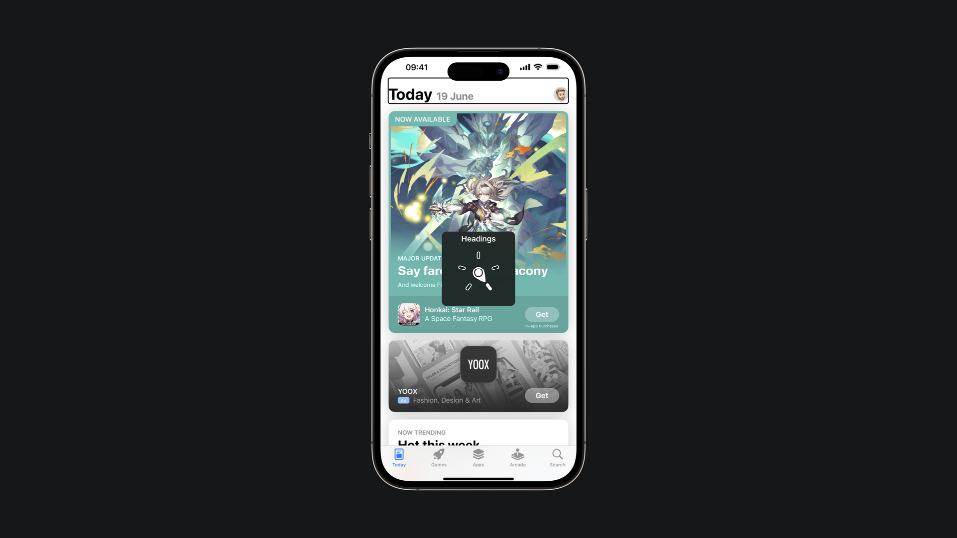
VoiceOver rotor in the Reminder App
As we know swiping one finger left or right on screen will advance one element to the left or right (Flick Navigation). Instead what happens swiping one finger up or down depends on how the VoiceOver rotor is set.
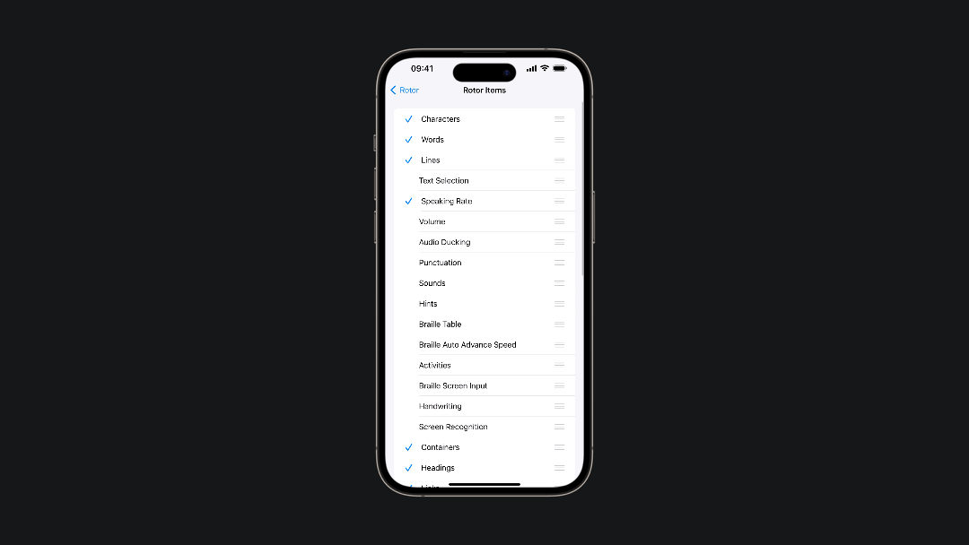
Rotor Options
Some of the default options of the rotor are "Headings", "Links", "Form controls", "Containers" and so on. VoiceOver allows users to customize the options that come up in the rotor. All the available options can be found in Settings → Accessibility → VoiceOver → Rotor → Rotor Items.
We can divide the most common rotor options into three categories:
- Text highlighting
- Moving through the organization of a page or screen
- Changing how you type
Text Highlighting
The most common options for VoiceOver rotor are Characters, Words, and Lines.
When users activate any of these three options on the rotor, they gain the ability to adjust the VoiceOver's text-highlighting behavior across characters, words, and lines. This customization allows users to interact with the text according to their preferences. This could be fundamental for reviewing text
Move through the organization of a page or screen
There are numerous options to customize how VoiceOver reads elements on the screen.
The Headings option allows users to swipe up or down to quickly identify different sections of the user interface. In addition, there is the Link option, providing the same functionality as on web content.
With the Navigation Style option users can choose between a flat or grouped navigation by a two-finger swipe to the left. In a grouped navigation VoiceOver will highlight an entire section while using the flat navigation VoiceOver will act as always.
The Navigation Style rotor option
The Containers option facilitates navigation through larger sections or macro areas within an app. It allows users to move between significant elements like the navigation bar, main content sections, or tab bar with vertical swipes.
The Containers rotor option
Change how you type
We can choose between three modalities:
- Standard Typing:
Select a key on the keyboard by swiping left or right, then double-tap to enter the character - Touch Typing:
Touch a key on the keyboard to select it, then lift your finger to enter the character - Direct Touch:
Type the same as when VoiceOver is off
How to create custom Voice Over rotors for your SwiftUI app
One of the most powerful features of VoiceOver rotor is the possibility to create custom rotor items inside your apps, like the ones in the Reminders app.
In SwiftUI we can use the accessibilityRotor(_:entries:) modifier to create a custom rotor option inside our app.
import SwiftUI

struct Task: Identifiable {
    let id: UUID = UUID()

    let content: String
    let complete: Bool
}

struct ContentView: View {
    let tasks = [
        Task(content: "Edit Understanding VoiceOver rotor article", complete: false),
        Task(content: "Update make it accessible page", complete: true),
        Task(content: "Run accessibility audit", complete: false)
    ]

    var body: some View {
        List{
            ForEach(tasks) { task in
                HStack {
                    Text(task.content)
                    Spacer()
                    if task.complete {
                        Text("✔︎")
                            .foregroundColor(.green)
                    }
                }
                .padding()
                .cornerRadius(8)
            }
        }
        .accessibilityRotor("Incomplete task") {
            ForEach(tasks){ task in
                if !task.complete {
                    AccessibilityRotorEntry(task.content, id: task.id)
                }
            }
        }
        .listStyle(PlainListStyle())
        .padding()
    }
}
The accessibilityRotor modifier uses two parameters. The first is a string that will be used as the title of the custom rotor. The second parameter is the AccessibilityRotorContentBuilder closure used to generate rotor entries. Each element is an AccessibilityRotorEntry that conforms with the AccessibilityRotorContent protocol.
Custom Rotor Item
Conclusion
The VoiceOver rotor is a helpful tool that enhances accessibility and usability for VoiceOver users. It provides a customizable wheel of commands that allows users to navigate, select, and interact with different types of content more efficiently. The rotor offers options such as text highlighting, organizational navigation, and typing methods, which can be personalized to cater to individual preferences and needs. Additionally, by creating custom rotor items you can let VoiceOver adapt to the specific needs of your app.