
Understanding Design Systems
Learn what design systems are and their role in software development.
A design system is an essential tool for software development teams, enabling creating and maintaining a consistent experience across products and media. For a design system to be effective, it must be thoughtfully structured, with particular attention to decisions made in the product itself.
Let’s explore the definition and components of a design system, its differences from a UI Style Guide, and the essential elements that shape a robust and effective design system.
Design Systems
Your product is more than just a pile of reusable UI elements. It has structure and meaning. It’s not a generic web page, it’s the embodiment of a system of concepts.
Emmet Connolly
A design system is often mistakenly reduced to a mere library of design elements and it's wrongly called a style guide. The style guide or ‘stickers page’ – where developers drag and drop reusable elements – plays a crucial role in the design system but is a session of the system. A true design system extends beyond the list of elements and it includes detailed rules, defined standards, and motivations behind product design choices.
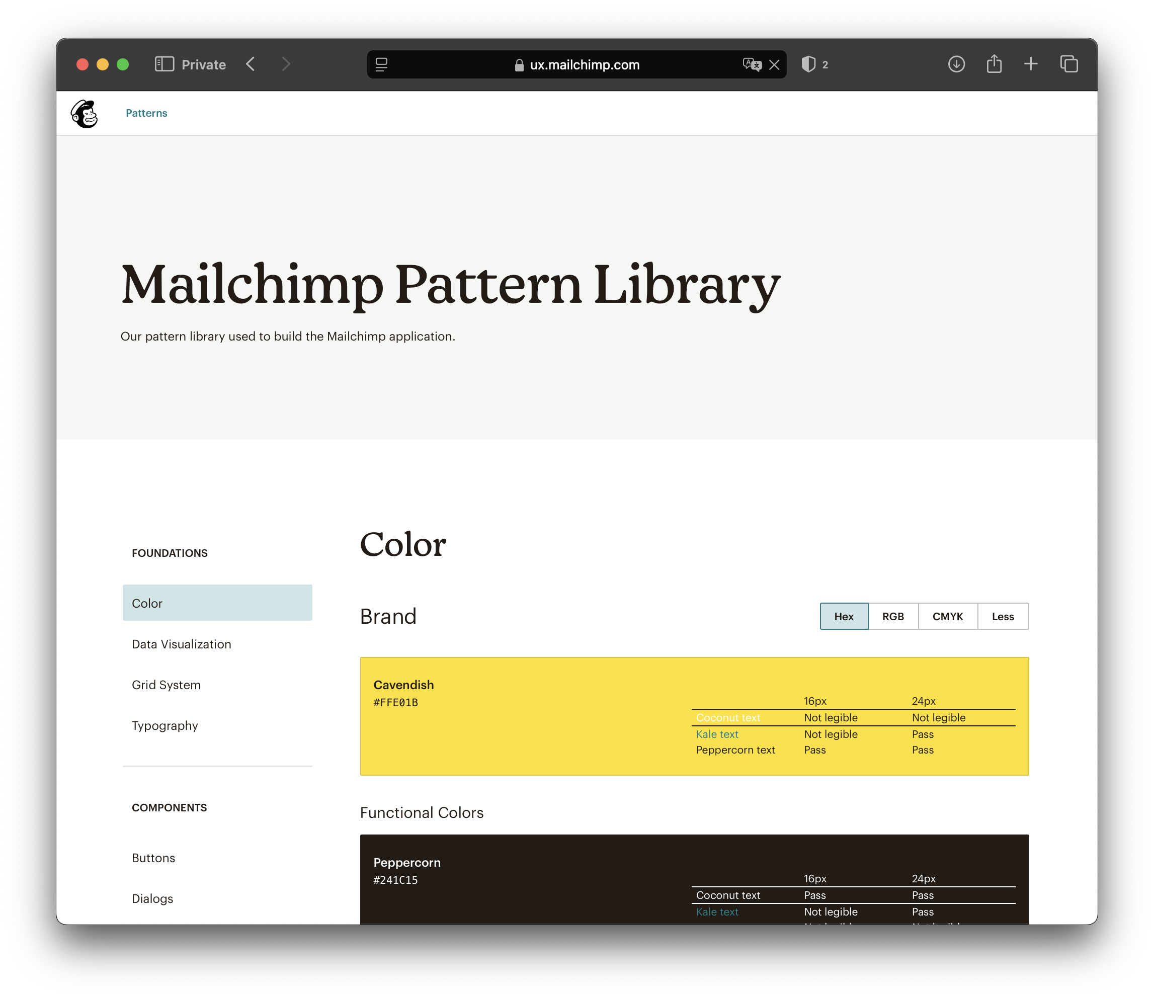
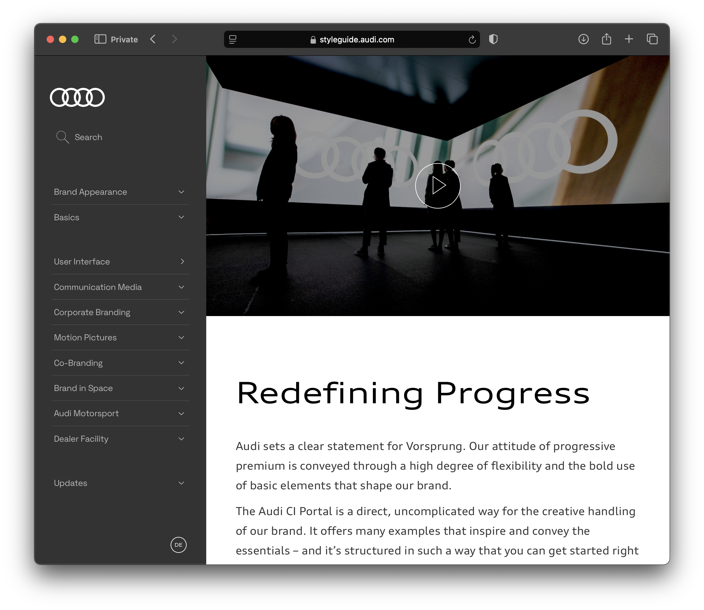
A well-structured design system functions as a source of truth, encapsulating shared patterns, principles, and guidelines. It should be available to designers, coders, and business teams to provide a complete understanding of how elements were designed, and how they should be implemented. It also helps new team members quickly learn and to contribute effectively.
A successful design system allows the product to grow seamlessly, allowing new user journeys to be added without losing identity or consistency. If a product becomes difficult to maintain or if developing new features is burdensome, the design system has failed.
A design system is a living entity and is never a finished or flawless product, meaning that it shouldn't receive extreme effort in perfecting every minor detail. Instead, the system evolves and iterates throughout the app's lifecycle. Feedback, new interactions, and product growth must be reflected in the design system. Don’t forget to define the goal of the system itself, whether it’s to guarantee consistency of interactions, faster implementation, or more accessible UIs, for example.
A design system should not be created before the product exists or wait for the product to be finished. Instead, it should be developed alongside the product, continuously documenting decisions and guidelines as they appear. All the design decisions need to be written down, but it doesn’t need to be boring. Designers can use their power –UI, storytelling and UX writing– to create documentation that is helpful and, more importantly, will be used. A design system is also a product.
Anatomy of a Design System
A reliable design system should include several key sections. The complete list of chapters will depend on the specific goals and objectives of the system.
Foundation
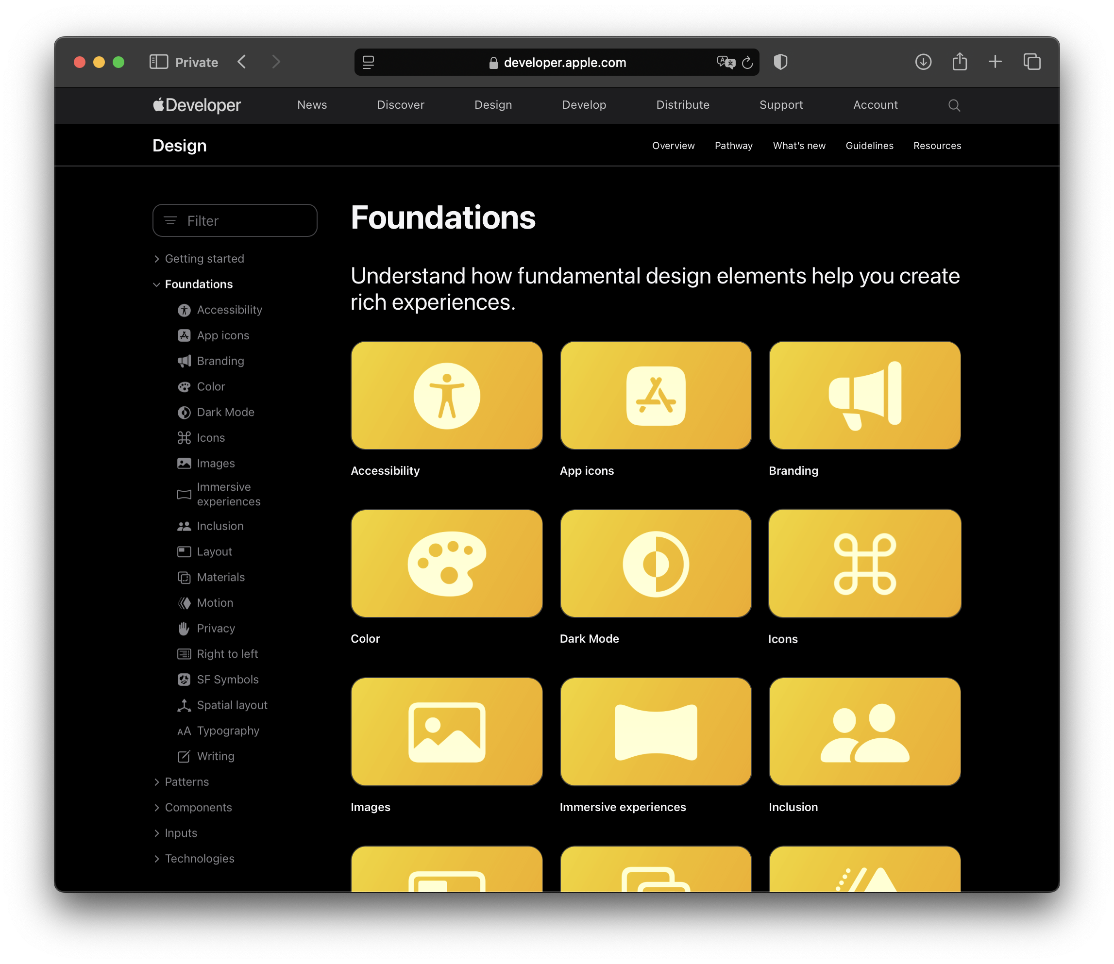
The Foundation chapter of a design system describes the core language of the product, it's the must-follow section for consistency. It typically includes specifications for the color palette –defining the primary, secondary, and neutral colors– typography and text styles, standards for spacing and padding, and guidelines for copies and accessibility. Describe why the tone of voice was chosen and the main characteristics of icons and illustrations. This is where the ‘why’ behind every decision lives. It also includes how the design system should be used and maintained.
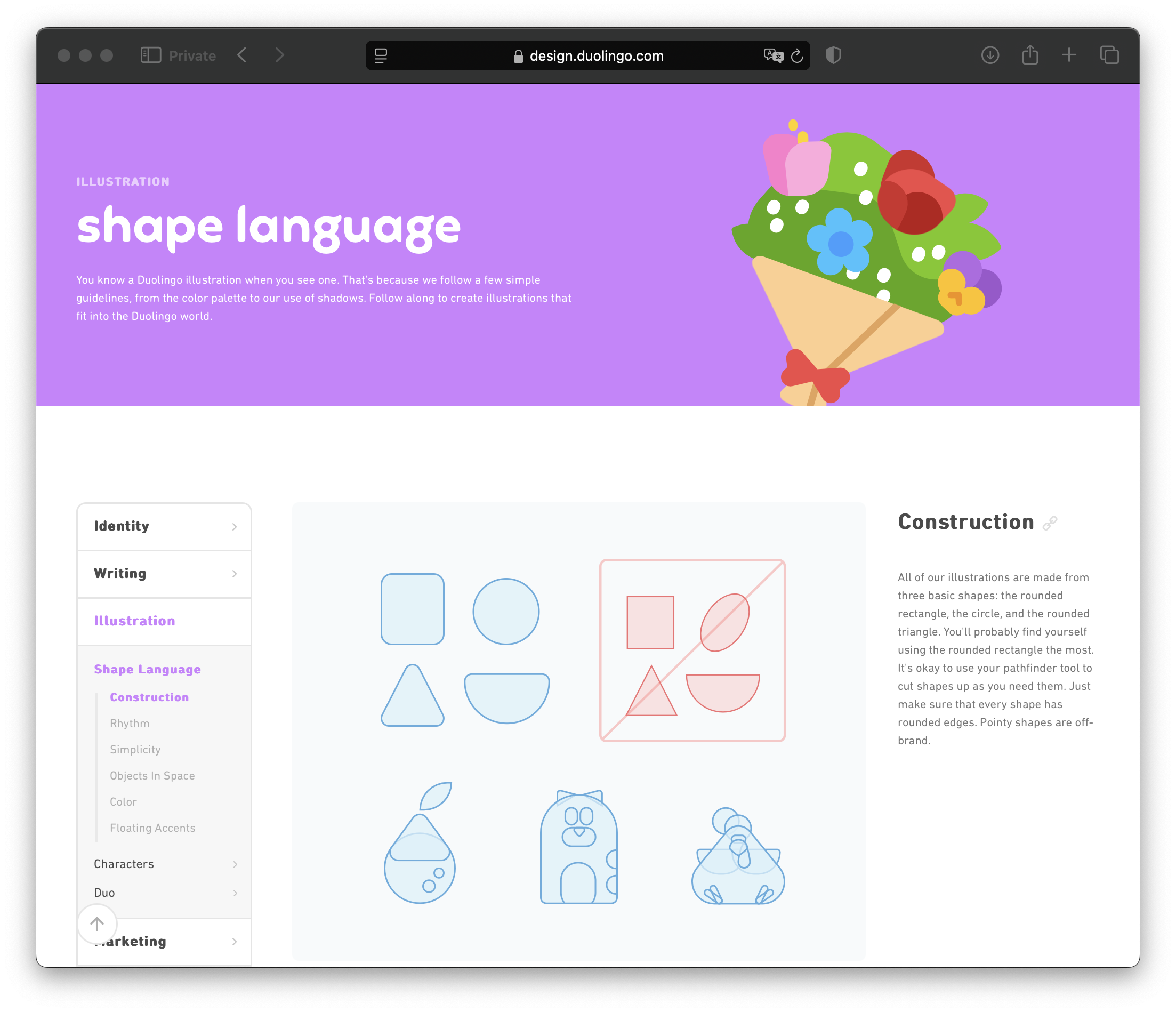
The foundation chapter acts as a ‘cookbook’, guiding on how to create new elements and consistently use the existing ones. It provides teams with the rationale behind each decision and guidance on using or creating elements consistently. For example, Duolingo's illustration guidelines clarify the brand’s visual language and its application.
Components
The components section summarizes the ‘what’ and ‘how’ of the design system. Components are reusable building blocks, designed for quick drag-and-drop usage. To minimize misusage, create a catalog of elements with a clear description to ensure they are applied correctly. This session should function as a guide, with ease to follow definitions and variations of an element.
Components should be connected to their properties –with ready-to-code specifications– and their limitations. For example, add the minimum and maximum quantity of characters in a headline.
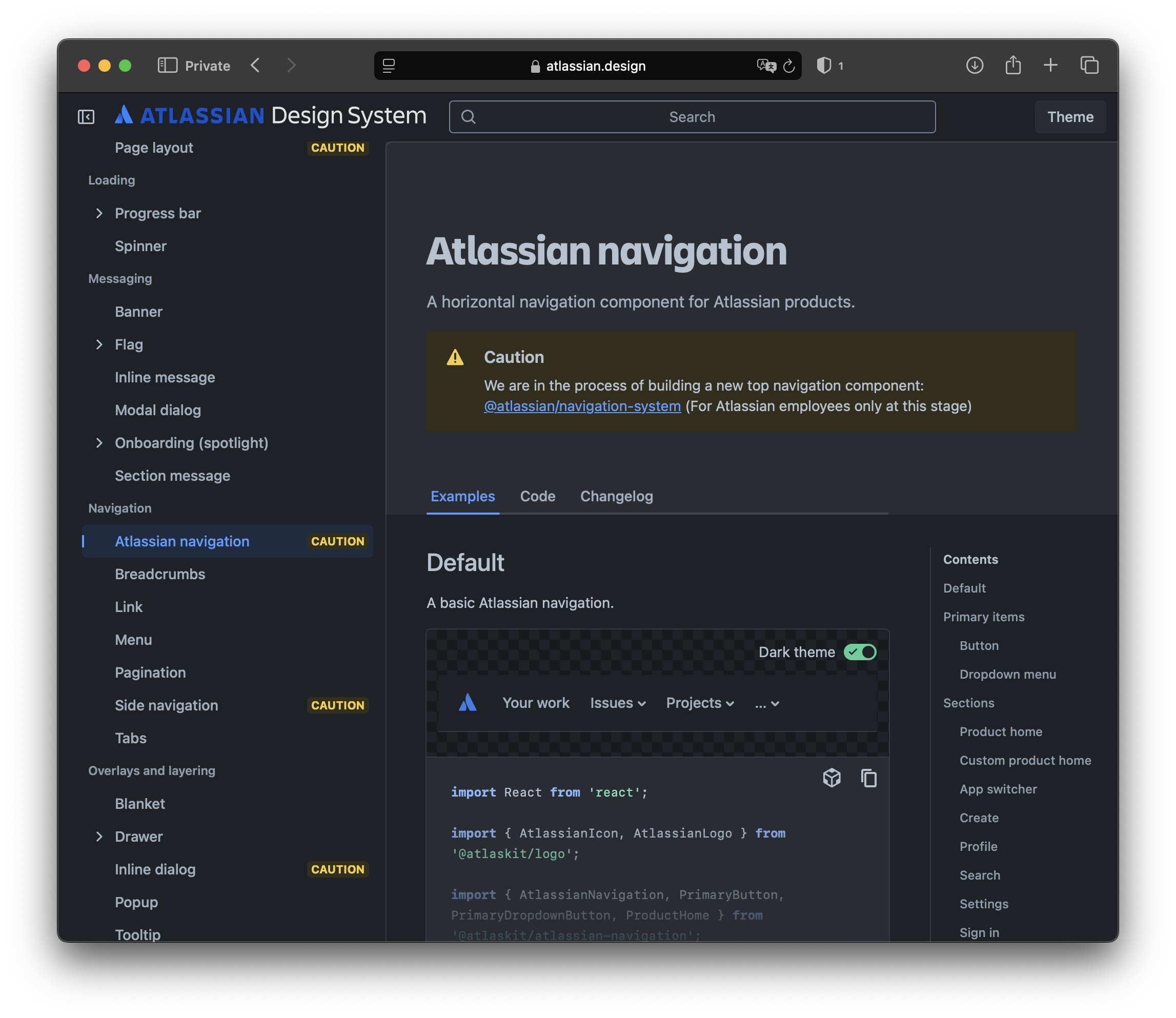
In the image above, Atlassian’s design system illustrates when to use different navigation levels, how primary buttons should act, and when dropdown menus are appropriate. This section addresses the 'when' and 'why' of using a component variation, including any necessary accessibility adjustments. Also, it highlights potential future changes to the element.
Accessibility
Design is about solving problems for humans, and a design system can support this by creating standards that systematically focus on real human needs. A design system must define the product's usability and compatibility standards. Usability refers to humans' needs when interacting with a product, while compatibility refers to how assistive technologies, such as screen readers or alternative input devices, interact with the product.
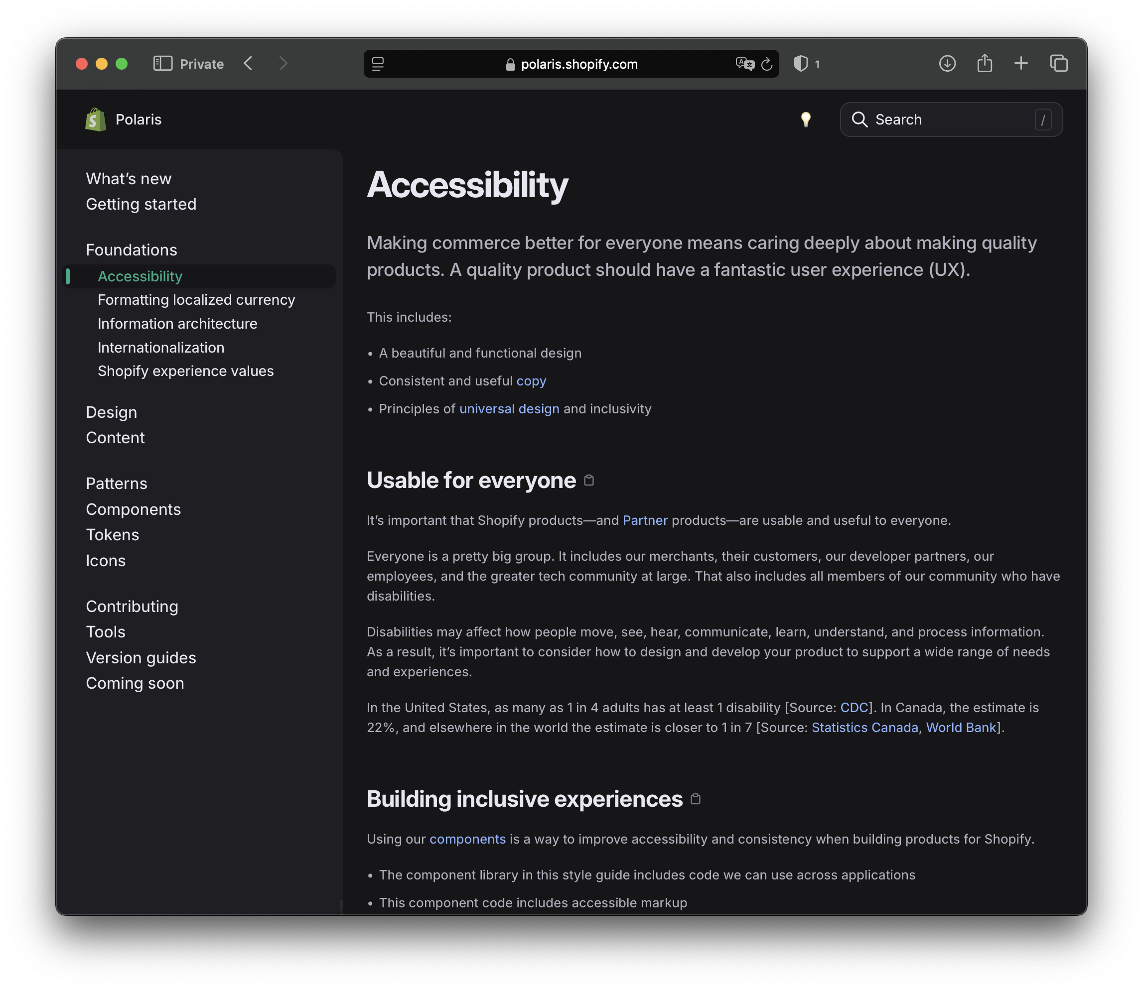
The image above features the accessibility chapter of Shopify's Polaris design system. It highlights how accessibility standards are systematically integrated into the product, ensuring that the product meets human needs.
UI Style Guide
UI style guide organizes visual elements —such as colors, typography, and icons— to ensure consistent aesthetics, while a design system encompasses the style guide along with tools, guidelines, and reusable components to support the entire product development process
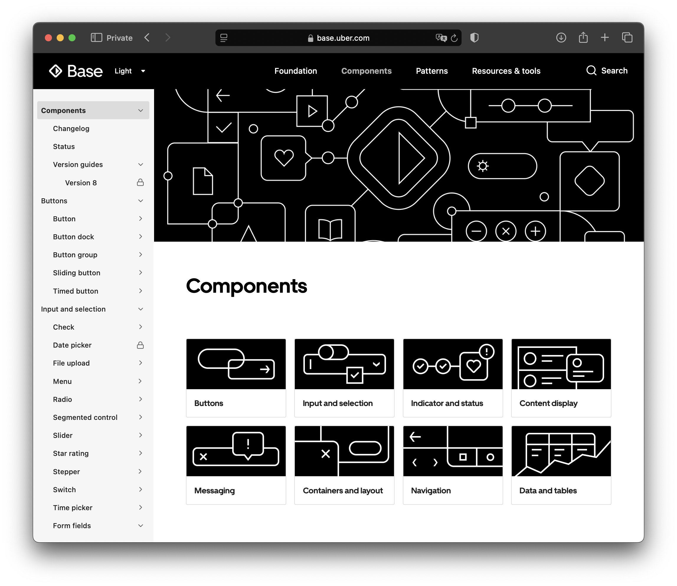
The UI Style Guide collects, for easy access, all components used in the product's interface. The components are organized with all possible variations —accessibility variations, light and dark modes, device options and screen size constraints, active and inactive states, and more.
To create and maintain this extensive section, some methodologies emerged, like Modular Design or the Atomic Design Methodology –developed by Brad Fros. The atomic mindset –which follows physics principles– begins with atoms, the fundamental and unbreakable elements (basic elements like buttons and labels), a group of atoms creates molecules (e.g., input forms) and organisms are made by combining atoms and molecules (e.g., navigation bars). Templates –bye-bye physics analogy– are formed by mixing organisms that appear multiple times in the application.

