Using gradients in SwiftUI
Learn how to use the different types of gradients to color your SwiftUI views


In this article, we will explore the world of gradients in SwiftUI, including the different types and properties for creating customized gradient effects in our View.
The different ways of creating gradients we will explore are:
- Simple gradient
- Custom gradient
- Linear gradient
- Angular gradient
- Angular gradient
Simple gradient
In SwiftUI we can easily apply gradients to colors. The system colors all come equipped with a gradient version of itself as a read-only property called gradient of type AnyGradient:
Circle()
    .fill(Color.blue.gradient)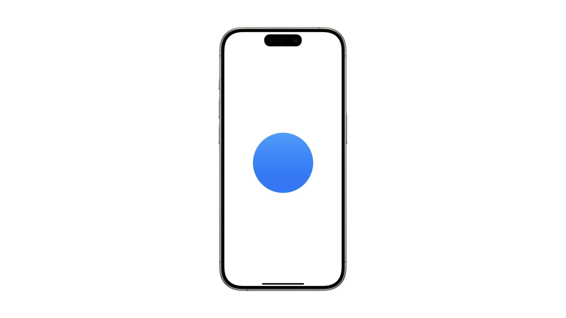
This method is the simplest way to apply a gradient. For a customized gradient effect, we can define a custom gradient by specifying each color and its position along the gradient.
Custom gradient
In SwiftUI, we can use the Gradient struct to define an object that holds both color and position information. There are two main initializers available:
The first one is the initializer init(colors:). It takes an array of Color and equally distributes them across the gradient.
@State var gradientStyle = Gradient(colors: [
    .blue, .purple, .red, .orange, .yellow
])
The second one is the init(stops:). It places each color along the gradient based on a floating point value from 0.0 to 1.0.
@State var gradientStopsStyle = Gradient(stops: [
    Gradient.Stop(color: .blue, location: 0),
    Gradient.Stop(color: .purple, location: 0.25),
    Gradient.Stop(color: .red, location: 0.5),
    Gradient.Stop(color: .orange, location: 0.75),
    Gradient.Stop(color: .yellow, location: 1)
])
A tip to make your life easier is to define your colors on a separate file as an extension of the type Color or to define your brand colors on the Assets folder of your Xcode project.
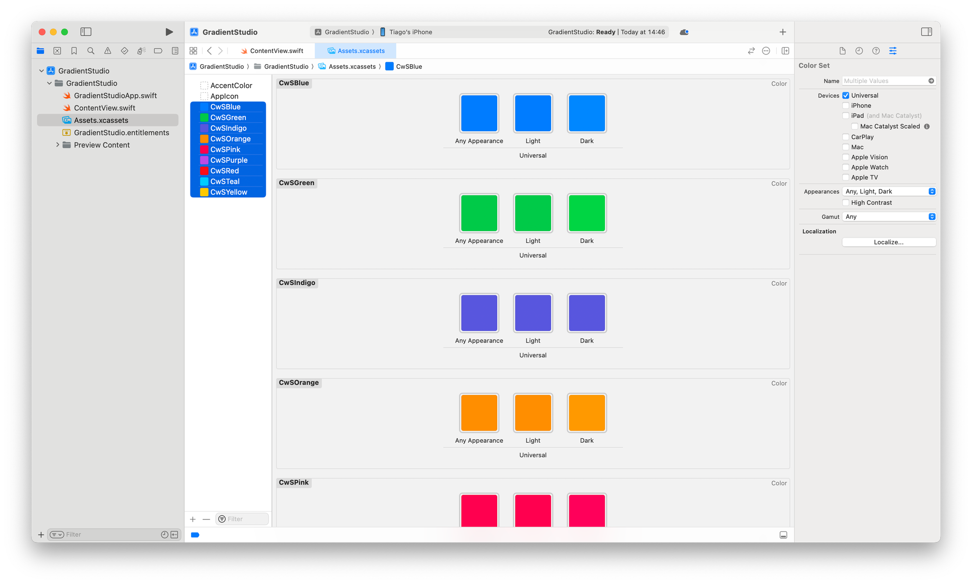
This way you can use the name of your colors to create your gradients.
@State var gradientCwSStyle = Gradient(colors: [
    Color("CwSTeal"),
    Color("CwSBlue"),
    Color("CwSPurple"),
    Color("CwSPink"),
    Color("CwSOrange"),
    Color("CwSYellow")
])
Types of Gradient
In SwiftUI there are four types of gradients. Which ones are them and their definition as in the official Apple documentation are:
LinearGradient: it applies the color function along an axis, defined by its start and end pointsRadialGradient: it applies the color as the distance from a center point, scaled to fit within the defined start and end radiiAngularGradient: it applies the color as the angle changes, relative to a center point and defined start and end anglesEllipticalGradient: it maps its coordinate space to the unit space square in which its center and radii are defined, then stretches that square to fill its bounding rect
Let's see how to use linear, radial, and angular gradients.
Linear Gradient
The LinearGradient struct renders colors along an axis, with start and end points specified using UnitPoint.
SwiftUI provides default UnitPoint values such as .zero, .center, .leading, .trailing, .top, .bottom, .topLeading, .topTrailing, .bottomLeading, and .bottomTrailing.
var gradient = Gradient(colors: [
    Color("CwSBlue"),
    Color("CwSIndigo")
])

var body: some View {
    VStack {
        Circle()
            .fill(
                LinearGradient(
                    gradient: gradient,
                    startPoint: .top,
                    endPoint: .bottom
                )
            )
            .frame(width: 200, height: 200)

        Text("Linear Gradient")
            .font(.title2).bold()
    }
}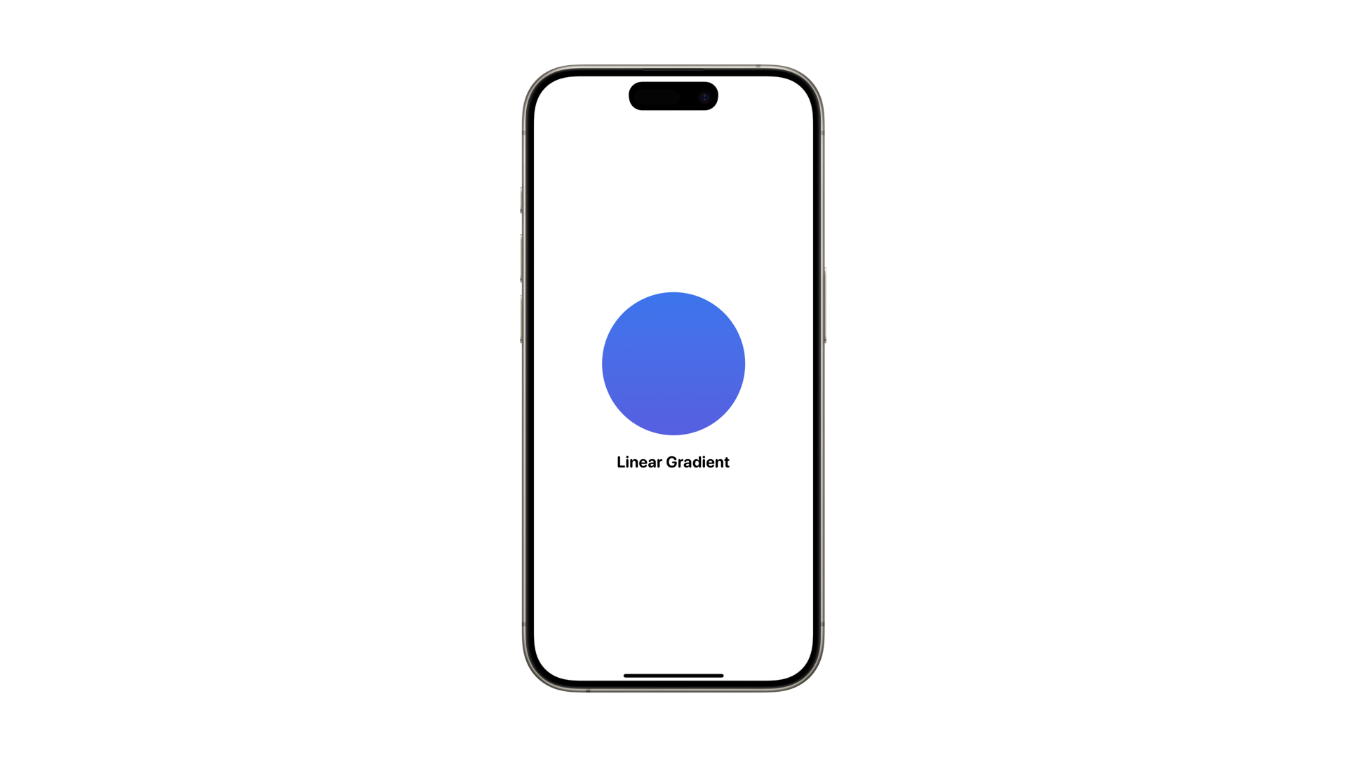
You can create custom UnitPoint values by passing x and y coordinates ranging from 0 to 1 to the initializer.
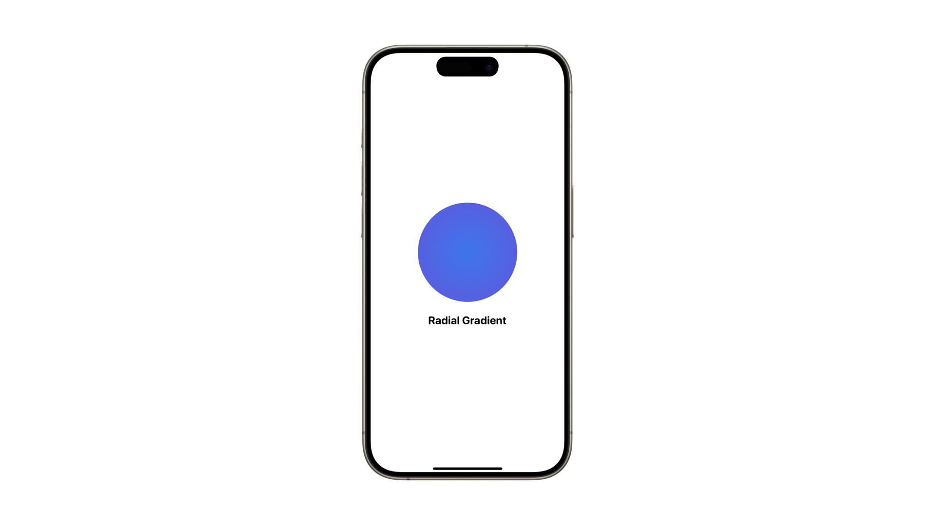
Radial Gradient
In RadialGradient, we specify the startRadius, endRadius, and the center of the gradient.
The gradient is circular, centered at the specified point, and extends outward to the end radius. The center is defined using a UnitPoint value.
The startRadius and endRadius are CGFloat values representing the radius in points.
var gradient = Gradient(colors: [
    Color("CwSBlue"),
    Color("CwSIndigo")
])

var body: some View {
    VStack {
        Circle()
            .fill(
                RadialGradient(
                    gradient: gradient,
                    center: .center,
                    startRadius: 1,
                    endRadius: 100
                )
            )
            .frame(width: 200, height: 200)

        Text("Radial Gradient")
            .font(.title2).bold()
    }
}
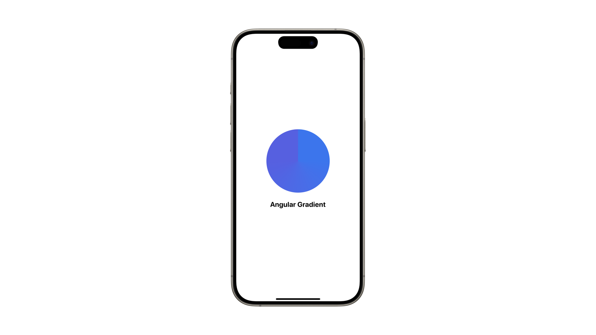
Angular Gradient
AngularGradient renders colors based on changing angles relative to a center point. By default, the gradient starts from 0 degrees and progresses clockwise until completing the circle.
var gradient = Gradient(colors: [
    Color("CwSBlue"),
    Color("CwSIndigo")
])

var body: some View {
    VStack {
        Circle()
            .fill(
                AngularGradient(gradient: gradient, center: .center)
            )
            .frame(width: 200, height: 200)

        Text("Angular Gradient")
            .font(.title2).bold()
    }
}
To specify the start and end angles, we need to use an alternative initializer where we can define startAngle and endAngle.
AngularGradient(
    gradient: gradient,
    center: .center,
    startAngle: .degrees(0),
    endAngle: .degrees(180)
)