
Writing better copies for your apps
Explore UX writing and how to communicate with your user through your application UI.
User experience refers to any interaction a user has with a product or service, and one crucial element of this interaction is language. Phrases and verbs are key components in creating communication between services and users. When written correctly, these lines can transform user journeys into delightful experiences.
But what should be written? Can it be humorous? Should the app be brutally honest?
Learn how to craft consistent and effective wording to enhance the user experience in your app.

UX Writing Principles
You do the work —not your users.
A user experience in a digital product is a complex collection of interactions to create communication with the user. An easy and powerful way to exchange information with users is by talking –which can be done by using voice or writing text. The choice of words can be as impactful as the choice of colors. When words work without friction within the scope of the app and interface elements, they often don't even notice the text or labels. Words in an app help users understand what's expected, and what to do next.
In native Apple apps, text is used consciously and intentionally. Across the platform, words are consistently used with the same purpose. The Apple Human Interface Guidelines has a dedicated page to support you in writing better copy on your app interface.

A good example is the notifications of the Activity app on the Apple Watch. The messages are designed to engage, celebrate, or encourage movement. The Activity app often uses exclamation points for a lively tone, while the Health app maintains a more formal tone. Despite these differences, the voice remains consistent throughout.
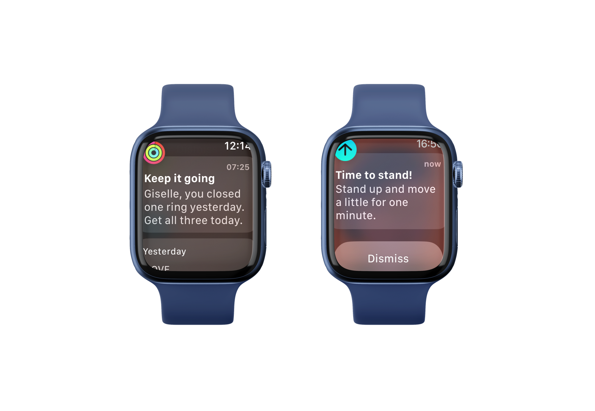
Design is the art of solving problems –without creating a new one–, with this, the app should instantly provide the information users need, and only. To perfect craft the communication between humans and apps, comes the skills of the UX writer (UXW) or Content Designers.
Don’t confuse UXW with a copywriter, they are ‘writers’ but have different intents. UX writers guide users through the interface in an intuitive experience by being concise, straight to point, and with microcopies.
Before going micro, begin with a macro perspective.
Just as a UI designer sets the language for the look of an application, the UX writer also needs to define the app’s voice. By defining the language a UXW defines how the app will speak with the user. Heavily based on research and with a deep understanding of the persona, the UXW will articulate the app's voice, and personality, to ensure it effectively communicates with the user.
'What are you really trying to say?’
The definition of an ideal copy is short, clear, straightforward, and consistent with the overhaul look and feel of the app. Colors and iconography reflect the intention and personality, and so do the copies. For consistency, texts should follow the same standards defined for the UI components.

Writing in text editors is a good practice, as it allows you to check for grammar and spelling errors constantly. Beyond that, copies should be created for the context they are inserted into, becoming important to apply copies in the UI. By applying the copies to the interface one can see the complete flow and reconsider chosen words –maybe even if they are needed. Adding words into context creates a clear picture of the journey that is being designed. Tone and voice can completely change the experience and it helps brands to develop trust and build lasting relationships.
Tone of voice
Imagine an app for kids with friendly, warm colors and cute and playful illustrations. The happy kid opens this app and reads:
Dear Miss/Mr. User, to prompt interact with the alphabet, be so kind and tap the ‘start’ button.
Sounds odd, right? There aren’t any grammar issues and the action needed is described in the text, so why does it sound wrong? The tone of the copy doesn't match the user's needs or expectations, making it a poor choice. The misused copy is evident because the tone conflicts with the interface elements' choices.
The app's voice evokes its personality and should be consistent throughout the product and complementary media (app product page, social media profiles, and so on). It belongs to the brand’s personality and it’s unchangeable.
The tone is contextual and adapts to the message; error messages have a different tone from the one applied in the onboarding. The tone reflects the app’s attitude towards a moment, is about emotions and mood, and should be used intentionally.
To better balance the tone, the UX Writer applies techniques such as a ‘tone map’. Start by defining four essential brand dimensions in contrasting pairs –fun/serious and concise/detailed, for example. Organize these dimensions in a matrix and map out where different copies should land, ensuring that the tone aligns with the app’s overall personality and the specific context of the message.
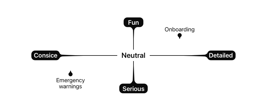
The right tone can make an app recognizable –and downloaded– in a market saturated with similar options. If you search for a weather app in the App Store you will find many different versions of it. So why did CARROT Weather stand out? It's all about its hilarious tone of voice, making this app a unique and memorable experience.
To reach the ideal voice and tone of your application, understand your users through research. Understand the users’ behavior, interest, culture, and slang. With deep knowledge about an app audience –and their boundaries– you can define the right tone for your application.

Emojis are a helpful way to make messages more casual ☺️. Watch for the quantity of emojis, don’t overuse them, 🤯🤯🤯. Choose the right moment, such as a welcoming message or a happy notification. Avoid double-meaning (🍆) or confusing, with no clear emotion, emojis (🎍).

A ‘hive’ for better copies
Creating products for people means that an app needs to communicate effectively with everyone, as you never know who is on the other side of the screen. The design principles of Apple were built on top of the "what you see is what you get" philosophy, and language is included here, as we can see in the WWDC 2022 session "Writing for interfaces".

A hive is a structure bees create to store and collect the honey they produce. To help you create consistent and clear communication in your app, here is a resourceful hive of "be's" you can draw from:
Be precise
Be precise and efficient. Avoid repeating words that will make the decision-making longer. Instead, add new elements to enhance clarity and precision –such as sub-titles or headers.
When actions have similar wording but conflicting actions, it can confuse and add extra effort to be understood, or worse, it can create interaction mistakes. Copies with opposite copies bring clarity.
Be repetitive
Action has consequences, and labels must be unquestionably clear about what will happen next. In this case, repetition enhances clearness. Users should always be certain about the result of tapping a button.

Be concise
Avoid long blocks of text; users don’t read it.
Users tend to scan, searching for what they want.
If bigger texts are needed, split them into shorter sentences and paragraphs.
Be consistent
Inconsistency in terminology creates confusion. Don’t use synonyms to refer to the same element in different places of the UI. One common mistake is mixing different forms of address –using the second person for general interaction but naming sessions in the first person.

Be objective then action
Start sentences with the objective, followed by the action needed to achieve it. This structure, helps users to scan and find what they need quickly.

Be or don't be
Avoid using double negatives as they increase cognitive load and delay decision-making.

Be human
Avoid using terms that are specific to certain skills and jargon. Copies are meant to be simple and clear for everyone. This also applies to error messages; why give users an error code, it doesn’t bring any value as they will not fix it. Avoid using acronyms, as users might not know what they mean or might have different interpretations.
Be visual
To create harmony and ensure consistency, document copies in a ‘style’ guide, the Content Style Guide. Include detailed specifications with when to use each type of copy with possible variations. Be visual by adding examples of the copies within the context of the UI.
The Content Style Guide is a chapter of a Design System and is constantly updated.
Be tested
Always test copies for wording and tone of voice. Read them out loud to timer how long it takes to read. During usability test sessions, analyze if the wording is helping, or not, the user and the understanding of the goal of the app.
Be inspired
Keep looking for inspiration and best practices, don’t assume you know all there is to know.
Creating a content style ensures copies are consistent and scalable. Part of the work behind it is to ensure clear documentation of the voice and tone of your application so the people working on it have a common source of truth
Mailchimp has well-documented principles for its voice and Monzo also provides a good example of how it can be done.
To go further the following articles are great resources about other aspects of how the voice and tone of your application can impact the experience of your user and how to find your application's voice and tone.
The article "How to design a voice experience" covers how to design an experience when the user is interacting with your application through a voice interface.
The article "How research is different for UX writing" walks you through the process of research for UX writing, how it differs from conventional UX research, and the process of choosing a research method to conduct your research.

