
WWDC24: What's new in the Human Interface Guidelines
Discover and navigate the WWDC24 updates to the Human Interface Guidelines.
WWDC 2024 has just started, bringing many exciting updates to Apple’s operating systems. This year, a significant focus has been placed on user customization of the Home Screen, Widgets, Control Center, and Lock Screen controls.
The ability for users to customize even the tint color of their device’s home screens means that designers and developers must consider this flexibility when designing app icons and widgets.
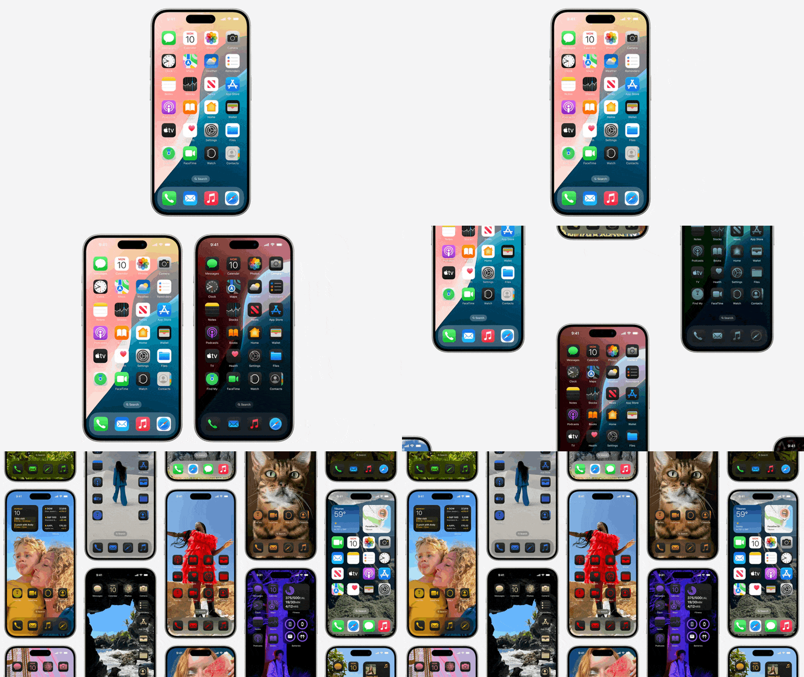
To support designers and developers in adapting to this new level of customization in iOS and iPadOS, the Human Interface Guidelines have been updated. These updates include guidance for designing widgets and app icons, revisions to existing pages, and the introduction of a completely new page titled Designing for Games.

Let’s delve into the main updates in the Human Interface Guidelines.
Home Screen
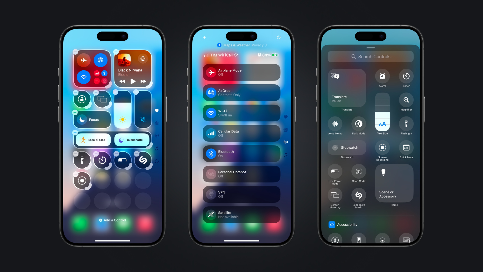
There is a completely new page called Controls providing guidance on extending the functionalities of your application that, with iOS 18, can also live in the Control Center, Lock Screen, or the Action button of your users.

This page outlines the anatomy of a Control on iOS and iPadOS, accompanied by a series of best practices to ensure an optimal user experience for custom controls.
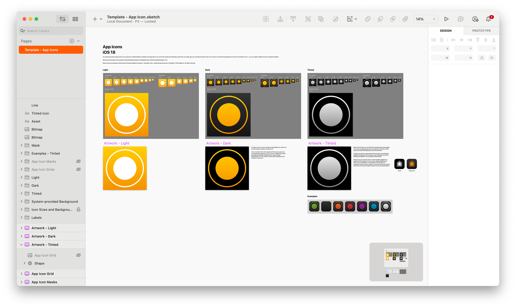
The guidelines for Widgets and App Icons have been updated to reflect the new customization options, including accented widgets and tint colors. There is also a new resource available to help you design your icon taking into consideration the light, dark, and tinted versions it can have on the Home Screen.
watchOS Updates
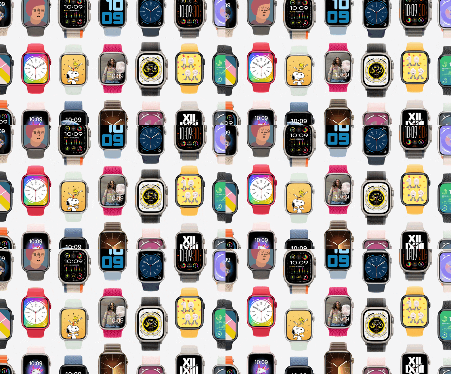
With watchOS 11, Live Activities from the iPhone appear at the top of the Smart Stack on the Apple Watch. While the default view includes elements from the iPhone’s compact presentation, a custom layout is recommended. Users can also use the double-tap gesture to scroll through lists, scroll views, and navigate between vertically paginated tabs,
The updated Human Interface Guidelines offer instructions for creating custom Live Activity layouts and implementing double-tap actions, helping you make the most of these new features.
Designing for Games
A completely new page providing lots of valuable guidelines regarding designing and creating game experiences for the Apple family of operational systems.

A long-awaited addition to the Human Interface Guidelines and acts like a collection of different guidelines providing guidance on lots of different aspects.
Among the many available guidelines, you can, for example, find ones regarding:
- Getting the player straight into the game
- Ensuring legibility in every display
- Designing intuitive controls and interactions
- Supporting accessibility features
- Adopting Apple technologies
It is worth diving into it even if you are not developing games since there is much we can learn by how user experiences are designed for gaming experiences.
visionOS
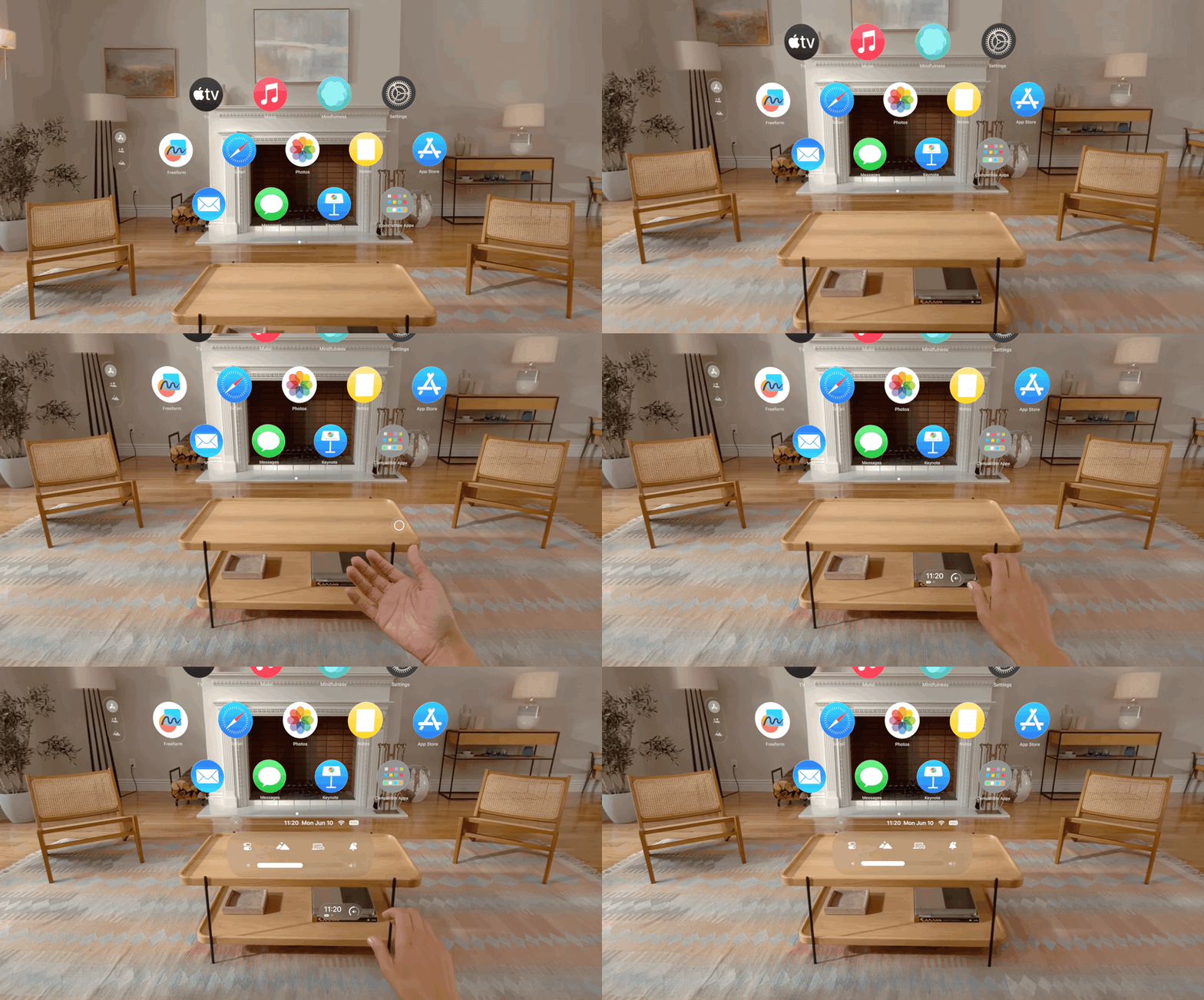
visionOS 2 has been announced, bringing several incremental updates. Notably, the Immersive Experiences page has two major updates: how to tint passthrough to visually coordinate the surroundings with their content, and how to set initial, minimum, and maximum immersion levels to enhance app or game experiences.
On the Eyes page, new guidelines help developers design custom hover effects that animate when users look at an element. The Windows page now includes game-specific examples and additional guidance on using volumes in visionOS.
What’s New
These are some highlights of the changes in the Apple Human Interface Guidelines from WWDC24. There are many more, like updates to the SF Symbols page, a new page for Settings, updates for how to handle File Management, new guidelines for Accessibility and new Apple Pay integrations within the system apps.
You can check them all on the What’s new page in the Design section of the Apple Developer Portal.


